Society of Visual Storytelling

    SVSLearn Forums

    • Register
    • Login
    • Search
    • Recent
    • Tags
    • Popular
    • Users
    • Groups
    • Search

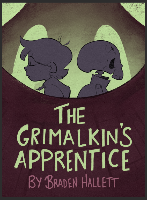
    Cover rough critique! How do you feel about the colours?

    Artwork
    15
    35
    1526
    Loading More Posts
    • Oldest to Newest
    • Newest to Oldest
    • Most Votes
    Reply
    • Reply as topic
    Log in to reply
    This topic has been deleted. Only users with topic management privileges can see it.
    • TessaW
      TessaW last edited by

      I think the colors work!

      Website: www.tessawrathall.com

      Instagram: www.instagram.com/tessawrathall_art/

      1 Reply Last reply Reply Quote 1
      • burvantill
        burvantill Moderator @chrisaakins last edited by

        @chrisaakins @Braden-Hallett I agree. I think the green can be much more saturated. Electric! I love the little dude on the right. Nice character design & silhouette. =)x

        Lisa Burvant
        www.lisaburvant.com
        Instagram & Twitter & SVS: @burvantill

        braden H 1 Reply Last reply Reply Quote 1
        • Jeremiahbrown
          Jeremiahbrown last edited by

          @Braden-Hallett I don't know what the story is about but the colors do give a feeling that seems accurate to what the story appears to be about. I like it.

          Your book "If you give a girl a bike" arrived at my house yesterday and it looks great! Great style and consistency!

          Jeremiah Brown
          www.jeremiahbrownillustration.com
          https://www.instagram.com/jeremiah.brownillustration/

          braden H 1 Reply Last reply Reply Quote 1
          • NessIllustration
            NessIllustration Pro @braden H last edited by

            @Braden-Hallett When we look at it from afar, the cover isn't as eye catching as it could be. How about if the shape up front was way darker, with the text in green on top? It could add enough contrast to really make it pop?

            vanessastoilova.com
            instagram.com/vanessa.stoilova/

            Check out my Youtube channel for tips on how to start your career in illustration! www.youtube.com/c/ArtBusinesswithNess

            braden H 1 Reply Last reply Reply Quote 1
            • braden H
              braden H @Jeremiahbrown last edited by

              @Jeremiahbrown said in Cover rough critique! How do you feel about the colours?:

              @Braden-Hallett I don't know what the story is about but the colors do give a feeling that seems accurate to what the story appears to be about. I like it.

              Your book "If you give a girl a bike" arrived at my house yesterday and it looks great! Great style and consistency!

              That's awesome! Glad you like it. I'm glad the author's advertising it because for some reason advertising triggers my anxiety goblin 😅

              1 Reply Last reply Reply Quote 1
              • braden H
                braden H last edited by

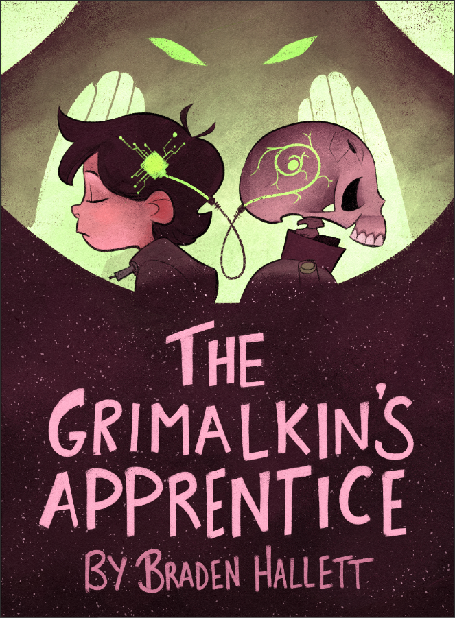
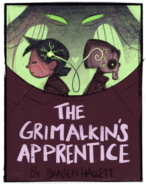
                Thanks for the feedback everyone! I got a bunch of awesome advice froma bunch of different places (including here) and I'm starting to settle on something darker (and much more saturated!)
                80832334-9b1b-4233-97c7-807cbd3ee41f-image.png

                And a further WIP shot

                080dbed3-fdf4-4a11-8098-7b2ebaf2d05f-image.png

                carlianne aska 2 Replies Last reply Reply Quote 7
                • braden H
                  braden H @burvantill last edited by

                  @burvantill said in Cover rough critique! How do you feel about the colours?:

                  I love the little dude on the right.

                  Ah yes. Skullmeister. No lines and very limited screen time, but totally steals the show, lol.

                  1 Reply Last reply Reply Quote 1
                  • braden H
                    braden H @NessIllustration last edited by

                    @NessIllustration said in Cover rough critique! How do you feel about the colours?:

                    When we look at it from afar, the cover isn't as eye catching as it could be

                    I agree! Works-ish, but definitely not on the level of "LOOKATMELOOKATME!" which is what I want!

                    NessIllustration 1 Reply Last reply Reply Quote 0
                    • braden H
                      braden H @chrisaakins last edited by

                      @chrisaakins said in Cover rough critique! How do you feel about the colours?:

                      If you wanted to you could push the intensity on the colors of his face and the alien's eyes but it's not necessary at all.

                      I think i tend toward muted colours which can be good for interiors, but (based on feedback) not necessarily the best for covers. So I'm definitely gonna push 'em a bit more!

                      1 Reply Last reply Reply Quote 0
                      • NessIllustration
                        NessIllustration Pro @braden H last edited by

                        @Braden-Hallett Yeah I think it might be because you have a lot of middle gray tones. The updated version you posted has the large block of high contrast, which really makes it pop!

                        vanessastoilova.com
                        instagram.com/vanessa.stoilova/

                        Check out my Youtube channel for tips on how to start your career in illustration! www.youtube.com/c/ArtBusinesswithNess

                        braden H 1 Reply Last reply Reply Quote 2
                        • braden H
                          braden H @NessIllustration last edited by

                          @NessIllustration said in Cover rough critique! How do you feel about the colours?:

                          @Braden-Hallett Yeah I think it might be because you have a lot of middle gray tones. The updated version you posted has the large block of high contrast, which really makes it pop!

                          Awesome! Good to hear it's popping more 😃

                          1 Reply Last reply Reply Quote 0
                          • carlianne
                            carlianne @braden H last edited by

                            have you explored making the dark area more purple than red? The purple green combo tends to have a cool eerie sci-fi feel to it, might be fun! 🙂

                            Check out my art and tutorials :)

                            Instagram: www.instagram.com/carliannecreates/

                            Youtube:
                            https://youtube.com/c/CarlianneCreates

                            Shop: www.carliannecreates.com

                            braden H 1 Reply Last reply Reply Quote 1
                            • braden H
                              braden H @carlianne last edited by

                              @carlianne said in Cover rough critique! How do you feel about the colours?:

                              have you explored making the dark area more purple than red? The purple green combo tends to have a cool eerie sci-fi feel to it, might be fun! 🙂

                              See, the interesting thing is that to me that DOES look purple 😆 Purple green is exactly what I was goin' for 🙂

                              carlianne APHOTICMOTH 2 Replies Last reply Reply Quote 0
                              • carlianne
                                carlianne @braden H last edited by

                                @Braden-Hallett moooooooaaaaar

                                Check out my art and tutorials :)

                                Instagram: www.instagram.com/carliannecreates/

                                Youtube:
                                https://youtube.com/c/CarlianneCreates

                                Shop: www.carliannecreates.com

                                braden H 1 Reply Last reply Reply Quote 1
                                • braden H
                                  braden H @carlianne last edited by

                                  @carlianne MOOOOOOAAAAAAR PUUUUUURPLLLLLLLLE!

                                  1 Reply Last reply Reply Quote 1
                                  • APHOTICMOTH
                                    APHOTICMOTH Moderator @braden H last edited by

                                    @Braden-Hallett Looks purple to me, a little on the red side. Like Mullberry/Wine. I like it.

                                    All my links: https://APHOTICMOTH.carrd.co/

                                    1 Reply Last reply Reply Quote 1
                                    • aska
                                      aska @braden H last edited by

                                      @Braden-Hallett looks really good now. I like that you made the bottom colour less greyish and more juicy. Purple works nice

                                      Aska
                                      www.mugaska.com
                                      https://www.instagram.com/mugaska/
                                      https://www.etsy.com/uk/shop/mugaska

                                      1 Reply Last reply Reply Quote 1
                                      • Georgios Christopoulos
                                        Georgios Christopoulos last edited by

                                        @Braden-Hallett Late to the party,but I think it works out fine.Maybe saturate th green a tad more.
                                        Also love the letters! the handwritten format suits the cover so much!

                                        Instagram : https://www.instagram.com/g.chris.artwork/
                                        Deviantart : https://www.deviantart.com/g-chris

                                        braden H 1 Reply Last reply Reply Quote 1
                                        • braden H
                                          braden H @Georgios Christopoulos last edited by

                                          @Georgios-Christopoulos said in Cover rough critique! How do you feel about the colours?:

                                          the handwritten format suits the cover so much!

                                          Thanks! It turned out surprisingly well 🙂

                                          1 Reply Last reply Reply Quote 0
                                          • braden H
                                            braden H last edited by

                                            I think it's close to done 🙂 Thanks for the feedback everyone!

                                            5e8e4d77-af99-4f9d-8af4-1922724236bc-image.png

                                            burvantill 1 Reply Last reply Reply Quote 4
                                            • First post
                                              Last post