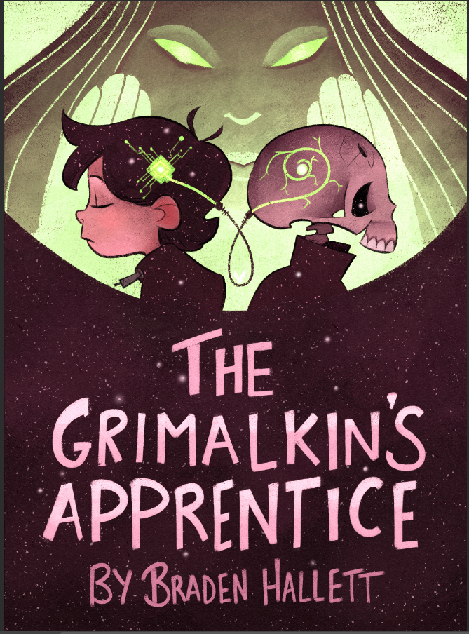
Cover rough critique! How do you feel about the colours?
-
@Braden-Hallett moooooooaaaaar
Check out my art and tutorials :)
Instagram: www.instagram.com/carliannecreates/
Youtube:
https://youtube.com/c/CarlianneCreatesShop: www.carliannecreates.com
-
@carlianne MOOOOOOAAAAAAR PUUUUUURPLLLLLLLLE!
-
@Braden-Hallett Looks purple to me, a little on the red side. Like Mullberry/Wine. I like it.
-
@Braden-Hallett looks really good now. I like that you made the bottom colour less greyish and more juicy. Purple works nice
-
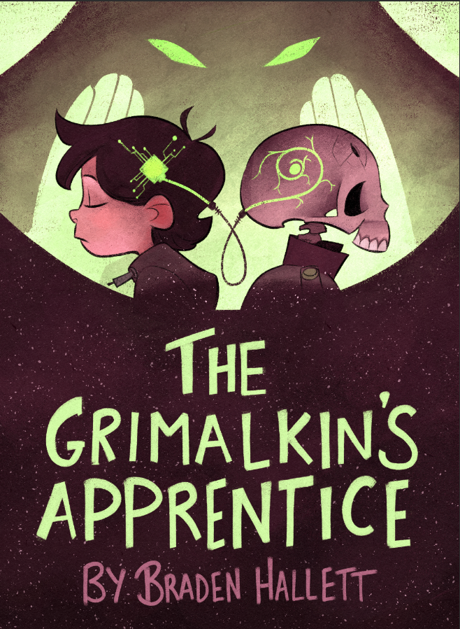
@Braden-Hallett Late to the party,but I think it works out fine.Maybe saturate th green a tad more.
Also love the letters! the handwritten format suits the cover so much!Instagram : https://www.instagram.com/g.chris.artwork/
Deviantart : https://www.deviantart.com/g-chris -
@Georgios-Christopoulos said in Cover rough critique! How do you feel about the colours?:
the handwritten format suits the cover so much!
Thanks! It turned out surprisingly well
")
-
I think it's close to done
Thanks for the feedback everyone!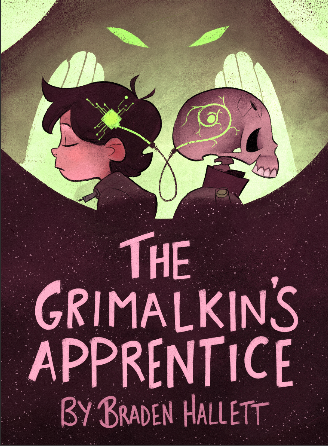
-
@Braden-Hallett Nice. I like the saturation in the magenta. And the electric green details. Good color scheme.

Lisa Burvant
www.lisaburvant.com
Instagram & Twitter & SVS: @burvantill -
I liked the green text, but that's just me
 Looking really nice.
All my links: https://APHOTICMOTH.carrd.co/
-
@burvantill Dunno why but I love purple/grey/green
-
@CLCanadyArts said in Cover rough critique! How do you feel about the colours?:
I liked the green text, but that's just me
Looking really nice.It's still a possibility! It just reminds me too much of mint chocolate chip ice cream

-
@Braden-Hallett I was just writing...
“I really like the colours and dark foreground of this. From a graphic design perspective I also Iiked the title in green to help with the hierarchy of the text and help the title stand out when on a shelf (the accent colour green could tie the eyes/head circuit chip and title together if that makes sense).”
...but you have just done it before I pressed submit

I like it in the green, I think it’s can be read and noticed easier. Whether the title is green or purple - I’m totally intrigued by what the story could be about by the cover as a whole.
Website: lizardillo.co.uk
IG: instagram.com/lizardillo -
@lizardillo said in Cover rough critique! How do you feel about the colours?:
Whether the title is green or purple - I’m totally intrigued by what the story could be about by the cover as a whole.
That's good to hear
 I always have a hard time pinpointing what part of the story will make an interesting cover or if it'll just be weird, lol.
 -
@Braden-Hallett I agree with everyone that this one is definitely popping a lot more. Much more likely to grab my attention when competing with other covers.
From my foray into self-publishing novels, that was big in my eyes. How much attention can this cover grab on a website in a gallery of other covers. Muted colors can help feel like the story, but then might cause the book to disappear among other covers.
-
@Kevintreaccar said in Cover rough critique! How do you feel about the colours?:
Muted colors can help feel like the story, but then might cause the book to disappear among other covers.
absolutely I agree. Covers have gotta pop!
-
Aaaaaaaand done! Thanks everyone for the feedback
-
Wow this is soo cool! You honestly did an amazing job here! that would definitely catch my eye in the bookstore! Also it was awesome to see how this evolved form your initial WIP.
-
@Braden-Hallett I like it!
-
@Braden-Hallett That gradient in the title has really lifted it. Nice.
-
@Braden-Hallett NICE cover design! Really simple and effective.
You’re gonna hate me cuz I’m late to the party, but honestly, a green title would work better, in my humble book design opinion.
Instead of that lighter “mint green” that you weren’t digging, have you tried the mid-green of the computer chip? That color, with a gradient, would really make the title pop as well has bring some color harmony to the bottom of the cover. It’s also nice to have the title and byline a little more separated in color.
It’s worth a try.