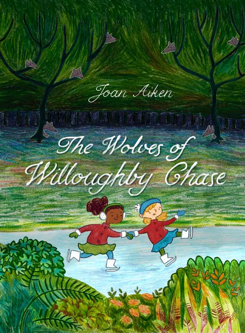
I'd love some critical feedback
-
@Robyn-Hepburn wow this is so beautiful! I love it. The thing I notice is that their body's have a lot of contrast from the background but their heads seam to blend into the background just a little bit. If there was a way to make it so there was greater contrast of tones behind their heads, so their faces could stand out more that might be good! I love this though, I think it is really great.
I also might have the words go up just a bit to give the girls a little bit of breathing room. Personally I like the font.
-
@MerryMary Aha! That's really helpful. Thank you!

-
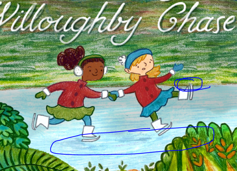
@MerryMary Thank you! That was really helpful. I've enlarged the ice area so that goes above the girls' heads and I think it looks much clearer now. 🥳
-
@Robyn-Hepburn, You mentioned the border you put around the wolves. It does make that part look different from the rest of the illustration. You could try making it a slightly lighter shade than the background behind it, instead of the white. You could also take more space to blend it from light to dark around them.
Also, they look like foxes to me. They are cute.
I'm not sure how realistic you're going for, but you might want to make them larger & stockier for wolves. There are some wolves that look more like coyotes and foxes, but I think they live in warmer climates. Most of the time when people think of wolves, they think of the kind with thicker bodies and necks, and wider, shorter ears and muzzles.
Here's a couple of photos to compare typical / iconic foxes & wolves.
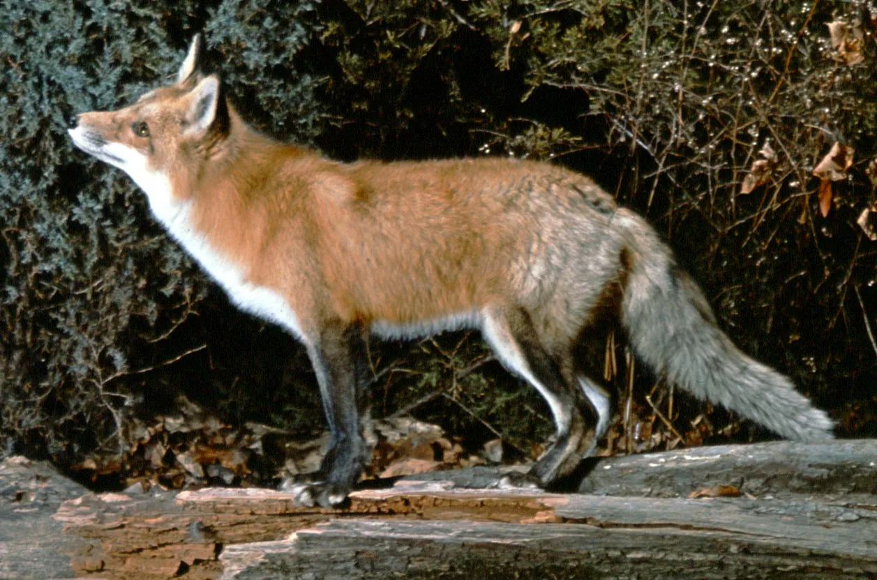
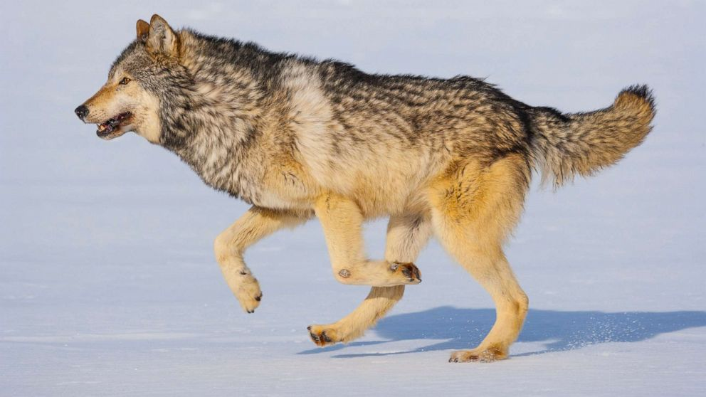
Since the girls are skating on the pond, the wolves would have thick fur like the photo above.I know foxes can jump & climb into a tree, but I don't think wolves can (at least, not higher than they can jump). I don't think them being in the tree is supposed to be literal here, but it's something to consider.
I don't know this story, but you could also think about what role the wolves take in the story. Are they threatening, fearsome, mysterious, playful, beautiful, curious, or cunning?
The girls kind of remind me of the Charlie Brown kids.
")
The foliage in the foreground has a lot of interesting shapes & fanciful design.
Again, I don't know how much realism you want to incorporate into the illustration. If you are going for something more natural & realistic, some of these plants are too tropical.
You could look at a search for cold-hearty evergreen bushes. The palm plant on the lower left & the pointy variegated plant on the lower right definitely look like warm climate plants. The variegated one is very striking, so if you do cut it here, you should save it for another drawing.I'm not sure about flowers when there's a hard freeze deep enough to make the ice safe to stand on. (I happily live where it doesn't snow.) But some plants can flower in the snow, so if you're going for "close enough" realism, we can say the one in the center is a camellia. You could also have snowdrops or crocus.
The trees in the background would also probably be dormant and leafless, since they look like deciduous trees. The two trees are also very thin to support that much foliage (and animals!
") ). The verdant greens add to the liviness of the drawing, so you could change them to evergreens, like pine trees.
). The verdant greens add to the liviness of the drawing, so you could change them to evergreens, like pine trees.Something that is distracting for me is the dark section that goes across the page. I wasn't sure what it was, but I think it's a forest? If that is the case, it would be good to place some trees in the space between the two main trees and the rest of the forest.
Yes, the text is clearly legible. It's very pretty.
-
Hi @Robyn-Hepburn, this is very lovely! I agree with the other feedback and offer the following feedback for consideration:
- The foreground foliage is following the form of the land too much, I suggest a bit of separation and variety with overlap to provide some interesting shapes.
- Suggest the foreground be a bit darker with more lighting on the main characters.
- The wolves in the back are cool, but to be honest, I thought they were flowers growing on the trees before taking a closer look. Maybe try giving them glowing eyes?
All in all, it’s a great piece for your portfolio!
-
@Miriam Thank you! You've put a lot of work into this feedback, I really appreciate that!

As you could tell, reality doesn't play a great part in my illustration...or in my mind.

I was wondering if anyone would mention the fact that it doesn't look much like winter... I don't want the juxtaposition to be jarring, but I have deliberately mixed the seasons because the book spans winter, spring and summer and I wanted the cover to convey that feeling of hope for a happy ending - when I set it completely in winter it just looked too bleak and depressing. But those plants probably are too tropical, considering it's set in England!

Indeed, they don't look much like wolves, but what to do when you don't want to make them too realistic... I'm definitely going to try your suggestion of allowing more space around them for the light colour to blend. The fact that they're poking through the trees is just a bit of silliness, and the real wolves in the story are only a vague threat - the true "wolves" are actually 2 human baddies. So I'll try make the 2 wolves on the ground look more wolf-like and threatening. I might also take away that dark tree-trunk-forest bit since I've tried it a few different ways and it's either too distracting or just doesn't make sense. Or maybe I'll make it bigger and it can take over from the green tree part and all the wolves can be peeking from behind tree trunks instead! Yay! Lots of new things to try!Thank you again for all your lovely suggestions. I'm going to make notes so I can think about what to try and what to change. Exciting! 🥳
-
Thanks so much, @Jeremy-Ross That's very helpful.
The glowing eyes are a great idea! And that reminded me that I had planned to give them little, sharp tooths as well - can't believe I forgot that!
Aha! The lighting on the plants at the front does detract a bit from the girls - I shall try it a wee bit darker. And vary the shapes with some over-lap: very good suggestion.
I feel like the illustration is improving already!
-
@Robyn-Hepburn I am glad it is helpful! Also just my personal opinion, I really like the wolves I think they look cute!
-
@MerryMary Haha! Thanks, I'm glad you like them.
-
@Robyn-Hepburn I really like the shapes, especially of the wolves!
The only thing that stood out to me upon first read was that the ice is so light, it almost looked like a break in the illustration until I looked a bit longer. Perhaps the ice could come down a little in value and maybe the grass could come up a bit?
I understand you’re trying to show the range of seasons; perhaps a gradient-esque approach would help to blend these contrasting elements into one image? I’m mostly brainstorming here.I really like the style though - would peek into this book off the shelf for sure.
-
@Robyn-Hepburn just to better communicate the above suggestions, I did a quick paint over. I lowered the value of the top of the ice, lightened the grass right above the ice and addd a bit of stroke shading to the text so it wouldn’t be washed out by my changes.
-
@skeletortoise wow! That gives it so much depth! Thank you. That's something I don't think would have occurred to me to do. And thanks for the kind words. I'm planning to do some more illustrations for the book so maybe you will see "inside" soon.
-
@Robyn-Hepburn would love to see definitely!

-
@Robyn-Hepburn said in I'd love some critical feedback:
Indeed, they don't look much like wolves, but what to do when you don't want to make them too realistic...
You can keep the same style & give them more wolf like characteristics by making them stockier. If you make the end of the muzzle a line instead of a point, I think that would help a lot in showing that it's not a fox. I would also make the neck thicker & make them bigger overall.
I would also choose gray colors for their fur (even though wolves do come in a range of colors—or colours, since these are English wolves.
 )
)Even if you change just a couple of characteristics, I think it would do the job. (For example, I have seen drawings with a pointy nose & it still looks like a wolf, because it was large, had wider-set eyes, and thick fur & neck.)
You could try tracing just the outline of a wolf photo or drawing, and see what you notice.
Ask yourself, "What is the difference between a fox & a wolf?" and use those traits.
-
@Robyn-Hepburn said in I'd love some critical feedback:
all the wolves can be peeking from behind tree trunks instead!
I think that would look great!
-
@Robyn-Hepburn Really cute image.
Something that sticks out right away to me is the feeling of being confined to a single color palette. The two girls having the exact same colors in their outfits reads a little odd to me. They compete for attention on the page and confuse the eye a bit especially where you've just swapped the green and blue on the tights.
I can definitely see that you've done this traditionally and then patched things together digitally, and while I do think there's a way to do that in a way that is seamless, I don't think you're quite there yet. For example in this image there are some issues with edge control and tangents:
The skate meeting the grass almost exactly on it's point is a distracting tangent.I'd also like to see you ground these characters a bit more. Right now they are just sort of floating. Maybe try adding a shadow.
Another thing that I find a bit confusing is the light colored vegetation in the front, which gives me the idea that we are in a tropical place with flowers and palm-like plants, but then we are suddenly ice skating on a frozen river. The two of them cause confusion rather than clarity.
If I were you here's what I'd do:
Ask myself: what am I trying to achieve with this image?
What is the story I'm trying to tell?
Where is it set? What time of day is it (there's some confusing things happening with the lighting as well)?
Am I confined to a color palette? Why am I choosing these colors? How can color work to help me tell the story and this scene?
What's happening in this scene? The front girl is falling but the one behind her is skating smoothly, which doesn't quite track... usually if the person in front of you is falling and you're holding their hand, they'll knock you off your balance too.I'm sorry I know that's a lot to read, but I've made a lot of images which are more confusing than clear and I think it helps to have someone remind you the necessity of asking yourself these questions.
But keep going! Try reworking this and see what you can come up with!
-
@Kristen-Lango Hi, Thank you!
Yup, I have been working on it...endlessly...but I'm finding this a really great piece for lots of trial and error. In fact, I'm even considering changing it into an internal illustration and then being able to make the cover more figurative. That way this one can be more literal, without the many-seasons and tree-wolves.The colour palette thing is a very good point... I love using many colours, or variations on a bunch of colours, but then I feel like I have to hold myself back and limit it because that's what so many illustrators say to do. So it's really helpful to know what your reaction was to those limited colours on the girls' clothes.
Right, I'll keep going...