Society of Visual Storytelling

    SVSLearn Forums

    • Register
    • Login
    • Search
    • Recent
    • Tags
    • Popular
    • Users
    • Groups
    • Search

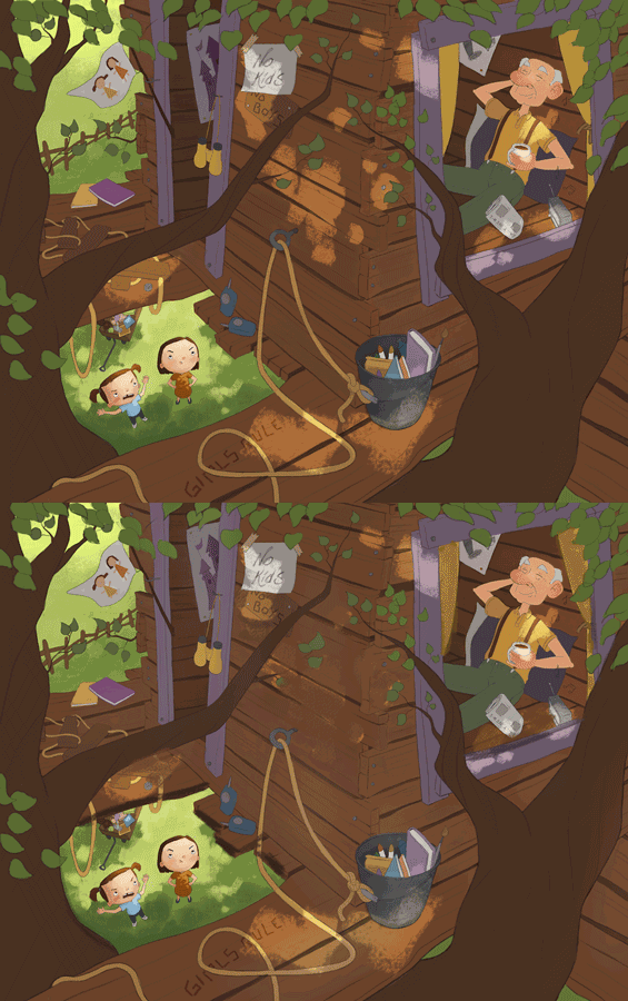
    Treehouse WIP for critique :)

    General Discussion
    17
    37
    8319
    Loading More Posts
    • Oldest to Newest
    • Newest to Oldest
    • Most Votes
    Reply
    • Reply as topic
    Log in to reply
    This topic has been deleted. Only users with topic management privileges can see it.
    • DanetteDraws
      DanetteDraws @NoWayMe last edited by

      @NoWayMe Awesome! I love all the details you've added in. My vote is for closed eyes too.

      https://danettebyatt.com
      Twitter @DanetteDraws
      Instagram @DanetteDraws

      1 Reply Last reply Reply Quote 1
      • K
        Kat SVS OG last edited by

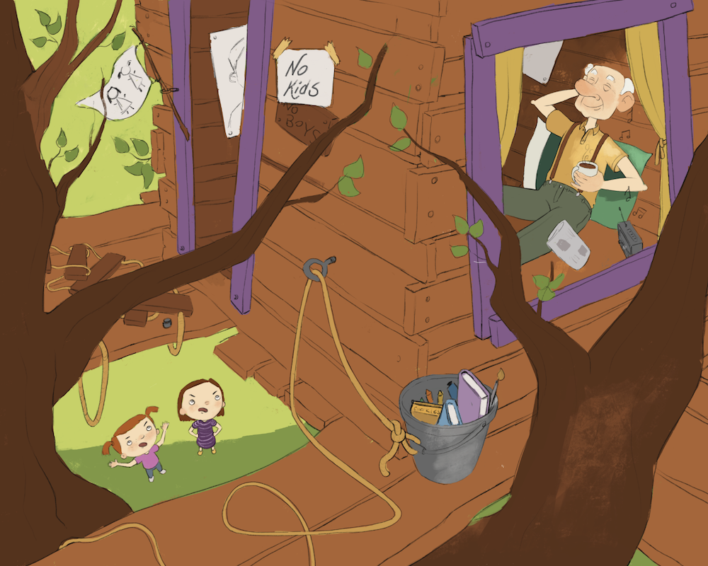
        Love this sketch! I'd vote for closed, too, but not holding a newspaper. Maybe with his arms behind his head, cup next to the radio, like he's totally relaxing in the seat. If the newspaper is important to the story, then looking at it with eyes open makes more sense to me.

        And I love the "no kids" sign - very funny!

        1 Reply Last reply Reply Quote 1
        • NoWayMe
          NoWayMe last edited by NoWayMe

          Another update! Flat colors

          Edit: I just saw a tangent between his hair and the curtain, I will fix that!

          @Kat - Thanks for the idea of having his arm behind his head! Great idea! I went with just one arm and still holding his cup of coffee, but you're right that the newspaper was not that important in the story.
          0_1496802284305_Capture d’écran 2017-06-06 à 23.22.13.png

          noemiegionetlandry.squarespace.com
          noemie_illustration on Instagram

          MOO 1 Reply Last reply Reply Quote 6
          • smceccarelli
            smceccarelli Pro SVS OG last edited by

            I love it - the storytelling is great!

            1 Reply Last reply Reply Quote 1
            • K
              Kat SVS OG last edited by

              Love it! And I'm glad the suggestion was useful. This is a great story, very fun!

              1 Reply Last reply Reply Quote 1
              • tombarrettillo
                tombarrettillo last edited by

                Maybe open the girls' mouths more, as if yelling loudly, over the music. And the pink shirt girl's eyebrows need to be a bit more angry (at least the left one). The Grandpa is perfect!

                https://www.youtube.com/@tombarrettart

                1 Reply Last reply Reply Quote 1
                • Doha
                  Doha last edited by

                  Such a fun illustration! the story is clear, the characters are really animated.

                  Doha Koma

                  www.Komaart.net
                  https://www.instagram.com/dohakomart/
                  https://www.facebook.com/dohakoma/

                  1 Reply Last reply Reply Quote 1
                  • P
                    pn last edited by pn

                    Hey,
                    The concept is very creative. I really liked it.
                    Maybe if you bring some texture into the art, mainly the wood of the treehouse, give it some texture, light and shadow play, 3D effect, to bring life to the picture overall. The colours now are very flat. otherwise the concept is really appealing.

                    Pranamee.
                    http://instagram.com/prnaths

                    NoWayMe 1 Reply Last reply Reply Quote 1
                    • NoWayMe
                      NoWayMe @pn last edited by

                      @pn Thanks! I actually haven't start rendering at all yet 🙂 For sure I will put more textures, light/shadow... I still have many hours of work to put in!

                      noemiegionetlandry.squarespace.com
                      noemie_illustration on Instagram

                      1 Reply Last reply Reply Quote 0
                      • lmrush
                        lmrush Pro SVS OG last edited by

                        Wow fantastic idea great story telling and I love the perspective!

                        Lisa Rush
                        www.lisarushgallery.com
                        www.facebook.com/ArtbyLisaRush/
                        www.instagram.com/lisarush11/

                        1 Reply Last reply Reply Quote 1
                        • NoWayMe
                          NoWayMe last edited by

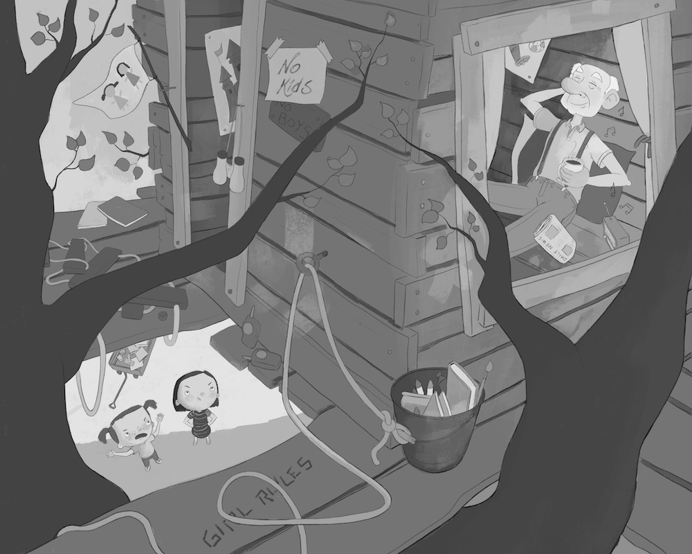
                          I am working on values to make sure my focal points read well. I know it's tricky to have two focal points but I would like to have the main focal point on the girls and then the grandpa (so for a few seconds the viewer wonders what they are angry about.. Any thoughts ? Anything that doesn't read well "value wise" ? Thanks!

                          0_1497109981135_Treehouse_ B&W.jpg

                          noemiegionetlandry.squarespace.com
                          noemie_illustration on Instagram

                          TessaW 1 Reply Last reply Reply Quote 0
                          • Charlie Eve Ryan
                            Charlie Eve Ryan Pro SVS OG last edited by

                            Really cool, he looks so relaxed! Great concept

                            Happy Creating
                            www.charlieeveryan.com

                            1 Reply Last reply Reply Quote 0
                            • Charlie Eve Ryan
                              Charlie Eve Ryan Pro SVS OG last edited by

                              I think having the girls as the first read works well and I love how you pulled up the ladder too. Nice touch!

                              Happy Creating
                              www.charlieeveryan.com

                              1 Reply Last reply Reply Quote 1
                              • TessaW
                                TessaW @NoWayMe last edited by

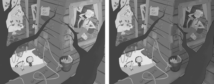
                                @NoWayMe To be honest, I see the guy first. Any one else? I think if you made that side slightly darker, with less contrast, it might help, though I'm not the greatest at values.

                                Something like this. Original is on the left.

                                0_1497116069652_Untitled-9.png

                                Website: www.tessawrathall.com

                                Instagram: www.instagram.com/tessawrathall_art/

                                1 Reply Last reply Reply Quote 2
                                • smceccarelli
                                  smceccarelli Pro SVS OG last edited by

                                  I think I see the guy first - he is the biggest and has the biggest contrast.
                                  Apart from that, you are crunching your value range. That can be a conscious choice (there are many wonderful pieces that only use a fraction of the value range), but here you may miss an opportunity to control your focal points. Here is an histogram of your values:

                                  0_1497122057390_Screen Shot 2017-06-10 at 21.09.18.png

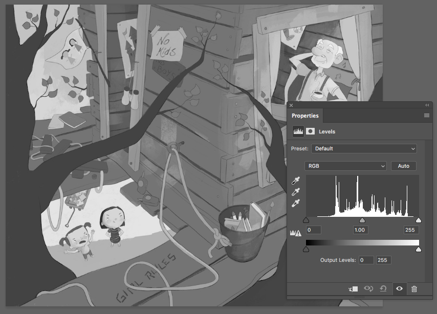
                                  Basically, the darks (on the left) and the lights (on the right) are not populated at all. Here is what happens if you use all the range (basically, I stretched your value range so that the darks get darker and the lights get lighter - left is the original. As you can see, the effect of crunching the value range in the mid tones is like putting a haze on the picture.

                                  0_1497122144167_Screen Shot 2017-06-10 at 21.11.23.png

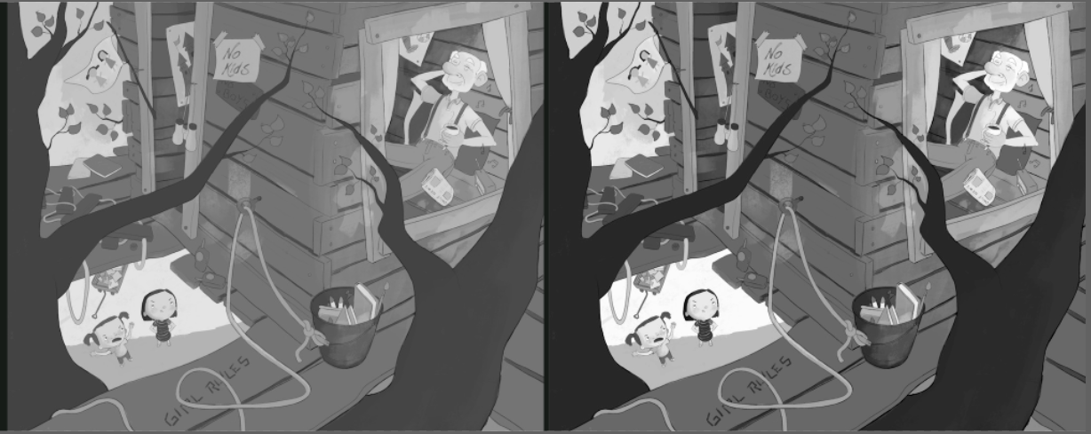
                                  You should not do this over the whole picture, as I have done - it was just to show the effect of using the whole range. If you extend your value range only where you want the focus, you can make it pop much better.

                                  1 Reply Last reply Reply Quote 5
                                  • NoWayMe
                                    NoWayMe last edited by

                                    Excellent tip @smceccarelli !!! Thanks! 🙂

                                    Thanks @TessW and @Charlie-Eve-Ryan !

                                    There is probably not one correct answer to this question, but do you think I should try to have the grandpa as a second read or is it working better if he stays the first read ? I like what @TessW did with the shadows, however I was planning to add dappled light so maybe it will increase the focus on the grandpa even more...

                                    Any thoughts ?!
                                    Thanks!

                                    noemiegionetlandry.squarespace.com
                                    noemie_illustration on Instagram

                                    1 Reply Last reply Reply Quote 0
                                    • holleywilliamson
                                      holleywilliamson SVS OG last edited by

                                      I see the grandpa first too. I like what @TessW did too. I think having Grandpa as a second read is great. If it was the other way around I don't think it is as funny.

                                      https://www.instagram.com/holleywilliamsonart/
                                      http://holleywilliamson.com

                                      1 Reply Last reply Reply Quote 1
                                      • MirkaH
                                        MirkaH last edited by

                                        I like the values in the last one on the right that Simona posted. With higher contrast.
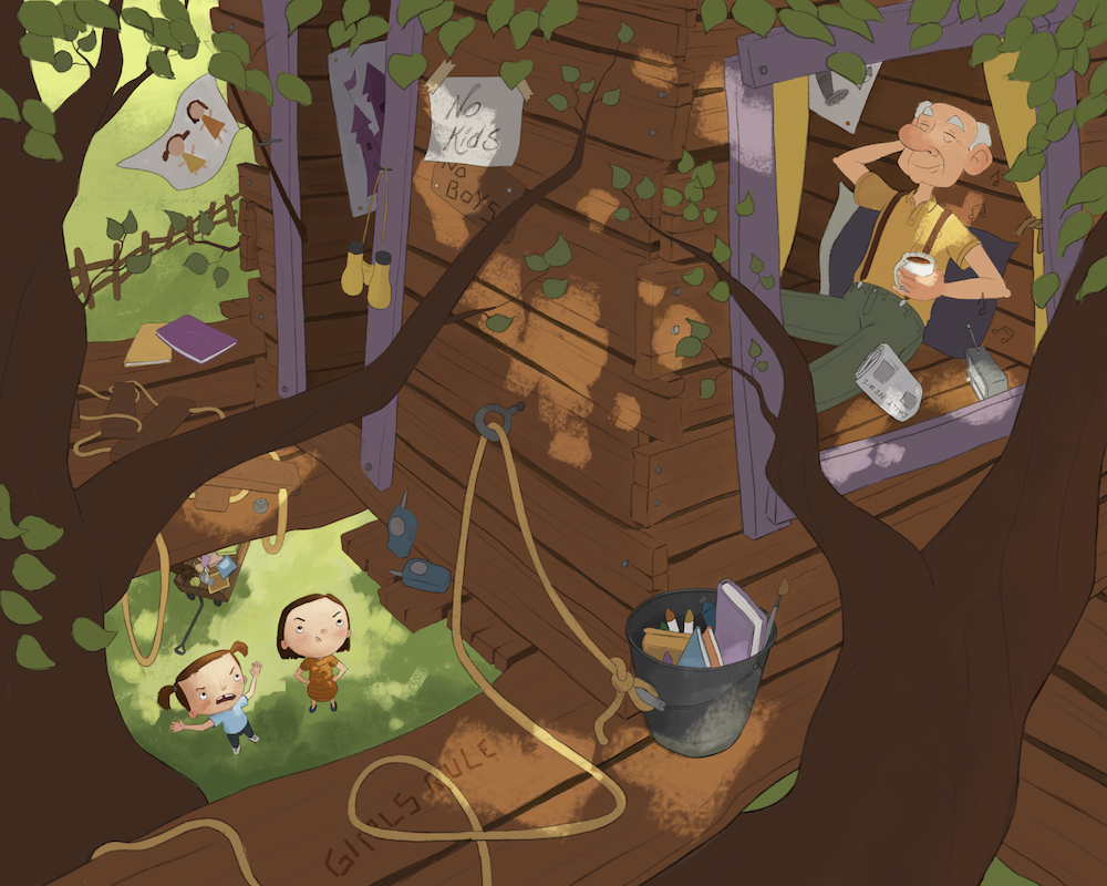
                                        http://www.mirkah.com
                                        http://instagram.com/mirkadraws
                                        http://www.twitter.com/mirkahokkanen
                                        http://Shoppicadoodlepress.etsy.com
                                        http://facebook.com/mirkahokkanen

                                        1 Reply Last reply Reply Quote 0
                                        • NoWayMe
                                          NoWayMe last edited by

                                          Hi everyone!

                                          I am in the final stages of this, but I wanted you opinion on lighting.
                                          I like the dappled light, but I am afraid it is too distracting. If I want the lighting to work, I kind of have to go with dappled light since it's what would most likely happen in a tree. Do you feel it's too distracting ?

                                          Also, do you see anything else I should modify ? I still have to add details to grandpa and rework the girls a little.

                                          Thanks!
                                          0_1497648771272_Capture d’écran 2017-06-16 à 18.19.27.png

                                          noemiegionetlandry.squarespace.com
                                          noemie_illustration on Instagram

                                          TessaW 1 Reply Last reply Reply Quote 2
                                          • TessaW
                                            TessaW @NoWayMe last edited by

                                            @NoWayMe Hmm, tough one. I think if you added some shadow to the edge of the boards surrounding the girls, it would bring more attention to them. I also think that if you eliminate that strong dappled light patch in the middle, it will allow us to go back and forth between your two focal points better. I'm also wondering how it would be to bring up the value of the tree house a little bit? Not sure if it would improve the piece or not.

                                            It's really shaping up! You're almost there! 🙂0_1497650205651_Untitled-4.png

                                            Website: www.tessawrathall.com

                                            Instagram: www.instagram.com/tessawrathall_art/

                                            1 Reply Last reply Reply Quote 1
                                            • First post
                                              Last post