Hello! also, please give critique
-
Hello!
My name is Marcin, and I'm from Poland, so please excuse any language problems. I'm new to this formu, but I watched this community for some time now, and I think it's finally time to introduce myself and show something. The picture is a part of a prohealth series witch main theme are tooths. Please, give me your critique, and thanks in advance for your feedback.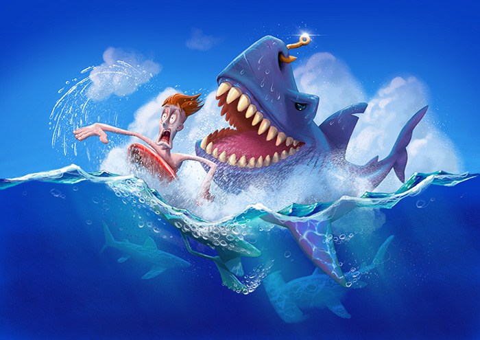
-
Hi Marcin. Welcome! This is a super fun image. Love the split view and the saturated palette. A couple of suggestions:
-
Warm up the flesh tones on the surfer. His skin looks sort of pale and lifeless. The combo of his expression and skin tone is coming off as zombie-like. You can possibly keep a cooler shadow side, but I'd warm up the light side at least. Even if you are attempting to convey that he's pale from being so scared, I don't think it's quite working.
-
Is he wearing fins or are his feet really big? I think you could perhaps keep the length, but thin the proportion of his foot a little. As far as I know, surfers don't really wear fins, though knee boarders sometimes do, and bodyboarders do. I'm reading him as a typical surfer, and his fin foot is distracting me.
Those are my critiques. Thanks so much for sharing this fun piece!
Website: www.tessawrathall.com
Instagram: www.instagram.com/tessawrathall_art/
-
-
@yego this is great, agree with the skin tone criticism earlier also do we need the clouds around the surfer’s head and sharks teeth? Love the lighting in the water, creates an authentic underwater atmosphere. Maybe one too many sharks swimming around-would like to focus more on the main players. Or maybe show the teeth on the other sharks since teeth are the theme. The image looks finished though so I assume you probably won’t rework it, which is ok because it’s pretty great as is. Jude
-
@tessaw Hi Teresa.Thank you for your welcome and critique. I'm vwry glad you like my image. About skintones, I did tried to make him pale as wall intentionaly, yet, It may by a good idea to tone it down, I realy don't watnt to make it too sceary for the children. When it comes to the feet, ther is no fin, big feets and hands with thick fingers is part of my style, that is how i portrait male characters, so, this is how I intended it to look like.
-
@judekill Hello Jude, thanks for your critique. Personally, i think there is no such thing as finished image, one must just stop to be able to start another
") About background sharks. Adding teeths will make them too detailed, and will draw too much atention, don't you think?
About background sharks. Adding teeths will make them too detailed, and will draw too much atention, don't you think? -
Awesome image, the color pallette is really lively and eye catching!
I may be very wrong here but is that splashing water on the left correct? It looks wrong. I think that when you splash water off yourself it stays behind you. Since his arm is coming down from doing a full circle to swim I'd guess the water wouldn't be like that. I might be wrong like I say or very nitpicky. It just caught my eye. -
Howdy!
Here's my two cents:
1 - The color of the shark is beautiful and rich! Love the underwater caustics.
2 - This one is super nit-picky, but his leg and foot do bother me a little. Not because the foot is to big, but I think the pose is difficult for me to grasp. I am having a hard time visualizing how he is sitting on the board. He's not straddling it, since we can only see one leg. The weight seems off, like he's slipping off or something thing.
3 - I don't particularly like the compositional choice to have the clouds be directly behind the characters. The splashing blends too much with the clouds, which is making the image less clear. That is to say, it's hard to distinguish what is forground splashing and what is background clouds. It could work to add some atmospheric perspective to the clouds, or simply remove them so you have crisp contrast against the blue sky.
-
@tianlian Hi! Well, i think it looks fine, foremost, it suggest movement of the arm.
-
@aaimiller Hello!
1 - Thanks!
2 - Well it supposed to some sort of panic pose, his other leg is bend upward and behind (little bit like scorpion's tail), but it's covered with foam and splashes.
3 - @JudeKill mentioned it too. I think removing clouds completely will make image dull, will try to add some atmosferic depth, thanks for suggestion. -
@yego
Hi! Great dinamics, the scene looks very vivid.
I know others already mentioned that, but me too, I would move the clouds somewhere else. I suppose you want the focus to be on the head of the man and the shark’s teeth So create as big contrast as possible between them and the background is crucial.
Another thing is... the mans foot just do not come across as a foot, it looks as a fin. I do get the fact that it’s your personal style to draw big hands and feet, but perhaps you might tweet the foot a little, maybe make it less wide and more slender and make the fingers more clear?
And the last nitpick would be that me personally I find the sparkle on the sharks nose with the little hook very distracting. It might steel some of the attention you want for your main focus.
But Those really are a nitpicks. Great pose and rendering! -
Hi, Yego! Nice concept! It’s very funny. However, there a few things I want to point out.
- The distance between the surfer and the shark. For me atleast, they look like they’re just swimming side by side because they are so close together with the surfer just ahead by a few feet. Coupled with the shark’s happy expression, the tension is lost. Now, I get that you need to make the shark smilling since this is for a teeth thing but that’s just it. The proximity of the shark to the surfer just makes things less tense. Try putting the surfer further from the shark with his feet mere inches from the shark’s mouth. That’ll ramp up the intensity.
- The surfer’s pale face. I get it that you’d be very scared if you have a shark chasing you but it just not work for the illustration. The surfer’s face just gets lost in all of that blue. It kinda blends in with the background.
I hope this helps!
-
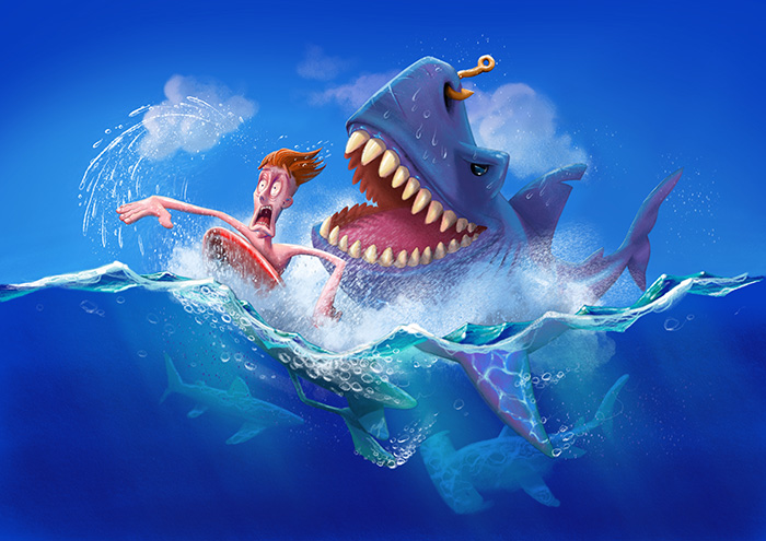
Hi guys! Thank You all for your feedback. This is an update based on some of your critique. I'm still not shure about the clouds tho. Not very fond of them.
Hi @nyrrylcadiz , thanks for your input.
-
@yego I would not have the clouds but if you look at clouds they tend to much harder than most people paint them and this type of cloud has a big overall shape with defined smaller shapes and the center will be much more opaque because of the thickness of the cloud. I would consider some warmer light around the characters form behind like a sun set with a touch of orange but that is a style choice overall nice piece
-
I love the water reflection on the fin and the bubbles in the piece! It really gives the image movement. I agree with others by saying that the skin tone looks a little strange, warmer tones would look a little more natural
 ️ Amazing work

-
@yego I would move the clouds up and away from the characters. That would then frame the characters in the picture some more. Its a fun piece. I love sharks!
-
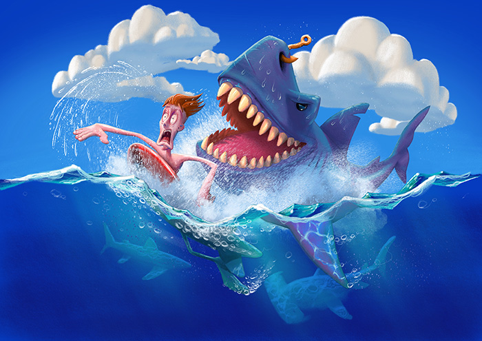
Hi all! Presenting you clouds in a bit different style. I like it better, what do you think?
@rcartwright , @melinahealy , @Chip-Valecek Thank tor your critique!
-
@yego I like these clouds much more
-
@yego This is so great. Do you want advice? Don't touch it!

Well, to be true, there's something is bothering me, but is a minor thing. The clouds on the background, two things. First, if you follow the line of the fin (the side that has a cut) it looks like the cloud on the bg continue the line and is bothering me because don't help to pull the subjects apart from the bg, but the contrary. Is bringing the cloud to the front and blending it with the subject. That is the thing I would touch for sure, to move a little the cloud.
The other thing is more like a matter of taste I think. Is the cloud behind the face of the swimmer. Is not like is wrong, but me, personally, would prefer if the face is against the blue or at least not so white. Take down the opacity a little could perfectly do for me. Now the hand has more central role than the face, and that's great if you intended, is nothing wrong. But I feel like an imbalance, like is too much, the hand is rock'n'roll star and the face is buried on the cloud.But again, is great the way it is. I'm just saying what I would touch if the piece where mine.
Great light again, by the way. Do you always use backlight? image url))
Seriously don't touch any more, any new version is worst. Trust your gut not your brain.
-
This post is deleted! -
This post is deleted!