Please critique, thanks in advance!
-
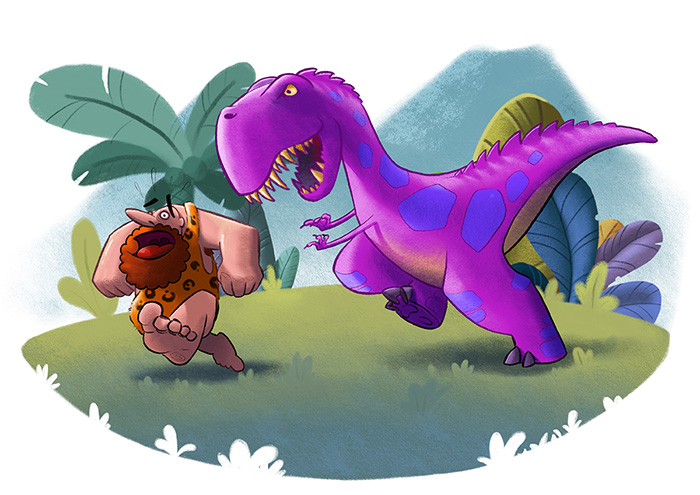
Hello again. You guys helped me so much in my last critique thread. Can You do it again? This time in a bit different style. Again, its a part od a prohealth poster, main theme are teeth.
-
Cool piece here are somethings to consider. The plants are very hard edge which will draw focus away from the characters. The cave man doesn't really look scared. The dinosaur's far leg could be dropped down a bit to help the shape read better. I would add some green into the reflected light on both characters. Cheers
-
@yego Hi! Looks awesome to me. I would add a little blur to the Plants in the background and take the saturation down a little on that plants too.
Though the colors are complementary and great, the two subjects can be integrated better on the scene if you add some color grading to them. For example:
-Make a stamp visible from the background without the subjects
-Filter, Blur, Average (now you have a layer filled with the average background color)
-Set this layer to color blending mode and take down the opacity as much as you feel. If you don't want the color to touch your highlights open the Layer Style panel and take down a little the white "blend if" slider.That is an easy way to integrate the subjects in the scene.
those are the things I would do. but is a great piece the way is now anyway. Congratulations!!! You have an interesting way of using light, are you a photographer?
-
@Zombie-Rhythm Thank you for your ideas. I'm shure they would work greate, unfortunately, I ran out of time to work on this one, Had to finish poster. Regarding photography, I've never did it on a pro level, but I have good understanding of 3d modeling and rendering.
@rcartwright thanks for your critique.
-
You've already had some great suggestions, but for me the number 1 thing I'd do is flip the image! The action is from right to left which feels very unnatural and against the flow. The eye is used to reading an image from left to right, and so the action should flow in that direction as well
")
P.S I really like the little plants cut out of the bottom edge, very effective and creative!