Society of Visual Storytelling

    SVSLearn Forums

    • Register
    • Login
    • Search
    • Recent
    • Tags
    • Popular
    • Users
    • Groups
    • Search

    Hello! also, please give critique

    Introductions
    illustration procreate ipad digitalart digital paintin
    14
    25
    4327
    Loading More Posts
    • Oldest to Newest
    • Newest to Oldest
    • Most Votes
    Reply
    • Reply as topic
    Log in to reply
    This topic has been deleted. Only users with topic management privileges can see it.
    • Yego
      Yego last edited by

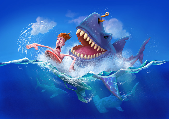
      Hi guys! Thank You all for your feedback. This is an update based on some of your critique. I'm still not shure about the clouds tho. Not very fond of them.
      Hi @nyrrylcadiz , thanks for your input.
      0_1536083931975_sharkattack_fix.jpg

      https://www.instagram.com/yego_pixele/

      rcartwright Chip Valecek 2 Replies Last reply Reply Quote 0
      • rcartwright
        rcartwright @Yego last edited by

        @yego I would not have the clouds but if you look at clouds they tend to much harder than most people paint them and this type of cloud has a big overall shape with defined smaller shapes and the center will be much more opaque because of the thickness of the cloud. I would consider some warmer light around the characters form behind like a sun set with a touch of orange but that is a style choice overall nice piece

        https://www.scbwi.org/members/richard-cartwright/
        https://www.instagram.com/richardwcartwright/
        https://www.pinterest.ca/richcartwright3/art-of-richard-cartwright/
        https://www.richardwcartwright.ca/

        1 Reply Last reply Reply Quote 0
        • M
          melinahealy last edited by

          I love the water reflection on the fin and the bubbles in the piece! It really gives the image movement. I agree with others by saying that the skin tone looks a little strange, warmer tones would look a little more natural ☺️ Amazing work 👏👏👌

          https://www.instagram.com/melina_healy/

          1 Reply Last reply Reply Quote 0
          • Chip Valecek
            Chip Valecek SVS Team SVS OG @Yego last edited by

            @yego I would move the clouds up and away from the characters. That would then frame the characters in the picture some more. Its a fun piece. I love sharks!


            https://www.instagram.com/chipvalecek/
            https://www.facebook.com/cvalecek
            http://www.cshellmedia.com/

            1 Reply Last reply Reply Quote 0
            • Yego
              Yego last edited by

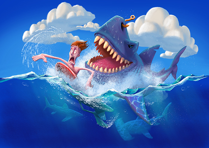
              Hi all! Presenting you clouds in a bit different style. I like it better, what do you think?

              0_1536177719116_sharkattack_fix.jpg

              @rcartwright , @melinahealy , @Chip-Valecek Thank tor your critique!

              https://www.instagram.com/yego_pixele/

              rcartwright Samu 2 Replies Last reply Reply Quote 1
              • rcartwright
                rcartwright @Yego last edited by

                @yego I like these clouds much more

                https://www.scbwi.org/members/richard-cartwright/
                https://www.instagram.com/richardwcartwright/
                https://www.pinterest.ca/richcartwright3/art-of-richard-cartwright/
                https://www.richardwcartwright.ca/

                1 Reply Last reply Reply Quote 0
                • Samu
                  Samu @Yego last edited by Samu

                  @yego This is so great. Do you want advice? Don't touch it! 😃

                  Well, to be true, there's something is bothering me, but is a minor thing. The clouds on the background, two things. First, if you follow the line of the fin (the side that has a cut) it looks like the cloud on the bg continue the line and is bothering me because don't help to pull the subjects apart from the bg, but the contrary. Is bringing the cloud to the front and blending it with the subject. That is the thing I would touch for sure, to move a little the cloud.
                  The other thing is more like a matter of taste I think. Is the cloud behind the face of the swimmer. Is not like is wrong, but me, personally, would prefer if the face is against the blue or at least not so white. Take down the opacity a little could perfectly do for me. Now the hand has more central role than the face, and that's great if you intended, is nothing wrong. But I feel like an imbalance, like is too much, the hand is rock'n'roll star and the face is buried on the cloud.

                  But again, is great the way it is. I'm just saying what I would touch if the piece where mine.

                  Great light again, by the way. Do you always use backlight?![alt text](![image url](0_1536357442275_1535812621522-sharkattack.jpg image url))

                  Seriously don't touch any more, any new version is worst. Trust your gut not your brain.

                  Samu 1 Reply Last reply Reply Quote 0
                  • Samu
                    Samu @Yego last edited by

                    This post is deleted!
                    1 Reply Last reply Reply Quote 0
                    • Samu
                      Samu @Samu last edited by

                      This post is deleted!
                      1 Reply Last reply Reply Quote 0
                      • lady chamomile
                        lady chamomile last edited by

                        This is so awesome! I love it! 😃 My only critique would be, remove the highlight on the hook and instead put it on the teeth- you know, for a "colgate smile" moment- to really sell the idea of anyone can have a great smile sort of thing XD

                        instagram
                        youtube
                        deviantart
                        tumblr

                        1 Reply Last reply Reply Quote 0
                        • Yego
                          Yego last edited by

                          Hi Guys!
                          Sorry for not responding for such long time. Deadline has come, so I guess that's it. Thank You all for yor help. Below I present to you finished product.

                          0_1537474664481_plakaty_small.jpg

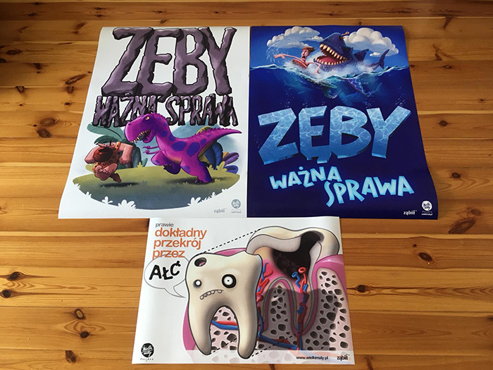
                          @lady-chamomile thanks for your critique.
                          @Zombie-Rhythm thank for your input, and yes. I use some backlight in 99% of my illustration

                          https://www.instagram.com/yego_pixele/

                          Sas aska 2 Replies Last reply Reply Quote 5
                          • Sas
                            Sas @Yego last edited by Sas

                            @yego Wow these look great! You must be so proud 🤗

                            https://www.instagram.com/sasmakkinje/

                            1 Reply Last reply Reply Quote 0
                            • aska
                              aska @Yego last edited by

                              @yego looks great! 🙂

                              Aska
                              www.mugaska.com
                              https://www.instagram.com/mugaska/
                              https://www.etsy.com/uk/shop/mugaska

                              1 Reply Last reply Reply Quote 0
                              • Yego
                                Yego last edited by

                                @Sas I am! Thank U!
                                @aska Thanks! 🙂

                                https://www.instagram.com/yego_pixele/

                                1 Reply Last reply Reply Quote 0
                                • First post
                                  Last post