Society of Visual Storytelling

    SVSLearn Forums

    • Register
    • Login
    • Search
    • Recent
    • Tags
    • Popular
    • Users
    • Groups
    • Search

    Book Cover WIP Hobbit

    General Discussion
    9
    14
    645
    Loading More Posts
    • Oldest to Newest
    • Newest to Oldest
    • Most Votes
    Reply
    • Reply as topic
    Log in to reply
    This topic has been deleted. Only users with topic management privileges can see it.
    • Pamela Fraley
      Pamela Fraley SVS OG last edited by

      This post is deleted!
      braden H Pamela Fraley Heather Boyd 3 Replies Last reply Reply Quote 6
      • ArtofAleksey
        ArtofAleksey last edited by ArtofAleksey

        Oh dang i love the graphic design aspect of it. Great use of silhouettes. Red and black always works together. I like the ones with the group of silhouettes. I think the one with the mountain the most.

        instagram and twitter: @artofaleksey
        alekseyillustration.com

        Pamela Fraley 1 Reply Last reply Reply Quote 2
        • Sarah LuAnn
          Sarah LuAnn SVS OG last edited by

          They all look so great! Another vote for the one with the mountain.

          sarahluann.com

          Pamela Fraley 1 Reply Last reply Reply Quote 1
          • burvantill
            burvantill Moderator last edited by

            These are all good idea's. I like the #3&4 the best. I would rework Gandolf's symbol though, right now it looks like a teacher stamped you're art with a big F ๐Ÿ˜ฌ๐Ÿ˜œ. The silhouettes are great ๐Ÿ‘. Looking forward to see this develop.

            Lisa Burvant
            www.lisaburvant.com
            Instagram & Twitter & SVS: @burvantill

            Pamela Fraley 1 Reply Last reply Reply Quote 1
            • Pamela Fraley
              Pamela Fraley SVS OG @ArtofAleksey last edited by

              @Aleksey thank you! Thatโ€™s very helpful. โ˜บ๏ธ

              1 Reply Last reply Reply Quote 1
              • Pamela Fraley
                Pamela Fraley SVS OG @Sarah LuAnn last edited by

                @Sarah-LuAnn thank you!

                1 Reply Last reply Reply Quote 0
                • Pamela Fraley
                  Pamela Fraley SVS OG @burvantill last edited by

                  @burvantill thank you! Yea. Iโ€™m going to rework all the lettering. Itโ€™ll be tricky with gandalfs symbol, because it looks like an โ€œfโ€ but hopefully it wonโ€™t look like I gave me self a bad grade. ๐Ÿ˜†

                  1 Reply Last reply Reply Quote 2
                  • braden H
                    braden H @Pamela Fraley last edited by

                    @Pamela-Fraley I don't think you're going too simple. I think 'too simple' is a pretty tough line to cross ๐Ÿ™‚

                    My fav's are the first and second option, I think, though they're all good. I can see the finished cover being done in some kind of awesome sumi ink style. Something nice and 'rough'.
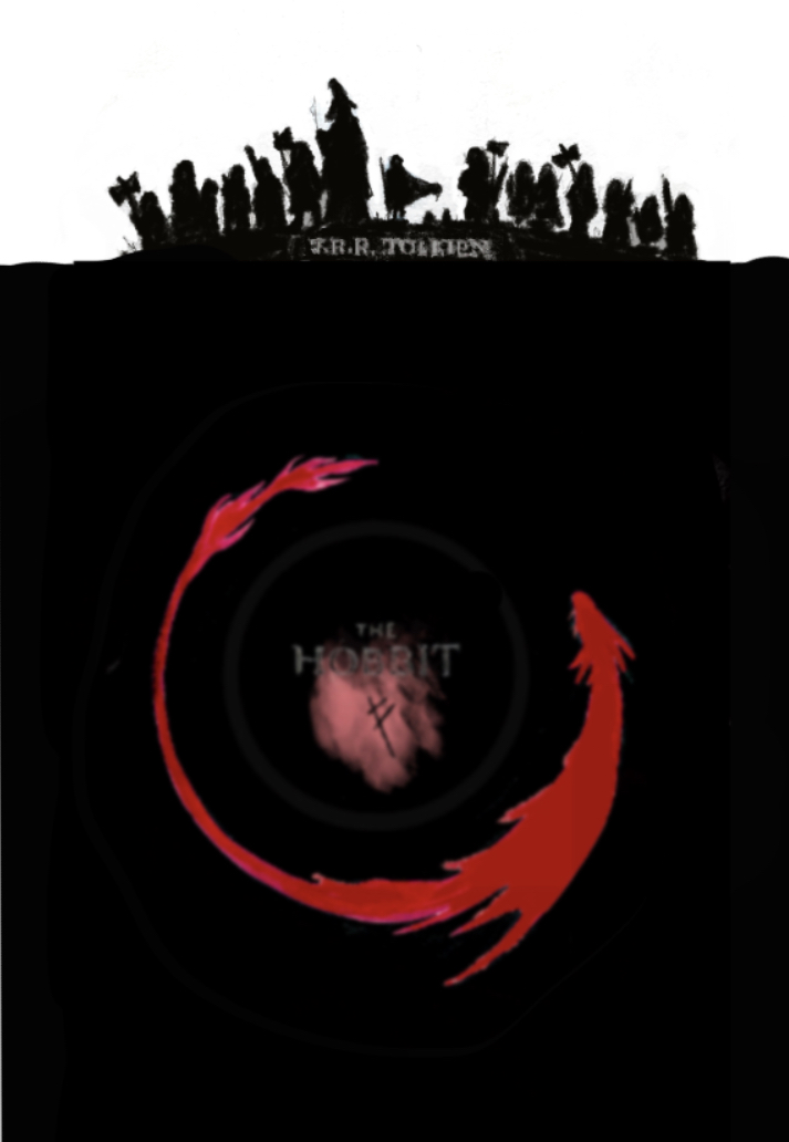
                    1 Reply Last reply Reply Quote 1
                    • Pamela Fraley
                      Pamela Fraley SVS OG @Pamela Fraley last edited by

                      E22CE8D0-E4B5-41BF-84E1-5DFF8789CEA0.jpeg

                      Hereโ€™s another version I made last night. Gahh! I donโ€™t know which one I like. The funny thing is that this is just all based on one of my thumbnails: I had about 3 or 4 more completely different concepts I wanted to explore.

                      burvantill 1 Reply Last reply Reply Quote 5
                      • burvantill
                        burvantill Moderator @Pamela Fraley last edited by burvantill

                        @Pamela-Fraley oooh. I like this one! I think you could make that dragon bigger to fill the space more. ๐Ÿ‘๐Ÿ‘๐Ÿ‘ At second glance, the titles value is a tad too dark. I almost didnโ€™t catch it. But I do like this one the best.

                        Lisa Burvant
                        www.lisaburvant.com
                        Instagram & Twitter & SVS: @burvantill

                        1 Reply Last reply Reply Quote 0
                        • theprairiefox
                          theprairiefox last edited by

                          I really like the mountain in the first one, but in the newest one the usage of black is really powerful.

                          -The Prairie Fox
                          https://www.instagram.com/theprairiefox
                          https://www.theprairiefox.com

                          1 Reply Last reply Reply Quote 0
                          • Heather Boyd
                            Heather Boyd @Pamela Fraley last edited by

                            @Pamela-Fraley
                            I like the first one with the added mountain in the background ๐Ÿ™‚

                            Instagram: www.instagram.com/heatherboyd.illustration/
                            Website: https://heatherboydillustration.ca
                            Shop: https://www.inprnt.com/search/products?q=HeatherBoydIllustration
                            Ko-Fi: https://ko-fi.com/heatherboydillustration

                            Be blessed,

                            1 Reply Last reply Reply Quote 0
                            • ShannonB
                              ShannonB last edited by

                              They're all great but I'm really drawn to the one with the mountain too!

                              https://www.instagram.com/shannonberginart/

                              1 Reply Last reply Reply Quote 0
                              • Elizabeth Rose
                                Elizabeth Rose last edited by

                                Me like mountain one too ๐Ÿ™‚

                                https://elizabethrosehoffman.com/
                                https://www.instagram.com/elizabethrosehoffmanart/
                                https://linktr.ee/elizabethrosehoffman

                                1 Reply Last reply Reply Quote 0
                                • First post
                                  Last post