Deity illustration feedback
-
Hello lovely people! I've got an illo that's been sitting unfinished in my WIP folder since...April, and I'm finally at a loss for where to take it.
A bit of background: this was primarily started as a world-building exercise for a friend's novel. She established a major part of her novel's background on a love story between gods; the predominant religion in her story is named after a goddess of love (Uthkima), whose vast well of compassion came from mourning her lover, a god who was killed by other gods and upon whose bones a city was built (Ujake). My friend made a note for me: "In legend his blood is the ocean and his body is the bones of the city." The illustration is really to help me stretch my legs and play with design and narrative and also to help her flesh out her concept by way of me asking an irritating amount of questions.
Unfortunately, I can't show my work as much as I'd want--I was freewheeling in early stages and have done so many little nudges this way and that that it's a weird mess to follow. But I have a few looks that might help show my thoughts.
Initial concept--which, bless Time Machine for letting me fetch:
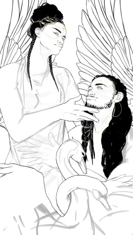
You can see that I stopped cold between rough sketching and refined lines. My friend suggested black swans as a major motif for them, but all of this felt like such a stiff mess that I got frustrated and had to take a step back, rather than lean heavily on layering and empty ornamentation.
So, #2:
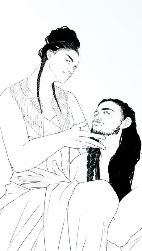
I stripped out a lot of noise and tried to refine the poses into something more elegant and natural-feeling. Success: questionable. Frustration: high. I thought, hmm, maybe I can push it over the edge by working color and value into it, and I really want to work on painting skin, too.
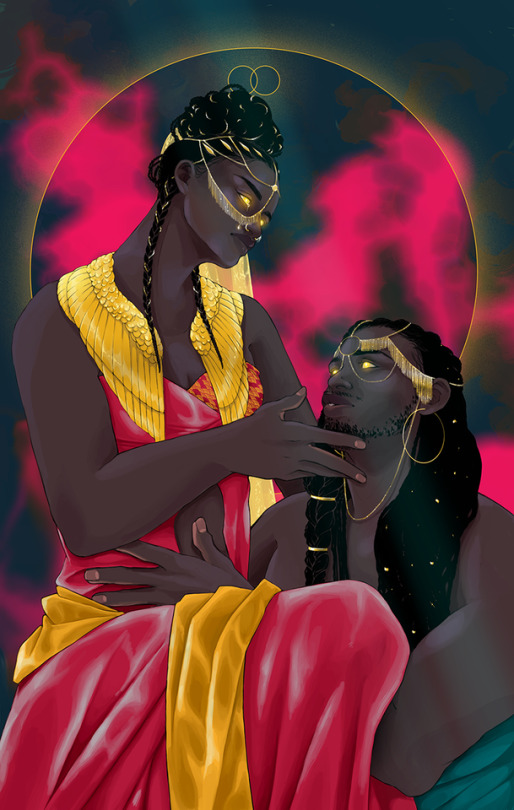
And, naturally, since I haven't fixed the problem at its most basic level, I'm still not all that happy (even though my inner magpie is in love with the gold and vivid color).
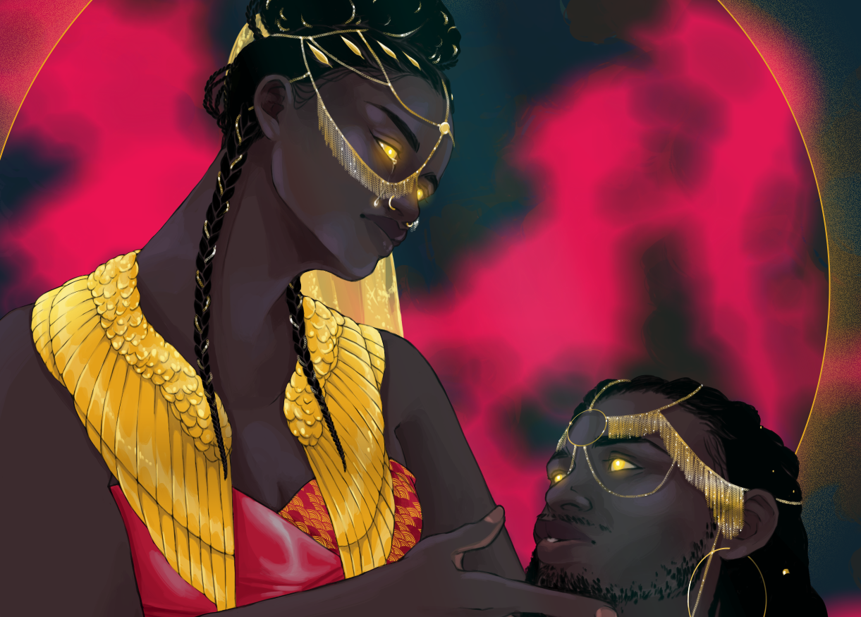
Detail shot, because of course I got too zoomed in and played:
There are things I really love about where I am (or
 namentation, skin painting, colors, afro-futuristic vibe), but I can't get over how this isn't actually....communicating anything. I would love to impart the sort of visual narrative you see in Caravaggio paintings and classic religious iconography: something celestial and serene, but still emotionally vibrant. Acceptance in mourning, devotion, and love (even doomed love). The only thing I can really think of is illustrating some of Ujake's manner of death (which really translates to me asking my friend lots of questions, because it's a bit vague to me), but that also seems kind of maudlin and like I'd be leaning on cheap tactics.
I do like the flow happening in the top half of the image, but the lower half is fairly unactivated right now:
Maybe the swans from version 1 need to make a bit of a comeback? Or is that me falling back on my worst tendencies to throw the kitchen sink at an illustration? Heck, maybe the answer is to make it vaguely gruesome with blood creeping up their robes. Or throw out half of what I have and rework their poses? Thoughts absolutely welcome, because I'm really just at a loss. I haven't touched this in about a month and I feel like it has potential to be effective narratively, but I can't see the path to get there.
Thank you in advance!
-
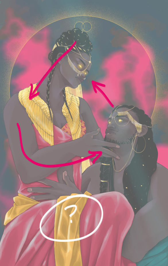
Also, would just like to say I give explicit permission for anyone to redline this! Sometimes that's the best way to communicate recommendations or thoughts, so please know I welcome it for constructive feedback. For ease, here's a version with a semi-opaque overlay.
-
@thousandwrecks - really nice work and neat to see your thought process.
I was recently looking at Alphonse Mucha's work because of the recent Three Point Perspective episode where Lee White mentions his work. Your work reminded me of a more modern take on his style. Perhaps you could do a more modern ornament around the framed circle using the swans?
Here is an image search of Mucha's work so maybe you can see what I'm talking about: https://www.google.com/search?q=alphonse+mucha&source=lnms&tbm=isch&sa=X&ved=0ahUKEwj3m9zPhLXjAhVN7J4KHZU0DLwQ_AUIESgC&biw=1920&bih=969#imgrc=hNoGYxAawe9STM:
Good luck!
-
@thousandwrecks I really like the swans with their necks intertwined, it mimics the gods who are in love...I think the swans need to make a comeback!

Really nice work btw! The jewelry is gorgeous!
-
@djly Ooh, nice tip on the Mucha (and omg thank you for such a flattering comparison)!! I'll definitely explore some options there.
@lou Thank you!! Maybe I can incorporate the swans in a way that isn't oppressive. More jewelry?
")
-
@thousandwrecks this is very good but is there a reason they are so distant from each other? If they are so in love why aren’t they actually embracing each other as if about to lose each other forever? Because at first glance I actually thought she might be planning to poison him. Until I read the thingy.
instagram and twitter: @artofaleksey
alekseyillustration.com -
@Aleksey Thank you for the feedback! I've been mulling this over for a bit--because I'm absolutely wary of my natural urge to defend my initial choice--and I think the reason why placing them so far apart felt correct (at least in the beginning) is because of the emotional intent that that distance implies. Love that has barriers, a distance because of power imbalance, and the sort of posed quality you see in classic religious paintings.
But I'm definitely reexamining that within myself, because I think that might be a big reason I'm not comfortable yet with what's happening. The posed quality is too there. Of course I'm hesitant to redraw them entirely, if only because there's a dumb amount of work put in so far....but I think I'm going to try some more intimate arrangement of bodies tonight when I have a chance to approach this after work. I'll post what I try!
-
@thousandwrecks yeah good thinking. Try some rough poses dont get too detailed see which one communicates the MAIN thing you want to communicate the best.
-
I know it must be frustrating to hear this but I love the initial sketch with the swans and the wings behind them so much more. The wings being behind the heads of the characters draws your eye into them and the swans with the intertwined necks nicely fills that lower space without being too distracting. Especially if they were black swans as your suggested but the wings behind the heads were white you could create a gradient of sorts throughout the whole image which could be really nice.
-
I totally agree with @juliekitzes - the swans and wings were lovely and set up a beautiful design - I also agree with her statement that white wings would work perfectly in the back - the two characters have such dark skin that they really need a lighter background to stand out from. Potentially you might also want to lower the value of their clothes slightly - that will help the flesh of the characters pop out better and potentially help give a good backdrop for the black swans.
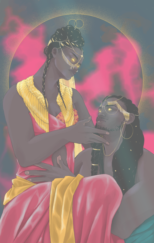
I think their embrace is sweet - but maybe this is a personal reading on my end. It reads as an enduring, deep bond - and if you were to add in the swans, their entanglement would highlight the depth of their love without having your characters all up in each others business.
I am in love with this painting and can not wait to see it come together! Seriously. I imagine you can’t wait as well! -
@juliekitzes & @kaitlinmakes -- thank you both so much! it's...well, that's not as frustrating to hear as you might think, haha. I know I've long-since lost my perspective with this and it would be ironic but not super surprising if my initial instinct was right all along.
I tried some things! I brought back my original layers and redrew the swans because I was seeing my original problem, which was the exaggerated separation between points of depth. It really felt like the swans were existing on a completely different plane, or were even cardboard cutout-y...so I tried something I had originally thought about but somehow couldn't get right in my initial sketch. Also added some more fraught face-touching in lieu of shifting Uthkima's posture. I think it helps, weirdly.
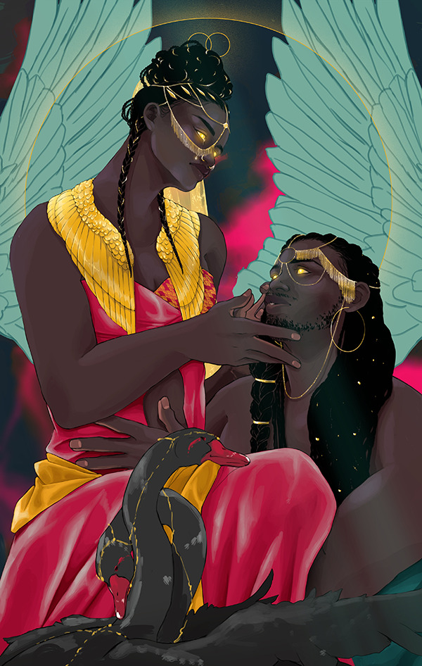
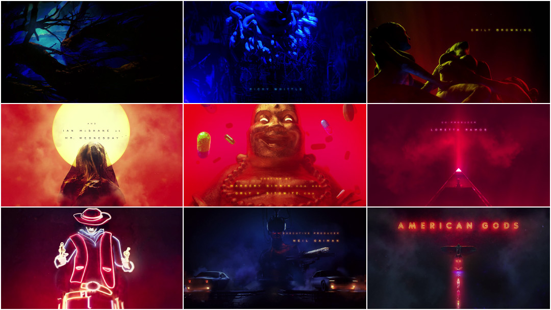
I'm on the fence about the wings in the back, but I can see that they're definitely doing something right in activating the space and helping to make my figures more distinct via contrast. Puzzling over what to do with them now that would keep the fill, since just lines would make everything dissolve into a mess again--otherwise my magpie brain would be going hard on making it look like a neon afterimage, sort of like the American Gods opening, which has such a stunning look:
ANYWAY. Thoughts on the swans?? I think they're definitely an improvement. And absolutely yes, I gave the swans jewelry. I love how they pull in the teal/pink/gold colors at the bottom, so that was a really good call. Thank you, everyone who cheered for the birds!! I am so glad they're back.

-
@thousandwrecks Swan is nice, but it's also its own point of focus and changing the entire composition. Personally I would have gone with something much more subtle like maybe adding some gold detailing/pattern to her dress. The illustration is already really nice, has a very strong composition, and it would be too bad messing with that. To me the problem of "the bottom part being boring" is actual a minor problem, because not every part of the illustration has to be packed with wow value. The focus isn't at the bottom, so it's quite okay if that part is a little more boring. Some detailing to her dress would be more than enough, in my opinion
") It's a great illustration!
It's a great illustration! -
@thousandwrecks I love it so much. I even thought "this reminds me of American Gods" before I even scrolled down and saw that.
-
Hello all!! Thank you all for your comments and feedback--it's been really helpful in getting this moved along and me working through it. Definitely could not have done it without the concrit I got from you! After a lot of mulling over, I'm currently here with it:
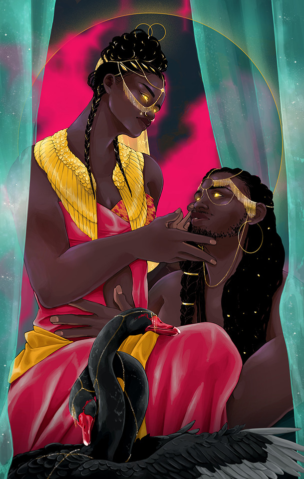
I feel pretty good about it, I think?? I finally gave up on the wings, lmao. I'm reaching a point where I actually feel like it's almost there....any thoughts? Thank you again!
-
I don’t know if this has been mentioned before but the chracter’s hands are too big. Realistically they would have to be the same length as the character’s faces. I hope this helps.
Portfolio: nyrrylcadiz.com
Instagram: https://www.instagram.com/nyrryl_cadiz/
YouTube: https://www.youtube.com/channel/UCbJCF1Im8ZO7hpGWTKOJMuA -
@thousandwrecks a very beautiful illustration! The swans are a gorgeous addition too! I really like this style, it's all very well people critiquing your work, but at some point you just have to go with your individual style and overall feeling for your artwork.
 I like the placement of the hands, when a woman lets a man put his hand on her stomach then you know its love!
-
@Nyrryl-Cadiz oh, nice catch, thank you!
@lou Thank you so much! I'm really happy with where this ended up!