December WIP - feedback really appreciated
-
An update on the WIP:
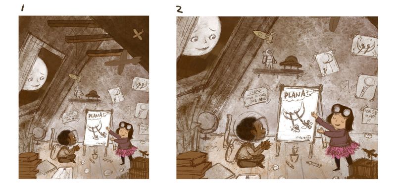
Which comp works better for you?I am very unsure about the color of this piece. I might end up doing a mono-color piece for now due to not having enough time to explore the color at this moment.
-
@xin-li i like the vertical format. #1
-
@xin-li My vote's for #1. It gives me a nice sense of height, which I think is necessary to make the moon comfortably in the sky
")
Awesome work. I think it would look great mostly monotone with small spots for the characters and moon
-
@burvantill @Braden-Hallett thank you for the feedback. Now I am ready to paint this piece :-).
-
@xin-li I agree with @Braden-Hallett i think monotone would work out really well. maybe adding a little colour to emphasise the places you want people’s eyes to bounce around.
-
I only just saw this, but really like the take on the prompt and agree that the vertical version is the way to go. Good luck with the finish!
-
@xin-li Lovely concept! 1 works better. however, you may want to consider make the comp a little bit more dynamical. Right now this image has a tendency of being symmetric (a big trangle, with things distributed almost equally on its left and right) and thus being stable instead of dynamical. Change the position of the boy and objects in front of him should help. Shifting the position of moon a little bit may help, too, from my perspective.
-
@peteolczyk and @LauraA, thank you for the feedback.
@idid Definitely good point, I will see what I can do.Really not sure if I will make it on time this month. But I have a lot of fun coming up with ideas for this prompt. If I run out of time, I will paint it in Jan :-).
-
Comp 1 for me. It's looking great!
-
Definitely 1. The moons is just well framed in that one.