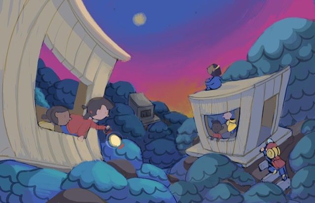
Society of Visual Storytelling

    SVSLearn Forums

    • Register
    • Login
    • Search
    • Recent
    • Tags
    • Popular
    • Users
    • Groups
    • Search

    February WIP!

    Artwork
    9
    24
    1158
    Loading More Posts
    • Oldest to Newest
    • Newest to Oldest
    • Most Votes
    Reply
    • Reply as topic
    Log in to reply
    This topic has been deleted. Only users with topic management privileges can see it.
    • sarahlash
      sarahlash @Kali last edited by

      @Kali I really like the composition you’ve created! It really moves your eye into the image.

      Kali 1 Reply Last reply Reply Quote 0
      • Kali
        Kali @sarahlash last edited by

        @sarahlash Thank you Sarah! I’ve been doing my best to work on composition so I am so glad to hear that 🙂

        1 Reply Last reply Reply Quote 0
        • Kali
          Kali last edited by

          This post is deleted!
          1 Reply Last reply Reply Quote 0
          • Kali
            Kali last edited by Kali

            Update!

            5EE0DEBF-005B-4B15-B14D-593F9B1721E8.jpeg

            xin li 1 Reply Last reply Reply Quote 3
            • xin li
              xin li @Kali last edited by xin li

              @Kali beautiful composition and very interesting shape you are using. I can recognize your design instantly.
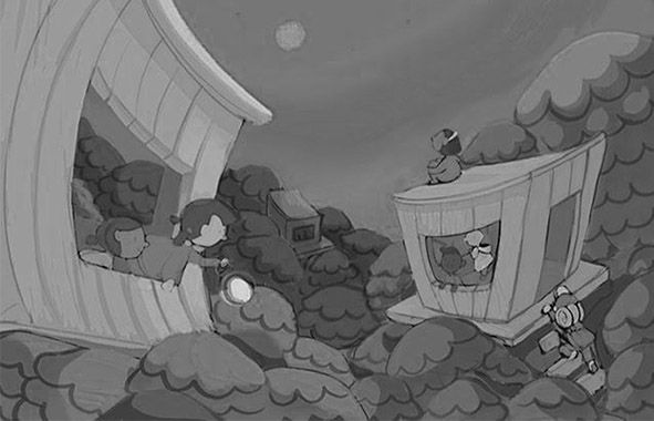
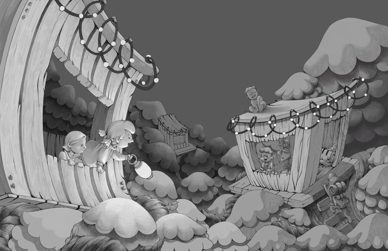
              I think there might be room for improvement in the value arrangement in this piece. I took your image and changed it to grayscale (hope you do not mind).

              The overall value is quite close to each other, you might want to just add a bit more contrast.
              Depending on the story you want to tell, If the girl on the rooftop is the main focus of this piece, I would try to have the most contrast around her in terms of the value - I would make her a darker figure and against a lighter background for example. I would also move the tree behind her a bit towards the right so the tree is not overlapping her. In this way, she will have a clear silhouette. Right now, the girl gets disappeared if you shrink the piece into a thumbnail size, or squint your eyes.

              Hope this makes sense.
              Untitled-2.jpg

              Web: www.lixin.no
              IG: www.instagram.com/lixin.illustration/

              Kali 1 Reply Last reply Reply Quote 0
              • Kali
                Kali @xin li last edited by

                @xin-li Thank you for your feedback. I think you’re definitely right about the values! I’ll keep defining the values a little better as the piece continues.

                I think you’re right when it comes to the story being told- it’s rather unclear right now. To be honest, I didn’t intend for her to be the protagonist the piece, but it definitely reads that way with how I have it now. I think I really have to make the decision to make her the main character since she is the odd one out and sticks out from the shape of the composition. Thank you for the advice!

                1 Reply Last reply Reply Quote 0
                • chrisaakins
                  chrisaakins last edited by

                  @Kali I love this. I reads really well. I agree with @xin-li about the value. I would make her lighter in value.

                  Chris Akins
                  www.chrisakinsart.com
                  www.instagram.com/chrisakinsart/

                  1 Reply Last reply Reply Quote 0
                  • burvantill
                    burvantill Moderator last edited by

                    I love wonky perspectives! 👍

                    Lisa Burvant
                    www.lisaburvant.com
                    Instagram & Twitter & SVS: @burvantill

                    1 Reply Last reply Reply Quote 0
                    • Kali
                      Kali last edited by

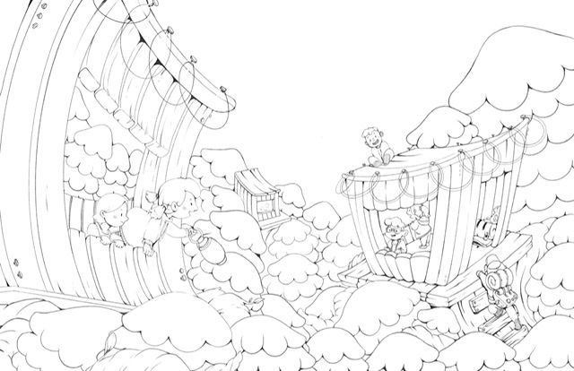
                      I started over... kinda. I wasn’t liking how it was turning out, so I went in and created some more refined Lineart. Still working on it! Definitely taking the longest out of any piece I’ve ever done, but something about it makes it mean a lot to me.

                      84E02EBE-9850-48B3-88CC-6E81A38506AC.jpeg

                      1 Reply Last reply Reply Quote 6
                      • Kali
                        Kali @Kali last edited by

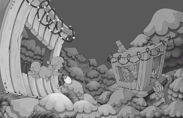
                        Adding in value! Just saw the February critique- I wish I would have varied my tree size more now!!

                        E40330C2-3C22-49B5-8BF3-894BB1343D7C.jpeg

                        My recorded time on this one so far is 19 hours... gonna have to hurry it up. My wrist has been feeling a lot of pain 😔

                        1 Reply Last reply Reply Quote 2
                        • Kali
                          Kali last edited by

                          Another update!! My Apple Pencil died during my lunch break 😔62F4FB9A-A3EC-4773-BB5C-FD8EDDDD302A.jpeg

                          NicolaSchofield 1 Reply Last reply Reply Quote 4
                          • NicolaSchofield
                            NicolaSchofield @Kali last edited by

                            @Kali it's looking amazing! I hope you have time to finish

                            Nicola Schofield

                            Twitter: twitter.com/NSchofieldArt
                            Instagram: instagram.com/NicolaSchofieldArt/

                            Kali 1 Reply Last reply Reply Quote 0
                            • Kali
                              Kali @NicolaSchofield last edited by

                              @neschof Thank you so much! I'm getting nervous about timing since February is a short month!! However, I am determined!

                              1 Reply Last reply Reply Quote 1
                              • Katie Kordesh
                                Katie Kordesh last edited by

                                I love how you stylized this 💗 looks great!

                                https://www.katiekordesh.com
                                https://twitter.com/KatieKordesh
                                https://www.instagram.com/kordesh.sketch/

                                Kali 1 Reply Last reply Reply Quote 0
                                • Kali
                                  Kali @Katie Kordesh last edited by

                                  @Katie-Kordesh Thank you 🙂

                                  1 Reply Last reply Reply Quote 0
                                  • Kali
                                    Kali last edited by

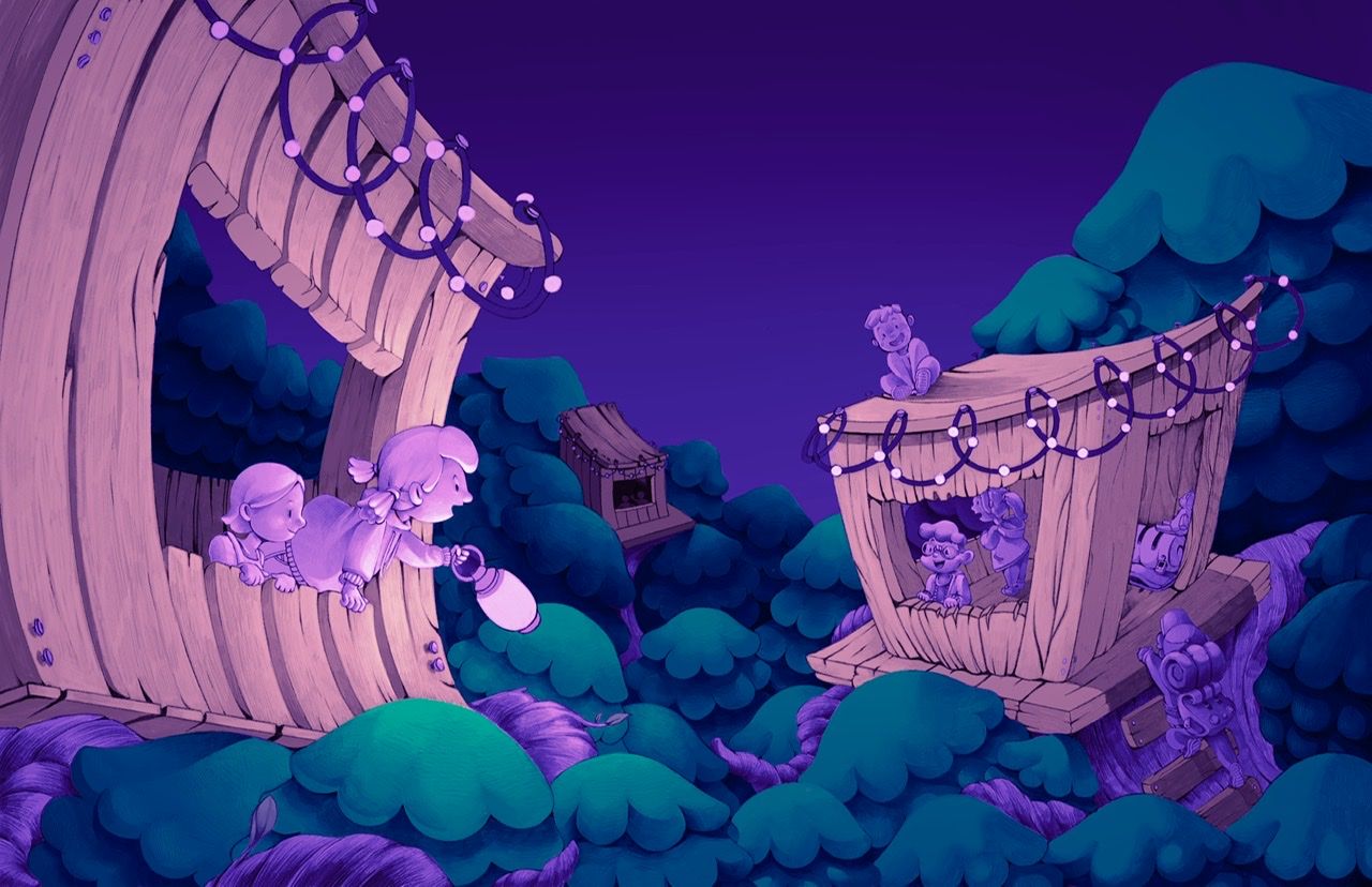
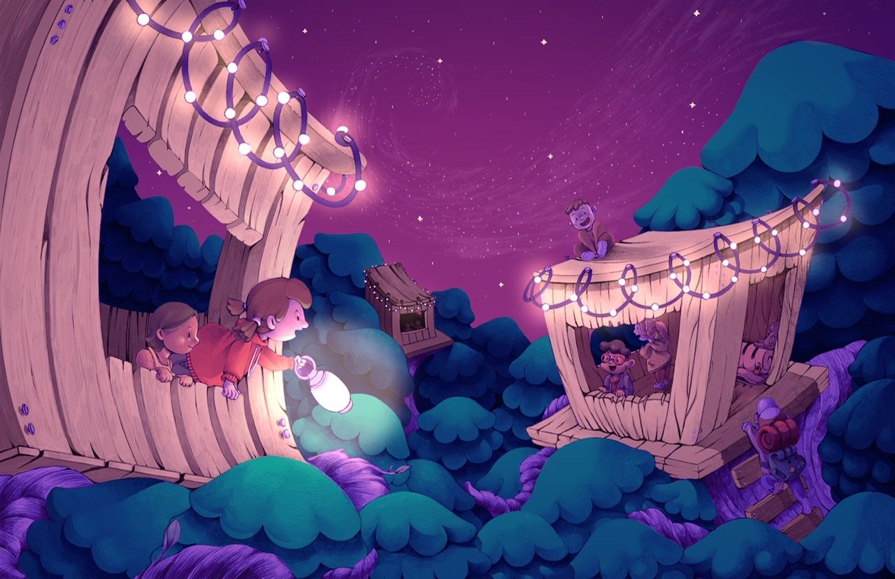
                                    Adding in color! It’s getting there.

                                    A149410D-03DD-4B92-95C7-88F27BE64F6B.jpeg

                                    1 Reply Last reply Reply Quote 0
                                    • Kali
                                      Kali last edited by

                                      I feel like now that I’ve added color it isn’t working 😞 6EC3A30E-9069-41DE-B83A-32BEFD8D7AE1.jpeg

                                      J 1 Reply Last reply Reply Quote 2
                                      • J
                                        jdubz @Kali last edited by

                                        @Kali said in February WIP!:

                                        I feel like now that I’ve added color it isn’t working 😞

                                        Sorry I don't usually like to tell people that they're flat out wrong, but you're off on this one 🙂

                                        I'm curious - this is Procreate, correct? Are you putting your color layers right over the top of your b/w values with layers on different modes?? The under-painting really seems to be giving it a lot of vibrancy and I've definitely struggled with Procreate on coloring over values without it coming out really weird.

                                        Josh White
                                        https://www.instagram.com/joshwhiteillustration/

                                        Kali 1 Reply Last reply Reply Quote 0
                                        • chrisaakins
                                          chrisaakins last edited by

                                          @Kali I think you were going in the right direction with the blues. I think the pinks are too bright.

                                          Chris Akins
                                          www.chrisakinsart.com
                                          www.instagram.com/chrisakinsart/

                                          Kali 1 Reply Last reply Reply Quote 0
                                          • Kali
                                            Kali @jdubz last edited by

                                            @jdubz Thank you! Trying to do my best 🙂

                                            I think it's important to not layer on top of anything that is completely black and white since you'll lose out on some saturation and you may come across a "dull-ness", which I think is what you're experiencing. Before coloring the line art, I changed the black and white values to have some color on them using a blending mode, and then painted on top of that. I hope that helps!

                                            I personally don't like to have a black line art by the time I color just because it can be a bit harsh too, depending on the style you are working in!

                                            1 Reply Last reply Reply Quote 0
                                            • First post
                                              Last post