February WIP!
-
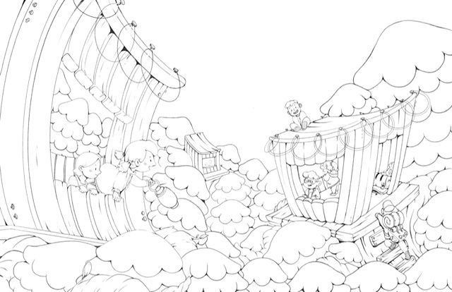
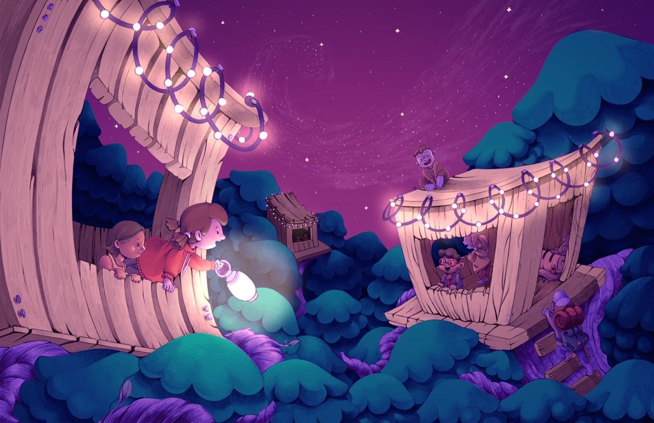
I love wonky perspectives!

-
I started over... kinda. I wasn’t liking how it was turning out, so I went in and created some more refined Lineart. Still working on it! Definitely taking the longest out of any piece I’ve ever done, but something about it makes it mean a lot to me.
-
Adding in value! Just saw the February critique- I wish I would have varied my tree size more now!!
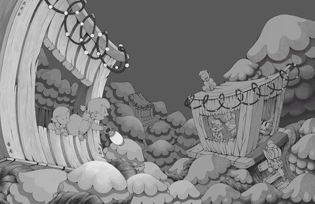
My recorded time on this one so far is 19 hours... gonna have to hurry it up. My wrist has been feeling a lot of pain

-
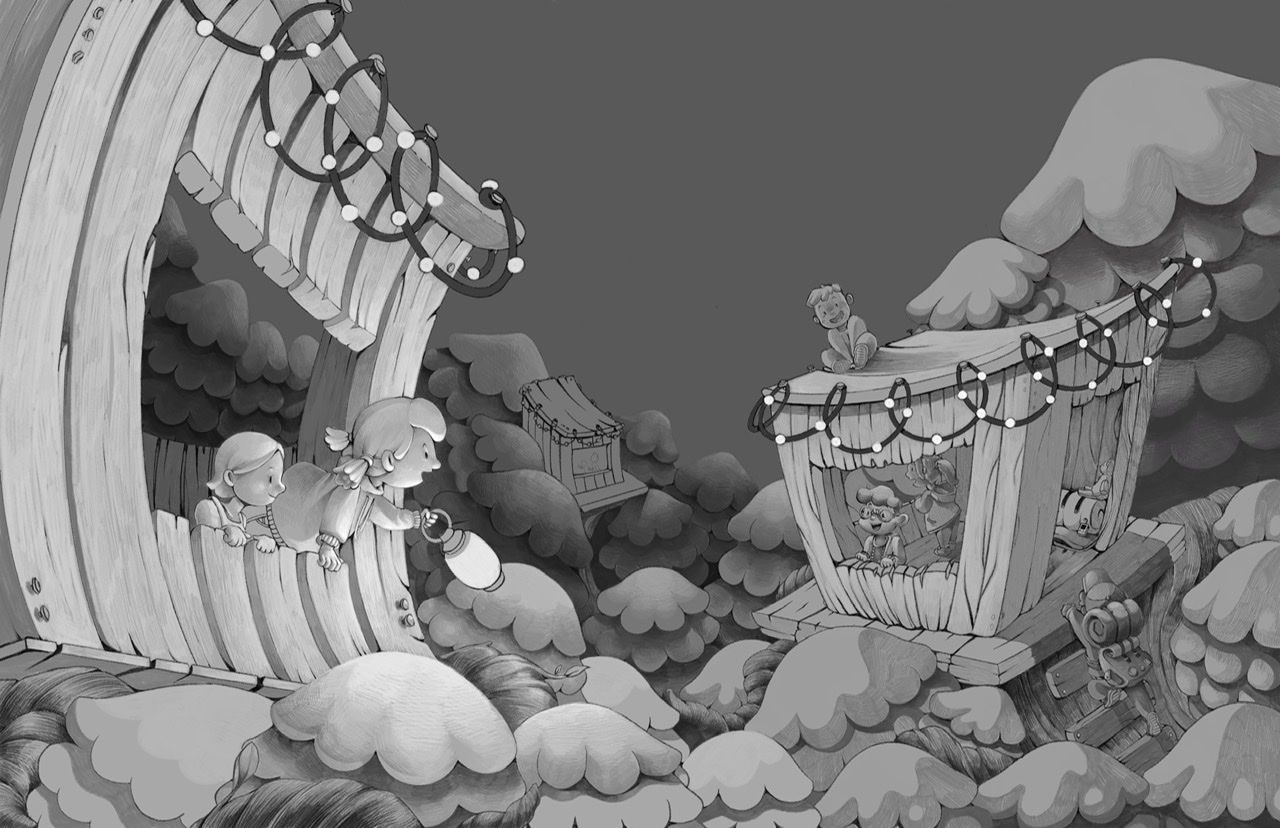
Another update!! My Apple Pencil died during my lunch break
-
@Kali it's looking amazing! I hope you have time to finish
Nicola Schofield
Twitter: twitter.com/NSchofieldArt
Instagram: instagram.com/NicolaSchofieldArt/ -
@neschof Thank you so much! I'm getting nervous about timing since February is a short month!! However, I am determined!
-
I love how you stylized this
 looks great!
 -
@Katie-Kordesh Thank you
")
-
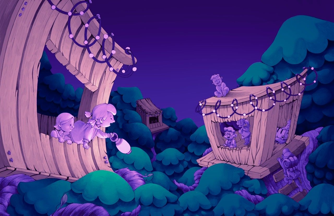
Adding in color! It’s getting there.
-
I feel like now that I’ve added color it isn’t working

-
@Kali said in February WIP!:
I feel like now that I’ve added color it isn’t working
Sorry I don't usually like to tell people that they're flat out wrong, but you're off on this one
I'm curious - this is Procreate, correct? Are you putting your color layers right over the top of your b/w values with layers on different modes?? The under-painting really seems to be giving it a lot of vibrancy and I've definitely struggled with Procreate on coloring over values without it coming out really weird.
-
@Kali I think you were going in the right direction with the blues. I think the pinks are too bright.
-
@jdubz Thank you! Trying to do my best
I think it's important to not layer on top of anything that is completely black and white since you'll lose out on some saturation and you may come across a "dull-ness", which I think is what you're experiencing. Before coloring the line art, I changed the black and white values to have some color on them using a blending mode, and then painted on top of that. I hope that helps!
I personally don't like to have a black line art by the time I color just because it can be a bit harsh too, depending on the style you are working in!
-
@chrisaakins I'm too addicted to making everything warm... maybe I just don't like cool colors but they're probably important to have in a portfolio
I'll try toning things down a little. Thank you!!