Campfire Spread
-
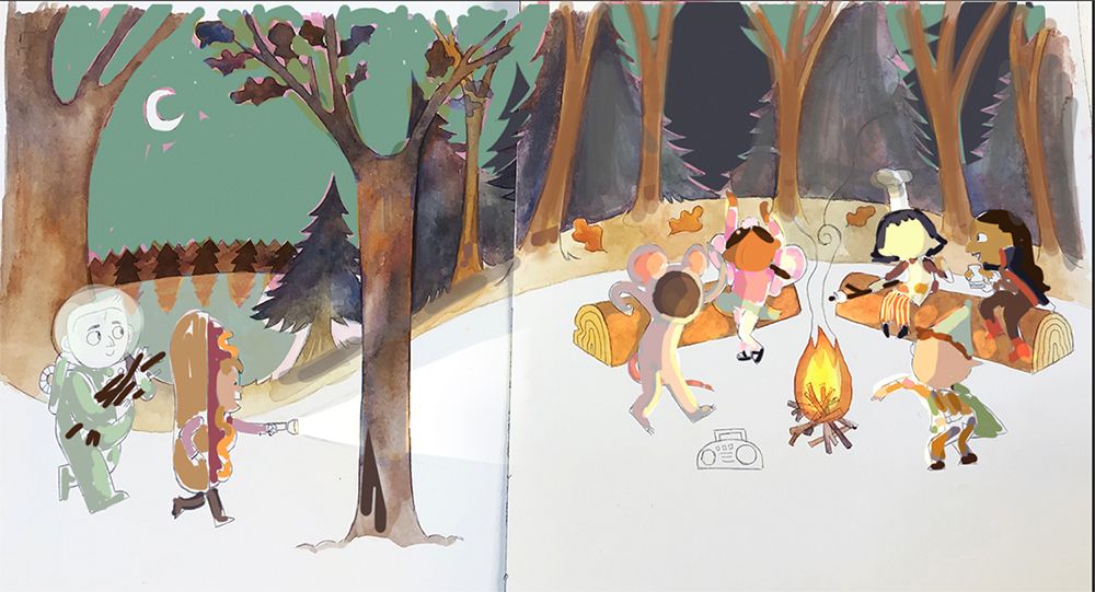
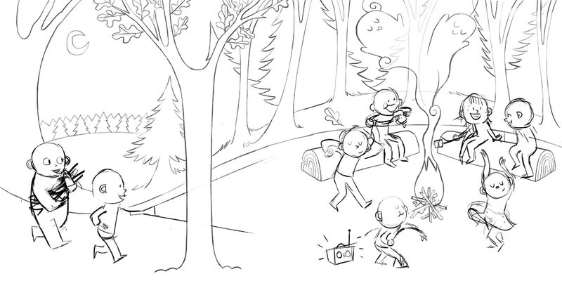
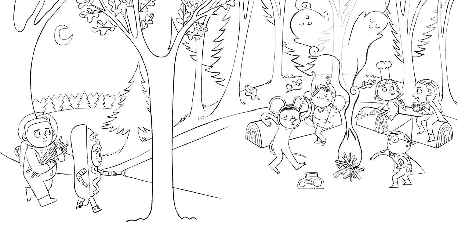
Hi everyone! I am currently working on a campfire spread and I am thinking its going to be halloween themed with fun costumes
V1
V2
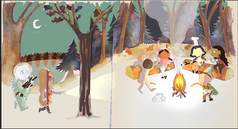
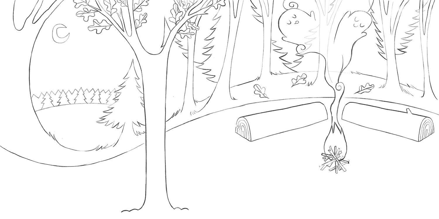
just the bg
A few questions I have are
1.) which composition is better? The first one I was trying to leave room for text
2.) Should there be some sort of chaperone present? and if yes where would you put them?
3.) will flashlight be too distracting?Also any other feedback is welcomed too : )
-
I like the first version! I don't think you need a chaperone, but I don't think it would hurt the image either. I tend to go with less is more when creating narrative children's work, so unless the chaperone is doing something that really adds to the story then they probably aren't needed
Instagram and Twitter: @eriberart
Website: www.erinmcclean.com -
I agree, I like the first one too. I don't think they need a chaperone. Hope this helps.
-
@Katie-Kordesh Hello Katie! It s a beautiful artwork even at this stage. I prefer option a.
Having the group slightly elevated and more on the right side of the page gives some feeling of depth and personally I find that pleasing.
I don t think that a flashlight would be much of a distraction. You should just make the fire a bit brighter. And don t make the light ray of the flashlight very big. I say go for it!
All in all really cool concept.
Thanks for sharing!Instagram : https://www.instagram.com/g.chris.artwork/
Deviantart : https://www.deviantart.com/g-chris -
The story you are trying to tell will determine if a chaperone is needed. The Peanuts gang never had one.
-
@Katie-Kordesh I like the first one. As far as chaperone, I would add one sitting on one of the logs, but maybe be scared of the smoke/ghosts, where the rest of the kids are just having a great ol time.
-
I do like the dancing girl on the right side and the hamburger eating guy in the second, but I would leave just the boom box as you have in 1 - I would remove the guy by the boom box. I don't think I would add a chaperone, since it might take away from the fun, if that's what you're going for.
-
@eriberart OO thank you! Yeah I'd rather not put one in hehe
-
@Rachel-Horne thanks rachel!! very much helps : )
-
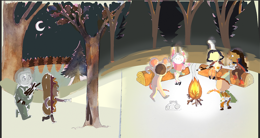
@Georgios-Christopoulos Oo good point about depth. I have gone with option A! Thanks for your help

-
@Kim-Hunter If its good enough for peanuts its good enough for me
-
@Chip-Valecek First one it is
 Thanks for your help!
 -
@deborah-Haagenson Thanks deborah!! Very helpful
-
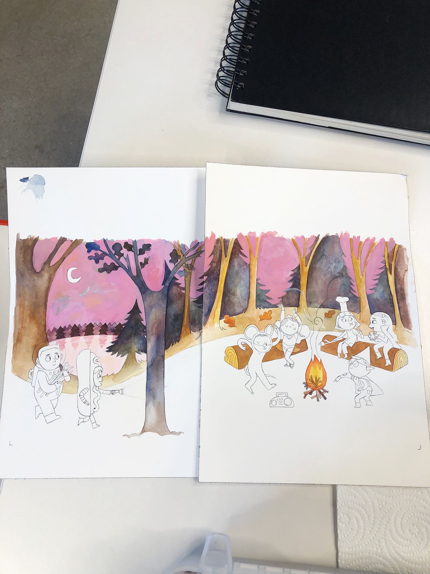
Current update, My plan when designing this was to leave the the ground completely white, but now I am not so sure.
Here was my compositional inspo
I am also currently second guessing the pink sky. I think I am going to start painting the characters and see how I feel after that. I really enjoy how it looks but I don't think I want it to be the focal point of the image -
This is looking so good! I agree with the pink sky--it's pretty but definitely draws my eye away from the kids.
Instagram: instagram.com/natlundeen/
Website: www.natalielundeen.com -
@NatLundeen aw thank you! RIP pink sky

-
@Katie-Kordesh
 I keep having to kill things like that in my illustrations. I just want everything to be bright and pretty!
-
Next time I will do a color comp before I started painting