Vehicle Design course
-
@ArtofAleksey I think this is totally awesome. You gonna put it on instagram?!
-
@shanehunt @Kim-Hunter ok cool I can definitely work on that.
@Coley yes

-
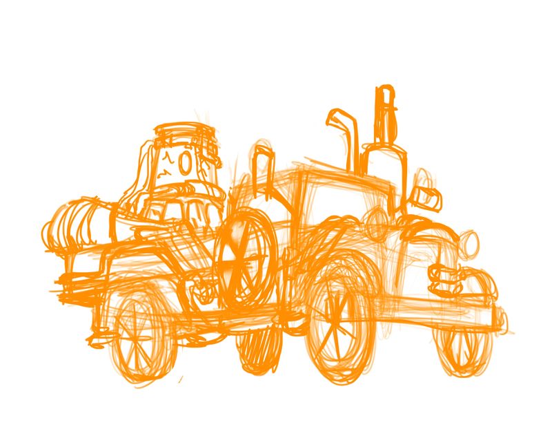
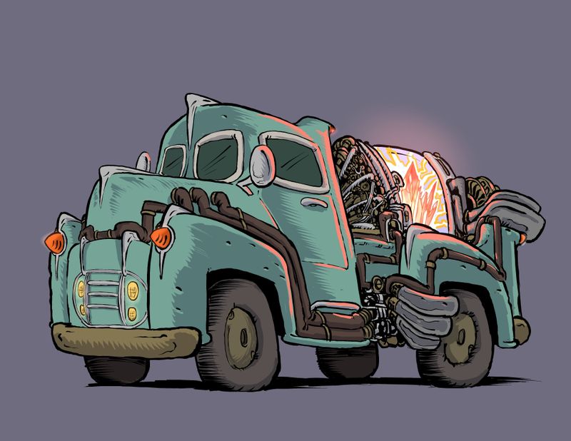
Ok for my last assignment i wanted to make one of those old timey 4x4 with the wooden wagon and those 1920s wheels and put one of those fantasy engines on the back. I’m trying to play around with the balance because the back definitely feels heavy so i put a truck exhaust closer to the front. I think i can do more with the Caricature of the design. Heres a rough sketch of the idea. I might try a few more silhouettes. I think i might also change it from a 20s truck to a 50s truck because Shanes ecample was a 20s vehicle.
-
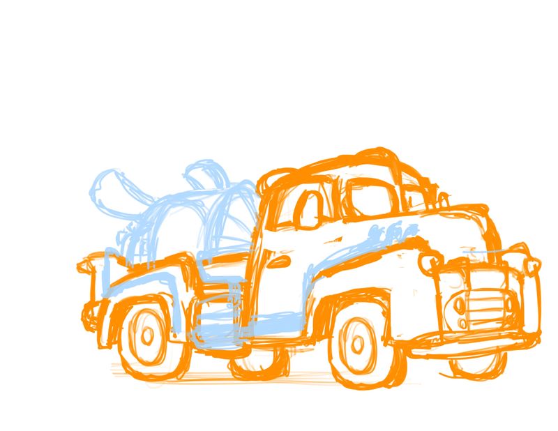
Ok i think the 1950s is definitely preferable
-
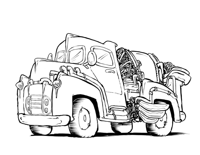
Trying a different ink pen. I want to put a weird crystal thing in the glass chamber on the back.
-
Yay it’s done!
Thanks for the fun course @shanehunt
I think i gotta go do The light and shadow course by @Lee-White had trouble with the light crystal thing.
-
My portfolio lacks vehicles. I’m thinking this needs to be remedied. I’ve finished the environment class so now I have time for vehicles.
@shanehunt, I have no questions yet, just sharing. Your videos and assignments are very understandable

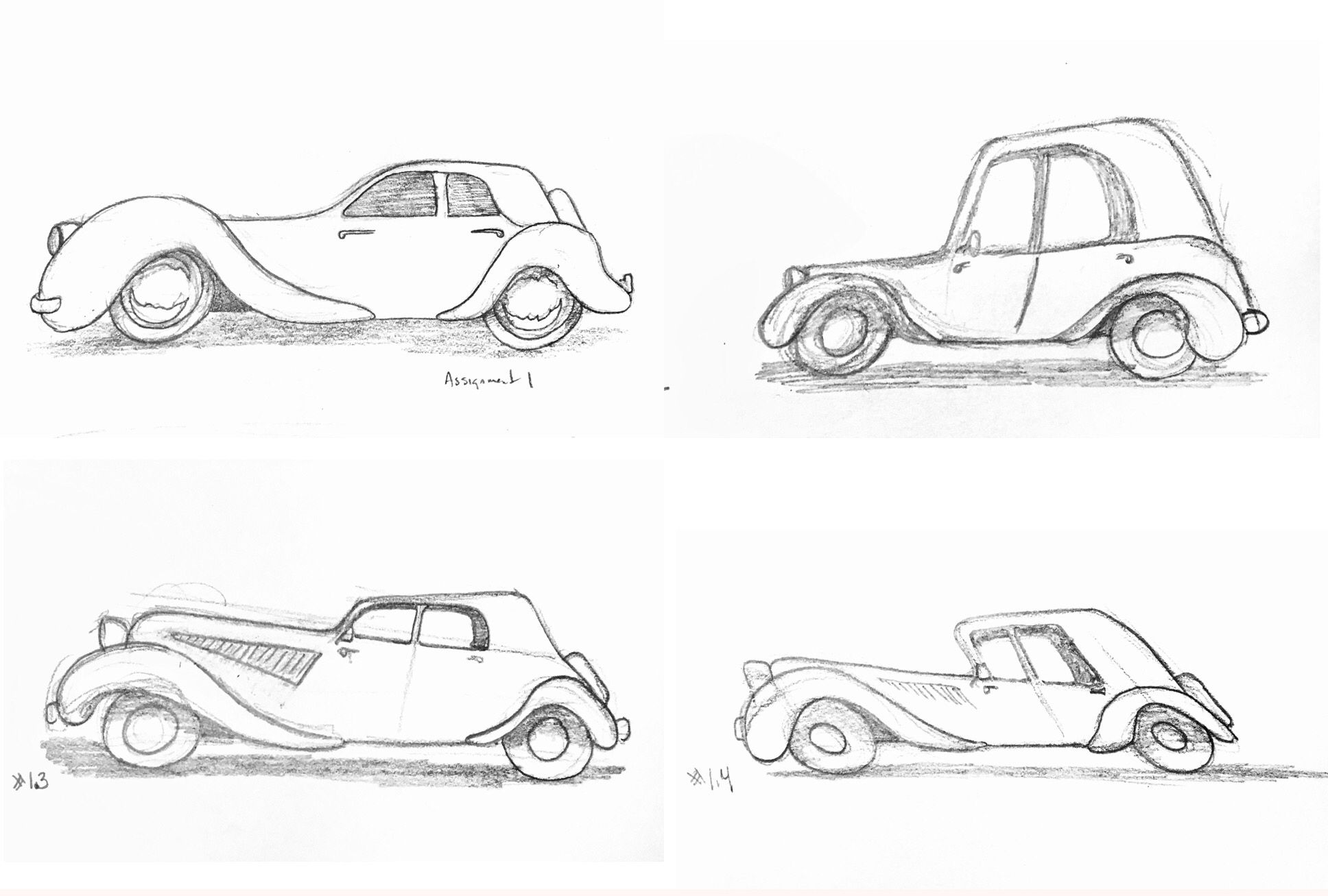
 . I’m having fun and it’s blowing my mind that I just drew 4 cars and didn’t stress over it.
Assignment 1 part 1
-
@burvantill ooo I like these very lively. May I offer critiques?
-
@ArtofAleksey Thankyou. Sure.

-
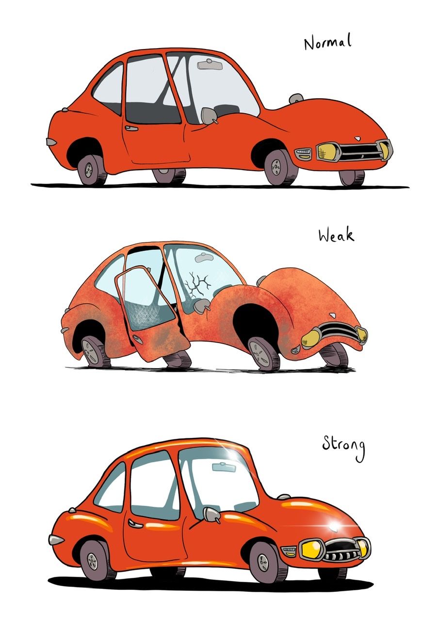
Weak and Strong
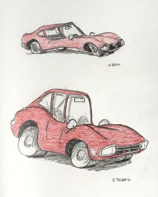
My Weak looks like a broken Stingray. Lol -
@burvantill yeah i think redrawing the weak car in the same confidence you did the strong one would make it easier for you to see things that are and arent working.
-
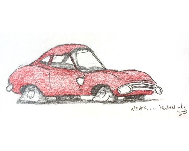
I redid my Weak car... better @ArtofAleksey?
-
@burvantill yes! Flat tires are a nice touch
-
@burvantill flat tires. What a stroke of genius! Very cool
-
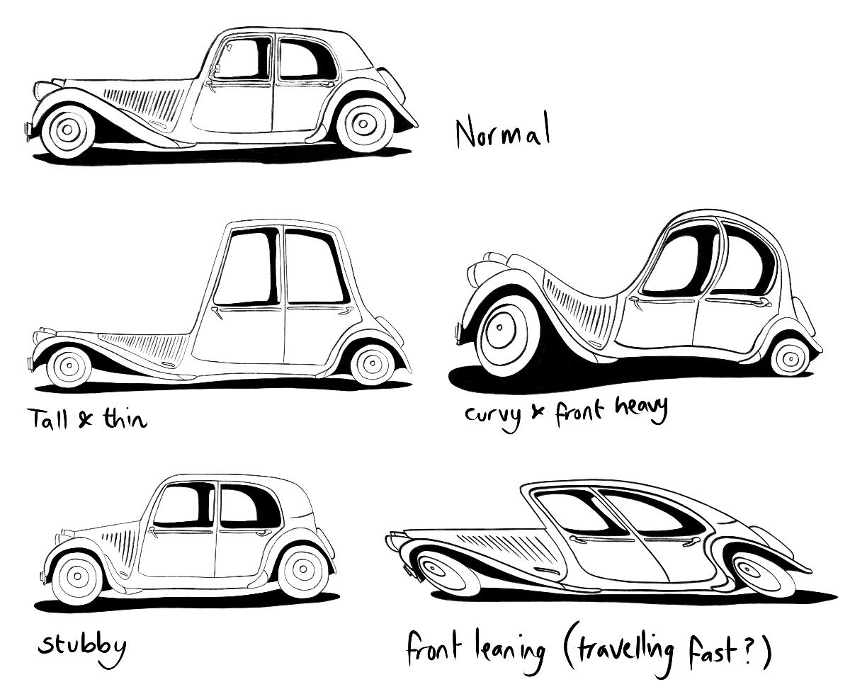
I decided I’m going to include a vehicle in my entry for the March contest so it’s a good time to do the vehicle design course! Here are my caricatures for the first assignment. I feel maybe I could have pushed them a bit further so will try to keep that in mind as I move on to the stance part of the first assignment.
-
@burvantill I agree about the flat tires. Great idea. It looks like your image might be a bit too small judging by the texture and line quality. I would consider doing slightly larger drawings for the future assignments and focusing on craftsmanship and tightness. Looking forward to more from you!
-
@neschof Excellent work! I’m impressed at the wide variation in proportions. And very nice line quality. Keep it up.
-
@neschof nice variation, I love the stubby car
-
@shanehunt Thankyou for the suggestion. I’ve been drawing these in my sketchbook (vertical format). I will start using the full page from now on.

-
Next part of the assignment - stance. I found this really hard but also quite fun. I had a vague idea of a scared & cringing creature for weak, I was trying for sort of hunched "shoulders", and being pushed forward but not wanting to go. For strong I was thinking of the puffed up superhero stance with chin up and chest out. It ended up more subtle than I thought.
