Vehicle Design course
-
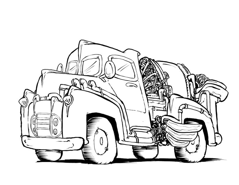
Trying a different ink pen. I want to put a weird crystal thing in the glass chamber on the back.
-
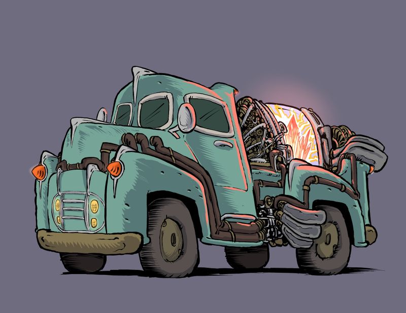
Yay it’s done!
Thanks for the fun course @shanehunt
I think i gotta go do The light and shadow course by @Lee-White had trouble with the light crystal thing.
-
My portfolio lacks vehicles. I’m thinking this needs to be remedied. I’ve finished the environment class so now I have time for vehicles.
@shanehunt, I have no questions yet, just sharing. Your videos and assignments are very understandable

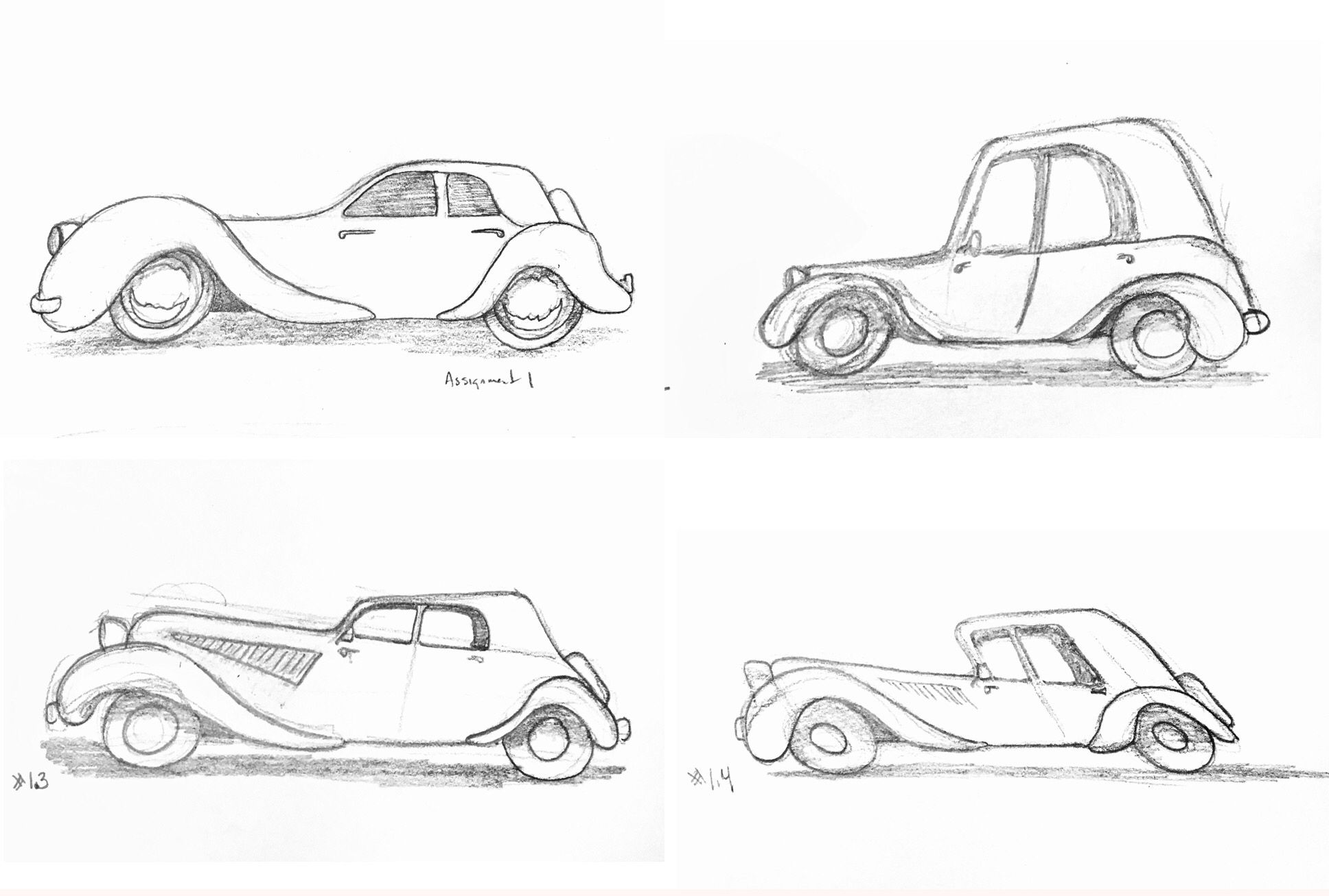
 . I’m having fun and it’s blowing my mind that I just drew 4 cars and didn’t stress over it.
Assignment 1 part 1
-
@burvantill ooo I like these very lively. May I offer critiques?
-
@ArtofAleksey Thankyou. Sure.

-
Weak and Strong
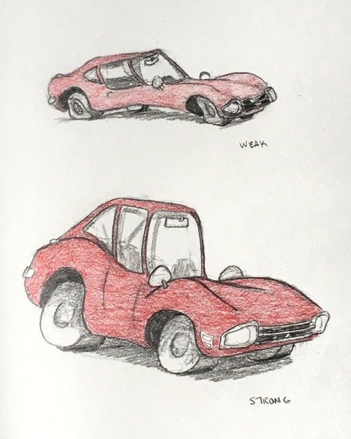
My Weak looks like a broken Stingray. Lol -
@burvantill yeah i think redrawing the weak car in the same confidence you did the strong one would make it easier for you to see things that are and arent working.
-
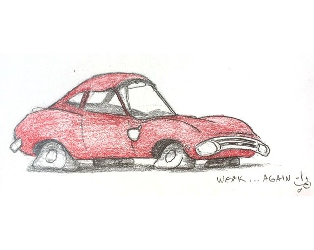
I redid my Weak car... better @ArtofAleksey?
-
@burvantill yes! Flat tires are a nice touch
-
@burvantill flat tires. What a stroke of genius! Very cool
-
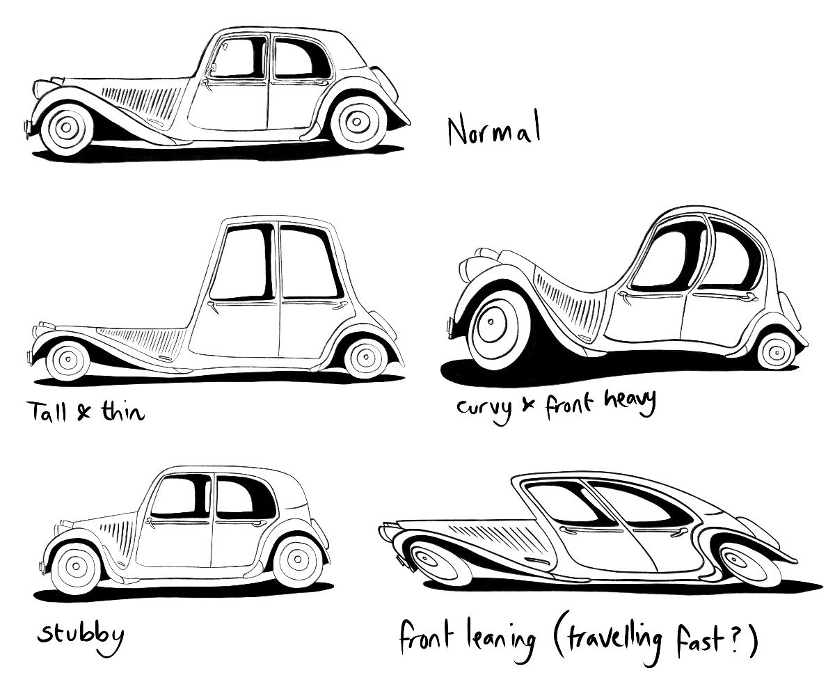
I decided I’m going to include a vehicle in my entry for the March contest so it’s a good time to do the vehicle design course! Here are my caricatures for the first assignment. I feel maybe I could have pushed them a bit further so will try to keep that in mind as I move on to the stance part of the first assignment.
-
@burvantill I agree about the flat tires. Great idea. It looks like your image might be a bit too small judging by the texture and line quality. I would consider doing slightly larger drawings for the future assignments and focusing on craftsmanship and tightness. Looking forward to more from you!
-
@neschof Excellent work! I’m impressed at the wide variation in proportions. And very nice line quality. Keep it up.
-
@neschof nice variation, I love the stubby car
-
@shanehunt Thankyou for the suggestion. I’ve been drawing these in my sketchbook (vertical format). I will start using the full page from now on.

-
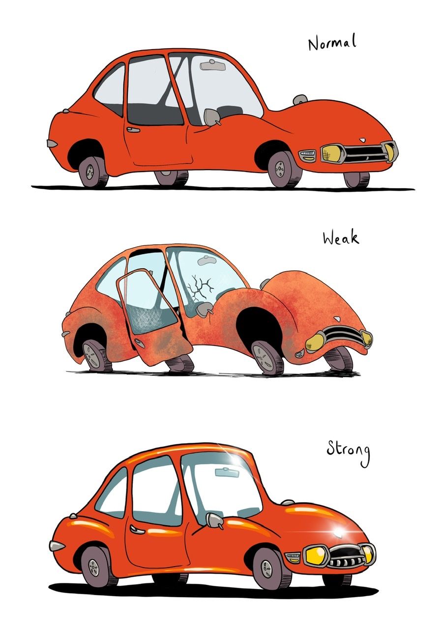
Next part of the assignment - stance. I found this really hard but also quite fun. I had a vague idea of a scared & cringing creature for weak, I was trying for sort of hunched "shoulders", and being pushed forward but not wanting to go. For strong I was thinking of the puffed up superhero stance with chin up and chest out. It ended up more subtle than I thought.
-
@shanehunt thank you! I’m finding the course fun and super useful / interesting

@ArtofAleksey thanks, I think stubby one kinda looks like a normal(ish) mini

-
@ArtofAleksey just seen your strong stance - he's so perky and cute! 🥰
-
@neschof thanks!
I like your weak stance it sorta looks terrified. Although your strong stance looks very close to the “normal” one you did
-
Assignment 1 Part 3
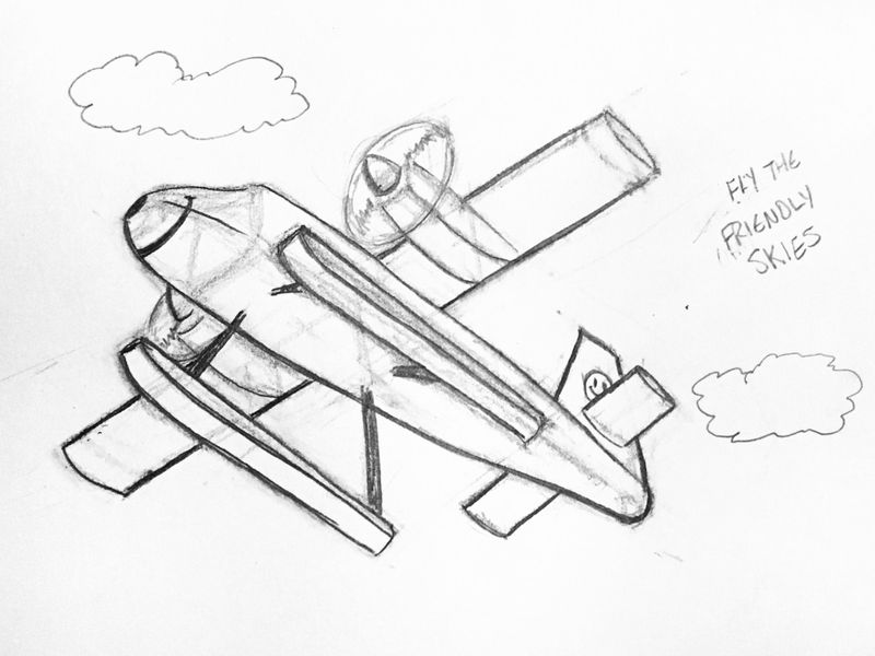
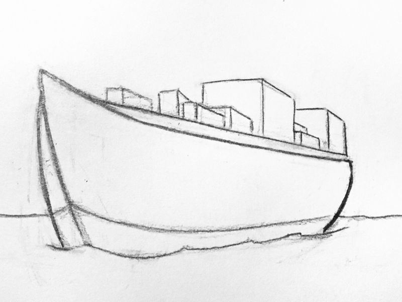
What I see: The pontoon on the port side seems wrong. I think it should be slightly bigger even though my perspective lines lineup, it’s closer so it should be a little bit bigger. It looks weird like this. And the starboard tail wing is too long.
I think my ship is OK except for the tangent of the horizon line and the bottom of the hull. LolWhat do you see?
