Society of Visual Storytelling

    SVSLearn Forums

    • Register
    • Login
    • Search
    • Recent
    • Tags
    • Popular
    • Users
    • Groups
    • Search

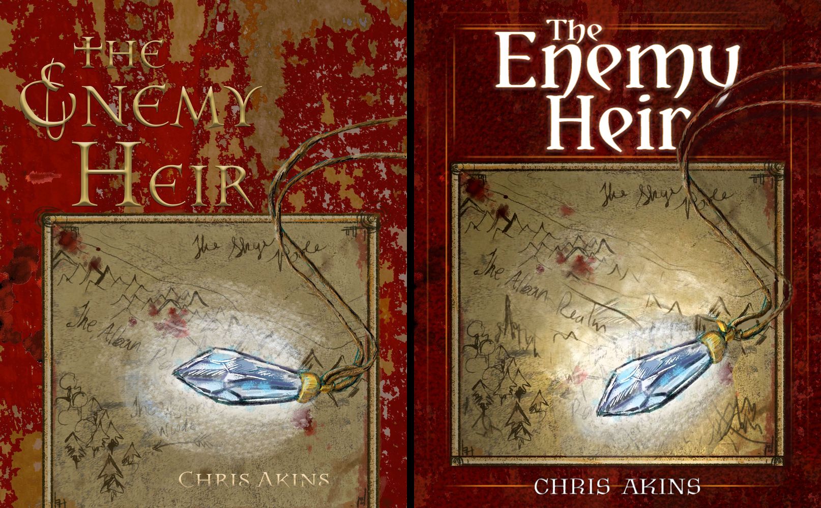
    COVER ART for a book I am writing... Critique requested

    Artwork
    9
    23
    1072
    Loading More Posts
    • Oldest to Newest
    • Newest to Oldest
    • Most Votes
    Reply
    • Reply as topic
    Log in to reply
    This topic has been deleted. Only users with topic management privileges can see it.
    • APHOTICMOTH
      APHOTICMOTH Moderator last edited by

      enemy heir.jpg

      I made this quick edit to maybe inspire you. Notes

      Title should be readable at thumbnail size, especially if you are selling on Amazon and such..

      Darker textured background, with a brighter more legible typeface. The top felt extremely heavy, pushed up the map to balance out the red a bit, and have a nice spot to feature your name.

      Pendant was straight across for the most part, I angled it down to make it seem more interesting, it also leads your eye to the beginning of your name.

      Tangent with the rope on the map, so I pulled it out a bit. Added a drop shadow to the pendant.

      Overlapped the title for added flair.

      Darkened and brightened the map to make it seem like the glowing pendant is actually a light source.

      Added a bit of a border to break things up and tie things together at the same time.

      I'm not a pro designer, these are just thoughts. 😃

      All my links: https://APHOTICMOTH.carrd.co/

      chrisaakins MattBaker 3 Replies Last reply Reply Quote 4
      • chrisaakins
        chrisaakins @APHOTICMOTH last edited by

        This post is deleted!
        1 Reply Last reply Reply Quote 0
        • chrisaakins
          chrisaakins @APHOTICMOTH last edited by

          @CLCanadyArts wow you are so good at this! What font did you use? I really like the edits you made. I will work on making it more like that.

          APHOTICMOTH 1 Reply Last reply Reply Quote 0
          • APHOTICMOTH
            APHOTICMOTH Moderator @chrisaakins last edited by

            @chrisaakins Yataghan for the title - free.

            Krasomila for the author name -free.

            Dafont.com

            Can't wait to see what you come up with. 🙂

            All my links: https://APHOTICMOTH.carrd.co/

            1 Reply Last reply Reply Quote 0
            • chrisaakins
              chrisaakins last edited by

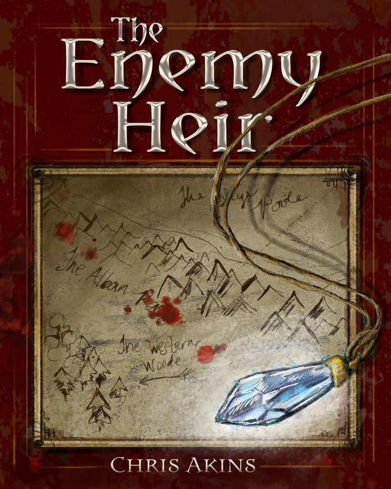
              Okay... Here is the final-ish version I think. Thanks to @burvantill @jwing @CLCanadyArts for your input. The font was exactly the one I was looking for. This was my first serious attempt at cover art, so I thank you for your patience. I learned a ton with your help. Let me know what you think, if you don't mind.
              The Enemy Heir Cover Art 4.jpg

              burvantill APHOTICMOTH 2 Replies Last reply Reply Quote 6
              • burvantill
                burvantill Moderator @chrisaakins last edited by

                @chrisaakins Great job👍👍👍 This looks very professional to me.

                Lisa Burvant
                www.lisaburvant.com
                Instagram & Twitter & SVS: @burvantill

                chrisaakins 1 Reply Last reply Reply Quote 1
                • chrisaakins
                  chrisaakins @burvantill last edited by

                  @burvantill thanks Lisa!

                  1 Reply Last reply Reply Quote 0
                  • APHOTICMOTH
                    APHOTICMOTH Moderator @chrisaakins last edited by

                    @chrisaakins Nice! 😃

                    All my links: https://APHOTICMOTH.carrd.co/

                    1 Reply Last reply Reply Quote 1
                    • Casual-T
                      Casual-T last edited by

                      Awesome (and very educational) to see the evolution of this. The final iteration looks great!

                      I hope the publisher likes stick figures!!
                      www.casual-t.com
                      www.instagram.com/casualcreates.art

                      chrisaakins 1 Reply Last reply Reply Quote 1
                      • chrisaakins
                        chrisaakins @Casual-T last edited by

                        @Casual-T Yes, this is what the forums do best. Help us to learn and grow. We have amazing people here.

                        1 Reply Last reply Reply Quote 1
                        • R
                          Rebekka last edited by Rebekka

                          All cover options for the book are beautiful. I think you should feel with your heart which one is the best.

                          1 Reply Last reply Reply Quote 0
                          • MattBaker
                            MattBaker @APHOTICMOTH last edited by

                            @CLCanadyArts That redo looks awesome. I think it would look really cool if the text was made to look like it was embedded/embossed into the leather of the book.

                            1 Reply Last reply Reply Quote 0
                            • Tracy McCusker
                              Tracy McCusker last edited by

                              The cover really came together after you workshopped it with the group, wow! The final version is eye-catching and mysterious. I love old maps and jewelry with potentially magical qualities... I would very much be arrested by this cover & want to learn more about the book. Outstanding work!

                              1 Reply Last reply Reply Quote 0
                              • LauraA
                                LauraA SVS OG last edited by

                                Just reading this now. I think the cover has improved a whole lot since the beginning and now it looks quite nice! The only thing I'd do is possibly move the type up a hair. It has had the tendency to be too low all throughout the process. One of my art professors told me, in relation to mattes in frames but I think it also applies to type placement, that the bottom of a matte should always be a little thicker than the other sides, because the eye wants more weight at the bottom. Make sense?

                                Instagram: https://www.instagram.com/lauraintorino/
                                http://lauraaldersonart.com/

                                1 Reply Last reply Reply Quote 1
                                • First post
                                  Last post