Society of Visual Storytelling

    SVSLearn Forums

    • Register
    • Login
    • Search
    • Recent
    • Tags
    • Popular
    • Users
    • Groups
    • Search

    April Contest WIP Critique

    Artwork
    art contest comic april
    6
    8
    896
    Loading More Posts
    • Oldest to Newest
    • Newest to Oldest
    • Most Votes
    Reply
    • Reply as topic
    Log in to reply
    This topic has been deleted. Only users with topic management privileges can see it.
    • JoshSchouwstra
      JoshSchouwstra last edited by

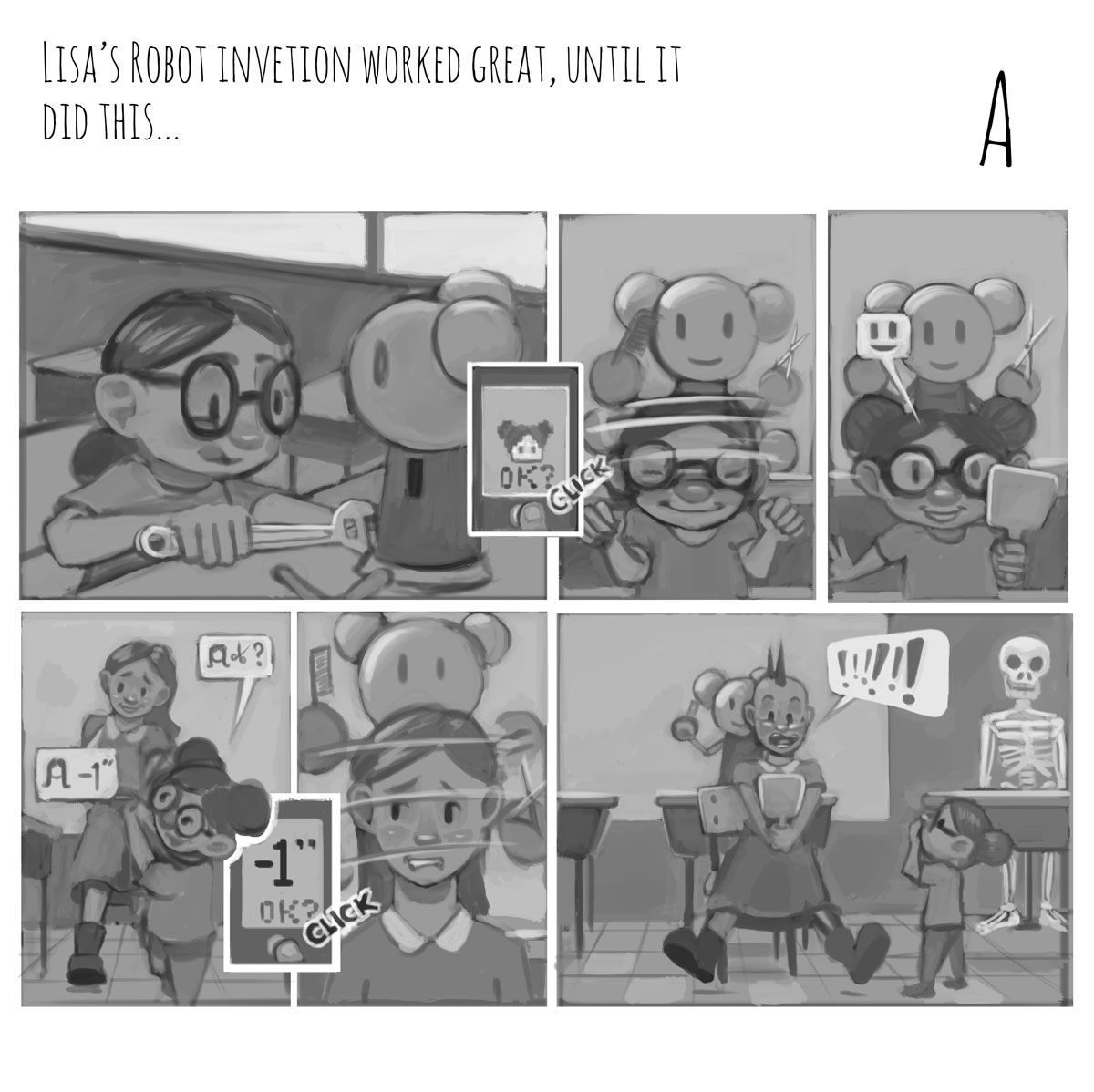
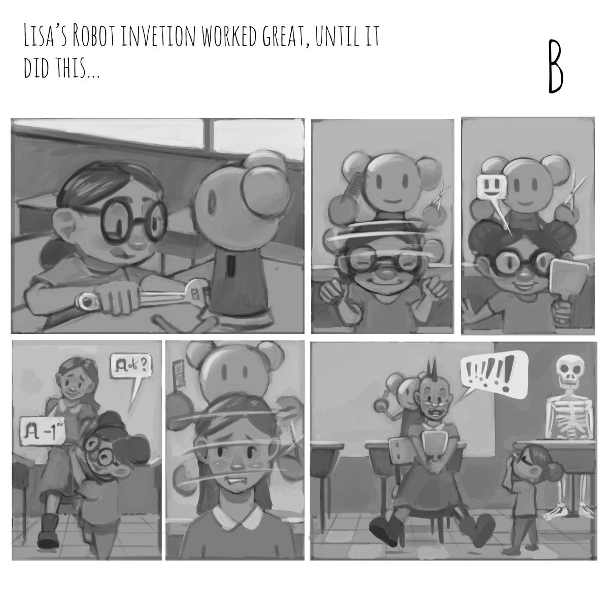
      Hey guys! I decided to try for more of a comic approach to this month's art contest, and was wondering if you could help me figure out which of the two versions read better story wise.
      Also if there are any other constructive critiques that you could give to the story, feedback is welcome!
      AprilContest_DraftA.jpg
      AprilContest_DraftB.jpg

      Thanks!

      1 Reply Last reply Reply Quote 5
      • Anna Lindsay
        Anna Lindsay last edited by

        Personally I prefer option B. I actually think you could do without the speech bubbles in the bottom left panel as well. Maybe I'm just being slow but it took me a few seconds to figure out what the symbols meant at first. Perhaps you could simplify the symbols so the little girl's speech bubble is just scissors and a question mark and the women's speech bubble is a drawing of the haircut she wants (similar to the icon in option A showing the hairstyle the girl wants). I think the overall concept is great though and I love the character's expressions! Looking forward to seeing the finished piece 🙂

        deborah Haagenson 1 Reply Last reply Reply Quote 1
        • deborah Haagenson
          deborah Haagenson @Anna Lindsay last edited by

          @Annabishop I agree B and I don't think you need the speech bubbles in the bottom left panel either. This is a great idea and very cute!

          1 Reply Last reply Reply Quote 0
          • chrisaakins
            chrisaakins last edited by

            @JoshSchouwstra I agree with B and @Annabishop 's take on losing or simplifying the speech bubbles. Other than that, I think everything looks great.

            Chris Akins
            www.chrisakinsart.com
            www.instagram.com/chrisakinsart/

            1 Reply Last reply Reply Quote 0
            • JoshSchouwstra
              JoshSchouwstra last edited by

              Thanks @Annabishop and everyone for the feedback! My first leaning was toward B, but wanted to see if it needed more; guess it didn't 😛
              Working on the colour and refinements now. Will hopefully post those later.

              1 Reply Last reply Reply Quote 1
              • Coley
                Coley last edited by

                This is really fun. I look forward to seeing more!

                https://www.instagram.com/nicoleledrewmay/

                1 Reply Last reply Reply Quote 0
                • burvantill
                  burvantill Moderator last edited by

                  This is cute. If you keep the speech bubbles then I would either remove the haircut symbol and keep the scissors only or change the haircut symbol. At this size I thought the woman was a teacher grading the robot assignment. I thought the hair symbol was an A and the scissors “ok”. lol. I thought the robot was getting revenge for getting -1 less than an A.
                  🙂😜

                  Lisa Burvant
                  www.lisaburvant.com
                  Instagram & Twitter & SVS: @burvantill

                  1 Reply Last reply Reply Quote 0
                  • JoshSchouwstra
                    JoshSchouwstra last edited by

                    And now colour!
                    Wondering if you guys see any lighting problems, or if there is some problem that I missed.
                    AprilContest02.jpg

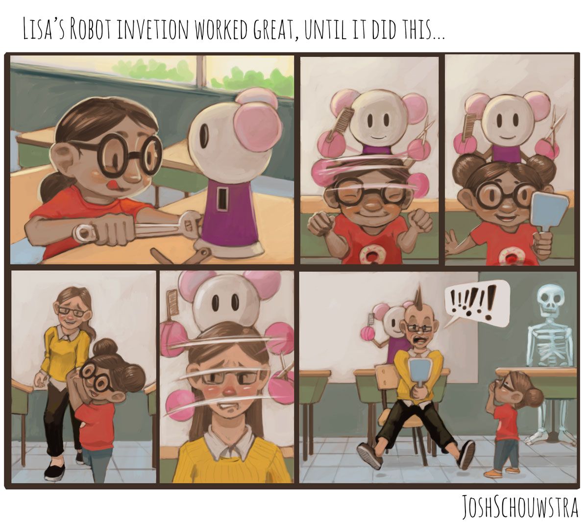
                    Thanks for the help!

                    1 Reply Last reply Reply Quote 4
                    • First post
                      Last post