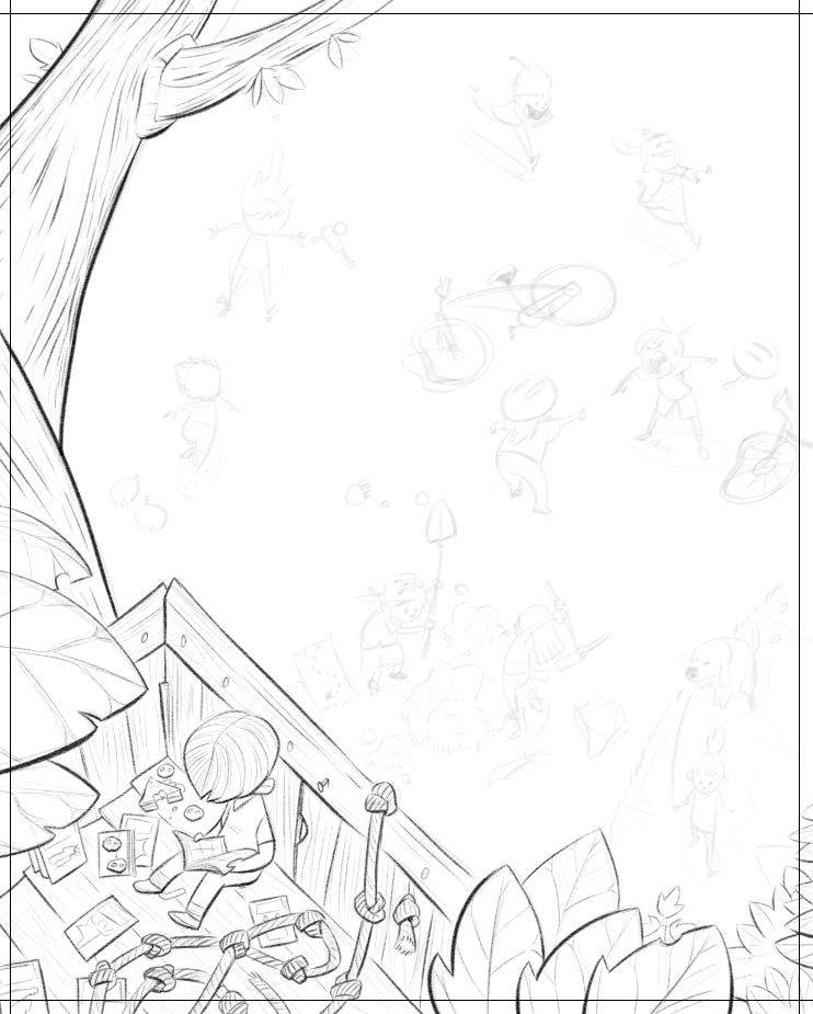
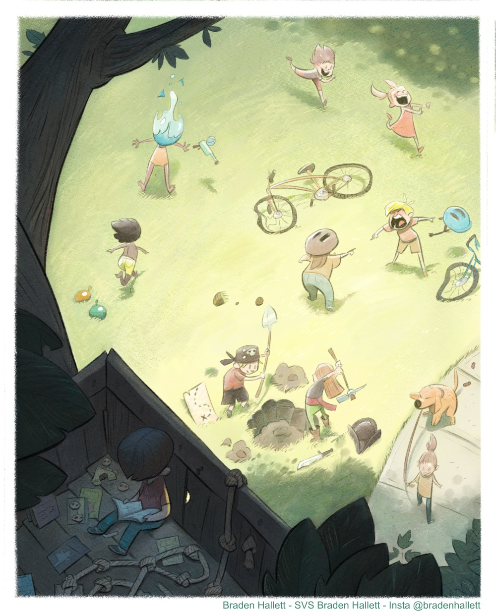
Isolation contest WIP
-
Love this piece!
I would second @EliaMurrayArt about the distance issue. Also, maybe because you don't have values done yet, boy on the balcony is the last character I noticed in this piece. So maybe you'll want to make sure its values/contrast stand out. Or using more objects/lines pointing toward this boy as visual guides. Otherwise this piece looks great to me! -
@Braden-Hallett - I always love your style and this image is great. I just love the idea that the wee lad is in a world of his own tucked away from the chaos below. I’d like to be in his tree house just now! Nice unusual point of view too. Your work inspires me!
We’re living in Toronto just now but I’m from a tiny village in Scotland, so I’m kinda wishing I could hop back to my rural house in Scotland for the lockdown where there’s loads of empty space to roam!
-
Really like where this is going - lots of interesting things to look at.
Instagram @rachel_horne_art
rachel-horne.com -
@Braden-Hallett my only thought is I am not getting any emotion from the kid in the tree.
Now you might be doing that intentionally and the viewer can read that the kid is happy not being in the mess or that the kid is sad being separated but I wonder if it would be more impactful (have a deeper emotional connection) if you went one way or the other and leaned into the kid's emotion?
-
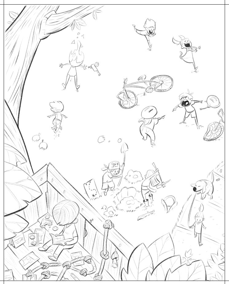
This is such a simple concept, but really impactful! I really like seeing your grayscale work.
-
Is that dog a pooper


-
@Mirananemone said in Isolation contest WIP:
I wish they were a little bit closer to the main bike, and that the other bike was a little more in the frame.
Interesting! I'll definitely need to fiddle around with that
")
@EliaMurrayArt said in Isolation contest WIP:
that they were all pretty evenly spaced away from each other, and the bike. With the bike so centered, it feels like a star.
Thanks for the feedback! I'll definitely play around with the spacing. I think the waterbaloon kids can definitely be happier closer to the tree branch
@idid said in Isolation contest WIP:
Also, maybe because you don't have values done yet,
Not seen here, the many thumbnails and value studies, lol. We'll see how it goes, though. I think I prefer the idea of the isolated kid contrasting the other kids by being almost hidden away. Though I'm sure there'll be some contrasty things I can do and keep that
Thanks for the feedback!@theprairiefox said in Isolation contest WIP:
Now you might be doing that intentionally
I am in this particular case
I want the kid to be utterly completely and totally removed. Though I may give him a big ol' pair of headphones, lol.@Coley said in Isolation contest WIP:
Is that dog a pooper
That dog is indeed spreading the love
-
Thanks everyone for the feedback thus far

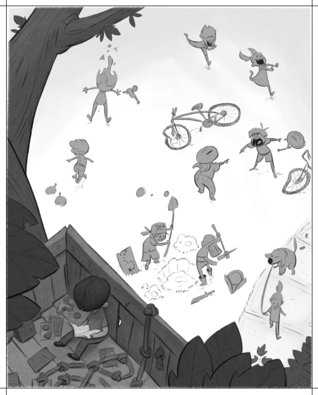
Work progresses! I'm trying to slow down and get more detail into my linework. I have a tendency to say 'I'll add that with paint' and it never quite works out.
-
@Braden-Hallett Looking great!
-
Work progresses
-
Work Progresses progresses. 'Bout 1/3 done some values.
-
Hi, Branden
Nice work! My eye goes to the fallen bicycle first, and the nice vignette of the arguing cyclists. I don't notice the boy in the foreground until later. I don't know which is the focus, but Changing the foreground character's hair color to something lighter may give it more contrast and more visual pull.
-
@Braden-Hallett I love the value design of the image. It is very unexpected, becautiful.
-
Work progresses!
-
@Braden-Hallett that tiny knot in the wall is just. excellent. like a teeny tiny eye watching over his shoulder.
-
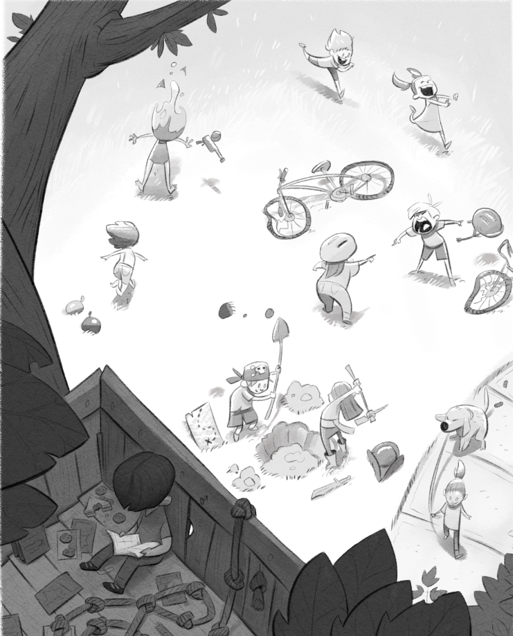
@Braden-Hallett - This looks great & the values are adding a lot! I like how the book is lighter than anything else in the treehouse. I agree that the detail of the knot in the wood is such a nice bit to add. It's also fighting with the book for attention though, since they are the only high-contrast points in the dark area. With the knot's hole being brighter, my eye keeps being tugged that way. Do you think you could tone it down & still have it blend with the grass below? Or maybe we could assume a leaf gets in the way & that's what shows through the hole? Just some ideas.
I like how you frame the image with the gradient at the top, the tree on the left & bottom, and the sidewalk to the right. It helps the eye start at the center, and then I naturally look down & get the payoff of the quiet reader.
-
Love how you're handling the grass! So subtle, but so good!
-
Right under the wire again. Sorry for not responding to everyone, my month got... Busy. But I finished it off! Hooray!
I hate it
-
@Braden-Hallett I think your darks are too dark. My wife did not even see the boys until I pointed him out.
-The Prairie Fox
https://www.instagram.com/theprairiefox
https://www.theprairiefox.com -
@theprairiefox said in Isolation contest WIP:
I think your darks are too dark. My wife did not even see the boys until I pointed him out.
Fair enough! You're almost certainly right. There's always next time since I think I'm doooooooone with this one for a little while