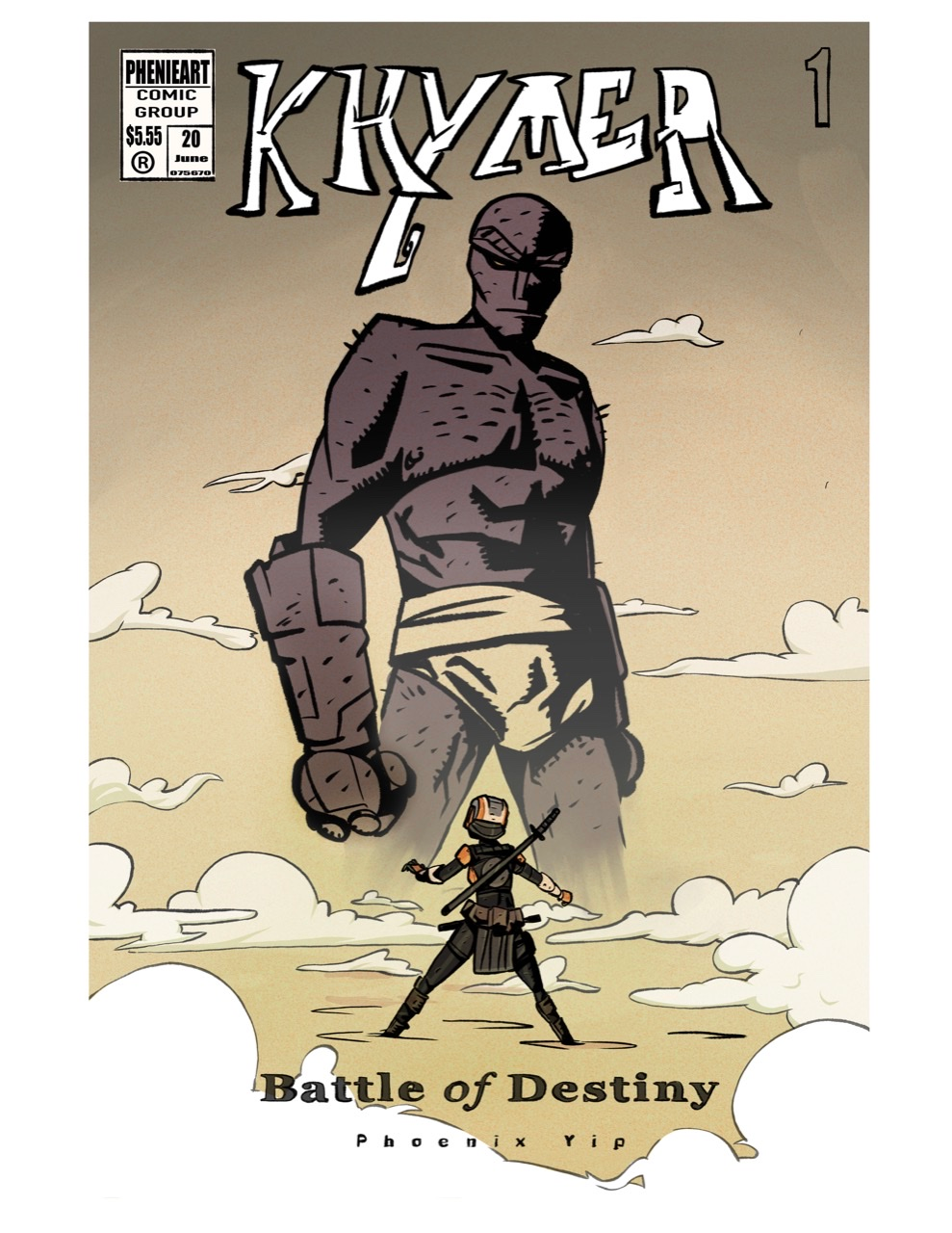
Comic book cover WIP, Critiques encouraged!
-
@Neha-Rawat thanks! Yeah the crotch things a little awkward I agree

-
How’s this look? Do you like the clouds better and is the crotch thing less awkward?
 also how’s the subtitle? I changed it
 -
Much better!
 I really like it!
 -
You made amazing improvements!! I really like this new cover compared to the old one. My only comment is I think you should still say "by pheonix yip" and maybe less kearning on that so it's easier to read. Also, maybe adjust the cloud shape around 'Battle" so it overlaps with the letters just once. It's getting hard to read there too.
