Society of Visual Storytelling

    SVSLearn Forums

    • Register
    • Login
    • Search
    • Recent
    • Tags
    • Popular
    • Users
    • Groups
    • Search

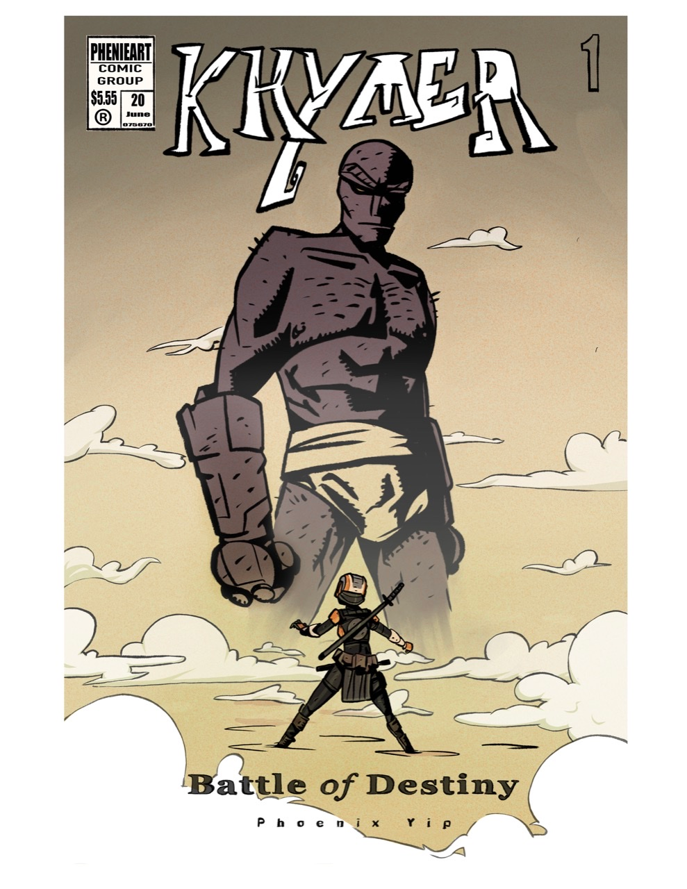
    Comic book cover WIP, Critiques encouraged!

    Projects
    comic composition illustration wip bookcover
    9
    24
    2713
    Loading More Posts
    • Oldest to Newest
    • Newest to Oldest
    • Most Votes
    Reply
    • Reply as topic
    Log in to reply
    This topic has been deleted. Only users with topic management privileges can see it.
    • Eelwick
      Eelwick last edited by

      The anatomy of the figures is really distracting.. maybe they are not supposed to be human, but they have otherwise human features. The character on the right, his ear is way up high on his skull. The purple figure.. I think you brought his lip up to show contempt, but there are lots of other nuances to expression you can use. Right now it looks like that is the structure of his head and itโ€™s odd. The heavy line weight you are using makes it hard to distinguish form from shadow.

      I would study different expressions and head constructions to help build the characters. I agree with the others, I like the palette.

      Erich von Hasseln
      https://ashcop-illustration.carbonmade.com/

      1 Reply Last reply Reply Quote 0
      • phoenix yip
        phoenix yip last edited by

        2244A171-A086-4E0D-B7D6-429B3E63C861.png

        Hey SVS! I made a new cover, Iโ€™ve seen all of your critiques and I completely agree, I hope this is better! Thank you all very much!

        Jacy13 1 Reply Last reply Reply Quote 4
        • Eelwick
          Eelwick last edited by

          This composition works and reads much better!

          Erich von Hasseln
          https://ashcop-illustration.carbonmade.com/

          phoenix yip 2 Replies Last reply Reply Quote 0
          • phoenix yip
            phoenix yip @Eelwick last edited by

            @Eelwick alright! Thanks a lot!

            1 Reply Last reply Reply Quote 0
            • phoenix yip
              phoenix yip @Eelwick last edited by

              @Eelwick 5E15DB44-C21A-4FBA-8E4B-89F111170B10.png 
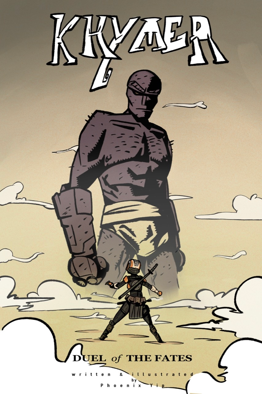
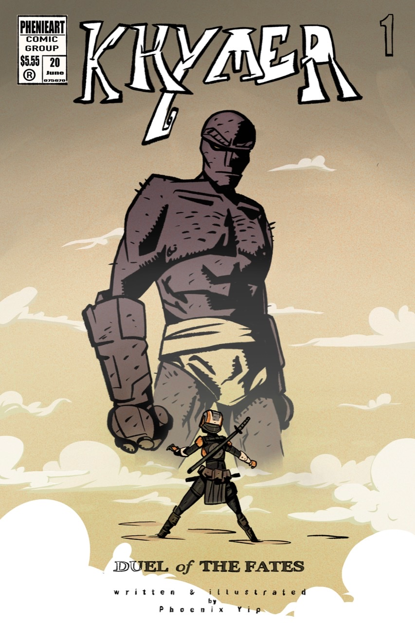
I added some and changed some, is it too busy? Do you like the other one better?

              1 Reply Last reply Reply Quote 0
              • Jacy13
                Jacy13 @phoenix yip last edited by

                @phoenix-yip This looks really cool! This cover has a lot more dynamism and clarity in composition than the last rendition. Great improvement! ๐Ÿ™‚

                Deviantart: https://www.deviantart.com/jacy13
                Instagram: https://www.instagram.com/jacy13draws/?hl=en
                Portfolio: https://jacy13.artstation.com/

                1 Reply Last reply Reply Quote 0
                • Neha Rawat
                  Neha Rawat last edited by

                  @phoenix-yip The second version of the cover is so much better! Great work!

                  I think I'm leaning more towards the version with the linework in the clouds since it goes with the overall look, but reduce the boldness of the lines coz you don't want it to be overpowering the characters.

                  A few suggestions I have:

                  • I'm guessing "Duel of the Fates" is the subtitle, so I think it could be made a little more prominent.
                  • You could consider omitting "written & illustrated by". If there's only one person's name mentioned on the cover, I feel it's sort of implicit that they've created the whole book. It would also give you more space to make your name more prominent.
                  • I can't help but notice that the little dude's head is right up there in the crotch of the giant dude ๐Ÿ˜… Either make him a little bigger or a little smaller.

                  Overall, very well done!

                  https://www.nrbstudio.in/
                  https://www.instagram.com/nrbstudio.in

                  phoenix yip 2 Replies Last reply Reply Quote 0
                  • phoenix yip
                    phoenix yip @Neha Rawat last edited by

                    @Neha-Rawat thanks! Yeah the crotch things a little awkward I agree ๐Ÿ˜‚

                    1 Reply Last reply Reply Quote 0
                    • phoenix yip
                      phoenix yip @Neha Rawat last edited by

                      @Neha-Rawat 0C1D132C-0180-41BF-9AD0-28050413F47A.png

                      Howโ€™s this look? Do you like the clouds better and is the crotch thing less awkward? ๐Ÿ˜‚ also howโ€™s the subtitle? I changed it

                      1 Reply Last reply Reply Quote 2
                      • Neha Rawat
                        Neha Rawat last edited by

                        Much better! ๐Ÿ˜ƒ I really like it!

                        https://www.nrbstudio.in/
                        https://www.instagram.com/nrbstudio.in

                        1 Reply Last reply Reply Quote 0
                        • carlianne
                          carlianne last edited by

                          You made amazing improvements!! I really like this new cover compared to the old one. My only comment is I think you should still say "by pheonix yip" and maybe less kearning on that so it's easier to read. Also, maybe adjust the cloud shape around 'Battle" so it overlaps with the letters just once. It's getting hard to read there too.

                          Check out my art and tutorials :)

                          Instagram: www.instagram.com/carliannecreates/

                          Youtube:
                          https://youtube.com/c/CarlianneCreates

                          Shop: www.carliannecreates.com

                          1 Reply Last reply Reply Quote 0
                          • First post
                            Last post