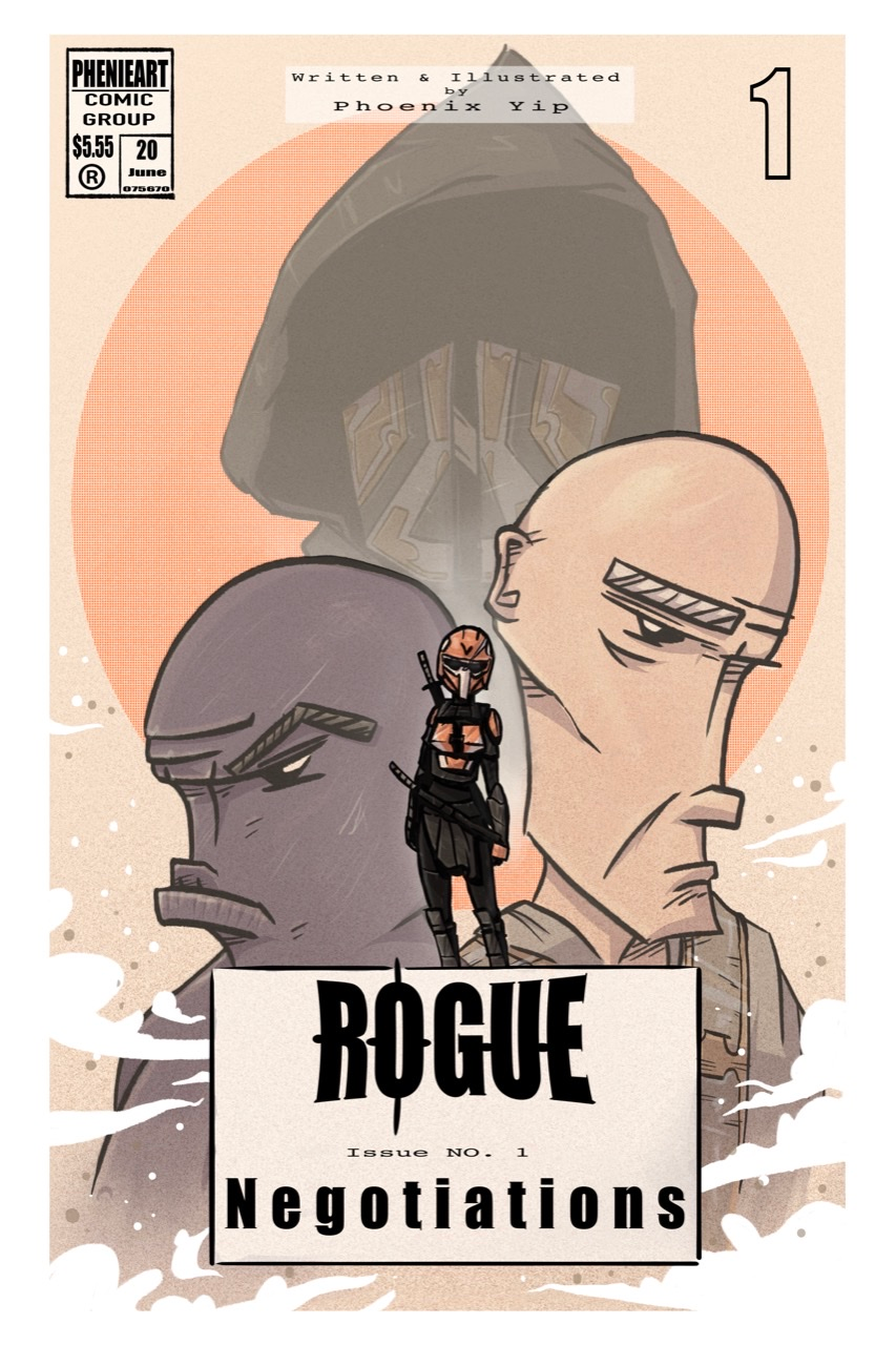
Comic book cover WIP, Critiques encouraged!
-
Ones this look better?
-
@phoenix-yip the guy with shirt addition looks good (it describes his character more) and you added colour to the man in the hood though I liked the hooded man before in the original -more mysterious. Can I ask who is the purple guy? I did actually mean adding some detail to the purple character -unless he is meant to just be purple skinned (and that's fine), that's what I meant by adding markings/accessories/clothes (to that character). But if the purple character is the same throughout carrying nothing, wearing nothing (unless pants which we can't see) etc. and adding would take away from your storytelling, than yeah it's good.
I appreciate you taking my feedback well. I don't have much experience in comic or graphic novel style -I do like some artists.
Instagram: www.instagram.com/heatherboyd.illustration/
Website: https://heatherboydillustration.ca
Shop: https://www.inprnt.com/search/products?q=HeatherBoydIllustration
Ko-Fi: https://ko-fi.com/heatherboydillustrationBe blessed,
-
what is that line coming out frrom under the bottom of white guys ear?
My Drawing Show: https://www.youtube.com/ArtParlor
Instagram: https://www.instagram.com/frostdrive/ -
@Heather-Boyd yeah, he is shirtless throughout the whole story, thanks you!
-
@Frost-Drive I was attempting to express the absence of light using a method of hatching
-
Love the textures and the color palette! The only thing that I'm iffy about is how you've done the title and credits in the boxes. It's tough for me to critique, because I'm not a graphic designer. First, my instinct would be to take the top credits and move it down under the title. You have a cool, simple graphic thing going on at the top, and it loses a bit of the impact having the credits there. Have you played with other options when it comes to how the title is handled? I wonder what it would look like if the girl character was standing on a landscape element, building, or spacecraft and you had the title over that, without a box.
-
I am going to be completely honest with you, apologies if it sounds harsh, please do not take it personally. If I saw this cover on a comic book I wouldn't buy it. Not because it looks bad or anything, the color palette is actually your strong suit it seems, but because it tells me nothing about whats going on inside. You have 3 grumpy faces behind a masked character standing upright. All this tells me is this is a comic with 4 characters in it. Maybe it's got some madmax vibes/desert star wars vibes because of the color palette but that's about it.
It also has the word "negotiations" on it, which doesn't sound exhilarating in any way.
Give me more!
-
The anatomy of the figures is really distracting.. maybe they are not supposed to be human, but they have otherwise human features. The character on the right, his ear is way up high on his skull. The purple figure.. I think you brought his lip up to show contempt, but there are lots of other nuances to expression you can use. Right now it looks like that is the structure of his head and it’s odd. The heavy line weight you are using makes it hard to distinguish form from shadow.
I would study different expressions and head constructions to help build the characters. I agree with the others, I like the palette.
-
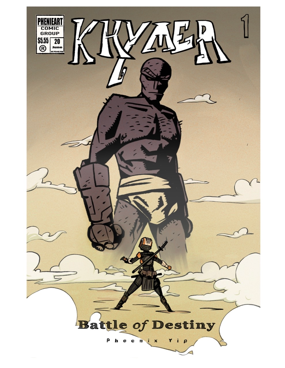
Hey SVS! I made a new cover, I’ve seen all of your critiques and I completely agree, I hope this is better! Thank you all very much!
-
This composition works and reads much better!
Erich von Hasseln
https://ashcop-illustration.carbonmade.com/ -
@Eelwick alright! Thanks a lot!
-
@Eelwick
 I added some and changed some, is it too busy? Do you like the other one better?
 -
@phoenix-yip This looks really cool! This cover has a lot more dynamism and clarity in composition than the last rendition. Great improvement!
")
-
@phoenix-yip The second version of the cover is so much better! Great work!
I think I'm leaning more towards the version with the linework in the clouds since it goes with the overall look, but reduce the boldness of the lines coz you don't want it to be overpowering the characters.
A few suggestions I have:
- I'm guessing "Duel of the Fates" is the subtitle, so I think it could be made a little more prominent.
- You could consider omitting "written & illustrated by". If there's only one person's name mentioned on the cover, I feel it's sort of implicit that they've created the whole book. It would also give you more space to make your name more prominent.
- I can't help but notice that the little dude's head is right up there in the crotch of the giant dude
 Either make him a little bigger or a little smaller.
Overall, very well done!
-
@Neha-Rawat thanks! Yeah the crotch things a little awkward I agree

-
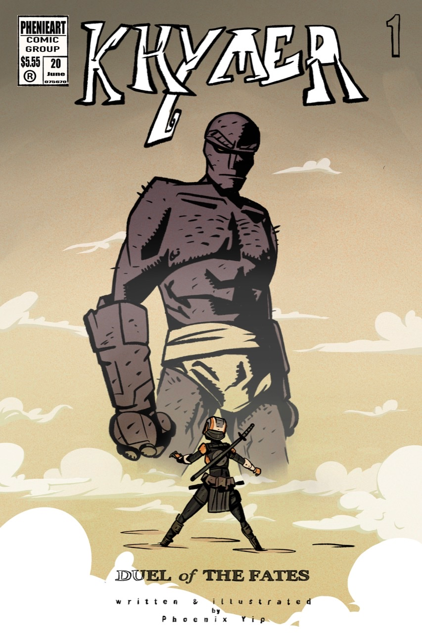
How’s this look? Do you like the clouds better and is the crotch thing less awkward?
also how’s the subtitle? I changed it -
Much better!
 I really like it!
 -
You made amazing improvements!! I really like this new cover compared to the old one. My only comment is I think you should still say "by pheonix yip" and maybe less kearning on that so it's easier to read. Also, maybe adjust the cloud shape around 'Battle" so it overlaps with the letters just once. It's getting hard to read there too.