Society of Visual Storytelling

    SVSLearn Forums

    • Register
    • Login
    • Search
    • Recent
    • Tags
    • Popular
    • Users
    • Groups
    • Search

    Feedback for a new illustration

    Artwork
    15
    26
    1447
    Loading More Posts
    • Oldest to Newest
    • Newest to Oldest
    • Most Votes
    Reply
    • Reply as topic
    Log in to reply
    This topic has been deleted. Only users with topic management privileges can see it.
    • Melissa_Bailey
      Melissa_Bailey last edited by

      Beautiful palette and landscape! It leads you right into the illustration.

      As everyone else has said, if you're trying to show a ruined carnival, the roller coaster should stay in, but perhaps make it fade into the background just a bit more? It does draw the eye.

      And as others have said, my eye doesn't know where to focus. The one character's legs stand out because they're such a light color, but her top half blends into the tree, making her difficult to read. And I didn't even see that there was more than one character until it was pointed out in the comments!

      Is the landscape intended to be the focus? Or are the characters? If your characters are helping tell the story of what's going on in this illustration, I would suggest making them stand out more. Perhaps with value, color, lighting, or a mix of all three.

      This is a really beautiful piece! Looking forward to seeing it finished!

      illustrator - author - smiley person
      mbaileyart.com
      instagram.com/mbaileyart/

      1 Reply Last reply Reply Quote 1
      • Adam Thornton 0
        Adam Thornton 0 @Freya Chakour last edited by

        @Freya-Chakour Hi Freya,
        Yes, I understood perfectly. Thank you.

        To help you further, may I recommend Marco Bucci's videos. He explains values, edges and light very well. Here is the link to a short YouTube video where he briefly explains: https://www.youtube.com/watch?v=BTYGWfiZnMA&ab_channel=MarcoBucci

        If you can get hold of Marco's Art of Colour and Light course, it is excellent! I completed it recently and it has helped me immensley.

        Best wishes,

        Adam

        1 Reply Last reply Reply Quote 1
        • Judy Elizabeth Wilson
          Judy Elizabeth Wilson SVS OG last edited by Judy Elizabeth Wilson

          I like where this is going. I love the atmosphere. I would like to see the background edges blurred a bit, to have less focus and then more focus on the edges of the characters and foreground. I feel like the left side of the piece is heavy with interest and and right not so much so, so add in a point of interest to the right side, maybe a magical animal exploring the ruins or their pet. Also check levels like the guys have said above. Really like this piece and hope this is useful!

          Website http://www.judyelizabethwilson.com/

          Instagram https://www.instagram.com/judyelizabethart/

          Sharing positivity through art.

          1 Reply Last reply Reply Quote 1
          • ?
            A Former User last edited by A Former User

            as a bunch of people already mentioned, it lacks focus since everything is sameish in term of value and saturation.
            here a quick overpaint to show in which direction you can push things. desaturated background, bringing the blue from the sky into the shadows in the forgeground. some sharpening/blur and light changes. you already played around with that image a lot so keep pushing it and try to differentiate things more. its digital, you cant break anything as lon as you have a backup 😛

            left original - right overpaint - click to see full size
            alt text

            1 Reply Last reply Reply Quote 2
            • Freya Chakour
              Freya Chakour @APHOTICMOTH last edited by

              @CLCanadyArts @HeatherBouteneff @jenithornhill @Thestyledare-Singh @Melissa-Bailey-0 @Judy-Elizabeth-Wilson

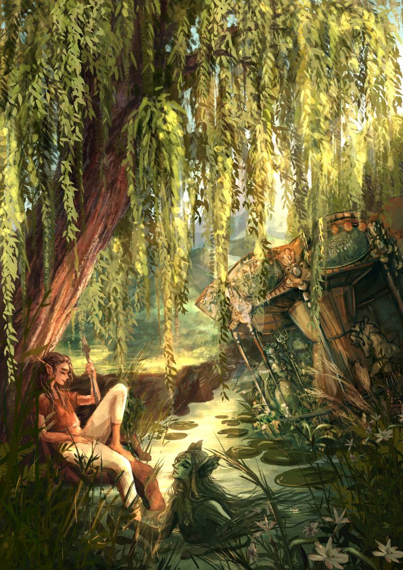
              First of all, thank you all so much for your feedback! this is really so helpful and so interesting to read how the piece is received so far and where the problems may lay. it helped me realize that its really difficult to navigate through the piece. also that the lines of the rollercoaster and the slightly tilted carousel make a super strong focal point in a place where nothing happens and its also the middle of the paper as well as the point where the river is going and parting the mountains. also I realized that I kind of divided the composition into a left and a right half.
              I tried out lot of changes, and came up with a new approach. sadly I had to remove the rollercoaster, because even smaller or more faded it leads the eye very strongly, as the only very industrial thing in the piece, to a point where I didn't want the viewers to look.

              so I made the scene a bit smaller, a bit more intimate I hope, and changed the oak into a big willow tree, also I added way more diagonal lines, and tried to fill up the middle of the piece a bit more.

              @miranda-hoover thank you so much for all of your ideas, I loved the one with the lantern, im thinking of creating a second piece in this direction, maybe a night or evening setting with lots of blues, and the rollercoaster, like a mini series with these characters or this world.

              @James-Toogood @Molambo thank you both a ton for your draw overs! I appreciate it very much and found it super helpful to see!

              https://www.instagram.com/fyra.c/
              Portfolio: https://www.artstation.com/fyrac

              1 Reply Last reply Reply Quote 0
              • Freya Chakour
                Freya Chakour last edited by

                A lot of changed later... this is where I am right now with this piece, I hope very much I could improve some of the points that where difficult about the former version and that it read better now.
                Would love to hear what you think.
                small - das karussel Kopie.jpg

                https://www.instagram.com/fyra.c/
                Portfolio: https://www.artstation.com/fyrac

                APHOTICMOTH HeatherBouteneff 2 Replies Last reply Reply Quote 6
                • APHOTICMOTH
                  APHOTICMOTH Moderator @Freya Chakour last edited by APHOTICMOTH

                  @Freya-Chakour Oh, this is a nice start. Could be a nice book cover.Really beautiful.

                  All my links: https://APHOTICMOTH.carrd.co/

                  1 Reply Last reply Reply Quote 1
                  • ?
                    A Former User last edited by

                    in term of readability and composition i think its better than the previous one.

                    1 Reply Last reply Reply Quote 1
                    • HeatherBouteneff
                      HeatherBouteneff @Freya Chakour last edited by

                      @Freya-Chakour great job! The lighting is so lovely especially the willow

                      1 Reply Last reply Reply Quote 1
                      • Freya Chakour
                        Freya Chakour last edited by

                        @CLCanadyArts @HeatherBouteneff thank you so much for your feedback :3 it is greatly appreciated and helped me a lot to hang on to this piece and finish it! I will post the final in a moment (still need to do some test printing and sometimes after seeing the print I go back and change a few things here and there, but for now I am happy with the result)

                        https://www.instagram.com/fyra.c/
                        Portfolio: https://www.artstation.com/fyrac

                        1 Reply Last reply Reply Quote 2
                        • Freya Chakour
                          Freya Chakour last edited by

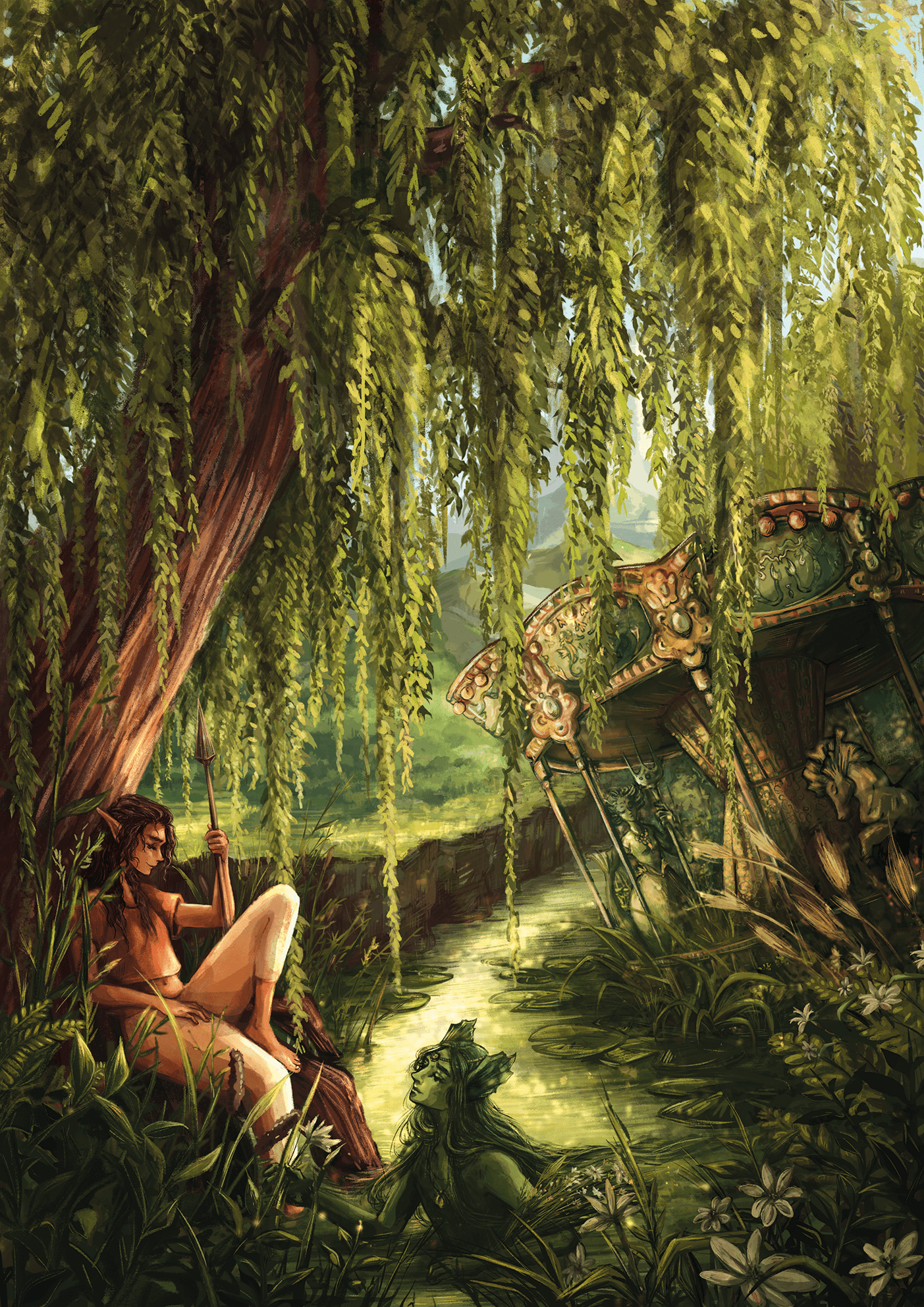
                          soo that's the final! it was definitely a challenging piece for me, but also I learned a ton. Thank you all again for your feedback!
                          Unbenanntesby the lake small_Projekt 58.png

                          https://www.instagram.com/fyra.c/
                          Portfolio: https://www.artstation.com/fyrac

                          KayPotter Jacy13 carlianne 3 Replies Last reply Reply Quote 6
                          • baileyvidler
                            baileyvidler last edited by

                            @Freya-Chakour This is gorgeous!! The textures and colors are magical.

                            Bailey Vidler
                            Portfolio: baileyvidler.com

                            1 Reply Last reply Reply Quote 0
                            • KayPotter
                              KayPotter @Freya Chakour last edited by

                              @Freya-Chakour
                              So beautiful, and makes me want to know more for sure. It was great to see your process and edits!

                              1 Reply Last reply Reply Quote 0
                              • Jacy13
                                Jacy13 @Freya Chakour last edited by

                                @Freya-Chakour Amazing work! The colors are just perfect 😃

                                Deviantart: https://www.deviantart.com/jacy13
                                Instagram: https://www.instagram.com/jacy13draws/?hl=en
                                Portfolio: https://jacy13.artstation.com/

                                1 Reply Last reply Reply Quote 0
                                • SheerArt
                                  SheerArt last edited by

                                  Awesome!

                                  1 Reply Last reply Reply Quote 0
                                  • APHOTICMOTH
                                    APHOTICMOTH Moderator last edited by

                                    It turned out so nice! Is the water nymph picking a bouquet for the elven girl? ❤ I love it.

                                    All my links: https://APHOTICMOTH.carrd.co/

                                    1 Reply Last reply Reply Quote 0
                                    • carlianne
                                      carlianne @Freya Chakour last edited by

                                      @Freya-Chakour you did such a fantastic job applying the feedback! It looks great ❤️

                                      Check out my art and tutorials :)

                                      Instagram: www.instagram.com/carliannecreates/

                                      Youtube:
                                      https://youtube.com/c/CarlianneCreates

                                      Shop: www.carliannecreates.com

                                      1 Reply Last reply Reply Quote 0
                                      • Freya Chakour
                                        Freya Chakour last edited by

                                        @baileyvidler @KayPotter @Jacy13 @SheerArt @carlianne thank you so much for your kind words! I apprechimade your words, feedback and support a lot!

                                        @CLCanadyArts Thank you so much! Yeah I imagined something like that, I also had this idea that they are living somewhere in a house half underwater, half above the sea level, in a kind of shared apartment situation, that I hope to explore in a future illustration : )

                                        https://www.instagram.com/fyra.c/
                                        Portfolio: https://www.artstation.com/fyrac

                                        1 Reply Last reply Reply Quote 2
                                        • First post
                                          Last post