Jadis White Witch Thumbnails
-
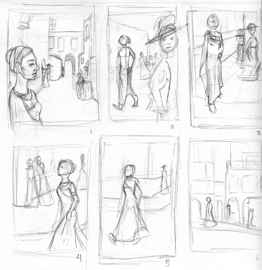
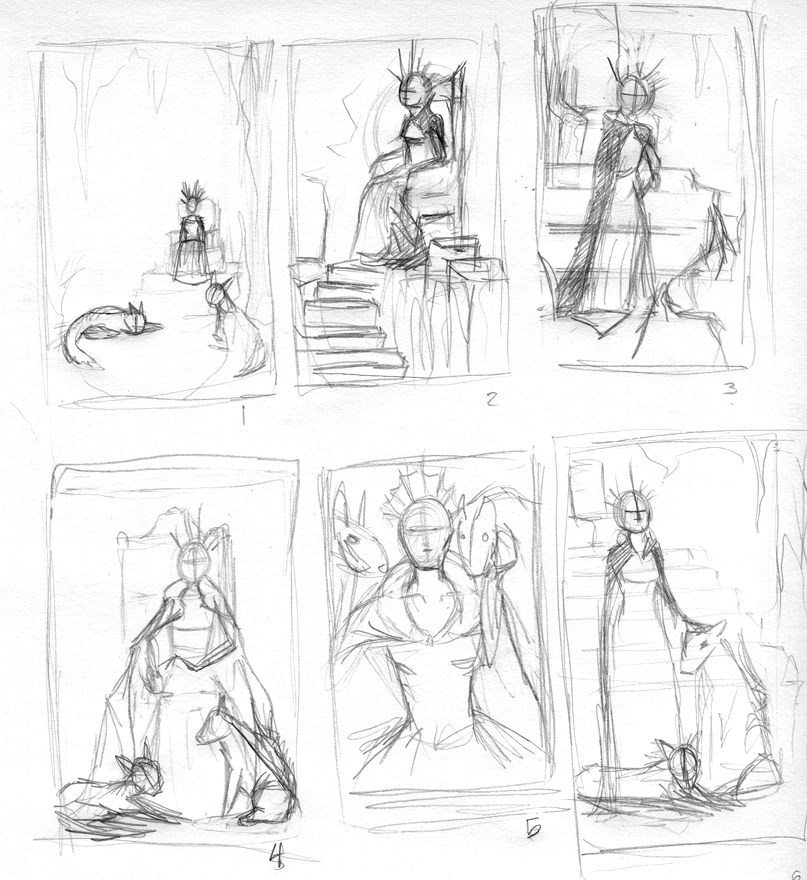
Hello everyone. I'm working on some portfolio pieces of Jadis the White Witch from C.S. Lewis' Narnia series. I want to do 1-5 pieces with her as the subject and have created 12 thumbnails trying to get an idea of where I want to go with this project. Initially I wanted to do one piece of her in England from the 1st book and then another piece of her in her thrown room with wolves (secret police) around her from when she is in Narnia. I'm not sure if 2 pieces would give a completed feel to the project OR if I should have 3 pieces to round it out OR if I should simply stick with one solidly done image.
Feedback on the project as well as the thumbnails would be appreciated.
This set of thumbnails are of different angles of Jadis and the reactions of Londoners around her as she walks in her Romanesque outfit. I thought it may be fun to capture the various reactions to her outfit, size, and attitude. I'm leaning more toward 1, 2, or 4.
Various views of Jadis in her throne room with her wolves. I'm leaning more toward 1, 4, or 5.
-
@laurencrest I like 4 for each one. In the first set she's 'front and center' per say as the focus and you can see the reactions in the back, gives that I don't care type of feeling with her head up too.
In the second set it is a good compromise I feel to show her and some of the throne and wolves. Although 6 in the second set could be a nice fantasy style painting.
You could do a couple from each having a more establishing shot type followed up by a close up.
-
For the first set I like #1 and I like #3. The second set I think is really strong I like something about all of them. But my favorites are #1, #3, and #4. I think it would be great if you did three different images telling the story.
-
@Rich-Chabot Thank you for your feedback. I've started getting ideas about having a closer/portrait type of shot as well as some of the action scenes to try to balance it out. I
@evilrobot
Thank you for your comment and your note of preferences. To clarify your comment and to make sure I understand it, do you mean three different images to tell the story of each setting/book or three images total for the portfolio project? I could easily do three from the first book (Jadis when they found her at the table of monarchs, her in London at some point, and her when they travel accidentally to Narnia) but I'm a bit stumped about what I'd do about scenes from the second book since they aren't as varied (at least not in my memory). I'm in love with depicting her Narnia persona since it finalizes up what she became so I'd definitely like to include at least one image of that, if possible.
-
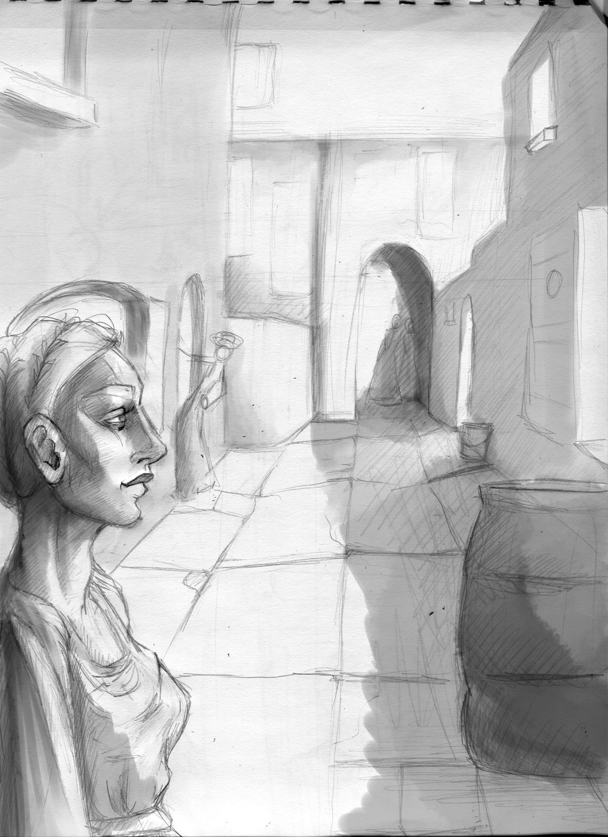
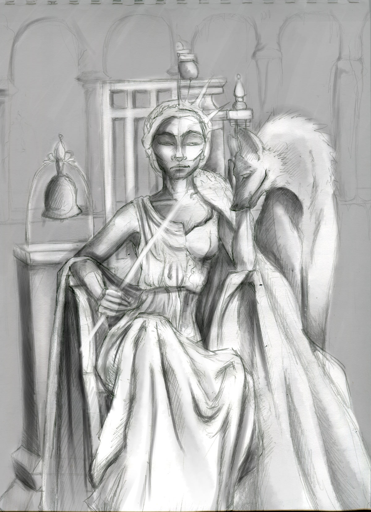
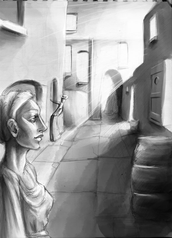
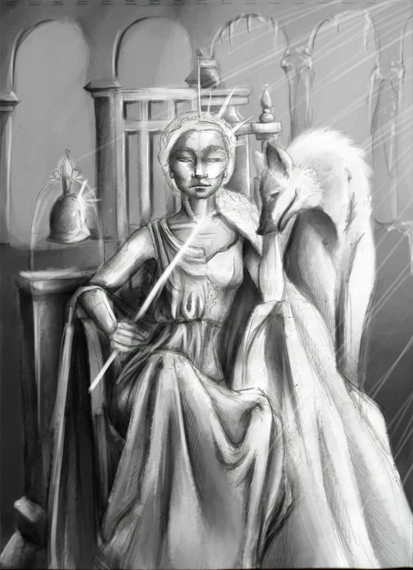
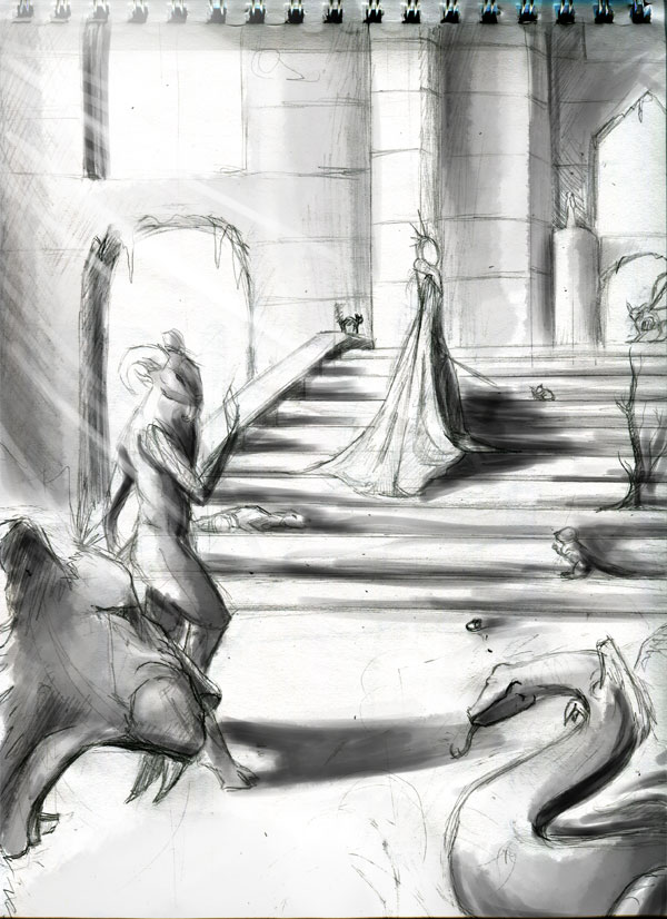
It took quite a long time (and double the amount of thumbnails) to decide on the three final images for this portfolio piece. The images will show Jadis in London, a portrait of her in Charn/Narnia to show her two ruling sides, and one in her courtyard in Narnia.
I'm not the happiest with the picture with her in London. It probably will look better with more details added to it, better lighting worked out, and the facial expression improved. Hopefully that should fix the stiffness in that image. Critiques, comments, or paint overs of any of the pieces are welcome.
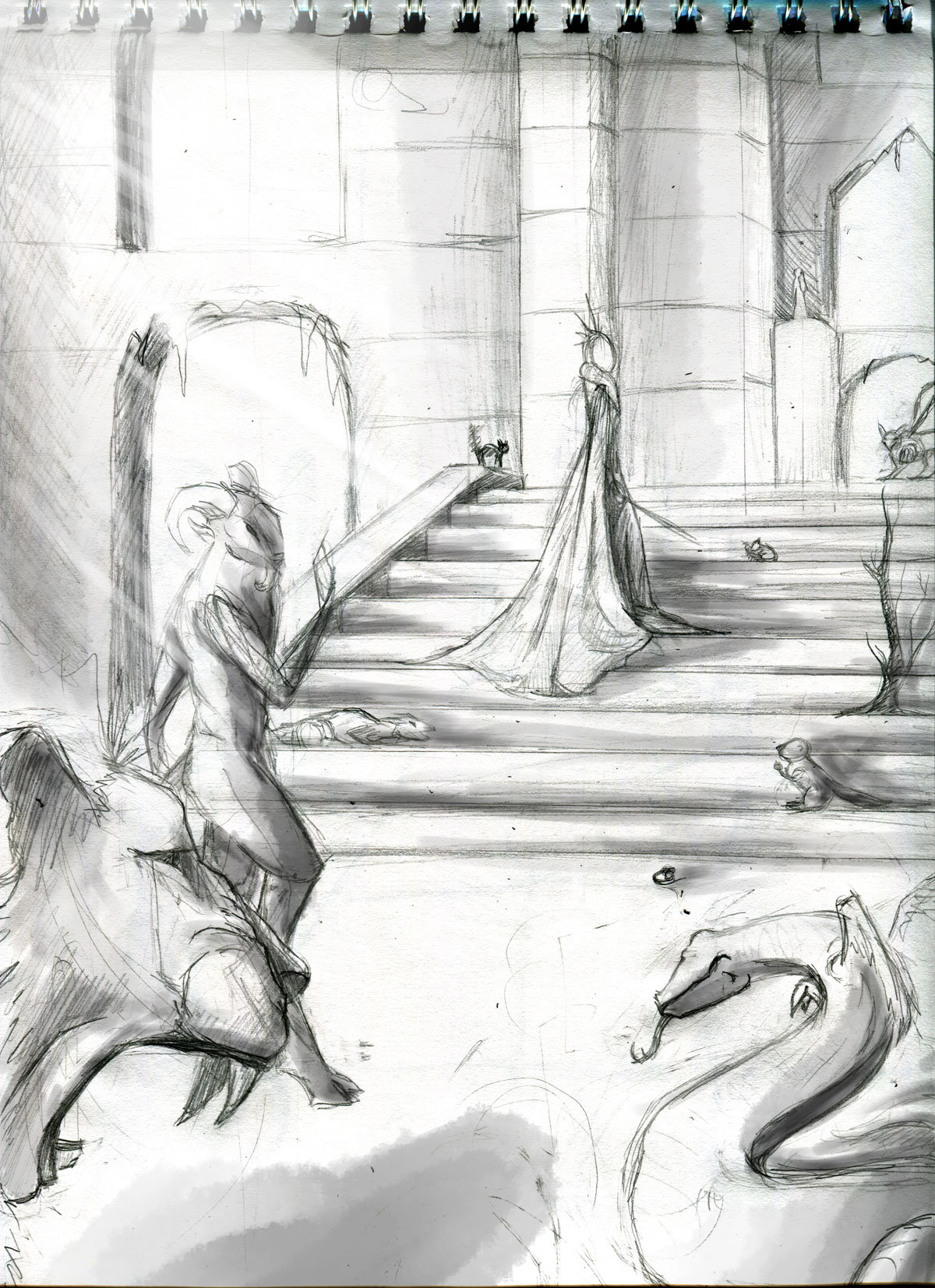
-
I wasn't too sure of the London scene but after working on the lighting of all three pieces more I feel they work well together after all. I'm going to start drawing these on nicer paper and will use the reference images and these studies to base the final images off of.
Suggestions are always welcome.

-
I like the last image a lot. The second image I think might be more effective if the composition wasn't dead center. I'd turn it to a 3/4 view and put her head in the first intersecting third and bring the wolf down more towards her waste. The first one is not quite working. It almost seems like you need another element to bring it together. Something in the middle on the opposite side of where the woman is coming out of the door. Also that woman coming out the door is taking a lot of attention away from the main character. I'd bring the main character out into the scene more. Also the top part of the image is all dead space. You may want to explore a different view that allows you to use more of that space if you need to keep those image dimensions.
-
@evilrobot Thanks for your feedback! Since I've already started on the second piece in pencil I'll work on what I can change (mostly the wolf at this point) and keep the suggestions in mind for future pieces. I initially choose to have the composition centered because I wanted to emphasize the starting and ending point for this character and wasn't sure another composition would highlight the differences as well as a centered comp. In the future I'll try making it less balanced and more dynamic.
I agree the first image is still super rough. I think I'll see about adding kids in the alley way to take up some of the space and move the main character as well. There does seem to be a lot of dead space in the first image. I didn't notice it before. I'll have to see what I can do to fix the composition and the blank space.