Critiques wanted for my WIP! Thank you.
-
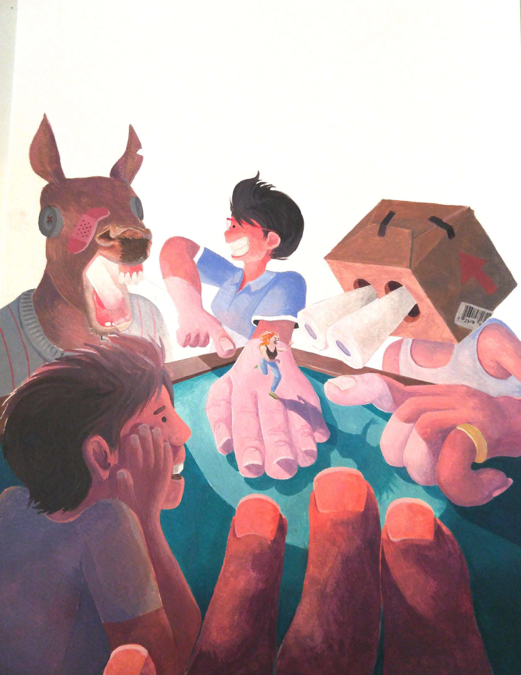
Hi there! I'd like some help with a personal illustration. What are your thoughts about this one?
Aside from the fact that I want the background to be dark, there's not much else I have planned. Should it be simple or complicated, and should it be structured or more organic? Thanks so much!
-
@box-head I like it. It's dynamic and interesting. However I am not sure about red hand in the front. It's grabbing a lot of attention. If it's digital illustration, maybe consider getting rid to give the lady some space to run? If it's traditional try to take some red off. Anyway, it's cool and smth different
")
-
@aska Thanks so much for your critique! I think I'll try to take some of the red off the hand.
-
I'm not even going to ask what the story is for this

I second what was mentioned about the red hand as you are using complimentary colors and a strong red on that green will be the focal point. If the story allows it I would have the mini woman on the table rather than on the hand as she gets washed out by the pinks. Also the person holding her is looking at something to the side, but considering his.... friends (?) are all around him i'm curious as to what he is looking at.
-
I'd love to know the story that goes with this picture
I think it looks pretty good! Like the dyanamics and it really has my interest. I might make the little dancer a little darker so she stands out more. The outside images are brighter and she is a bit faded in comparison. I think id she were a bit darke and crisper against the bright light it would draw the focus in on her more.Marsha Ottum Owen
-
@gary-wilkinson Thank you very much for your critique! I completely agree that the tiny woman is being washed out by the hand, but it'll be a little hard to have her on the table, since I've done this in watercolour. I was wondering if you have any other ideas or advice to help make the woman pop? I was thinking maybe the hair could be darker - would that work?
On a side note, your work is amazing -
@marsha-kay-ottum-owen On the outside, it's a story about a girl who wakes up one day to find herself in a tiny body, causing all types of trouble. But it's supposed to reflect the self conciousness one may feel during their coming of age. I'm not sure if I'm sticking with this idea, though. Thanks for asking!
-
Interesting concept! I love the colors. I love the texture. The thing I have an issue with is the arms. Are they supposed to be huge or are the huge because of perspective. If it is because of the perspective, I think you need to work on that more. Seeing this is a handmade piece, I suggest you leave this one be. It's amazing as it is and just strive to do better in your next artwork. I hope this helps!
Portfolio: nyrrylcadiz.com
Instagram: https://www.instagram.com/nyrryl_cadiz/
YouTube: https://www.youtube.com/channel/UCbJCF1Im8ZO7hpGWTKOJMuA -
@box-head Thanks for telling
I added a little more to my response as I took a better look at it. It's a lot of fun -
@nyrryl-cadiz Thanks for your critique! I'm not going to lie, I'm not sure myself if I was going for perspective or if the characters originally had big hands - I just knew I wanted to have some funky proportions! These things usually don't cross my mind so I'm very glad you brought it up
Definitely going to consider these factors for my future pieces though. Thanks! -
@box-head You're welcome! I really like your work. I can't wait to see more.
-
@marsha-kay-ottum-owen I think that's exactly what I'm going to do! Thank you
-
@box-head Thanks Box-Head, i'm glad you like my work

As for making the woman pop out. You could give her more contrast and if you make the cast shadow a bit darker, especially around the point of origin then it might help "ground" her a bit more
-
@gary-wilkinson Thanks so much!