TRASHED - Bologna Children Book Fair Project
-
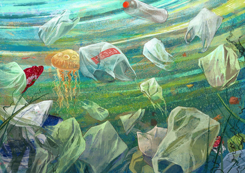
@smceccarelli - I'm really loving the emotion the 2nd image evokes. Haunting, sad, and desolate. (Color is on point) It's almost hard to look at (in a good way.) It did take me a minute to find the turtle, so if that is what you were going for, thumbs up! I think having similar pops of the same orange as the turtles
shell, draws your eye to many areas of the image. -
These images are so powerful to me. Their theme seems to be deepened by the way that the animals don't instantly stand out. I was so moved by them that I showed them to my husband. The way they are now seems very impactful and affects the mind in the way that the dizzying amounts of trash in the oceans do in reality. That's my reaction anyway. Thanks so much for sharing these...
-
@adriana-bergstrom Good points and yes - I think I should increase the “underwater” feeling of some of the elements and those two will be the first candidates.
This was my first experience in printing and I dared it because I only needed it for the backgrounds. You basically make a large batch of flavorless jelly-o (but you use more gelatine to water than you would normally) and make it settle in plate form (I used an oven pan). Then you can roll any water-based color on it and press a sheet of paper on top to transfer it. Because gelatine is soft, you don´t need tools to make the paper lift the color properly.
That is....the theory - there are a lot of tutorials and it seems to produce good results. My gelatine plate, however, kept breaking (I probably didn’t make it firm enough) and become unusable very fast. So I dag out a piece of foam core board from my stock and went on with that one. The color transferred well and I got the effect I wanted (randomly mixing stripes of colors with lots of texture). So maybe I should say “acrylic printing with gelatine and random art materials” rather than “acrylic gelatine printing” ;-)) -
No 3 - not quite finished yet - there are a couple of ellipses to correct and maybe some color balance....
-
@smceccarelli Really Nice!!
-
I just want to chime in here and say that your preliminary sketches are SO solid @smceccarelli. I really endeavor to put more thought and effort into mine.
-
@smceccarelli i love number 3. All the textures just adds to the feeling that the scene takes place at the beach. The colors are amazing as always.
-
@smceccarelli
For me, the concept on the first one and the perspective on the last one are really great! -
These are so good! I am glad to see these from drawing to finished painting. Thank you for posting. Excited to see the rest!
=)x -
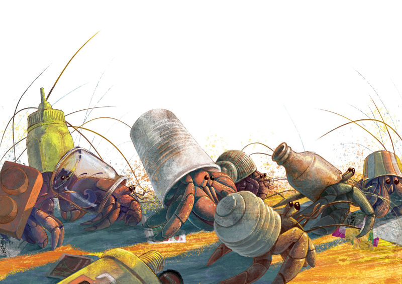
No 4!
-
These are amazing and heartbreaking! Who knows how our beach friends are fairing with the damage and trash from the hurricane too. They are really thought provoking. Images like these can help to make us better at cleaning up behind ourselves!
-
I thought I had already commented! Just wanted to say that I love these! I don't know much about composition but I'm very interested in it at the moment and I think they look great
")
-
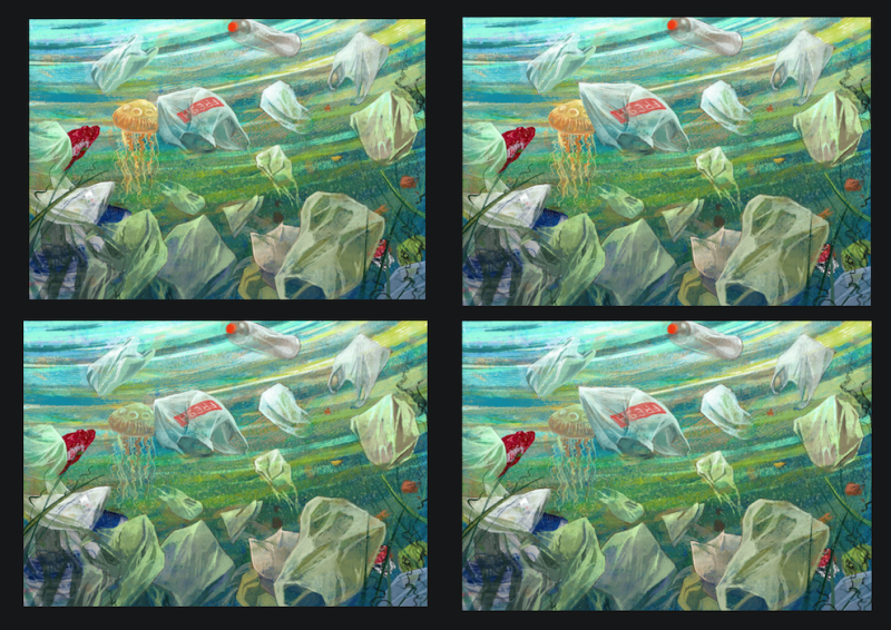
@smceccarelli This looks great! One thing that may be an issue (unless it is just me) is that i feel like the jelly fish Is coming forward and that my eye gets pulled very strongly to the vertical line where the bag and the jellyfish meet - it is hard to pull away from that spot for me - i am wondering if it is the vertical line amongst the strong diagonals or possibly the saturation of the jellyfish next to the bag - i did a quick thumbnail to show what i was thinking - in the first one the only change is i painted out the ghost image of the second jellyfish to the left of the jellyfish to see how that looked - in the second i changed the bag line to diagonal and in the 3rd and fourth i did the same but with desaturating the jellyfish to see what that might do - i think for me, overall, the diagonal bag edge does the trick and lets my eye move freely around with or without the saturation being changes - really nice piece
-
Excellent suggestion @Kevin-Longueil !! I’ll definitely edit that as you suggest!
-
Number 5!
Now tweaking and correcting all before printing and shipping...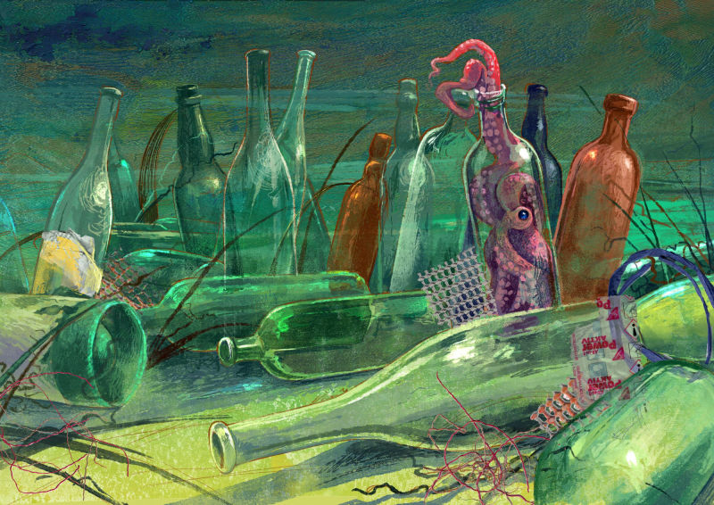
-
Wow, very cool! This reminds me of a forest of bottles!
-
I just noticed, the bottle right next to the octopus one is exactly the same height and the end part messes with the silhouette of the octopus - maybe I'd make that bottle smaller to free its silhouette?
-
@smceccarelli I particularly like this one. The pink octopus is such a charming focal point! Ness has a point about the adjacent bottle, though. At least from a distance, there's something tangent-y about it. Should be easy to fix, though. (I know, easy for me to say.)
In bocca al lupo per Bologna!
-
@lauraa I do hope I get in this time...but at only 3% selection rate, it's a tough call! Are you coming again this year?
-
@smceccarelli I haven't decided yet. I don't really have a portfolio put together still (making progress but still having some problems with environments), so I was thinking about skipping this year and hopefully coming back next year all ready to go. But who knows---I like to take short trips and may change my mind!
I found the exhibit selections this year very interesting, but not particularly children's book oriented, even in the European sense. I guess part of their purpose is to stretch our visual imagination. Yours seem conceptually interesting, but still what I can imagine seeing in a book for an actual child, so I really hope you make it!