Paddington book cover - thoughts?
-
@hannahmccaffery I really love all about your design. Just one thing bothered me - the paw - it looks a little like pig's hoof. I cant wait to see it finished.
-
@nyrrylcadiz thank you!
")
@Claudi thanks so much!
@NessIllustration thank you for your kind words Vanessa, that's really made me feel less anxious about the whole thing haha! Yes maybe it is a little bit too crowded for a book cover, what would you remove? I tend to get a bit carried away so I don't know when to stop adding detail haha!
@Dima-Eichhorn thanks so much! Oooh yes well spotted, haha it really does look like a little pig hoof, i'll be changing that later thank you
-
@hannahmccaffery I wouldn't remove a single thing! I'm kind of anxious about over-crowding illustrations myself and tend to over-simplify out of fear of having this problem. Even on the cover of my children's book, the designer had to ask me to add stuff cause I went so minimal hahaha... Your illustration reminded me that a lot of details can work VERY well if well planned like it is here, and like someone else mentioned the kids love when there are a lot of fun details to look at! It's just harder to do, but you SLAYED it here!
-
@NessIllustration Thank you!!!
 Your illustrations never look too minimal to me, they're just the right amount and you make them so beautiful with your wonderful use of colour, plus sometimes minimal is better in some illustrations!
 -
@hannahmccaffery This looks great! I love the expressions and action in the characters. It’s hard to tell how the additions in red will read once they are rendered, but it looks like it may be too busy if all are included. The sign is fantastic, and the bird sitting on it is perfection!
-
@inkandspatter Thank you! Yes maybe it will look a bit too cluttered once i've drawn the extras out properly, i'll post an update on here once I've done it to see what everyone thinks
My idea was if the people and background were all just one colour (well different shades of one colour like the example i mentioned) then it might not be too busy, but i'll try it and see how it looks -
@hannahmccaffery they might not stand out so much if they are toned down anyhow
-
Hey @hannahmccaffery
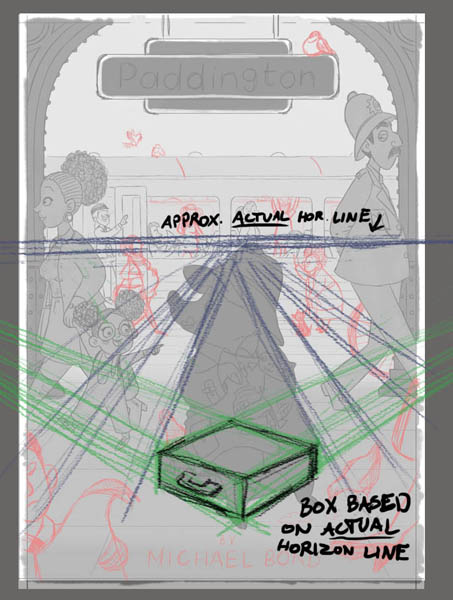
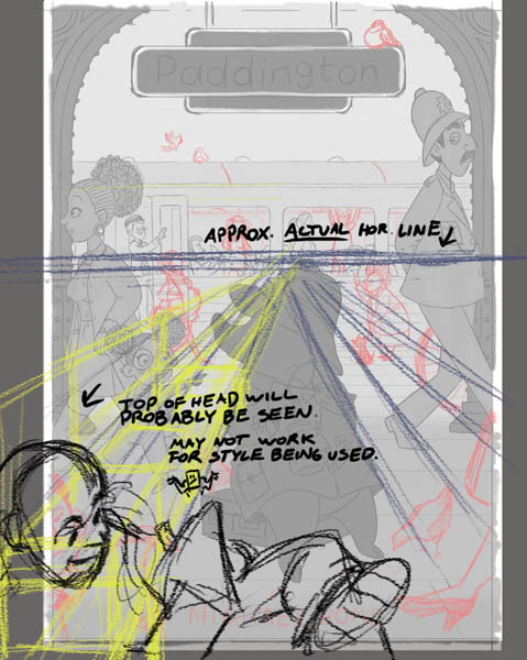
This is a great start. I like how you spent a little time on a few of the other characters. It's like they each have their own stories they we may not get to read. (Is that a waving dog? )One thing that bothers me is the perspective. It looks like 3 different horizon lines are being used here. One for everyone at Paddington's eye level and above, one for the suitcase, and one for the passenger below (and possibly for passenger's foot?).
If you were in a room (with lots of stuff in it) and looked straight ahead, your eye line would be the horizon line. It wouldn't just be the horizon line for what you were looking at. It would be the horizon line for everything you see at that moment. So every object would have vanishing points on that single horizon line. Using several horizon lines can work in some situations but I don't think it's working here.
Having said all of that, I really like where this is going.
I did some draw overs to help illustrate my concerns.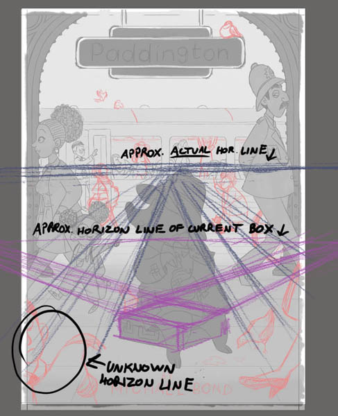
-
@demetrius thanks so much for taking the time to do those draw overs for me and for your detailed reply
You’re right about the suitcase and guy in the foreground and the horizon line, I didn’t even think about that! I’m not 100% how I can apply that to the people in the background, do you mean that they should look more 3D or that I should angle them more so they’re not all profiles?
Thanks again, really appreciate the feedback -
@hannahmccaffery No problem
The woman and daughter, the police officer, and everyone near/on the train all look as if they exist in the same space. For the look I think you're going for, I think they look ok as is. It was just the suitcase and bottom left person that looked out of place.
-
@demetrius Ah okay then, i'm in the middle of fixing the suitcase now and i'll work on the man too, thank you
maybe once i add colour the people in the background won't look at though they're in the same place -
@hannahmccaffery Really like your cover design. The policeman's sideway glance and the little girl pointing are a nice touch. One note I do have is that I feel like the title is a bit small. Almost insignificant to the cover. I was a commercial artist/Art Director for 20+ years and I'm pretty sure a publisher would want that title bumped up in size a bit. Otherwise, looking forward to the final art.
-
It’s looking really good
-
@Susy-Barton-Garner I was kind of worried about that too to be honest so I'm glad you've mentioned that it bothers you too, so i'll definitely look at it and make it much bigger
thank you -
Hey everyone!
Thanks so much to those who have given me all the brilliant feedback, I've really appreciated it and it helps so much!
Here's a little update on the piece, i've made the title bigger like you suggested @Susy-Barton-Garner and you're right it looks much better, I know it should probably be even bigger but i'm worried about ruining the composition
I think i've managed to adjust the suitcase and foreground @demetrius , i can see where you were coming from now so thank you!
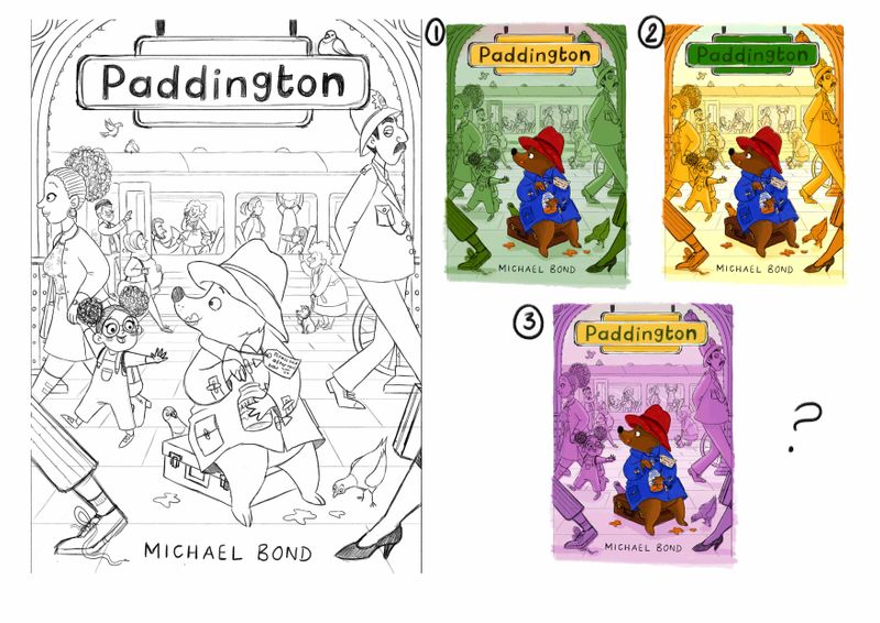
Hopefully his paws don't look like pig hooves now @Dima-Eichhorn ? haha! And I fixed the little girls gaze direction @MichaelaH thank you again I've done some quick colour roughs so I'm just wondering which you all prefer? Or none of them? I'm wondering whether I should drop the whole same colour background idea, however all the people will have more detail on them and be shaded etc.
Also do you think the foreground works with the walking legs and the size of the new title? It overlaps the policeman a bit, so i'm worried that it looks a bit cramped with the bird plonked on the sign too!
Anyways, thanks everyone!
-
I think it is ok, that the polie man is behind the sign, because the sign, it comes to me, as it would be the first thing in perspektive. I like all the changes
It looks beautiful.
Color: I don't like any of them. The green and lila not at all and the yellow, I like it, but don't like the green of the sign. What about some light brownrosa to go with the bear as background color or if yellow, than the sign in other color. The bear is to saturated now, I think you will change it later.
Your cover is really my favorite, so loooking forward to see it finished. -
@hannahmccaffery It's better!
 I like first one.
 -
@Dima-Eichhorn Thank you!
@MichaelaH I don't like any of the colours either to be honest, it didn't look the way I was hoping, but maybe the yellow has more potential if i change the colour of the sign like you say, that's a good idea of incorporating some more browns to go with the bear. Thank you for your feedback -
I especially love the yellow one. Paddington just pops out from the background.
-
@nyrrylcadiz Thank you