Society of Visual Storytelling

    SVSLearn Forums

    • Register
    • Login
    • Search
    • Recent
    • Tags
    • Popular
    • Users
    • Groups
    • Search

    Group run through creative environment design week 2 art and feedback

    Artwork
    9
    58
    3572
    Loading More Posts
    • Oldest to Newest
    • Newest to Oldest
    • Most Votes
    Reply
    • Reply as topic
    Log in to reply
    This topic has been deleted. Only users with topic management privileges can see it.
    • ArtofAleksey
      ArtofAleksey last edited by

      Ughh this was a little rough to get through for me but I did it. Environment is not my forte... yet
      8DA908D2-6D44-4BED-A4A9-7BF37568BC1C.jpeg

      instagram and twitter: @artofaleksey
      alekseyillustration.com

      braden H burvantill murielle Heather Boyd 4 Replies Last reply Reply Quote 4
      • braden H
        braden H @ArtofAleksey last edited by

        @Aleksey Wow, man! That bar's gettin' higher and higher.

        Gonna have to get off my butt and do some of these 😃

        ArtofAleksey 1 Reply Last reply Reply Quote 1
        • ArtofAleksey
          ArtofAleksey @braden H last edited by

          @Braden-Hallett better do some work or I’m gonna leave ya in the dust 😉

          instagram and twitter: @artofaleksey
          alekseyillustration.com

          1 Reply Last reply Reply Quote 0
          • burvantill
            burvantill Moderator @ArtofAleksey last edited by

            @Aleksey wow you picked some pretty tough environments. Way to challenge yourself! ✊
            I love Jeremy Fenske... not in a creepy way. I just follow him around/ I mean on IG. 😜

            Lisa Burvant
            www.lisaburvant.com
            Instagram & Twitter & SVS: @burvantill

            ArtofAleksey 1 Reply Last reply Reply Quote 1
            • ArtofAleksey
              ArtofAleksey @burvantill last edited by

              @burvantill yes he’s so good! Yes that is an acceptable form of stalking

              Thanks. If I wanna get good at this I gotta challenge myself.

              instagram and twitter: @artofaleksey
              alekseyillustration.com

              1 Reply Last reply Reply Quote 1
              • murielle
                murielle @ArtofAleksey last edited by

                @Aleksey These are really good. Very hard and detailed environments :smiling_face_with_open_mouth_cold_sweat:

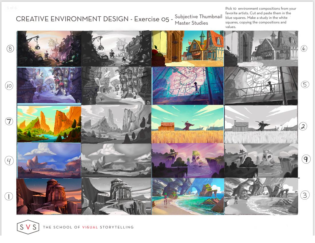
                While writing this review I realize you probably limited yourself to 3 colors. That might be the cause of what I'm going to mention below. I remember Will Terry saying something about limiting yourself to only 3, but I found it was to little for this exercise. So I also used white for the highlight and black for the darkest parts.

                It's the highlights that I'm missing in some of your pieces, which make the focal point disappear.
                If I give numbers to your images
                1 . 2 .
                3 . 4 . ....
                In that case the 3rd one with the castle, it has a yellow glow behind it. Which makes the tower the focal point of the image. I miss that in your value version. I would put a little white around the top of the castle and see if that makes a difference.

                The same goes for number 10. I feel the house and the street should be lighter than the dark part of the background. You could put in the white highlight at the edge of the building and the street.

                (I'm currently at work so I can't edit the image, let me know if you don't understand ☺ )

                http://artbymurielle.com
                https://www.instagram.com/artbymurielle/

                ArtofAleksey 1 Reply Last reply Reply Quote 1
                • ArtofAleksey
                  ArtofAleksey @murielle last edited by

                  @murielle i see what you’re saying, you don’t need to do a drawover I’m gonna keep this in mind for the next batch. im gonna do this exercise at least 2 more times.

                  For the highlights though I don’t know if I wanna put highlights because i was trying to see if I could rely on my silhouettes more. Because if I can communicate the shapes without the highlights I would be very happy. I really liked the silhouette exercises from last week and it made me realize that approach helps me with so many issues I’ve been facing so I’m gonna try to experiment more.

                  instagram and twitter: @artofaleksey
                  alekseyillustration.com

                  1 Reply Last reply Reply Quote 3
                  • ArtofAleksey
                    ArtofAleksey last edited by

                    @murielle i really thought about what you said and about highlights and really tried to restrict myself further with these next few.

                    I had to ask how would I know there is a highlight on something, and reaized that values are relative, and contrast is what really makes it stand out. So i only used 3 values, no matter what, no white nor black. I think the fact that these were from a cartoon (steven universe, amazing cartoon with a great story and art btw) made it easier to try this out. So thank you 🙂

                    The next one i think will be interiors. I really stink at interiors.

                    0D239581-4FE8-48DF-8C52-56FC58DB9E28.jpeg

                    instagram and twitter: @artofaleksey
                    alekseyillustration.com

                    1 Reply Last reply Reply Quote 4
                    • Heather Boyd
                      Heather Boyd @murielle last edited by

                      @murielle looks like fun fun fun!

                      Instagram: www.instagram.com/heatherboyd.illustration/
                      Website: https://heatherboydillustration.ca
                      Shop: https://www.inprnt.com/search/products?q=HeatherBoydIllustration
                      Ko-Fi: https://ko-fi.com/heatherboydillustration

                      Be blessed,

                      1 Reply Last reply Reply Quote 0
                      • Heather Boyd
                        Heather Boyd @ArtofAleksey last edited by

                        @Aleksey look fabulous 🙂

                        Instagram: www.instagram.com/heatherboyd.illustration/
                        Website: https://heatherboydillustration.ca
                        Shop: https://www.inprnt.com/search/products?q=HeatherBoydIllustration
                        Ko-Fi: https://ko-fi.com/heatherboydillustration

                        Be blessed,

                        1 Reply Last reply Reply Quote 1
                        • JerrySketchyArt
                          JerrySketchyArt last edited by

                          Exercise 5

                          CED_Workbook1_Page_5.png

                          1 Reply Last reply Reply Quote 2
                          • Heather Boyd
                            Heather Boyd last edited by

                            Which video talks about Exercise 5? I am currently working through the Reference video.

                            Instagram: www.instagram.com/heatherboyd.illustration/
                            Website: https://heatherboydillustration.ca
                            Shop: https://www.inprnt.com/search/products?q=HeatherBoydIllustration
                            Ko-Fi: https://ko-fi.com/heatherboydillustration

                            Be blessed,

                            braden H 1 Reply Last reply Reply Quote 0
                            • braden H
                              braden H @Heather Boyd last edited by

                              @Heather-Boyd They go through ALL the work books starting at about 50 minutes into reference 🙂

                              Heather Boyd 1 Reply Last reply Reply Quote 1
                              • Heather Boyd
                                Heather Boyd @braden H last edited by

                                @Braden-Hallett I stopped at 48:45 what timing I have lols

                                Instagram: www.instagram.com/heatherboyd.illustration/
                                Website: https://heatherboydillustration.ca
                                Shop: https://www.inprnt.com/search/products?q=HeatherBoydIllustration
                                Ko-Fi: https://ko-fi.com/heatherboydillustration

                                Be blessed,

                                1 Reply Last reply Reply Quote 4
                                • JerrySketchyArt
                                  JerrySketchyArt last edited by

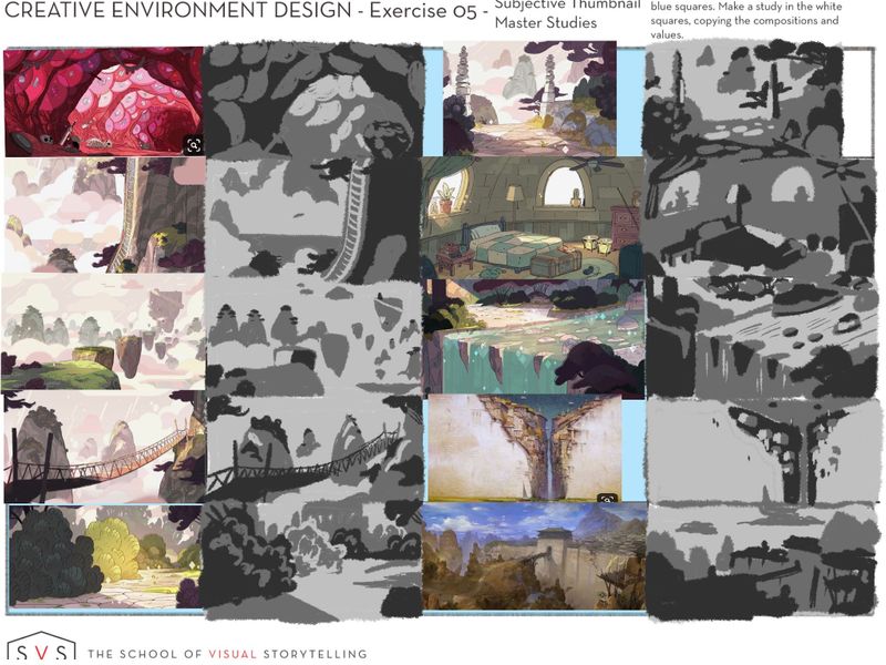
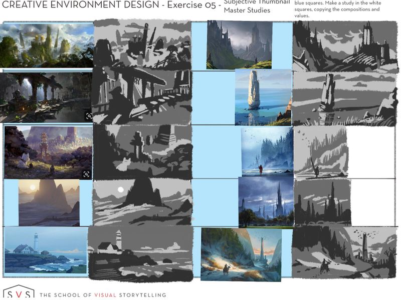
                                  Decided to redo these. Wanted to try that style with more detail, but I really prefer my thumbnails to be less specific. This fits me better:

                                  CED_Workbook1_Page_5 r1.png

                                  murielle braden H 2 Replies Last reply Reply Quote 1
                                  • ArtofAleksey
                                    ArtofAleksey last edited by

                                    Ok my last one for the exterior environment studies. I admit i zoomed in a bit because i wanted to see how far i can push the contrasts with only 3 grays. I did use white for that one with the sun, i didnt know how else to solve that. I’ll do interiors tomorrow

                                    92CE6C32-E3C6-4479-8068-812BA0CF9270.jpeg

                                    instagram and twitter: @artofaleksey
                                    alekseyillustration.com

                                    murielle 1 Reply Last reply Reply Quote 5
                                    • murielle
                                      murielle @JerrySketchyArt last edited by

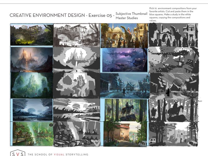
                                      @JerrySketchyArt Interesting take on this exercise. I never would have thought to go abstract like this.

                                      http://artbymurielle.com
                                      https://www.instagram.com/artbymurielle/

                                      1 Reply Last reply Reply Quote 0
                                      • murielle
                                        murielle @ArtofAleksey last edited by

                                        @Aleksey Admit it... you're addicted to this exercise :smiling_face_with_open_mouth_closed_eyes:

                                        http://artbymurielle.com
                                        https://www.instagram.com/artbymurielle/

                                        ArtofAleksey 1 Reply Last reply Reply Quote 1
                                        • braden H
                                          braden H @JerrySketchyArt last edited by

                                          @JerrySketchyArt Cool, man 🙂 Very 'framed ink'!

                                          1 Reply Last reply Reply Quote 1
                                          • Erin.Cortese
                                            Erin.Cortese Moderator last edited by Erin.Cortese

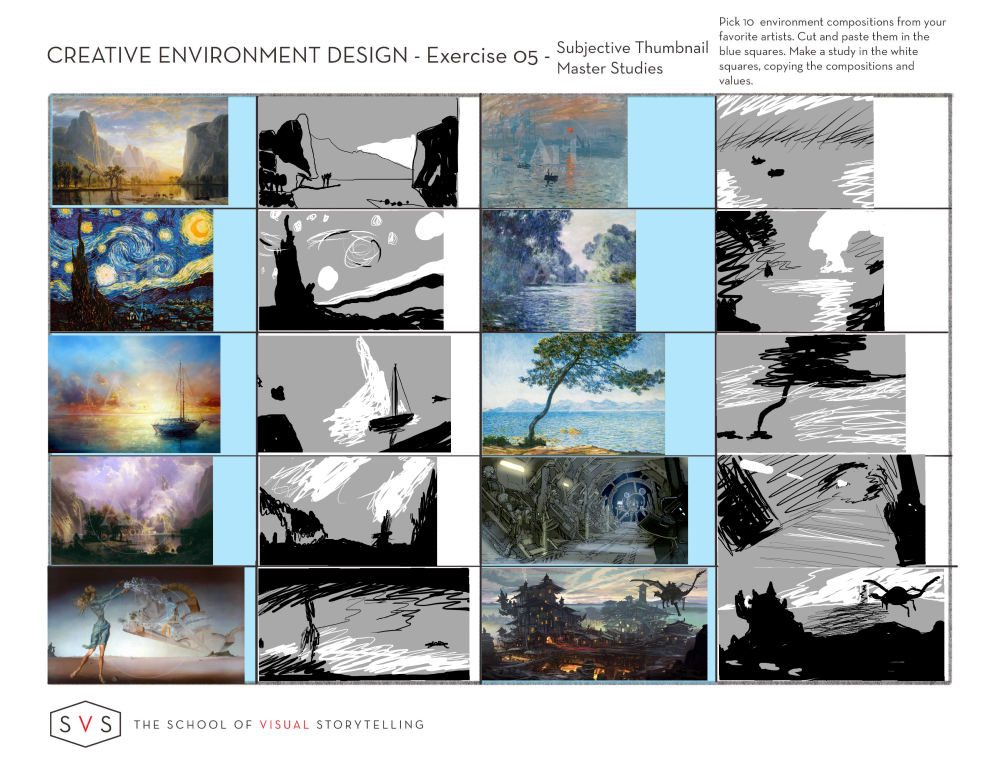
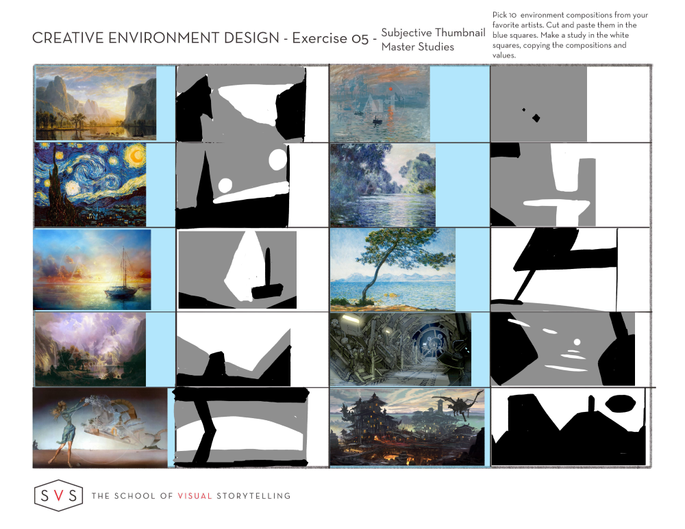
                                            Whoo, these were tough but I learned sooo much! I decided to go in a different direction with these and really focus on values and shape - almost like a master study in thumbnails. ***I had to update this because I just realized the exercise is literally titled “Master Studies” - I thought Master Studies were supposed to be detailed. Anyways, I went with detailed!

                                            I am so glad I did because I learned so much about how the artists use values to visually organize the composition and draw attention to certain objects. At that size, everything is a random shape and value and it was really neat to see how the values literally lead your eye through the composition and give the piece balance. It made me realize that very little is random, and these artists are making conscious choices for every single value and shape relationship! I also learned a lot about my own process and bad habits - to pull these off in this detail I had to begin with large shapes and work my way to finer details later (which my brain always fights), and l discovered why it is easier to work from back to front like Disney artist Laura Price does with her compositions.

                                            *I worked out of order, so I labelled the order that I completed these in.

                                            EV-Thumbnails.jpg

                                            Heather Boyd braden H murielle 3 Replies Last reply Reply Quote 6
                                            • First post
                                              Last post