Society of Visual Storytelling

    SVSLearn Forums

    • Register
    • Login
    • Search
    • Recent
    • Tags
    • Popular
    • Users
    • Groups
    • Search

    Group run through creative environment design week 2 art and feedback

    Artwork
    9
    58
    3308
    Loading More Posts
    • Oldest to Newest
    • Newest to Oldest
    • Most Votes
    Reply
    • Reply as topic
    Log in to reply
    This topic has been deleted. Only users with topic management privileges can see it.
    • braden H
      braden H last edited by

      Hello ladies and gents! So much awesome work in week one! Loved the silhouettes.

      This week is the videos 'design pyramid' and 'reference' and exercise 5.

      The point where Jake explains ALL the homework is at about the 50 minute mark in the 'reference' video.

      Feel free to pop into the discord to chat! PM me if you need a link and instructions ๐Ÿ™‚

      Have fun! If you need to work at a slower pace, that's fine, too.

      Post exercise 5 here for feedback and remember that thumbnails are most certainly NOT meant to be perfect ๐Ÿ™‚

      murielle 1 Reply Last reply Reply Quote 8
      • murielle
        murielle @braden H last edited by

        @Braden-Hallett Thank you for organizing this.

        http://artbymurielle.com
        https://www.instagram.com/artbymurielle/

        braden H 1 Reply Last reply Reply Quote 4
        • ArtofAleksey
          ArtofAleksey last edited by

          So this weeks goal is just exercise 5?

          instagram and twitter: @artofaleksey
          alekseyillustration.com

          braden H 1 Reply Last reply Reply Quote 1
          • braden H
            braden H @murielle last edited by

            @murielle You're welcome! My motives are purely selfish ๐Ÿ˜ƒ

            1 Reply Last reply Reply Quote 0
            • braden H
              braden H @ArtofAleksey last edited by

              @Aleksey Yiss. I find it takes me a lot longer to find reference to copy than it does to copy it (dunno if this is the same for everyone else ๐Ÿ™‚ )

              If you can do it quickly feel free to work ahead ๐Ÿ™‚

              demotlj 1 Reply Last reply Reply Quote 1
              • ArtofAleksey
                ArtofAleksey last edited by ArtofAleksey

                I like having a pace.
                @Braden-Hallett also jake did say that you can use pieces in his pintrest for composition references

                instagram and twitter: @artofaleksey
                alekseyillustration.com

                braden H 1 Reply Last reply Reply Quote 1
                • braden H
                  braden H @ArtofAleksey last edited by

                  @Aleksey I do, too. And yes! He did. That'll make is easy.

                  1 Reply Last reply Reply Quote 0
                  • demotlj
                    demotlj SVS OG @braden H last edited by

                    @Braden-Hallett I have the same problem.

                    Laurie DeMott
                    instagram.com/demotlj

                    1 Reply Last reply Reply Quote 1
                    • murielle
                      murielle last edited by

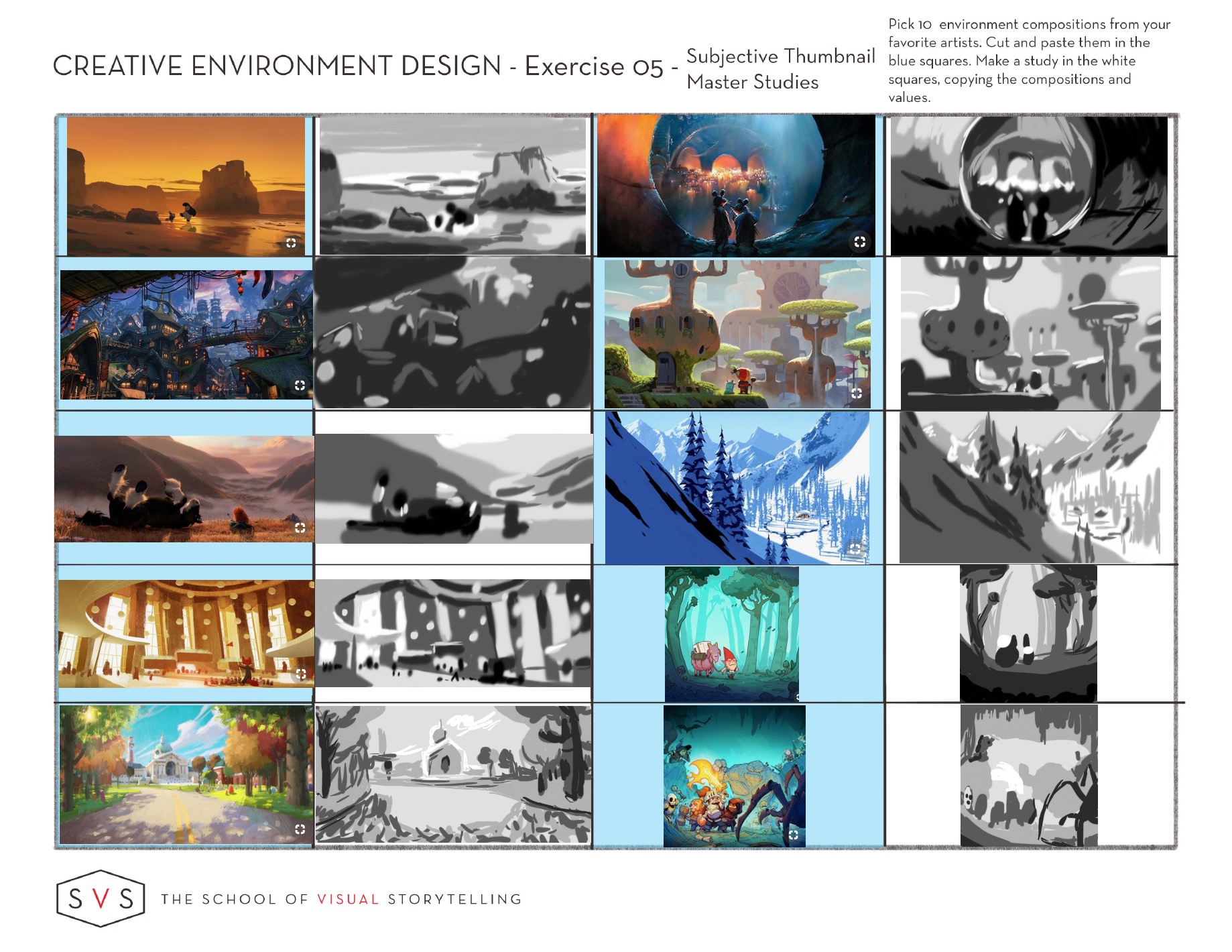
                      Looks like I'm the first to post. I had already gathered all my references since I had gone through the course before this Group discussions started โ˜บ

                      I specifically looked for Disney, Blue Sky, and Pixar references. I really enjoyed this exercise, so I can't wait to see what you all come up with.

                      exercise 5.jpg

                      http://artbymurielle.com
                      https://www.instagram.com/artbymurielle/

                      ArtofAleksey braden H Heather Boyd 3 Replies Last reply Reply Quote 10
                      • ArtofAleksey
                        ArtofAleksey @murielle last edited by

                        @murielle oh i like these a lot. You did an interior piece too nice work

                        instagram and twitter: @artofaleksey
                        alekseyillustration.com

                        1 Reply Last reply Reply Quote 1
                        • braden H
                          braden H @murielle last edited by

                          @murielle Awesome!

                          I can't help but notice that you started more detailed, and as you went on focussed more on simplifying shapes to blocks of value. Very cool!

                          1 Reply Last reply Reply Quote 1
                          • ArtofAleksey
                            ArtofAleksey last edited by

                            Ughh this was a little rough to get through for me but I did it. Environment is not my forte... yet
                            8DA908D2-6D44-4BED-A4A9-7BF37568BC1C.jpeg

                            instagram and twitter: @artofaleksey
                            alekseyillustration.com

                            braden H burvantill murielle Heather Boyd 4 Replies Last reply Reply Quote 4
                            • braden H
                              braden H @ArtofAleksey last edited by

                              @Aleksey Wow, man! That bar's gettin' higher and higher.

                              Gonna have to get off my butt and do some of these ๐Ÿ˜ƒ

                              ArtofAleksey 1 Reply Last reply Reply Quote 1
                              • ArtofAleksey
                                ArtofAleksey @braden H last edited by

                                @Braden-Hallett better do some work or Iโ€™m gonna leave ya in the dust ๐Ÿ˜‰

                                instagram and twitter: @artofaleksey
                                alekseyillustration.com

                                1 Reply Last reply Reply Quote 0
                                • burvantill
                                  burvantill Moderator @ArtofAleksey last edited by

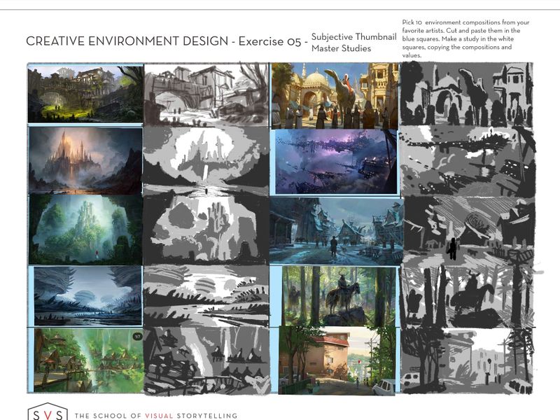
                                  @Aleksey wow you picked some pretty tough environments. Way to challenge yourself! โœŠ
                                  I love Jeremy Fenske... not in a creepy way. I just follow him around/ I mean on IG. ๐Ÿ˜œ

                                  Lisa Burvant
                                  www.lisaburvant.com
                                  Instagram & Twitter & SVS: @burvantill

                                  ArtofAleksey 1 Reply Last reply Reply Quote 1
                                  • ArtofAleksey
                                    ArtofAleksey @burvantill last edited by

                                    @burvantill yes heโ€™s so good! Yes that is an acceptable form of stalking

                                    Thanks. If I wanna get good at this I gotta challenge myself.

                                    instagram and twitter: @artofaleksey
                                    alekseyillustration.com

                                    1 Reply Last reply Reply Quote 1
                                    • murielle
                                      murielle @ArtofAleksey last edited by

                                      @Aleksey These are really good. Very hard and detailed environments :smiling_face_with_open_mouth_cold_sweat:

                                      While writing this review I realize you probably limited yourself to 3 colors. That might be the cause of what I'm going to mention below. I remember Will Terry saying something about limiting yourself to only 3, but I found it was to little for this exercise. So I also used white for the highlight and black for the darkest parts.

                                      It's the highlights that I'm missing in some of your pieces, which make the focal point disappear.
                                      If I give numbers to your images
                                      1 . 2 .
                                      3 . 4 . ....
                                      In that case the 3rd one with the castle, it has a yellow glow behind it. Which makes the tower the focal point of the image. I miss that in your value version. I would put a little white around the top of the castle and see if that makes a difference.

                                      The same goes for number 10. I feel the house and the street should be lighter than the dark part of the background. You could put in the white highlight at the edge of the building and the street.

                                      (I'm currently at work so I can't edit the image, let me know if you don't understand โ˜บ )

                                      http://artbymurielle.com
                                      https://www.instagram.com/artbymurielle/

                                      ArtofAleksey 1 Reply Last reply Reply Quote 1
                                      • ArtofAleksey
                                        ArtofAleksey @murielle last edited by

                                        @murielle i see what youโ€™re saying, you donโ€™t need to do a drawover Iโ€™m gonna keep this in mind for the next batch. im gonna do this exercise at least 2 more times.

                                        For the highlights though I donโ€™t know if I wanna put highlights because i was trying to see if I could rely on my silhouettes more. Because if I can communicate the shapes without the highlights I would be very happy. I really liked the silhouette exercises from last week and it made me realize that approach helps me with so many issues Iโ€™ve been facing so Iโ€™m gonna try to experiment more.

                                        instagram and twitter: @artofaleksey
                                        alekseyillustration.com

                                        1 Reply Last reply Reply Quote 3
                                        • ArtofAleksey
                                          ArtofAleksey last edited by

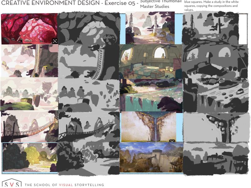
                                          @murielle i really thought about what you said and about highlights and really tried to restrict myself further with these next few.

                                          I had to ask how would I know there is a highlight on something, and reaized that values are relative, and contrast is what really makes it stand out. So i only used 3 values, no matter what, no white nor black. I think the fact that these were from a cartoon (steven universe, amazing cartoon with a great story and art btw) made it easier to try this out. So thank you ๐Ÿ™‚

                                          The next one i think will be interiors. I really stink at interiors.

                                          0D239581-4FE8-48DF-8C52-56FC58DB9E28.jpeg

                                          instagram and twitter: @artofaleksey
                                          alekseyillustration.com

                                          1 Reply Last reply Reply Quote 4
                                          • Heather Boyd
                                            Heather Boyd @murielle last edited by

                                            @murielle looks like fun fun fun!

                                            Instagram: www.instagram.com/heatherboyd.illustration/
                                            Website: https://heatherboydillustration.ca
                                            Shop: https://www.inprnt.com/search/products?q=HeatherBoydIllustration
                                            Ko-Fi: https://ko-fi.com/heatherboydillustration

                                            Be blessed,

                                            1 Reply Last reply Reply Quote 0
                                            • First post
                                              Last post