Finishing Drills for a Chronic Dabbler.
-
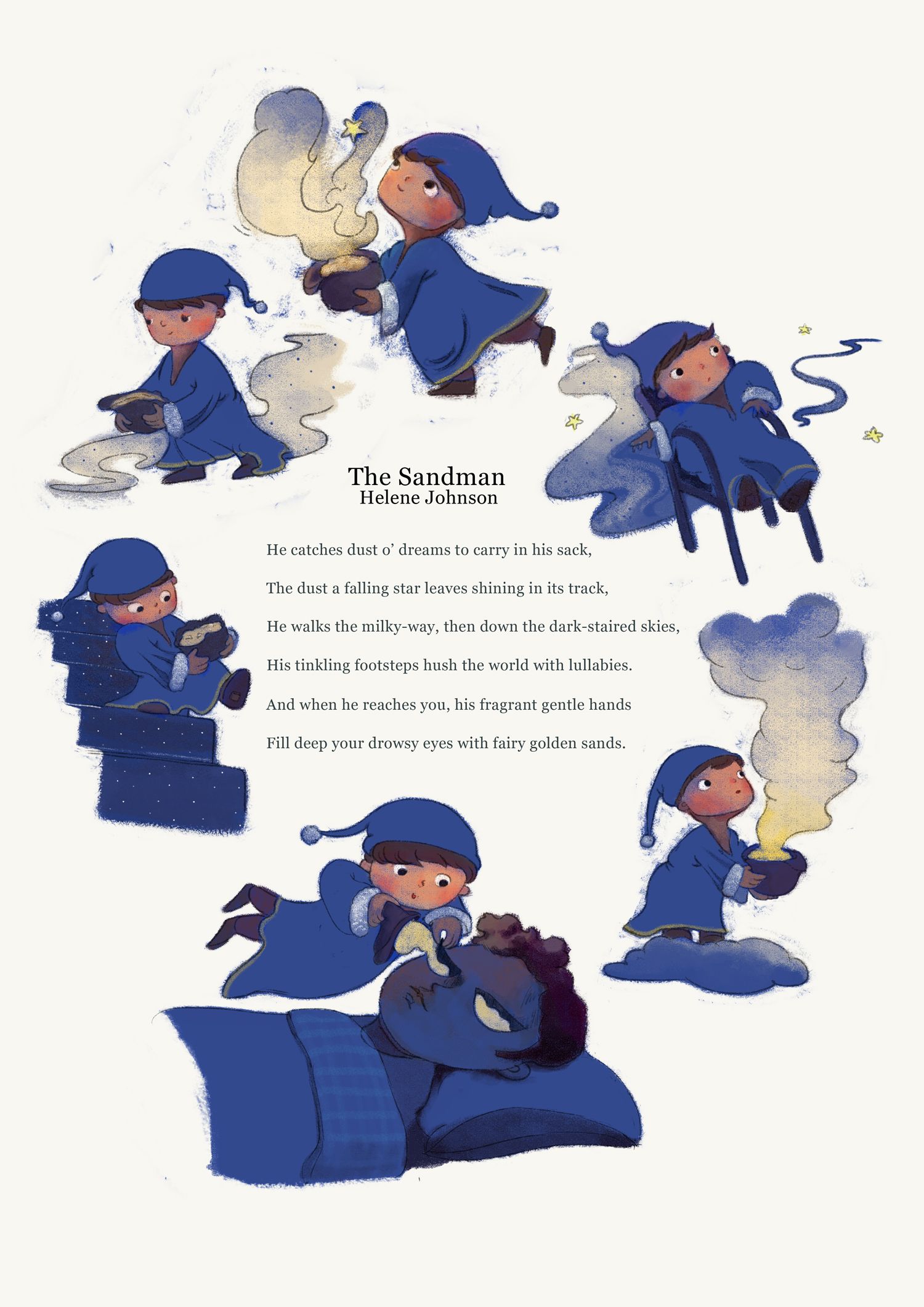
@animatosoor I like this style of this book, it is really wonderful. Maybe I would move the right bottom sandman little bit down. so taht it isn't so near to the chair.
-
@MichaelaH Thanks once again! It's so helpful to hear notes on the arrangement, since after a certain point I feel like I can't really see what needs to be moved where anymore. I've moved it down to let it breathe a bit, and it does look better.:
-
@animatosoor I really love your use of colour and lighting. It’s great to see your process as well.
Keep going, you’re doing great

-
@sarahlawrence It means a lot to hear that, especially since colour/light has been scary for me to tackle. Thank you, Sarah.

https://www.instagram.com/sooryajart/
The Beatles: "Roll up, roll up for the Mystery Tour!"
-
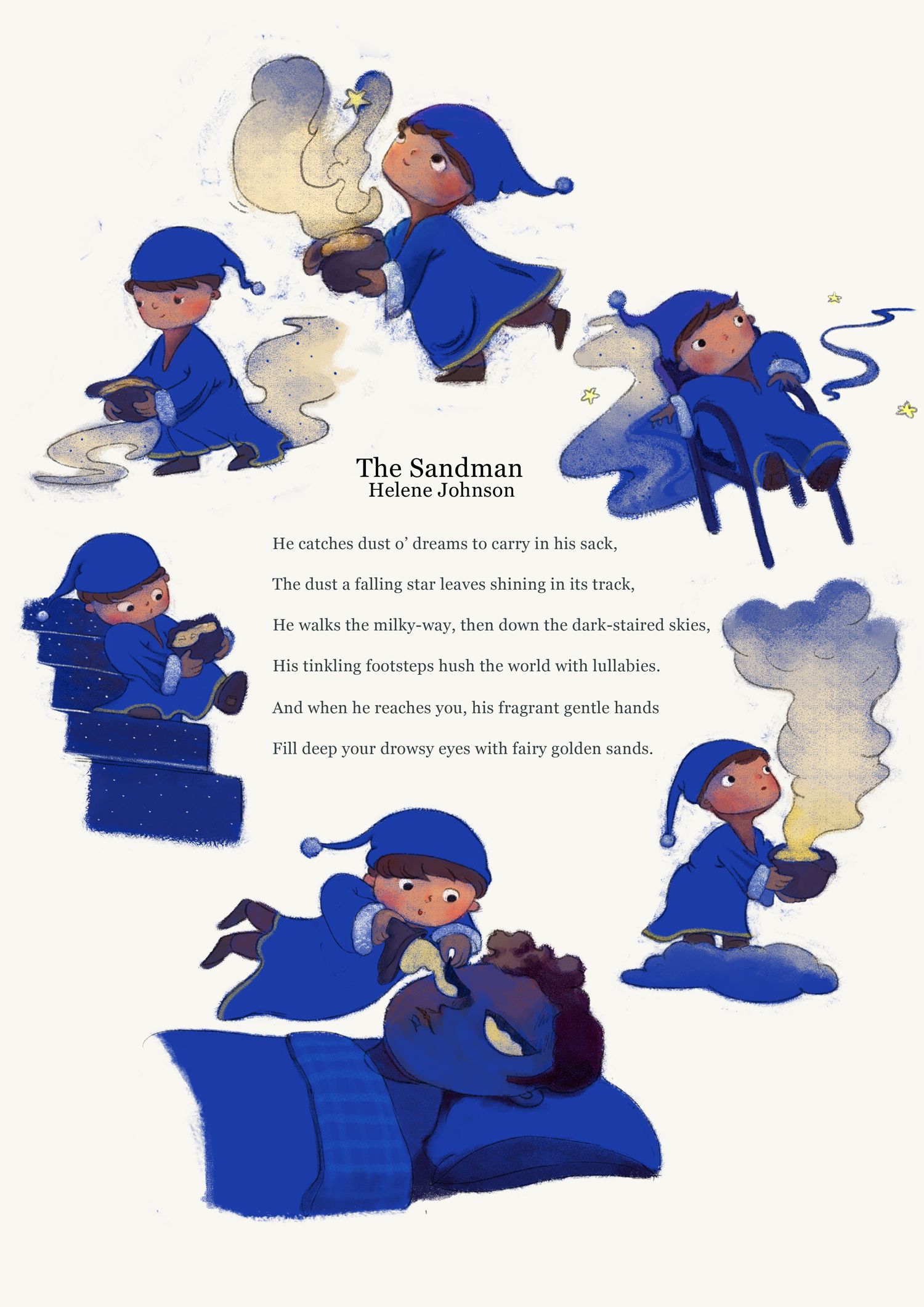
@animatosoor I love this! Do you work traditionally or digitally? The blue reads a little intense to me. If you work digitally, what might it look like knocked back just a bit? When I think of night and sleepy, I think a little more muted.
-
@Susan-Marks Thank you so much for your comment on the colour. It's weird, but it's like I threw those keywords (relaxing, dreamy, sleepy) completely out the window with the blue. XD
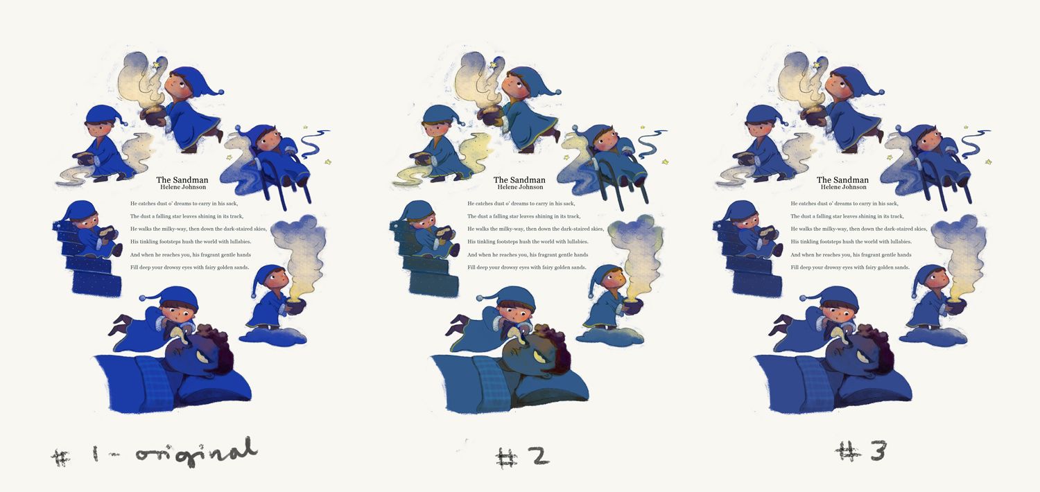
My painting is all done digitally. Your comment got me thinking, and I took your advice and knocked the blue back a bit to see what it looks like. I actually think I like the new versions better, particularly #3. What do you think?
https://www.instagram.com/sooryajart/
The Beatles: "Roll up, roll up for the Mystery Tour!"
-
Super cute. I love the shade of blue on version 3. Gives a night time feeling.
All my links: https://APHOTICMOTH.carrd.co/
-
@CLCanadyArts Hehe thank you, Cassandra! I'm also getting more of a night-time feeling from that one than I was from the original!

https://www.instagram.com/sooryajart/
The Beatles: "Roll up, roll up for the Mystery Tour!"
-
@animatosoor I think it's easier on the eyes as well, could be just me, but the original was harsh enough blue that I didn't want to look, insta headache, in print would probably be a lot different without the blinding backlight on my computer.
It would be lovely to see a little collection of pieces like this in a book.
-
I like the original strong bright color, but 3 goes also for me. I think the most ppl the original color is to strong, I found it very refreshing in the point, nobody else is doing it and I was drawn to it.
-
I like 1 and 3. 3 is a bit softer but 1 original blue brighter for me portrays a more active sandman -because it is about him and his daily duties.
Instagram: www.instagram.com/heatherboyd.illustration/
Website: https://heatherboydillustration.ca
Shop: https://www.inprnt.com/search/products?q=HeatherBoydIllustration
Ko-Fi: https://ko-fi.com/heatherboydillustrationBe blessed,
-
@animatosoor I think the color changes you're exploring think it's helped make your piece more dreamy. I like them both, with a #3 winning by a bit.
-
@Heather-Boyd interesting point--about keeping the active sandman brighter or more saturated than the sleeping man.
-
@CLCanadyArts Yikes, I didn't realise it might have been headache-inducing!
 Thank you for your input; I will be keeping it in mind as I choose colours in the future. Definitely learning with every new piece on this thread.
And yes, I am in the process of sketching new ideas for more poems I'd like illustrated, and eventually I'd want to compile them! It's nice to hear I won't be the only one interested in that outcome. :face_savouring_delicious_food:
-
@MichaelaH I appreciate that - thanks! I'll be going for #3.
@Heather-Boyd Thank you - that is an interesting take, and something for me to consider for my next piece.
-
@Susan-Marks Your initial comment helped immensely with that. Thanks once again.

-
It's Monday here!
Final:
Thank you everyone for all of your invaluable input. Moving on to the next project.

-
Week 3!
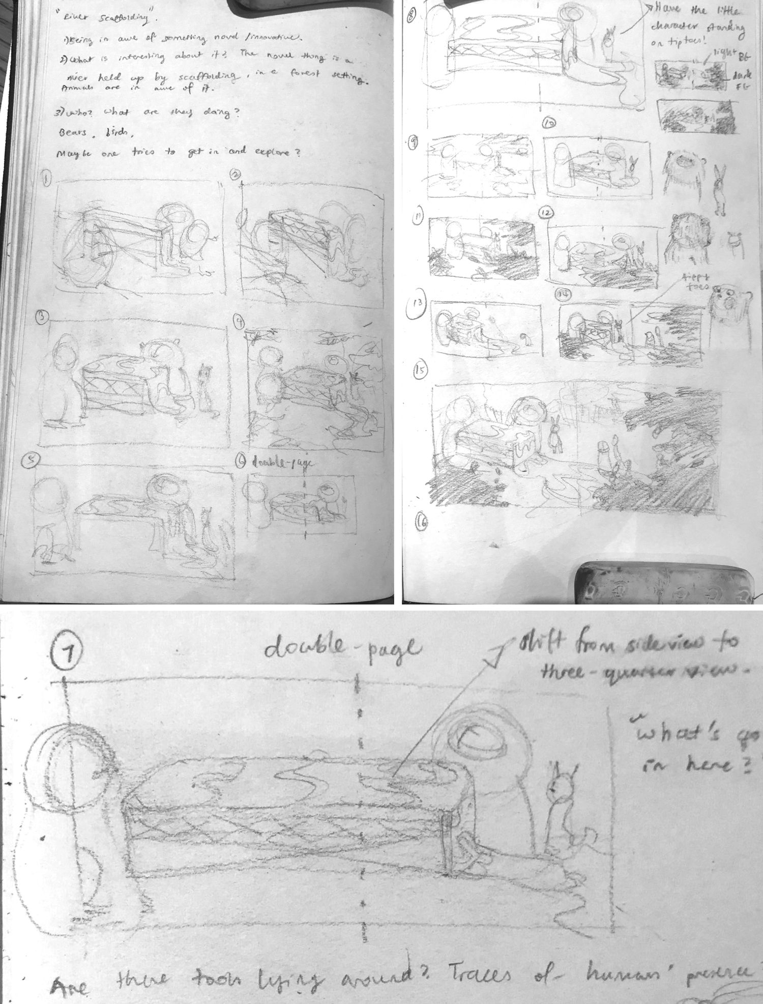
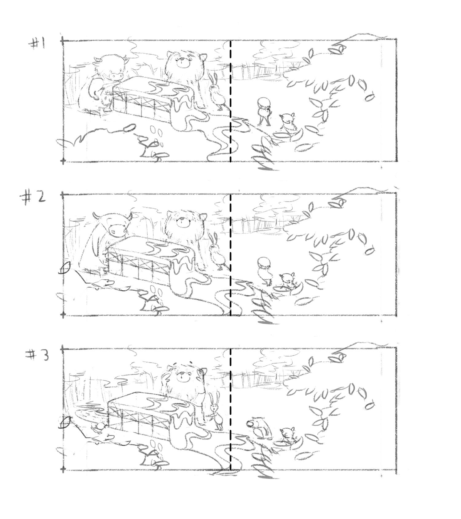
Thumbnails and a set of slightly more comprehensible idea sketches for a new illustration I'm working on. This would be my first attempt at a double-page spread for my portfolio, and also my first serious attempt at including animal characters in any composition. :S I'm quite nervous, lol.
https://www.instagram.com/sooryajart/
The Beatles: "Roll up, roll up for the Mystery Tour!"
-
@animatosoor I like the third option. The expressions of the characters are clear and the character themselves look just funny

Maybe you can try the foreground bush on the first page to overlap the box ? (i am not exactly sure what it is) . The perspective feels kinda flat to me - so this might help it.
But I like that you added the mark behind it instead of the cow. That on the other hand is deepening the perspective wellAnyways it looks fun! Good luck
-
@Jonas-Zavacky Hi, and thank you so much for your feedback!
I realise what’s on the foreground on the first page looks like a bush, but it’s meant to be the leaves of a tree and we have a bit of a bird’s eye view with this one, so you’re right, it should overlap the box a little bit.
As for the box itself: your comment made me smile, lol, because I think the concept hardly makes sense to begin with and it’s perfectly understandable that you don’t know what it is. Let me have another go at the box and see if I can make that bit make a bit more sense. XD I might also eventually add a page before this to give this weird structure some context, haha.
Thanks again.