DECEMBER prompt WIP by Akins
-
I'm not really a sequential art expert, but my advice would be to make sure it is obvious the correct order of the text boxes. I had to read it a few times before it clicked. That being said I think this is a cool take on the prompt and I love the transition between the three facial expressions. You could do a lot of cool things with color and lighting throughout that transition. Good luck!
-
Good idea. I am interested in how you solve this.

-
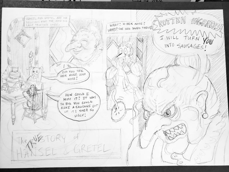
@chrisaakins Lol~ I love the witch's expression in the middle panel! What a unique take on the prompt! I would love to see the candy house in the background with all the different colors. Maybe instead of three boxes that are the same size, maybe try short rectangles for two of them and then a larger box for the expression you want the most emphasis on?
Or maybe another direction could be that instead of the witch getting mad, she gets sad so that we feel empathy for the witch, which would be a new emotion that readers have towards this legendary villain.
I love that you're going with the "misunderstood villain" route (much like "The True Story of the 3 Little Pigs" by Jon Scieszka, illustrated by Lane Smith), because it's such a fresh and hilarious take on a classic fairy tale! I would love to see an entire book on this idea!
 Great work so far!
 -
Here is another thumbnail. My high schooler comic experts in class say it reads better than the first.
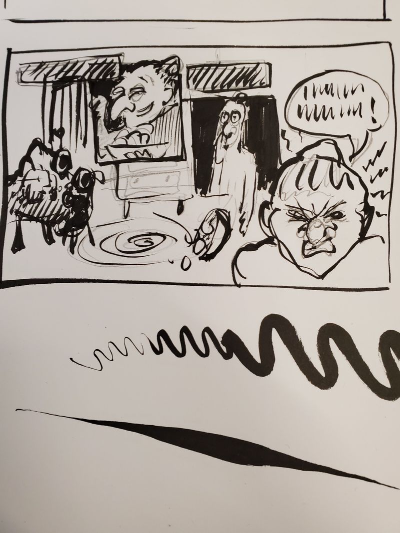
Excuse the ink. I was demonstrating how cool my brush pen is to a student. -
I'm still a little confused about how the conversation will go back and forth between the kids and the witch? In your original I read all of the witch's lines first, and then the kids lines. Maybe you can do a version with the text in it to make sure it is working?
Check out my art and tutorials :)
Instagram: www.instagram.com/carliannecreates/
Youtube:
https://youtube.com/c/CarlianneCreatesShop: www.carliannecreates.com
-
@carlianne does this help? My students all said it read well.
Bonus Points: they all said they would read this. -
Yeah! My only question text-wise is if the title should be at the top and not the bottom?
Also, after looking at it a few times I realized that she was listening to them from the other side of the door, and you can see her through the window, but that was hard for me to understand so maybe there is a way to make that more clear?
Also do you have a constraint on how many panels you can make this? The pacing seems a bit fast. I almost want to see the nice witch with the pie established in the beginning, and then the bratty children, followed by her reaction. Totally up to you, but I would try it out!
-
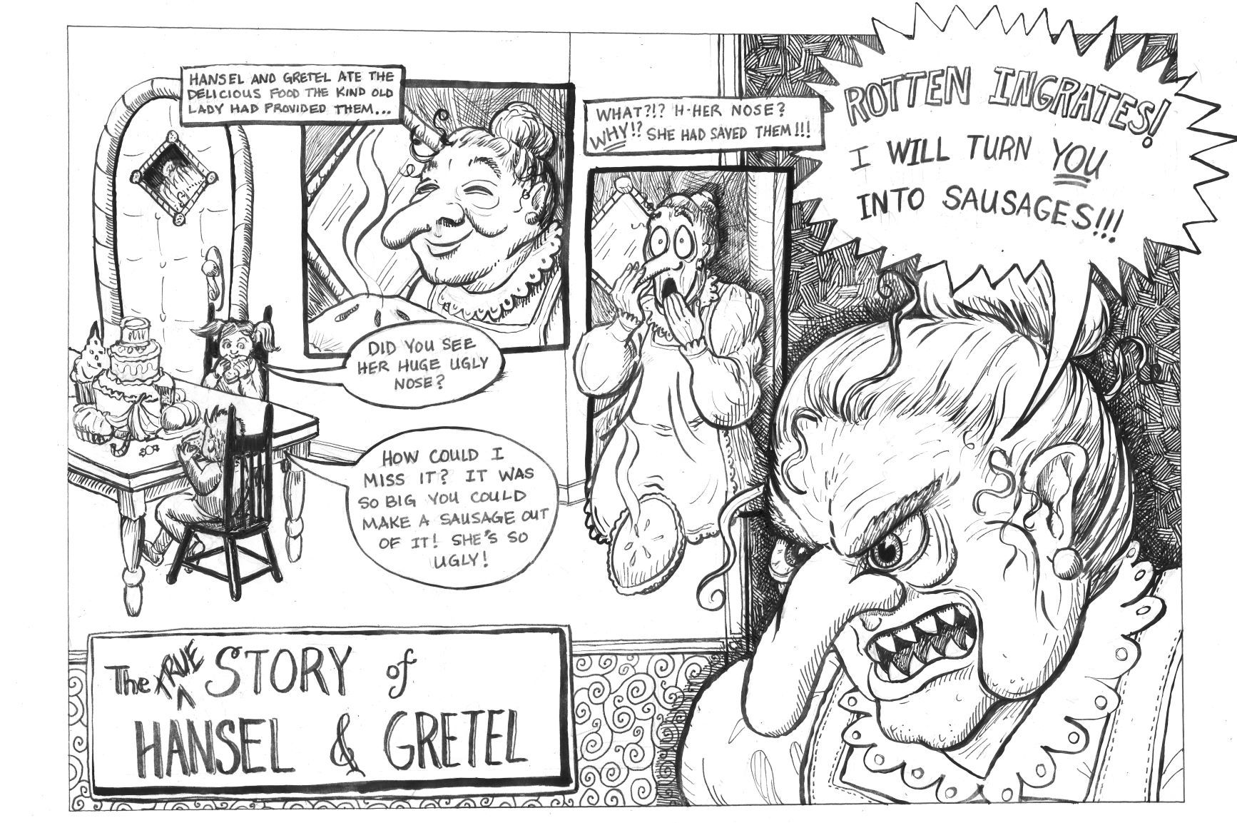
Well, I inked it at school traditionally. I will probably try to recreate it digitally in layers, but I have not found a pen I like in Photoshop. I know there are several little flaws with it, but I really like it.
-
@chrisaakins Really cool idea! I wish I'd weighed in during the sketch stage. If you DO end up recreating this digitally, I would move the first 'witch' panel where she's smiling with the pie to the left, and hansel and gretel to the right (switch places, essentially). I may do a quick hack and slash edit tomorrow to show you what I mean, but have the happy granny panel first would help the narrative flow better
Still pretty cool as is, though

-
@Braden-Hallett That would have been a good idea. I went ahead with the traditional scan and colorized it. Not sure how successful it was. I like the colors, I just don't like how it doesn't look clean. Not sure what to do other than redrawing it in Photoshop and then color it there, too.
Ugh! This is when my vision exceeds my digital skills.
I feel like I have a decent composition and story but don't know how to render the colors better. Any suggestions would be helpful. Are there any basic "Here is how to color comic books digitally for dummies" course out there?
Also scanning in inked copies is not as easy as it looks (my pencil showed up even though I erased it, for example). Any suggestions there would be welcome as well.
Sorry to be so needy... and grumpy.
Here it is:
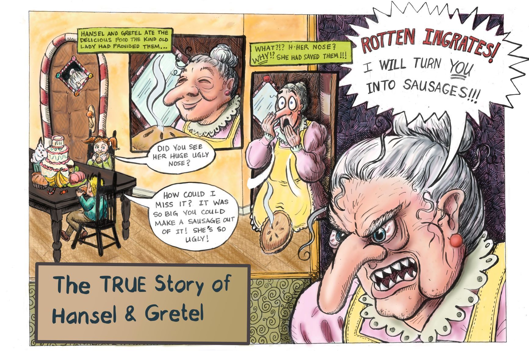
Also...the title....ugh again. I think I have found a major limitation of Sketchbook.