Society of Visual Storytelling

    SVSLearn Forums

    • Register
    • Login
    • Search
    • Recent
    • Tags
    • Popular
    • Users
    • Groups
    • Search

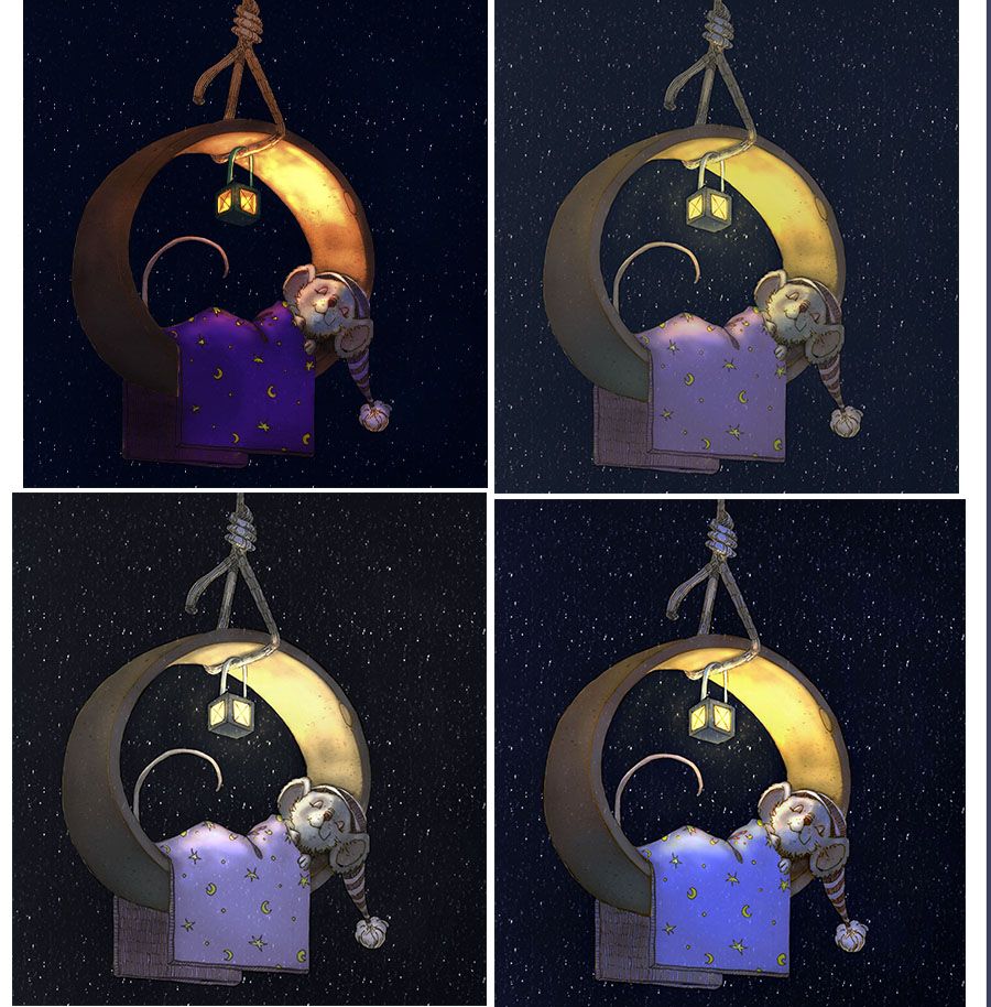
    little mouse in the wedding band - which do you prefer?

    Artwork
    17
    31
    1685
    Loading More Posts
    • Oldest to Newest
    • Newest to Oldest
    • Most Votes
    Reply
    • Reply as topic
    Log in to reply
    This topic has been deleted. Only users with topic management privileges can see it.
    • Coley
      Coley last edited by

      I'm having trouble figuring out which one I like best. Any thoughts?! littlemouseoptionsm.jpg

      https://www.instagram.com/nicoleledrewmay/

      burvantill Nyrryl  Cadiz 2 Replies Last reply Reply Quote 4
      • burvantill
        burvantill Moderator @Coley last edited by

        @Coley I like the saturation of 1, but it’s dark. I think 4 reads better. Can you up the saturation and contrast, just a little, in 4? This is super cute. πŸ™‚

        Lisa Burvant
        www.lisaburvant.com
        Instagram & Twitter & SVS: @burvantill

        Coley 1 Reply Last reply Reply Quote 3
        • Coley
          Coley @burvantill last edited by

          @burvantill I'm thinking you're right! I'm missing the saturation especially in the blanket in number 4. Will try. Thanks!

          https://www.instagram.com/nicoleledrewmay/

          BichonBistro 1 Reply Last reply Reply Quote 1
          • BichonBistro
            BichonBistro @Coley last edited by

            @Coley adorable 😍

            https://www.instagram.com/bichonbistro
            http://www.heartfeltimpressions.com
            https://www.facebook.com/patty.burke.9655
            https://twitter.com/BichonBistro

            1 Reply Last reply Reply Quote 0
            • deborah Haagenson
              deborah Haagenson last edited by

              I agree, now that I read the posts and looked at them again. I like the deep and dark color of the blanket in 1, but the light on the mouse in 4. I think the mouse is a little too dark in 1.

              1 Reply Last reply Reply Quote 0
              • sarahlash
                sarahlash last edited by

                I love the orange-y warmth in the first one, but agree that it is a little dark.

                1 Reply Last reply Reply Quote 0
                • ajillustrates
                  ajillustrates last edited by

                  @Coley I love the low key lighting top left-hand option; just needs some rim lighting to help the ring and blanket stand out from the night sky.

                  https://ajillustrates.com
                  https://www.instagram.com/aj.illustrates/

                  1 Reply Last reply Reply Quote 0
                  • TessaW
                    TessaW last edited by

                    I agree with the general consensus here. Really love the warmth and saturation of 1- but it could be a tad lighter.

                    Website: www.tessawrathall.com

                    Instagram: www.instagram.com/tessawrathall_art/

                    1 Reply Last reply Reply Quote 0
                    • Oriana Fernandez
                      Oriana Fernandez last edited by

                      I like option 1 (the top left corner). The lighting is spot on, but have to agree with the above suggestions about the surroundings being a bit too dark and the blanket not standing out as much. Go for one!

                      https://www.instagram.com/oriana_fernandez_/
                      My blog: https://orianafernandez.wordpress.com/2018/05/16/28-twilight-stories-or-the-flight-of-the-wryter-and-the-weaver/

                      1 Reply Last reply Reply Quote 0
                      • Nyrryl  Cadiz
                        Nyrryl Cadiz SVS OG @Coley last edited by

                        @Coley the first one. That warm orange and that cool purple just look so good together

                        Portfolio: nyrrylcadiz.com
                        Instagram: https://www.instagram.com/nyrryl_cadiz/
                        YouTube: https://www.youtube.com/channel/UCbJCF1Im8ZO7hpGWTKOJMuA

                        1 Reply Last reply Reply Quote 0
                        • lenwen
                          lenwen last edited by

                          it's a very sweet illustration! so cozy and warm. I love the second one, I love the night is not totally dark and black and the light area is not oversaturated, it gives the natural and classic feeling πŸ™‚

                          www.lennywen.com
                          https://www.instagram.com/lunartcy/

                          jbleau 1 Reply Last reply Reply Quote 0
                          • jbleau
                            jbleau @lenwen last edited by

                            @lenwen I like top left ...I think the dark covers allow the focus to be on the face

                            1 Reply Last reply Reply Quote 0
                            • chrisaakins
                              chrisaakins last edited by

                              Hi, @Coley I really like the rich colors of the 1st (top left) way better than the others. It gives it a rich and dreamy quality that the others don't have. That being said, on my phone, it doesn't show up as well. On my laptop, though it looks amazing. And to think this came from your Inktober drawing. You are inspiring me to revisit my mice, too.

                              Chris Akins
                              www.chrisakinsart.com
                              www.instagram.com/chrisakinsart/

                              Coley 1 Reply Last reply Reply Quote 1
                              • Coley
                                Coley @chrisaakins last edited by

                                @chrisaakins inktober is great for ideas! I go back to my folder on occasion for inspiration. Your little mice were awesome and one of the main things that I remember from inktober. Thanks for the feedback. I'm working on something along the lines of those colors just a little more readable. I also started rendering out the mouse with fur as an experiment too so we'll see where that goes!

                                https://www.instagram.com/nicoleledrewmay/

                                NicolaSchofield baileyvidler 2 Replies Last reply Reply Quote 0
                                • NicolaSchofield
                                  NicolaSchofield @Coley last edited by

                                  @Coley I joined SVS during inktober and I remember this piece as one of the first things I saw on the forum. So cool that you're still evolving it. Perhaps an entry for the Nightfall February prompt?

                                  Nicola Schofield

                                  Twitter: twitter.com/NSchofieldArt
                                  Instagram: instagram.com/NicolaSchofieldArt/

                                  chrisaakins Coley 2 Replies Last reply Reply Quote 0
                                  • chrisaakins
                                    chrisaakins @NicolaSchofield last edited by

                                    @neschof what a great idea!

                                    Chris Akins
                                    www.chrisakinsart.com
                                    www.instagram.com/chrisakinsart/

                                    1 Reply Last reply Reply Quote 0
                                    • baileyvidler
                                      baileyvidler @Coley last edited by

                                      @Coley I thought this image looked familiar, but I couldn't remember when I had seen it last! That's so cool this came from Inktober!

                                      My favorite is the top right, although, I'd be interested to see what it looks like with the saturation of the top left, but the values of the top right.

                                      Bailey Vidler
                                      Portfolio: baileyvidler.com

                                      1 Reply Last reply Reply Quote 1
                                      • Coley
                                        Coley @NicolaSchofield last edited by

                                        @neschof I might do that πŸ™‚ thanks 😁

                                        https://www.instagram.com/nicoleledrewmay/

                                        1 Reply Last reply Reply Quote 0
                                        • Coley
                                          Coley last edited by

                                          littlemouseq.jpg
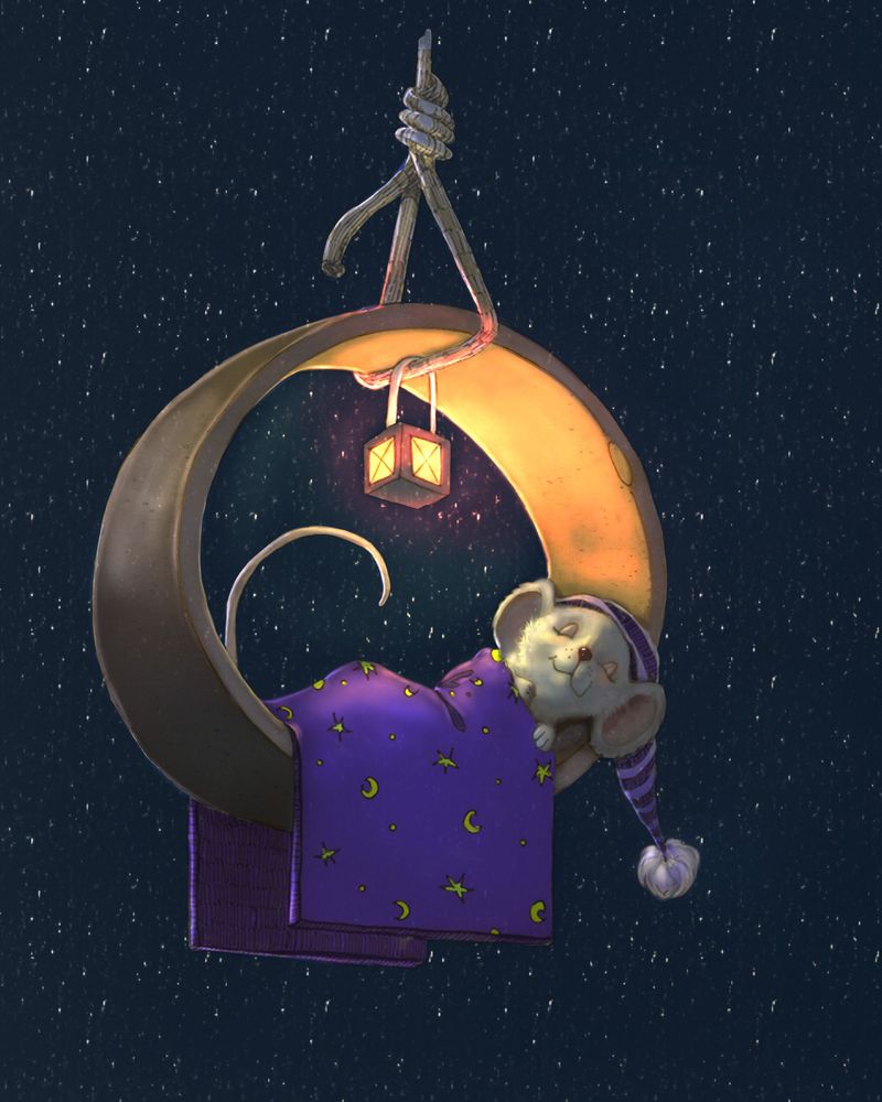
                                          I did some rim lighting etc and did a fair amount of rendering to the little mousie's face as the lines were a bit harsh I thought. I wanted to see things a little more rendered. wondering people;s thoughts? Do you like it better with the lines or more rendered? I wonder if I need a few harder lines/pieces of fur if it has gotten too soft?

                                          https://www.instagram.com/nicoleledrewmay/

                                          burvantill 1 Reply Last reply Reply Quote 3
                                          • Coley
                                            Coley last edited by

                                            oh I'm realizing I gave him a nose more like a dog than a mouse lol. back to reference!

                                            https://www.instagram.com/nicoleledrewmay/

                                            1 Reply Last reply Reply Quote 0
                                            • First post
                                              Last post