WIP: Color...the struggle is real.
-
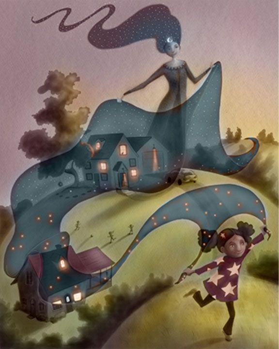
I'm really struggling with color in my Nightfall piece, and I could really use some help. The keywords are soft, comforting, quiet, joyful. The overall palette is influence by warm, late afternoon light and then the "blanket" of Nightfall, which has cool tones. I don't want to get all rainbowy with too many colors, so I'm thinking muted palette. Any ideas/thoughts would be great. Thanks!
-
@Laurel-Aylesworth I'm pretty new at this and worried I'll be wrong but I feel like your grass is too green and bright. Maybe you can push the pink dusk tones a bit further all around and make the ground a bit darker?
-
@Laurel-Aylesworth I think if it were me I'd go with a warm/cold color contrast here! If this is close to night that means it's sunset. Great opportunity for beautiful warm oranges, yellows and reds! And then the cooler night blanket would stand out beautifully. I think you're sticking with overly traditional color choices right now (like grass HAS to be green) and it's keeping you from unleashing the full potential of the piece. This is after all, more of a whimsy piece. So don't be afraid to stray away from typical and very realistic color choices
")
vanessastoilova.com
instagram.com/vanessa.stoilova/Check out my Youtube channel for tips on how to start your career in illustration! www.youtube.com/c/ArtBusinesswithNess
-
@NessIllustration You're so right. Sometimes I get fixated on how things "should" look instead of choosing whatever would serve the keywords. Thanks! I'll explore this some more.
-
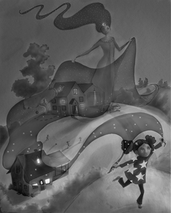
@Laurel-Aylesworth I love this, what a great concept! You asked for help with color, but something was bothering me that I couldn't put my finger on, so i took the color out:
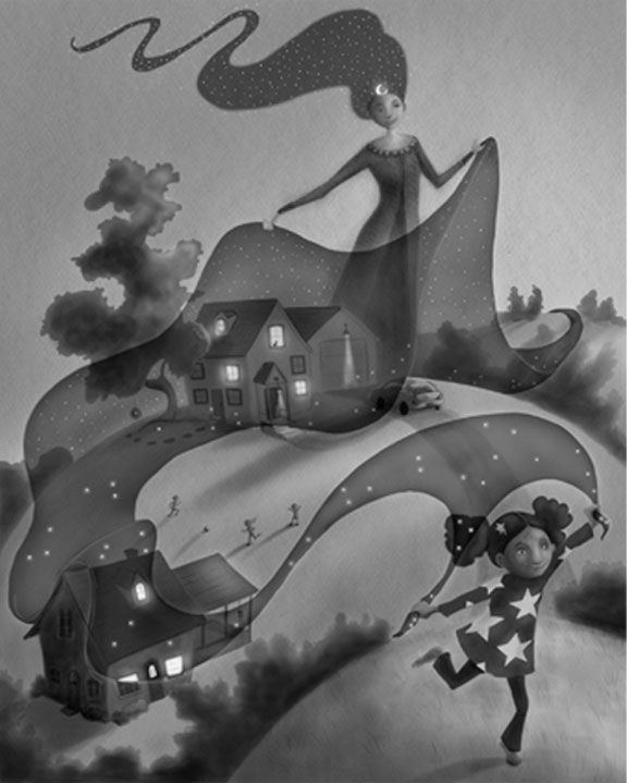
And then changed the contrast to make the girl a focal point:
I didn't finish because I am supposed to be working on my entry
 I always lose track of the contrast I planned with color. The struggle is real over here today too! BUT i don't want to look at mine right now, it's making me a little crazy... I think the edges of the night fabric at the horizon would work better with less contrast than the foreground.
While I was doing this, I noticed the bushes around the foreground hill are creating some tangents that you might not want with the front door and the edge of the sky she's holding.
-
@carolinedrawing Good thinking on the focal point and the tangents. Thank you!
-
Omg I love the way you set up the flow through this! And the translucent veil. WOW!
-
@Laurel-Aylesworth I think that this is lovely, but I agree turning the grass to a warmer hue would really make that nightfall pop.