Society of Visual Storytelling

    SVSLearn Forums

    • Register
    • Login
    • Search
    • Recent
    • Tags
    • Popular
    • Users
    • Groups
    • Search

    Campfire Spread

    Artwork
    critique
    8
    18
    703
    Loading More Posts
    • Oldest to Newest
    • Newest to Oldest
    • Most Votes
    Reply
    • Reply as topic
    Log in to reply
    This topic has been deleted. Only users with topic management privileges can see it.
    • Georgios Christopoulos
      Georgios Christopoulos last edited by

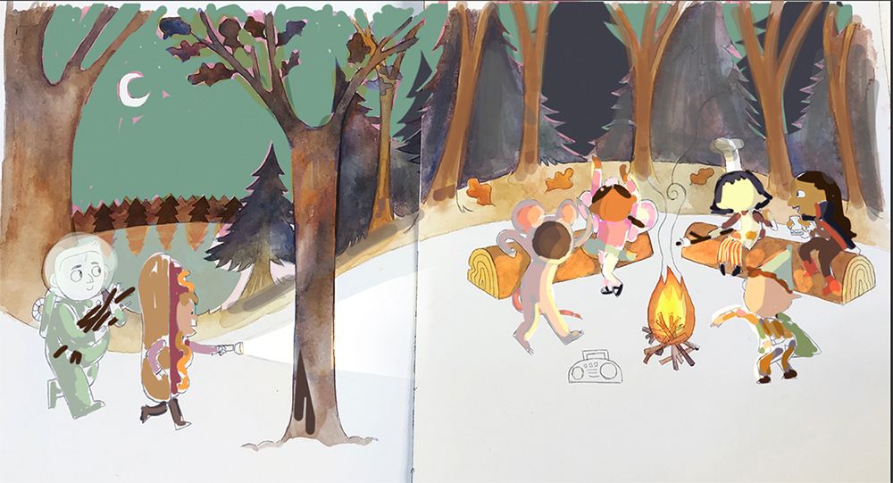
      @Katie-Kordesh Hello Katie! It s a beautiful artwork even at this stage. I prefer option a.

      Having the group slightly elevated and more on the right side of the page gives some feeling of depth and personally I find that pleasing.

      I don t think that a flashlight would be much of a distraction. You should just make the fire a bit brighter. And don t make the light ray of the flashlight very big. I say go for it!

      All in all really cool concept.
      Thanks for sharing!

      Instagram : https://www.instagram.com/g.chris.artwork/
      Deviantart : https://www.deviantart.com/g-chris

      Katie Kordesh 1 Reply Last reply Reply Quote 1
      • Kim Hunter
        Kim Hunter last edited by

        The story you are trying to tell will determine if a chaperone is needed. The Peanuts gang never had one.

        Katie Kordesh 1 Reply Last reply Reply Quote 1
        • Chip Valecek
          Chip Valecek SVS Team SVS OG @Katie Kordesh last edited by

          @Katie-Kordesh I like the first one. As far as chaperone, I would add one sitting on one of the logs, but maybe be scared of the smoke/ghosts, where the rest of the kids are just having a great ol time.


          https://www.instagram.com/chipvalecek/
          https://www.facebook.com/cvalecek
          http://www.cshellmedia.com/

          Katie Kordesh 1 Reply Last reply Reply Quote 1
          • deborah Haagenson
            deborah Haagenson last edited by

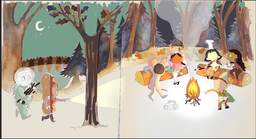
            I do like the dancing girl on the right side and the hamburger eating guy in the second, but I would leave just the boom box as you have in 1 - I would remove the guy by the boom box. I don't think I would add a chaperone, since it might take away from the fun, if that's what you're going for.

            Katie Kordesh 1 Reply Last reply Reply Quote 0
            • Katie Kordesh
              Katie Kordesh @eriberart last edited by

              @eriberart OO thank you! Yeah I'd rather not put one in hehe

              https://www.katiekordesh.com
              https://twitter.com/KatieKordesh
              https://www.instagram.com/kordesh.sketch/

              1 Reply Last reply Reply Quote 0
              • Katie Kordesh
                Katie Kordesh @Rachel Horne last edited by

                @Rachel-Horne thanks rachel!! very much helps : )

                https://www.katiekordesh.com
                https://twitter.com/KatieKordesh
                https://www.instagram.com/kordesh.sketch/

                1 Reply Last reply Reply Quote 0
                • Katie Kordesh
                  Katie Kordesh @Georgios Christopoulos last edited by

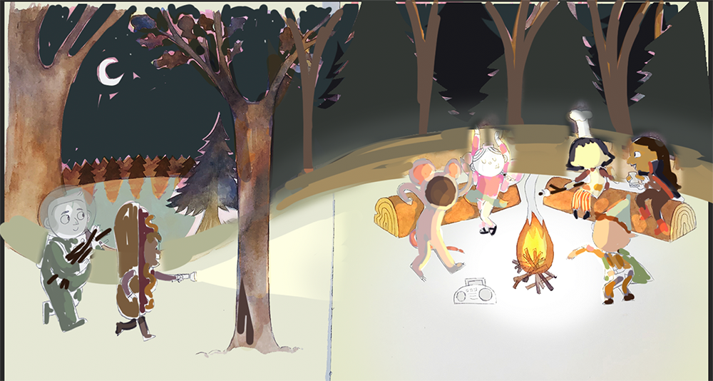
                  @Georgios-Christopoulos Oo good point about depth. I have gone with option A! Thanks for your help 😊

                  https://www.katiekordesh.com
                  https://twitter.com/KatieKordesh
                  https://www.instagram.com/kordesh.sketch/

                  1 Reply Last reply Reply Quote 0
                  • Katie Kordesh
                    Katie Kordesh @Kim Hunter last edited by

                    @Kim-Hunter If its good enough for peanuts its good enough for me

                    https://www.katiekordesh.com
                    https://twitter.com/KatieKordesh
                    https://www.instagram.com/kordesh.sketch/

                    1 Reply Last reply Reply Quote 0
                    • Katie Kordesh
                      Katie Kordesh @Chip Valecek last edited by

                      @Chip-Valecek First one it is 💪🏼 Thanks for your help!

                      https://www.katiekordesh.com
                      https://twitter.com/KatieKordesh
                      https://www.instagram.com/kordesh.sketch/

                      1 Reply Last reply Reply Quote 1
                      • Katie Kordesh
                        Katie Kordesh @deborah Haagenson last edited by

                        @deborah-Haagenson Thanks deborah!! Very helpful

                        https://www.katiekordesh.com
                        https://twitter.com/KatieKordesh
                        https://www.instagram.com/kordesh.sketch/

                        1 Reply Last reply Reply Quote 1
                        • Katie Kordesh
                          Katie Kordesh last edited by Katie Kordesh

                          Current update, My plan when designing this was to leave the the ground completely white, but now I am not so sure.
                          image.jpg camp_v4.jpg

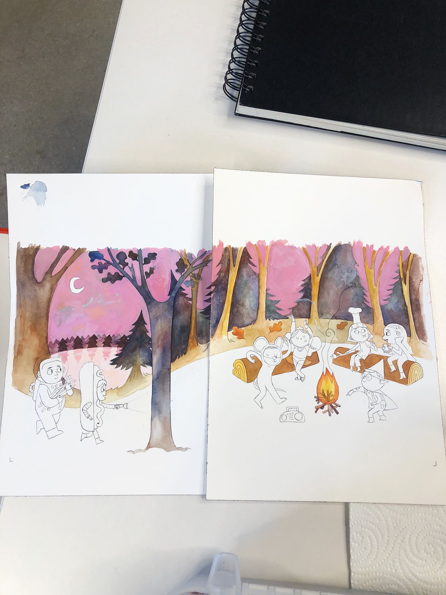
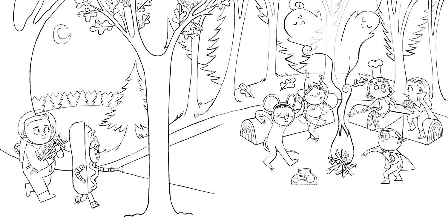
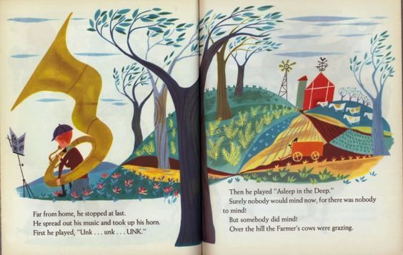
                          Here was my compositional inspo
                          fb480e7bde90347b2e6ee95145ae5f2f.jpg
                          I am also currently second guessing the pink sky. I think I am going to start painting the characters and see how I feel after that. I really enjoy how it looks but I don't think I want it to be the focal point of the image

                          https://www.katiekordesh.com
                          https://twitter.com/KatieKordesh
                          https://www.instagram.com/kordesh.sketch/

                          NatLundeen 1 Reply Last reply Reply Quote 0
                          • NatLundeen
                            NatLundeen @Katie Kordesh last edited by

                            @Katie-Kordesh

                            This is looking so good! I agree with the pink sky--it's pretty but definitely draws my eye away from the kids.

                            Instagram: instagram.com/natlundeen/
                            Website: www.natalielundeen.com

                            Katie Kordesh 1 Reply Last reply Reply Quote 1
                            • Katie Kordesh
                              Katie Kordesh @NatLundeen last edited by

                              @NatLundeen aw thank you! RIP pink sky 😢

                              https://www.katiekordesh.com
                              https://twitter.com/KatieKordesh
                              https://www.instagram.com/kordesh.sketch/

                              NatLundeen 1 Reply Last reply Reply Quote 0
                              • NatLundeen
                                NatLundeen @Katie Kordesh last edited by

                                @Katie-Kordesh 😭 I keep having to kill things like that in my illustrations. I just want everything to be bright and pretty! 😋

                                Instagram: instagram.com/natlundeen/
                                Website: www.natalielundeen.com

                                1 Reply Last reply Reply Quote 1
                                • Katie Kordesh
                                  Katie Kordesh last edited by

                                  Next time I will do a color comp before I started painting

                                  Screen Shot 2020-03-05 at 1.21.24 PM copy.jpg Screen Shot 2020-03-05 at 1.17.31 PM copy.png
                                  Screen Shot 2020-03-05 at 1.31.11 PM copy.png

                                  https://www.katiekordesh.com
                                  https://twitter.com/KatieKordesh
                                  https://www.instagram.com/kordesh.sketch/

                                  1 Reply Last reply Reply Quote 1
                                  • First post
                                    Last post