April contest WIP, any feedback welcome!
-
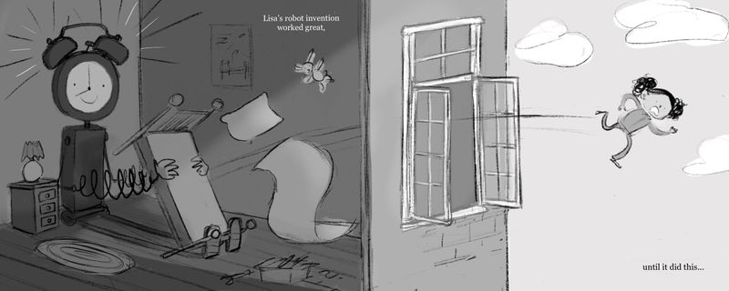
Rough work in progress for the April contest - I'd love to know what you guys think. Does the concept read clearly and does the composition work okay? I've drawn this with a double page spread in mind. Any feedback at all would be greatly appreciated! Thanks!
-
Cool concept, and I encourage you to have fun with adding stuff to Lisa's bedroom! (I realize it's just in the rough phase right now, but eh, something to look forward to when adding details!)
Though on the topic of details, if you're going to add text to this spread, be aware of the margins and text size. While you have plenty of room to move around the text on the right page, the left page looks a bit cramped for room. I would suggest removing the poster (or moving it to the other wall?), and rearranging the pillow, blanket and bunny so that their spacing relationship isn't so even with the bed or with each other.
Also some technical advice with type, fine white text on a dark background doesn't usually read as well. Some work arounds are increase text size, choose a font that reads a bit better (slab serif, or san serif work well), and/or if using a program like Adobe Illustrator or InDesign, you can place a .1 pt. stroke around the text which can help it to read better without damaging the look.You've got some great lighting going on though! Have fun making the final image!
-
@JoshSchouwstra Hi Josh, thank you so much for taking the time to give some feedback!
Now that you mention the text on the left I can totally see what you mean. Removing the poster to free up space for the text is a really good suggestion. I agree with you the flying objects need rearranging, thank you pointing that out. When I come to the point of deciding which font and type size to use in the final I will bear your tips in mind")
-
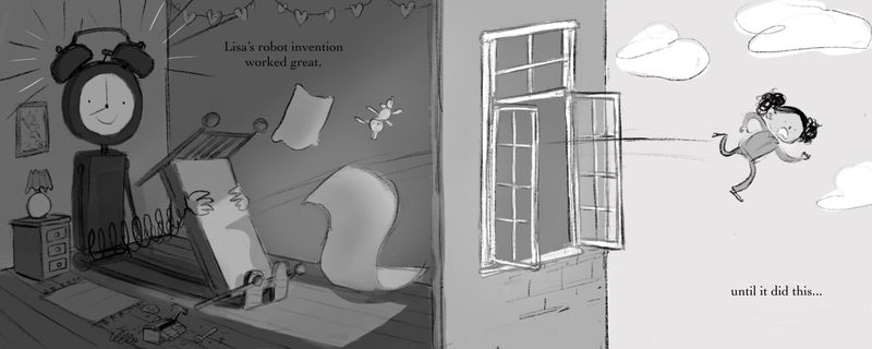
Made some small changes and improved the lighting. Still not sure if the light completely makes sense.
-
Hi @Annabishop I like it a lot, a good idea! Yes the concept and comp reads clearly. If it were me, I would play with the pose of the girl being flung out. Maybe some waving arms? maybe have the stuffed animal outside with her being dropped...adds a touch more story. I've sketched a quick ugly thing if you don't mind!
Whatever you choose, I look forward to seeing it further!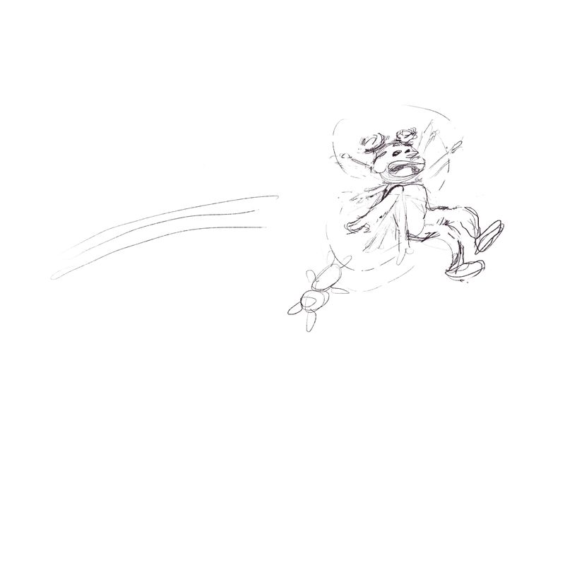
-
@artbytra Thank you for the feedback! I like the idea of the rabbit falling out the window too. I will move some elements around and see how it looks. I think you're right that I could push the pose of the girl a bit more. However I'm wary of adding too many cartoon-y elements since I want this to fit in a children's book portfolio. I'm googling 'human catapult' for some reference images now haha
-
Hi @Annabishop, I like the 2 page spread!
From a kid’s lense, I’m a bit worried for the little girl. Is she 20 stories in the air? Will she be okay? Maybe you can show a back yard and a trampoline with her flying over it instead of landing on it? Almost like the trampoline would allow her to bounce up into a tree house, but instead she’s flying past it?
It’s a cool piece, but that’s what came to mind.
-
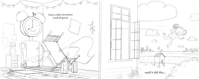
Realised the perspective was pretty wonky so did a second pass with adjusted perspective and some added details. @Jeremy-Ross you make a really good point about the implied danger the character is in. I wonder if this updated version solves that effectively?
-
Hi @Annabishop, that did the trick! Nicely done.