Society of Visual Storytelling

    SVSLearn Forums

    • Register
    • Login
    • Search
    • Recent
    • Tags
    • Popular
    • Users
    • Groups
    • Search

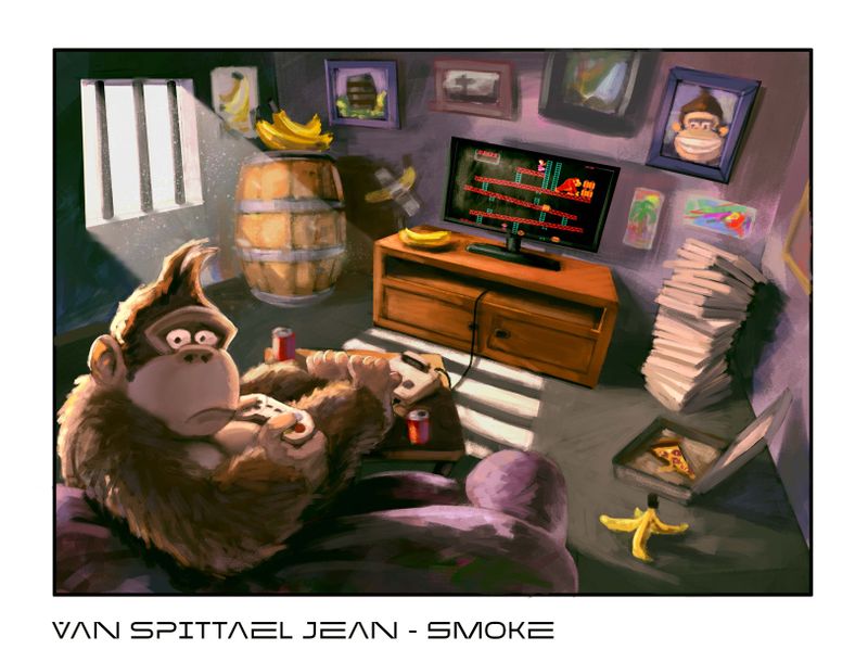
    ISOLATION WIP - toughts please

    Artwork
    7
    17
    580
    Loading More Posts
    • Oldest to Newest
    • Newest to Oldest
    • Most Votes
    Reply
    • Reply as topic
    Log in to reply
    This topic has been deleted. Only users with topic management privileges can see it.
    • Neha Rawat
      Neha Rawat last edited by

      Great rendering! I've never played Donkey Kong so I'm not sure if I'm missing some connection to the setting, but it's still a funny image!
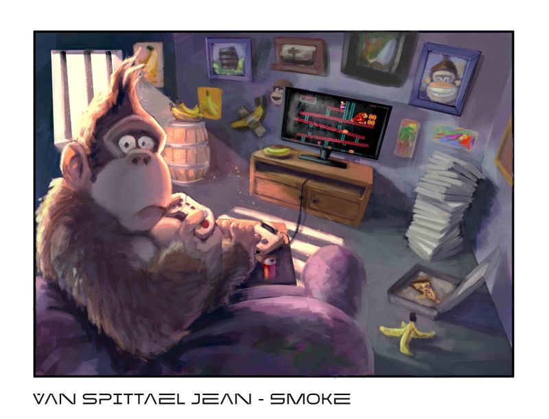
      I'd just smudge the edges of the light beam coming in through the window. The sharpness of that is really standing out compared to everything else.
      Other than that, I really like the expression!

      https://www.nrbstudio.in/
      https://www.instagram.com/nrbstudio.in

      smoke 1 Reply Last reply Reply Quote 1
      • smoke
        smoke @Neha Rawat last edited by

        @Neha-Rawat thank you, i will look into that. 🙂

        smoke

        1 Reply Last reply Reply Quote 0
        • smoke
          smoke @JudeKillory last edited by

          @JudeKillory thanks 🙂

          smoke

          1 Reply Last reply Reply Quote 0
          • smoke
            smoke @carlianne last edited by

            @carlianne Thanks, i'll see if i can fix it 🙂

            smoke

            1 Reply Last reply Reply Quote 0
            • smoke
              smoke @theprairiefox last edited by

              @theprairiefox the window is more simbolic obout how i feel with the corona lockdown, and he looks at us to drag the viewer into his miserable feeling about the whole situation, to get a sort off conection with the viewer. but i wil think about your toughts, thank you

              smoke

              1 Reply Last reply Reply Quote 1
              • Rachel Horne
                Rachel Horne @smoke last edited by

                @smoke I like this a lot, I think the style is really nice. I agree with the comment coming in through the window, the edges could maybe be more smudgy. I like the concept and don't know what expression you're going for but he looks a little guilty to me likes he's been caught off-guard...?

                www.rachel-horne.com
                instagram.com/rachel_horne_art

                1 Reply Last reply Reply Quote 1
                • smoke
                  smoke @smoke last edited by

                  @smoke

                  part 2?
                  Toughts please

                  kong-mei svs.jpg

                  smoke

                  Kevin Longueil 1 Reply Last reply Reply Quote 0
                  • Kevin Longueil
                    Kevin Longueil SVS OG @smoke last edited by Kevin Longueil

                    @smoke Ha! this cracks me up - I hope you don't mind, I did a quick and not so good draw over to show what i was thinking - i feel like we would see the top of the barrel from our eye level - @carlianne mentioned the ellipsis of it earlier - i tried to get everything to match the same horizon and vanishing points in the image - i think right now that the table, the room, the couch, Kong, and the barrel all have slightly different vanishing points - and possibly our eye level is much higher when looking at Kong than it is for the rest of the room...i could be wrong on this - 🙂 anyways feel free to ignore

                    Kong 3.jpg

                    Portfolio: kevinlongueil.com
                    https://www.instagram.com/kevinlongueil/

                    smoke 1 Reply Last reply Reply Quote 2
                    • smoke
                      smoke @Kevin Longueil last edited by

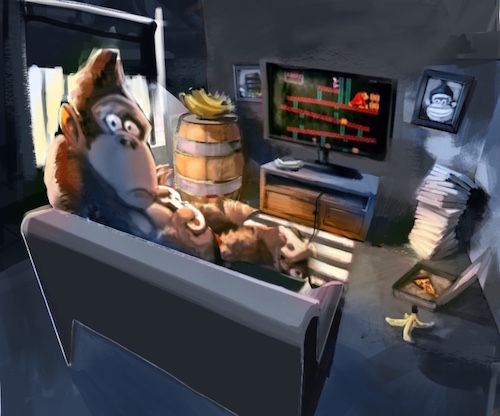
                      @Kevin-Longueil there are some things I like about your paint over, first off al, DK looks a lots bigger with your Approach, so I will surely will work with that, I yust dont want that the room looks to small, and I ain't a big fan of that that very Blue / saturated color use.
                      I am yust a very big fan off Marco Bucci, s color use. So that's what I am going for
                      And your right making the vanishing point lower make DK appear bigger and make you see the top of that barrel, so I will work with that for sure.
                      Thank you for your input, it makes a big deal for me and it is a great help. Ty

                      smoke

                      1 Reply Last reply Reply Quote 1
                      • smoke
                        smoke @smoke last edited by

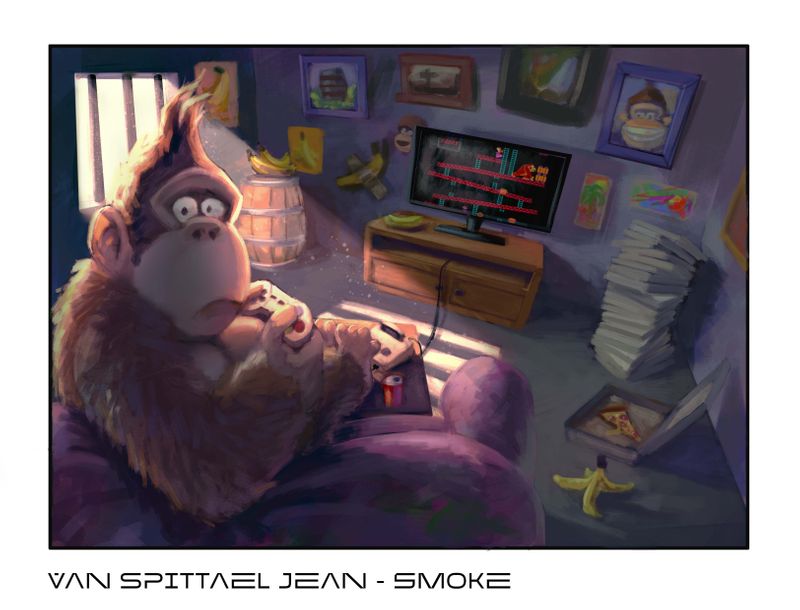
                        @smoke New attempt with some adjustments you people recommended.
                        More feeback always welcome.
                        Thanks everybody for helping me out to be a better artist. your'e all appriciated.
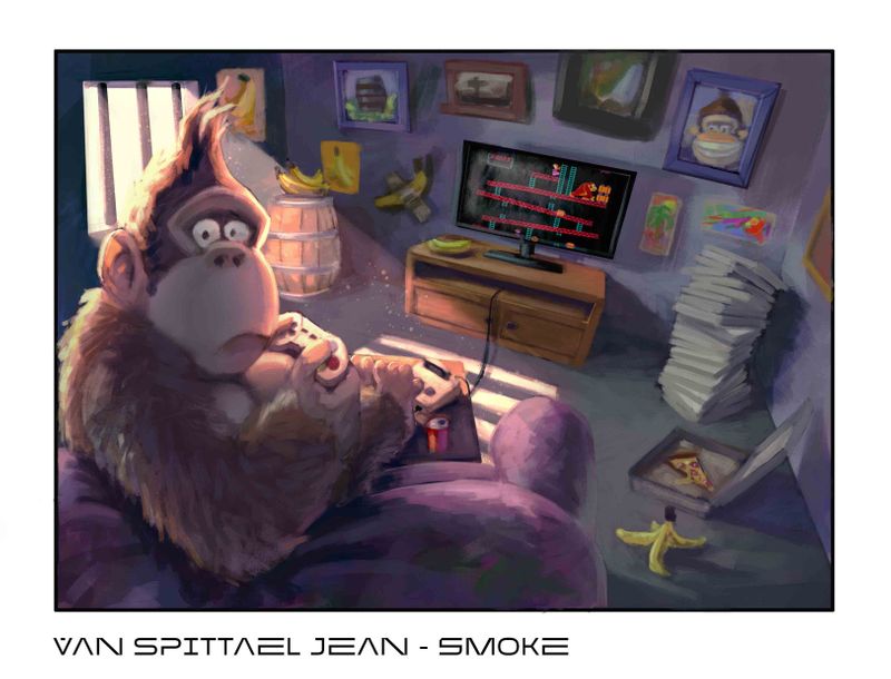
kong-mei svs.jpg

                        smoke

                        1 Reply Last reply Reply Quote 0
                        • smoke
                          smoke @smoke last edited by

                          @smoke kong-mei svs.jpg

                          smoke

                          1 Reply Last reply Reply Quote 0
                          • smoke
                            smoke @smoke last edited by

                            @smoke

                            Thats it, if you got some feedback? please br free to share please.

                            kong-mei svs.jpg

                            smoke

                            1 Reply Last reply Reply Quote 0
                            • smoke
                              smoke @smoke last edited by

                              @smoke kong-mei svs.jpg

                              smoke

                              1 Reply Last reply Reply Quote 2
                              • First post
                                Last post