Dragonfly WIP looking for feedback
-
@Annabishop I really like the whimsy of this idea!
 my only thought is maaaybe make them a teensy bit bigger than the rest of the objects just to give it that extra oomph of focal point...just an idea
-
Great idea @Annabishop, and grayscale contrasts look great! Can’t wait to see the finished piece!
-
@Annabishop Very cute idea! I think making her larger in your second version really improved the image.
My only comment would be that she's flying out of the image instead of into the image. Maybe try flipping the background and her position, but leave her and the other dragonflies pointing the same direction (so she's still between the flowers and flying left to right, but she's on the left side of the image instead of the right).
Great values and love the other pixies hanging out if the flowers.
-
@Annabishop This is great, and I'm so glad you shifted the dragonfly to the right a bit. You might want to think about reducing the size of the pixie's head (the one on the left in the flower) because it's competing with the dragonfly pixie in order of importance (right now they seem equal). Values look good too. Can't wait to see the next version!
-
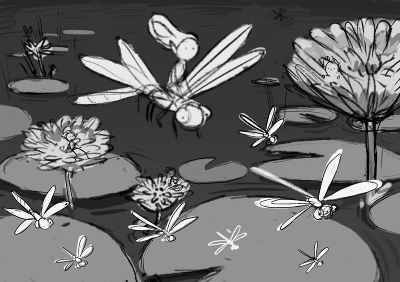
@Annabishop Play with more thumbnails. This idea seems to close to the prompt image. Add something to the story. The use of tones is good showing focal point and my eye goes directly to the middle figure with the circular framing of the pond beneath it.
-
Thank you everyone for the helpful feedback! I had some time today to make a (hopefully) improved version. I took @miranda-hoover's great suggestion of flipping the background so the main character is flying in to the image rather than flying out. Does this look better?
-
@Annabishop I think this is looking great! I can't wait to see your progress on this drawing
")
-
@Chris-Perry-0 When Jake posted the fairy and dragonfly image the day after I uploaded this WIP I did have a "Ahh crap" moment haha.
 It may well mean I don't get votes in the contest since it looks unoriginal but winning the contest isn't really a priority. I'm more interested in using the contest as motivation to make a cool portfolio piece.
 -
@Annabishop hey,
*these comments are feedback from your original post.
Your values look good. I agree with those who have noted your character to centered. If you moved her over slightly to the right and maybe down a bit, I feel it is a bit uneasy near the top edge. And if you possibly overlapped the character and her ride overtop another Lilly pad (add to our perception of depth).
I recognized the shadows of the dragonflies a bit more but maybe make them more blurry because they are in motion and the actual critters more in focus but less focus than the main characters.
My last note is maybe adjust the two sizes of the pixie and the dragonfly she is riding, she feels to me she might be more weight on top of him/her. So I'd either make your pixie smaller or your dragonfly larger.
Water lilles are really among my very favorite flowers.
-
@Annabishop Looks great! I'm excited to see what colors you pick!
-
@Annabishop looking good! Your composition is lovely. I can't wait for your finished piece
-
I love the perspective on this. I think your latest version is spot on. Can't wait to see it!
-
@Annabishop Good. That is why I'm doing it as well. It gives you real life scenario for creating story driven images. Good Luck.
-
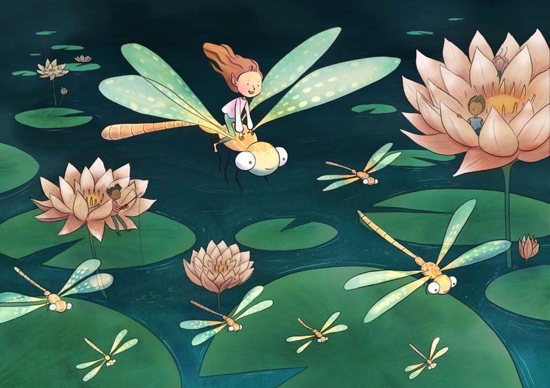
Here's the latest version! I'm at the stage where I'm not sure if it's finished or not. What do you guys think? Are there any adjustments I could make to improve it?
-
@Annabishop Beautiful piece! I love how her hair is flowing in the breeze! If it were me, I’d go through and add shadow and highlights just to give the painting a bit more dimension. Great job!
-
@Annabishop hey its a beatiful piece!! Ready to go!
If you ask for adjusments...I think the image is already working but..mmm maybe you can add a little more light on the big flower to generate some contrast, but as I said is already working, good job!
-
@alicia Thank you! I think you're right, I'll have a go at adding some more shadows and highlights.
-
@Jordi-Ventura Thank you! I will have a go at adding some more highlights to the flower. I was a bit worried it would compete with the focal point if it had too much contrast but I'll try it out and see what it looks like.

-
Hi! I'm new to SVS forums so I hope this is okay. I like a lot of things about your piece especially the world you've created here. I wonder if you could strengthen the focal point by darkening the flowers etc? As is, the three flowers, the girl on the dragonfly, and even the large lily pad on the bottom almost read as on the same plane? Good job and good luck!
-
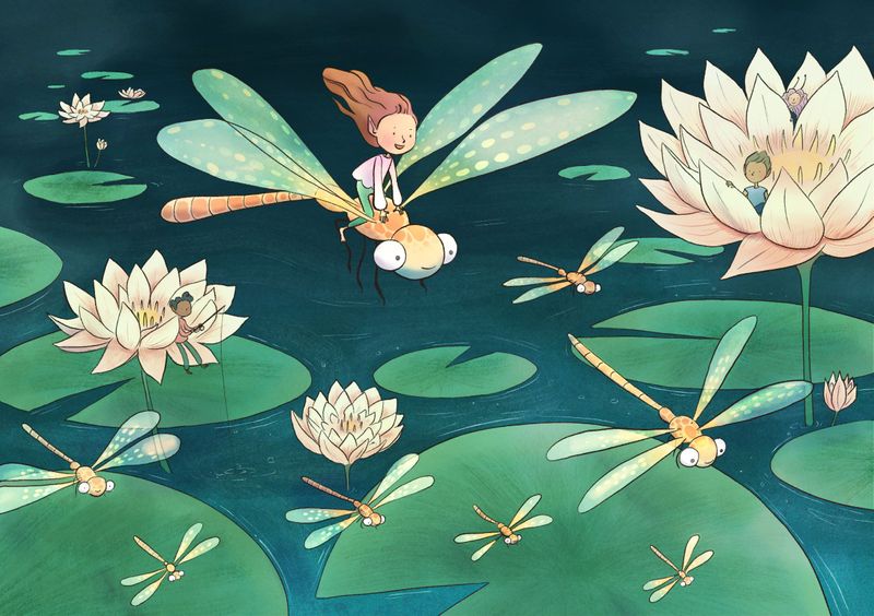
Thank you @Joanne-Roberts, @alicia, and @Jordi-Ventura for the feedback! Is this working better?