September WIP | Squid Ink Fairy | Requesting Feedback
-
I like 4 also, but I prefer 1 over 2.
-
I love your ink fairy! It's so cute!
I prefer 1 and 3 where Ellie is looking at the fairy. Ellie's line of sight guides us across the page to the fairy, and towards the page turn of the book.
2 and 4 are a little confusing to me as Ellie is looking back instead of towards the fairy (and towards the page turn/flow of the reader, line of action in a picture book should be left to right in western picture books as this is the way we read!) so it feels to me almost like 2 separate spreads as the 2 elements (Ellie and the fairy) aren't engaging with each other. 2 also doesn't convey to me that Ellie is hidden
-
@miranda-hoover #3 draws me into the story the most. I like that Ellie is hidden and we’re in on the secret and the composition has a nice depth that 1, 2, and 4 don’t.
5 is nice too but Ellie’s face will be pulled into the gutter which would be a shame. -
Nice sketches! I prefer 1 and 3, because for me it guides the eye better to the main focal point (fairy) by following the gaze of Ellie. The readability of the spread goes nicely from left to right by following the gaze of Ellie towards the fairy and following the fairy to the next page (continuing the story). Both characters are also nicely positioned on 1/3 of the spread.
-
@miranda-hoover I love the idea of Ellie being an animal instead of a human!
I don't know much about children's book spreads either, but I like the layout of #3 the best.
Also, an idea that might be fun is Ellie having multiple cameras (since she has so many arms) giving the text a little more weight. Like, she REALLY wants to get the picture and isn't taking any chances.
Just a thought! I love your idea and can't wait to see more!
-
Really cool concept! I'm looking forward to seeing the final. I personally like 3 the most because like some other people have said, Ellie looking at the fairy definitely guides the eye across the page. And I think that one looks the most like she's hiding if that's what you're going for, and the plants surrounding the fairy really put the emphasis on her
-
I like 3 best also! It directs the eye and the other pages seem very symmetrical. Very creative Idea! Can't wait to see the final piece!
-
I love the character design of the squid!! Especially how the head part looks like the pen nib.
In terms of the comp it's number 3 for me, I think it works really well and i'm looking forward to seeing the development whichever you go for
-
@miranda-hoover this is so cute!
-
@miranda-hoover I really love 3, and 5. 3 being my favorite because there is a curiosity and apprehensiveness.
-
@Jacy13 @Rachel-Horne @deborah-Haagenson @eriberart @Lovsey @Wouter-Pasman @JoshuaDages @Melanie-Ortins @K-Flagg @Gary-Wilkinson @Nyrryl-Cadiz @Heather-Boyd
Thank you all for your great feedback! It's been super helpful Think I'll go forward with #3 for this one.
 -
@JoshuaDages
 That is a great idea! Thank you!
 -
Amazing! Such an out of the box idea. Love it! I am really drawn to #5 but I think #3 shows more of the octopus and I think that works beter compositionally as well.
-
Super love your concept! For me I like 2 the best, it seems to be the moment before the action and allows for my own imagination to fill the gaps.
-
@Gabby-Correia & @erinrew Thank you!

-

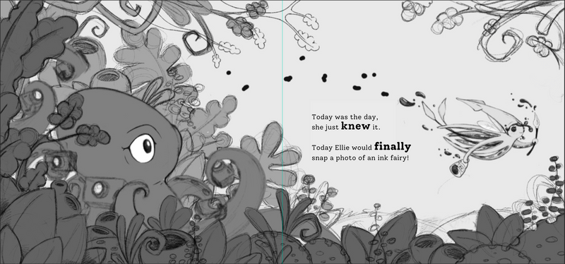
Thought this would be a good stage to show my progress. It's still a sketch (I had a bit of a battle with the plants), and I haven't sorted out my values just yet. I took @JoshuaDages awesome idea and added in some more cameras, and if I have the time, I'll try to make each camera look different. I also changed the position of the fairy and the text (from thumbnail #3
 ) and I was curious if this works better. Also, any thoughts on the font choice?
 -
@miranda-hoover I love the way this is coming out! Great job!
-
@JoshuaDages Yay! Thank you!
-
@miranda-hoover I think the new positioning of the text/fairy is much better. I really love this one, sweet concept and really nice design!
-
@mamadraw Oh good! Thank you for the feedback
