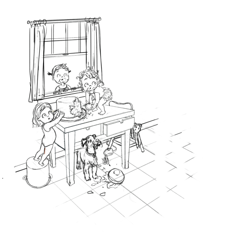
I need to finish this piece.
-
@tessaw I like the change, it brings more focus on the girls. This is such a fun piece!
-
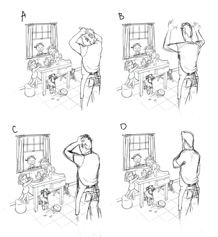
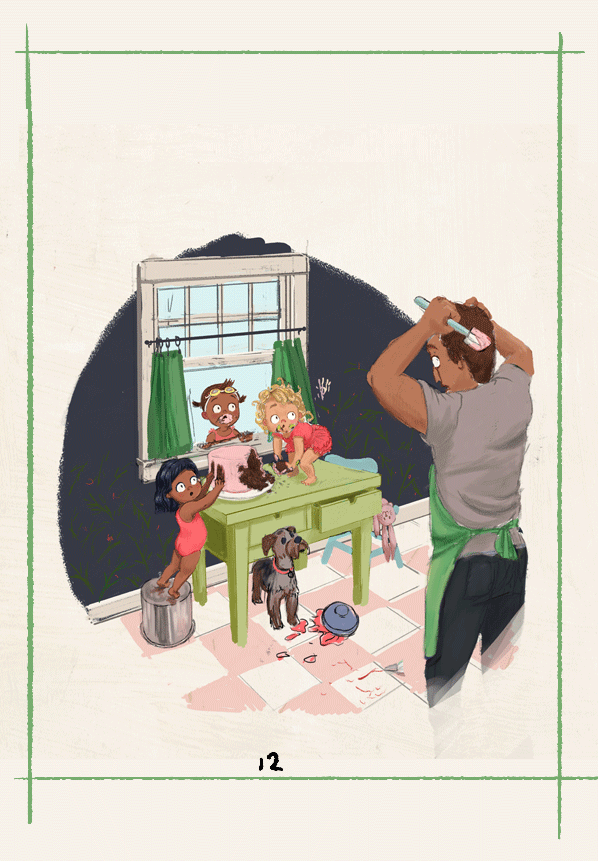
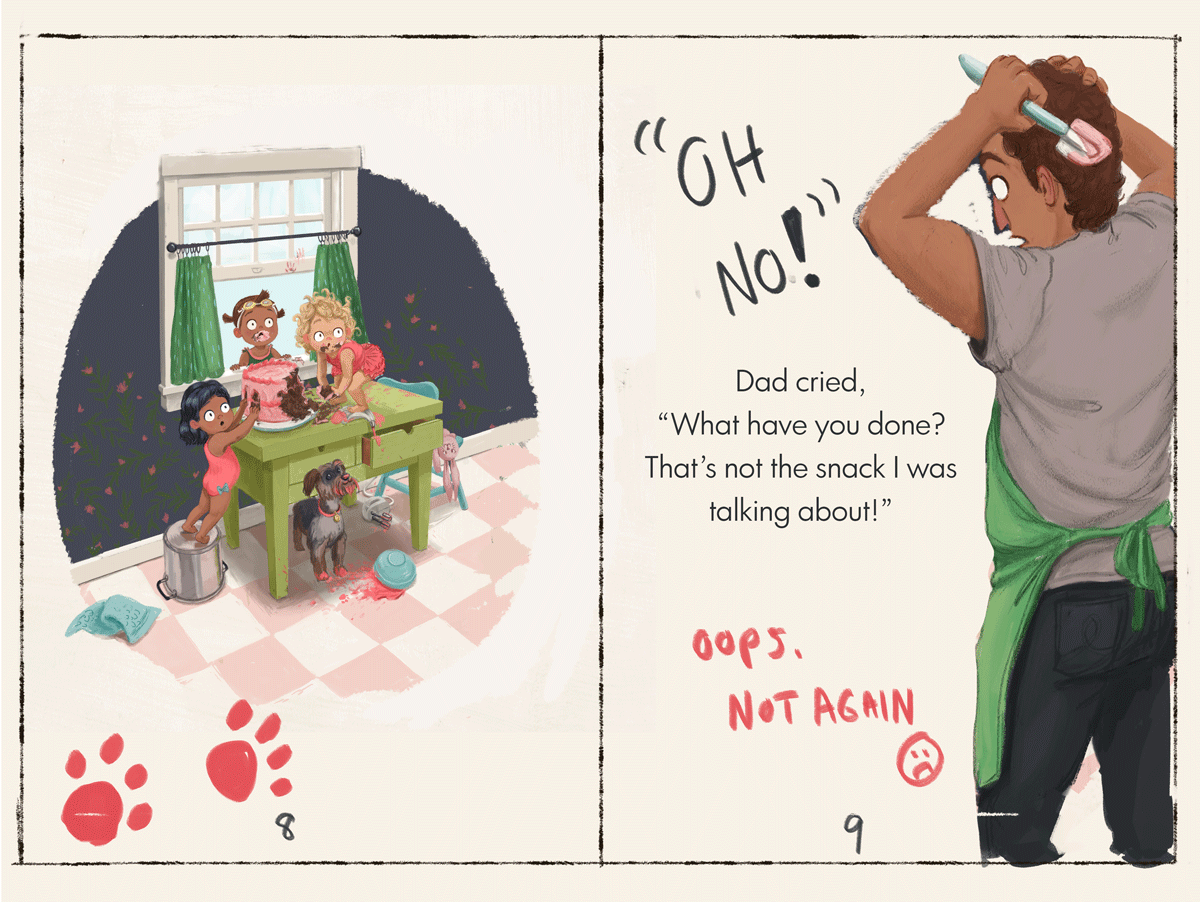
Thank you all for your feedback so far! It's been really helpful and you've provided some great ideas. I've made some additions, and I feel that perhaps the dad's pose may need to change as a result. What do you think of these general ideas?
Website: www.tessawrathall.com
Instagram: www.instagram.com/tessawrathall_art/
-
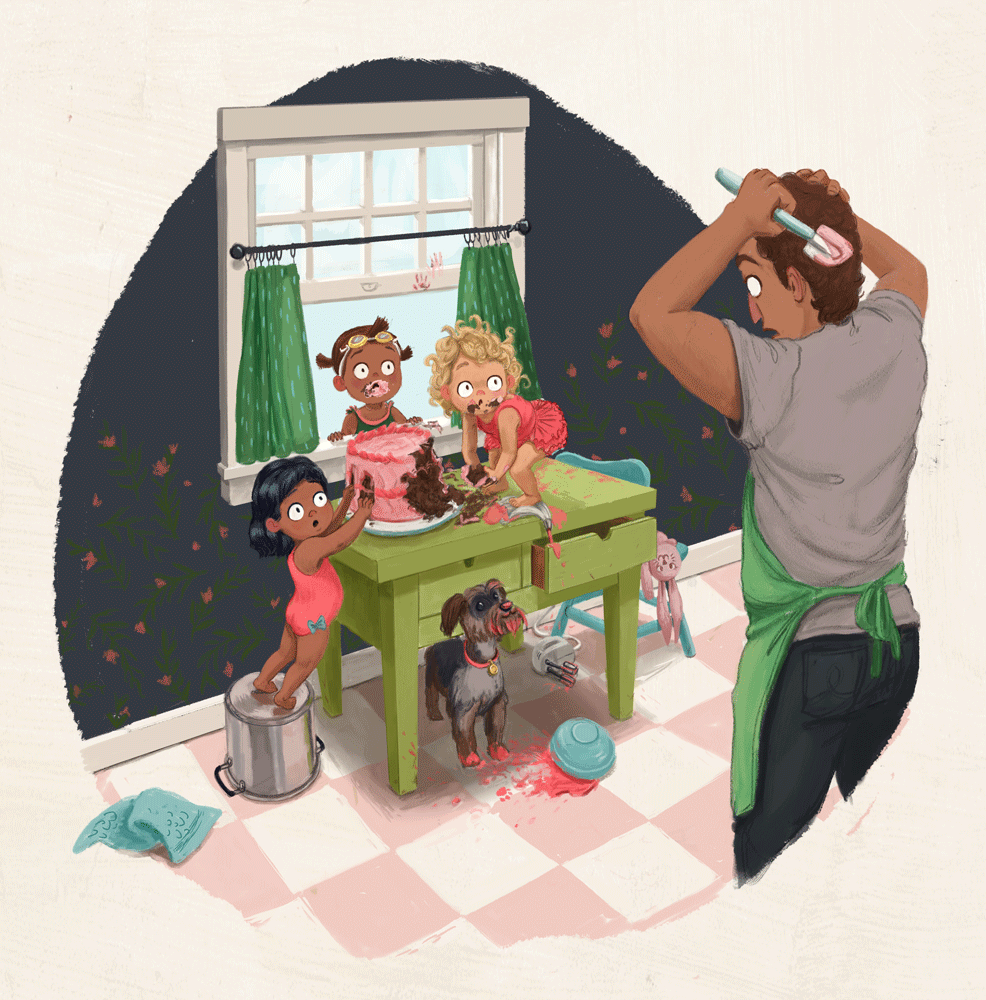
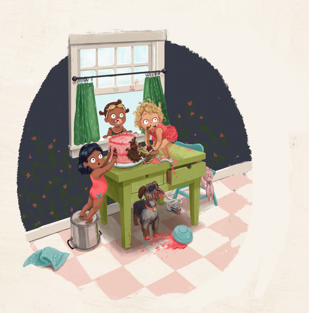
@tessaw I like C the best. Great addition with the dog and kid in the window. You should had some chocolate hand prints on the walls or curtains.
-
@tessaw I like A & D the best (B seems like it could be read as angry instead of exasperated). All the additions look good! I also like the simplicity of the first one at the start of this thread. Whatever you decide to go with, this piece makes a fun little story!
-
I still like A best. I like that he is holding the spatula. Agree that B looks too angry
-
I think I like A the best, with C as a close second. Love that he's holding the spatula--"Oh, think I'll just put the finishing touches on the caaaaaakkkkkeeee." I like the dog as well. I love the juxtaposition of the kids like "UH OH!!" and the dog's clueless joy! When my old girl was a puppy, I'd come home and she'd be sitting in a little pile of my ruined possessions, all proud and glad to see me! "Hi! I missed you! I destroyed your stuff while you were gone!"
-
@tessaw very interesting story! I like A the best because it shows clearly that the dad who just finished creating the cake. I really like this illustration

-
@tessaw Love A especially, dad's emotion can be clearly understood, spatula adds to the drama. Wonderful illustration!
-
@Chip-Valecek Thank you! The hand print is a good idea. I'll play around with that during the final stages.
@Miriam Thanks! I also liked the simplicity of the first one, but I can see how the second has it's appeal. It's difficult to choose.
@holleywilliamson Yeah, I think you're right!
@Eli Aw, that's so cute. Reminds me of my kids. Sometimes they mess things up, but they are so cute about it, that it's hard to be mad!
@lenwen Thanks for voting! It seems like A is definitely the favorite.
@Anyak Good points!
I've messed around with it more. It's hard to find a long enough chunk of time to get into the zone. I did try to insert them into an easy read chapter book format, as an experiment to see how that would impact it.
-
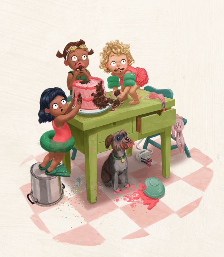
Just a thought, but I was looking at the sketch you did that has the dad missing from it and I thought that the children's faces were so expressive that you may not even need the dad. One look says that there is an adult in the room and they are BUSTED.
-
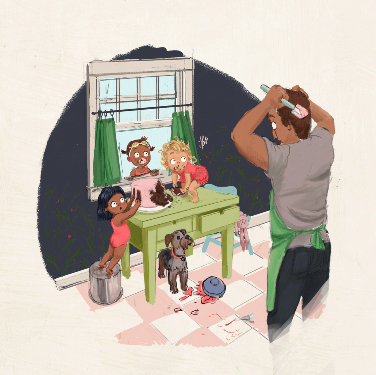
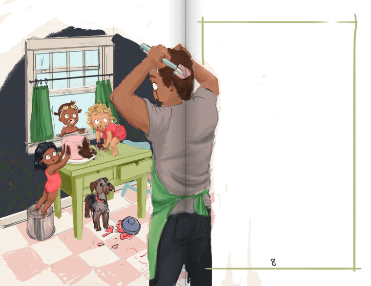
When I saw this I wondered if maybe it could be a two-page spread. The words of a story set between the kids and the dad. I could totally see him off to one side, so the focus is still on the kids.
")
-
@burvantill That's interesting. I tried it without the dad. What do you think?
@HBryant That's a good idea. It's fun to think of composition within a page layout. I'm not sure how that works in a portfolio though. I don't think I've seen a spread in someone's portfolio site. I'll have to look it up.
Ok, I'm pretty much done, but I'll let it rest for a bit and probably make finishing touches. Any thing not working? Does it look like all the characters are looking at the dad? I also included some alternate versions, to try out people's suggestions.
-
Looks so good!
One tiny thing that threw me off... I can't see the Dad's pupils, so it looks a bit spooky to me.
-
One thing I noticed is the dogs butt is tangent to the bottom of the table. It flattens that part of the illustration. I would set the dog back further under the table to give it more of an overlap or move it further out from under the table so there is a gap between the dogs back and the bottom of the table. I'm loving everything else.
-
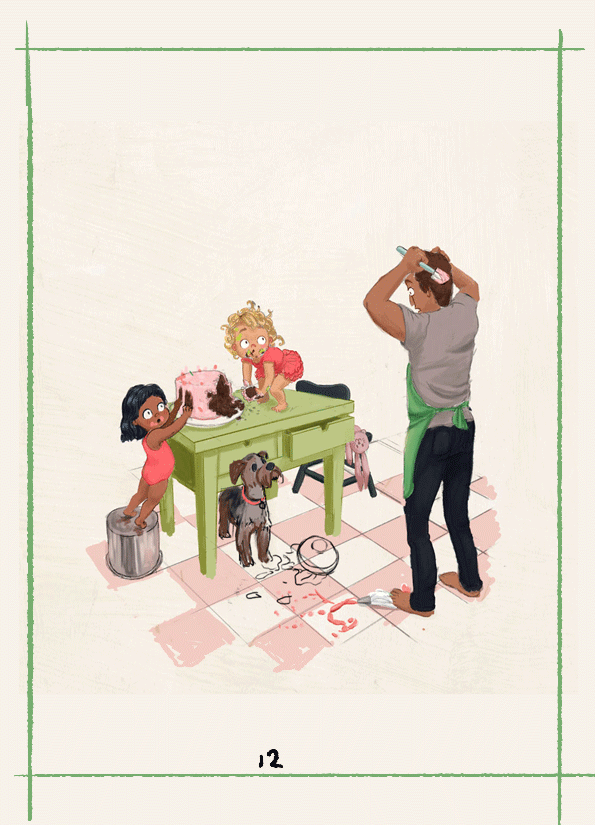
I think the illustration is stronger without the dad in, but having in on the opposite page as you have in the last image, although you might want to reduce the size of him slightly. Lovely work!
-
Hi Tessa, fun and beautiful work! I really love the first image you posted!!!! It actually looks finished to me when I saw it. I love the composition- how I was drawn to the little girl of the table first, then the one on the bucket, then the dad's expression.
With a simple background as it is, with maybe just finishing up the little details. Just my opinion though. Have fun and good luck! -
Firstly, your work is amazing and I’m a huge fan. Seccondly, everything about the kids poses/expressions is perfect and hilarious. Just love, love, love them! And the dog’s happy-to-see-you face with his beard covered in red icing is just great haha (the cute little pawprint is an adorable detail, too).
Thirdly, my crits (take ‘em or leave ‘em):
-
I agree with @Concept about the dog butt table tangent. I think, in perspective, the back end would be raised just a bit higher and be slighterly further back (it looks small/short atm in comparison to the front) perhaps, and that would fix things?
-
At first I thought the floral wallpaper was bits of cake, possibly because the flowers are just close enough to pink that you wonder, and because the entire wall isn’t covered evenly with the pattern.
-
I don’t think we need to see the dad’s face, or his eyes bulging (it looks a bit odd anatomically), because we can tell he’s surprised already from the pose and the kid’s expressions. I prefered pose D because his body language felt more instinctual, as though he were placing his hand on his chin to pause and take a deep breath of horror at the realization that he would not be bringing this cake to the party lol. The spatulata in a fist by his hair (which might have icing in it from doing that) feels a bit stiff/unatural, and more like anger/frustration than the initial shock you’d experience in the first moment of discovery.
 Just my opinion, though.
Even if you leave it as is, I love this piece. Best of luck finishing up your portfolio!!
-
-
@tessaw I really like the image without the dad. The scene is 100% about the kids without dad. I really feel for those poor kids getting in over their heads and I can imagine the scary/angry look on dad's face! Really nice updates and on this one. I like the window added and the dark wallpaper used to frame the scene.
-
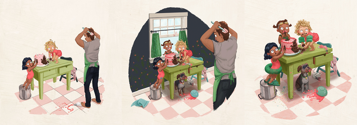
Thank you all so much for the continued feedback! I've tried to implement a lot of the suggestions. Hopefully I've worked out some of the issues and gotten it to a better balance. While I was liking the idea of the window and wall, I think I ultimately wanted to add a piece to my portfolio that included minimal background. Let me know how it's working and if the values are too dark? I'm also not totally feeling the color palette with how the greens are distributed, but hopefully I can sort that out.
Here are the major iterations
Website: www.tessawrathall.com
Instagram: www.instagram.com/tessawrathall_art/
-
@tessaw Love the addition of the sprinkles!!