Can I ask for your help? Which backdrop looks better?
-
Hello!
")
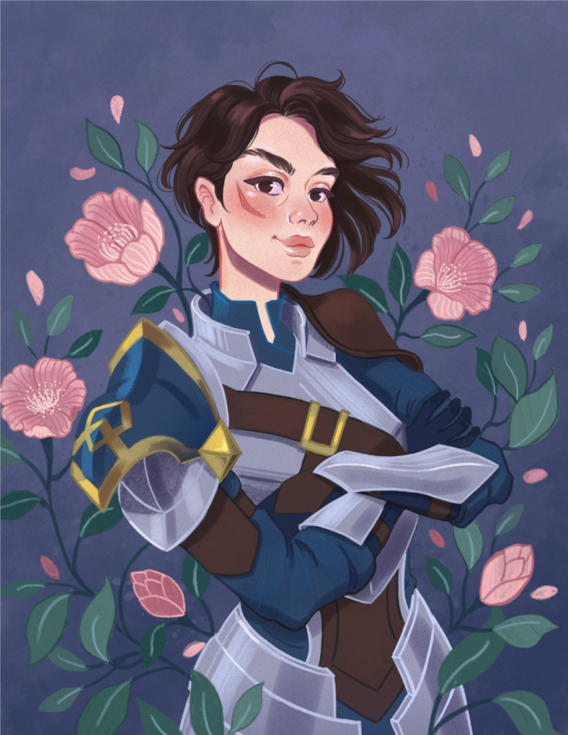
So I think I went overboard with this General Amaya fanart (The Dragon Prince) - it was supposed to be a lot simpler. But I'm struggling with the backdrop, I can't tell which one looks better, 1, 2, or 3? I think I tend to make my drawings too crowded...
#1
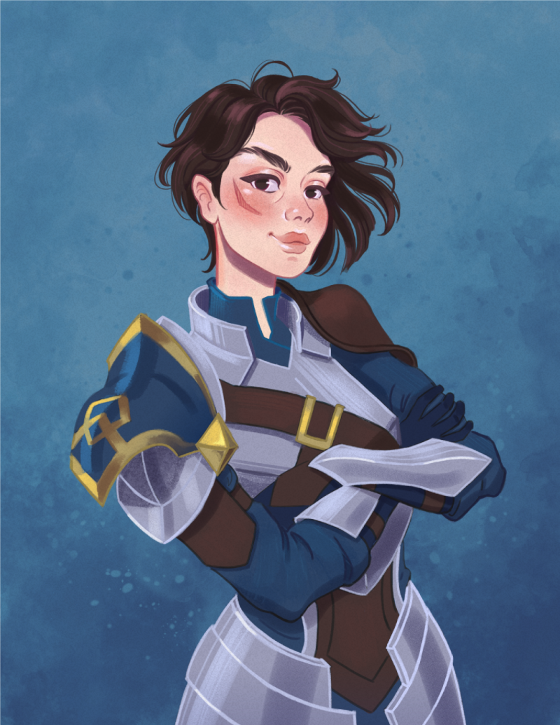
#2
 !
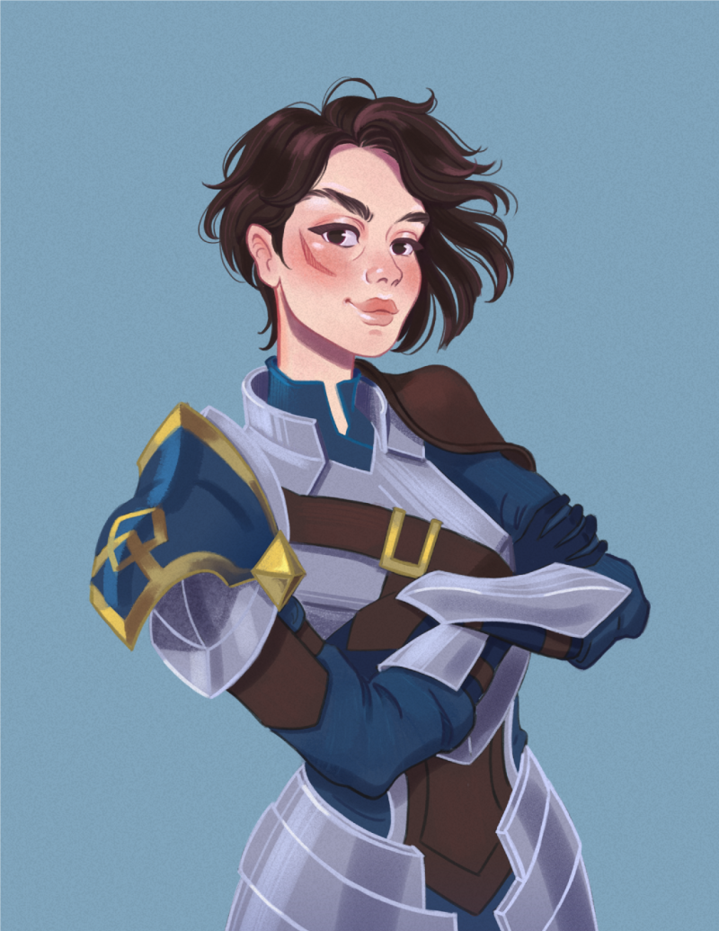
!#3
Thank you for your time!
-
I generally like 2 better but maybe you tell us your keywords. What is the feeling you are trying to convey?
-
2 or 3, 1 feels crowded due to the values. Ilike3 this but I think the lighting needs work
-
Without a doubt, #1 is for me. It showcases both the character’s femininity and badassery. I also love the pink flowers against the dark blue background. Go with 1.
-
@holleywilliamson hmm... you make a good point... I guess I just wanted to do fanart and I like flowers so I mashed them together... but the initial feeling was that she is a strong and confident character...
-
@rcartwright thank you for the feedback! I'll check the values
-
@nyrrylcadiz oh yay! That one was my original idea but towards the end I wasn't sure anymore
-
I like #1. Not only do I like busy patterns and florals, but I think it adds a storytelling element that gives it more interest. It plays with the idea of feminine/masculine energy, and it also is reminiscent of tapestry/embroidery, which suits what looks like a high fantasy character. I also enjoy the more varied color palette. She has such a strong presence and gaze, that she's not getting lost.
-
@lady-chamomile defenietly 1st one!
the other two look boring compared to the 1st one -
I like number 1 the best.
-
Love number 1!! While it is busy and maybe not as simple as you had envisioned, to me it just creates the most striking effect, it's beautiful and looking at the other two after seeing that one, they seem to be lacking something!
-
#1 for me too- so lovely!
-
I like one, also. If you are worried about the character being lost in the chaos you could tone down the background a little. Desaturate it and maybe lighten or darken it to pop the woman. Personally I would try darkening it because of what it might say about the character. Strong warrior that retains femininity.


-
@lady-chamomile Oh man, I struggle with this question all the time. While they all work in their own way, and I usually try to lean on not having anything in the background, the composition with the flowers is done really well. It actually frames your character quite nicely. They're not a distraction like some backgrounds and it allows my eye to focus on the face. Great work.
-
I never thought I'd say this, but I like the one with the flowers best! It's very well done, and harmonious. I don't think it's too busy. Beautiful.
-
I love the 1st one, knocking down the pink in the flowers like @burvantill mentioned would help your character become the essential focal point in your composition. Beautiful work!
-
@TessaW @aska @Chip-Valecek @NessIllustration @CaroStoltz oh wow so many replies! Thank you guys for taking the time to look and answer!
@burvantill Thank you! That's a great suggestion, I'll try some value changes
@Branden-Brushett @Eli Thank you! I'm glad the flowers worked as a frame rather than swallowing her up lol
@Dan-Tavis Thank you! Someone else also suggested that the flowers be gold instead of pink. I may try that to see if it works

With inktober upon us I may have to put aside the suggestions for now but I promise I'll work on it afterwards! You guys are awesome!