Society of Visual Storytelling

    SVSLearn Forums

    • Register
    • Login
    • Search
    • Recent
    • Tags
    • Popular
    • Users
    • Groups
    • Search

    Love composition WIP feedback welcome

    Artwork
    9
    22
    1308
    Loading More Posts
    • Oldest to Newest
    • Newest to Oldest
    • Most Votes
    Reply
    • Reply as topic
    Log in to reply
    This topic has been deleted. Only users with topic management privileges can see it.
    • Chip Valecek
      Chip Valecek SVS Team SVS OG last edited by

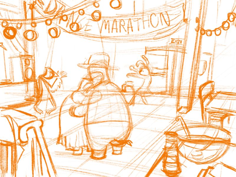
      Looks great so far, my only suggestion would be to add or move the characters over to the right some more. The right side of the image feels empty and the left side feels heavy. Unless you are keeping that area open for text, then I can see why.


      https://www.instagram.com/chipvalecek/
      https://www.facebook.com/cvalecek
      http://www.cshellmedia.com/

      ArtofAleksey 1 Reply Last reply Reply Quote 0
      • ArtofAleksey
        ArtofAleksey @Chip Valecek last edited by

        @Chip-Valecek i tried that but didnt like it. I’m going to put some stuff there but no characters

        instagram and twitter: @artofaleksey
        alekseyillustration.com

        braden H 1 Reply Last reply Reply Quote 0
        • braden H
          braden H @ArtofAleksey last edited by

          @Aleksey The first thing that comes to mind that'll fit in that empty space bottom right is a big ol' punch bowl mostly out of frame.

          ArtofAleksey 1 Reply Last reply Reply Quote 1
          • ArtofAleksey
            ArtofAleksey @braden H last edited by

            @Braden-Hallett that’s what i was thinking! Im struggling to figure out what to put in the back against the wall. Maybe a curtain?

            instagram and twitter: @artofaleksey
            alekseyillustration.com

            braden H 1 Reply Last reply Reply Quote 0
            • braden H
              braden H @ArtofAleksey last edited by

              @Aleksey It could just be left as a dark space. Dances in gyms are usually pretty low light

              1 Reply Last reply Reply Quote 0
              • ArtofAleksey
                ArtofAleksey last edited by

                @Braden-Hallett yeah I put a single element in the back and it seems to works pretty well.

                @Chip-Valecek hows this?
                DD82C646-0B32-4A00-840A-31A3D97F8177.jpeg

                instagram and twitter: @artofaleksey
                alekseyillustration.com

                burvantill 1 Reply Last reply Reply Quote 2
                • burvantill
                  burvantill Moderator @ArtofAleksey last edited by

                  @Aleksey this is looking good but I think that table is a little busy. I like @Braden-Hallett s idea about the big bowl. And for some reason the cane keeps grabbing my eye away. I hope you don’t mind but I played a little with the crop and foreground.
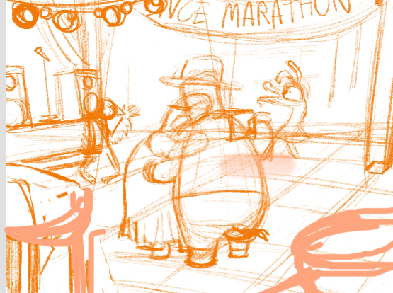
                  8ED95474-14A1-4F8F-88D5-C59BC855F2C7.jpeg

                  Lisa Burvant
                  www.lisaburvant.com
                  Instagram & Twitter & SVS: @burvantill

                  ArtofAleksey 1 Reply Last reply Reply Quote 1
                  • ArtofAleksey
                    ArtofAleksey @burvantill last edited by

                    @burvantill no I don’t mind. I put the cane there intentionally because i think it adds a little bit more story. And i see the bigger punch bowl makes sense but the right side feels emptier now for some reason.

                    instagram and twitter: @artofaleksey
                    alekseyillustration.com

                    burvantill 1 Reply Last reply Reply Quote 0
                    • burvantill
                      burvantill Moderator @ArtofAleksey last edited by

                      @Aleksey I agree. Maybe a different angle or perspective on the cane. 🤔

                      Lisa Burvant
                      www.lisaburvant.com
                      Instagram & Twitter & SVS: @burvantill

                      ArtofAleksey 1 Reply Last reply Reply Quote 1
                      • ArtofAleksey
                        ArtofAleksey @burvantill last edited by

                        @burvantill yeah that’s a good point. I flipped it and added a few more elements. I think using color and values with the spotlight will really help bring this together. What do you think?
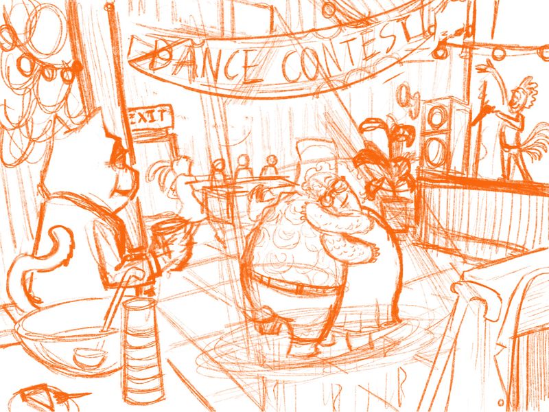
                        43DBA9FE-003E-4C66-AC50-89B27EC89CFB.jpeg

                        instagram and twitter: @artofaleksey
                        alekseyillustration.com

                        avfarrar 1 Reply Last reply Reply Quote 8
                        • avfarrar
                          avfarrar @ArtofAleksey last edited by

                          @Aleksey Yeah. I think I like how this one is turning out. Keep up the good work!

                          There is beauty in life!

                          WWW.AVFILLUSTRATION.COM
                          www.instagram.com/avfillustration/

                          1 Reply Last reply Reply Quote 1
                          • ArtofAleksey
                            ArtofAleksey last edited by

                            Ok so here is a updated version done in pencil
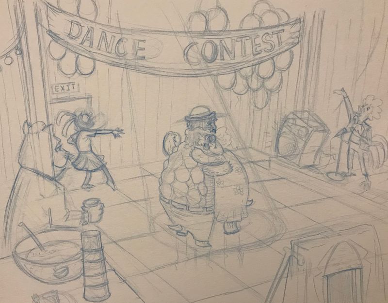
                            49884496-48C1-49B9-92A0-1A508AD70844.jpeg

                            instagram and twitter: @artofaleksey
                            alekseyillustration.com

                            1 Reply Last reply Reply Quote 3
                            • ArtofAleksey
                              ArtofAleksey last edited by

                              I think I might scrap this idea and do a different one that’s more fun

                              instagram and twitter: @artofaleksey
                              alekseyillustration.com

                              1 Reply Last reply Reply Quote 0
                              • First post
                                Last post