Society of Visual Storytelling

    SVSLearn Forums

    • Register
    • Login
    • Search
    • Recent
    • Tags
    • Popular
    • Users
    • Groups
    • Search

    Lusia and Sponge

    Artwork
    8
    17
    813
    Loading More Posts
    • Oldest to Newest
    • Newest to Oldest
    • Most Votes
    Reply
    • Reply as topic
    Log in to reply
    This topic has been deleted. Only users with topic management privileges can see it.
    • Laurel Aylesworth
      Laurel Aylesworth @Jonas Zavacky last edited by

      @Jonas-Zavacky These are just dreamy and lovely. I don't know what the story is about, but I'm loving #1 and #5.

      www.laurelaylesworth.com
      instagram.com/laurelaylesworth

      1 Reply Last reply Reply Quote 1
      • Ailantan
        Ailantan last edited by

        I really like #5, I feel most drawn to it. Number #2 have a nice road that feels like travel, but I do not like traveling towards sunset that much. Depends on what the story is about. Number #4 looks like nice rest in shadow, #6 like entering somewhere dangerous.

        https://www.instagram.com/ailantanart/

        1 Reply Last reply Reply Quote 1
        • ?
          A Former User last edited by

          I love number 1 or number 5!

          1 Reply Last reply Reply Quote 1
          • Jonas Zavacky
            Jonas Zavacky last edited by Jonas Zavacky

            I guess I will go with the 5th one 🙂 It is my favorite as well 😃 Thanks for feedback

            1 Reply Last reply Reply Quote 1
            • Jonas Zavacky
              Jonas Zavacky last edited by

              Ok made some progress 🙂 Linework + values. I feel like I can push it more with the plants and stuff, but I am afraid I will make a huge mess from that. So, for now, that is what I have... any comment before I move onto color?

              ilustrace.jpg

              Kevin Longueil burvantill 2 Replies Last reply Reply Quote 1
              • Ailantan
                Ailantan last edited by

                diagonal.jpg

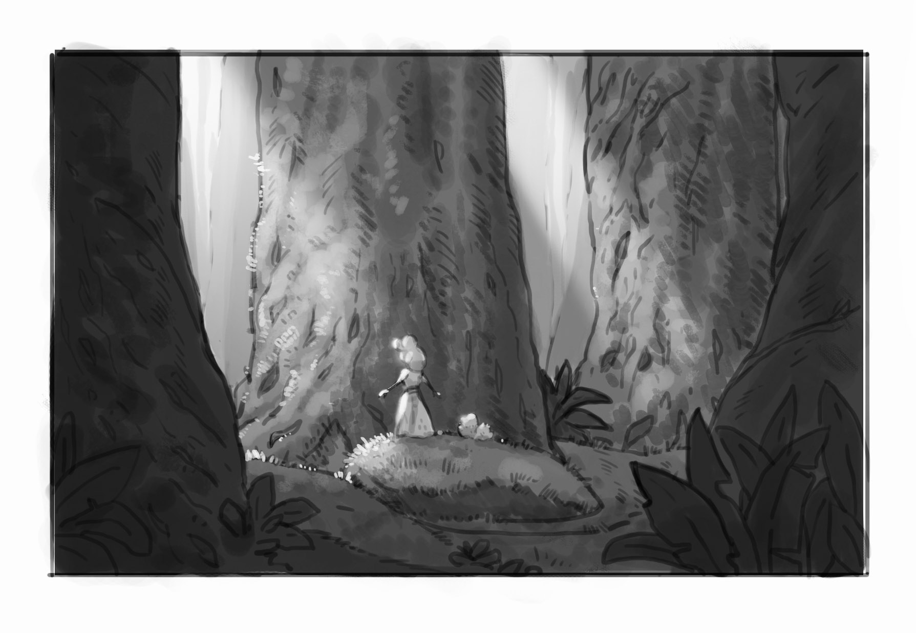
                I played with it a bit, how do you feel about this: I decreased the value of the tree on the left and increased one in the middle, so the contrast between light character and a dark tree is bigger. Also how about more diagonal grass embarkment, for increased interest? Btw you lineart is amazing, I love it, can't wait to see more 😃

                https://www.instagram.com/ailantanart/

                Jonas Zavacky 1 Reply Last reply Reply Quote 1
                • Jonas Zavacky
                  Jonas Zavacky @Ailantan last edited by Jonas Zavacky

                  @Ailantan Thanks for suggestions. Yes adding more contrast between the character and the tree is probably needed. With the grass, I would like to keep it real low and passive, but It suggests me that it needs more interest so I will play with that! Thank you! 🙂

                  1 Reply Last reply Reply Quote 1
                  • Kevin Longueil
                    Kevin Longueil SVS OG @Jonas Zavacky last edited by

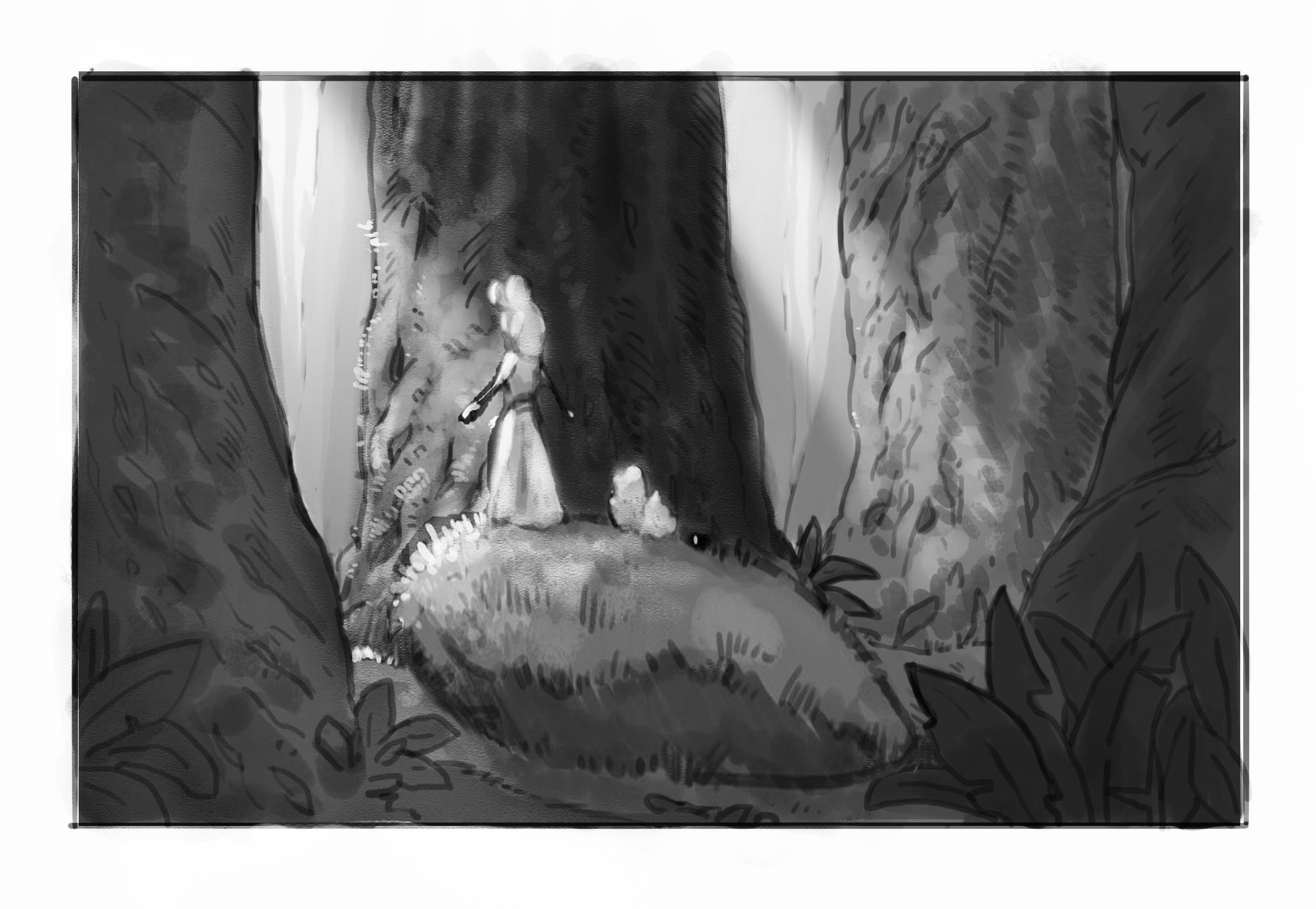
                    @Jonas-Zavacky Looking good! I did a quick cut and paste of my thoughts too - my only thought was that moving her to one side of the composition would help balance the image and possibly give you the opportunity to do a longer stretch of the interesting lighting you are doing between the trees in front of her - i went a bit far with the light in my quick cut and paste but it shows the idea - just a thought though 🙂Untitled_Artwork 2.jpg

                    Portfolio: kevinlongueil.com
                    https://www.instagram.com/kevinlongueil/

                    Jonas Zavacky 1 Reply Last reply Reply Quote 3
                    • Jonas Zavacky
                      Jonas Zavacky @Kevin Longueil last edited by

                      @Kevin-Longueil I am on the fence right now. I kinda like the composition what I have right now, but I am not 100% convinced with it and your take on it is definitely interesting (a lot) but I am not sure if it helps to convey the feel what I want from it. anyway, thanks for the suggestion.

                      1 Reply Last reply Reply Quote 2
                      • Jonas Zavacky
                        Jonas Zavacky last edited by

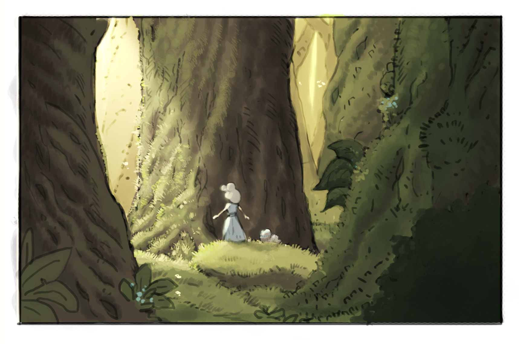
                        alright, I think I'm done with this. Realized that I still really don't understand a whole lot about rendering hehe

                        ilustrace.jpg

                        1 Reply Last reply Reply Quote 7
                        • evilrobot
                          evilrobot SVS OG last edited by

                          @Jonas-Zavacky Looks fantastic. Nice work.

                          http://www.palacioillustration.com/

                          https://www.scbwi.org/illustrator-gallery/illustrator-detail/?illustrator_id=84142

                          https://www.pinterest.com/evilrobot2/pins/

                          https://twitter.com/MyEvilRobot

                          1 Reply Last reply Reply Quote 2
                          • Jonas Zavacky
                            Jonas Zavacky last edited by

                            thank you @evilrobot

                            1 Reply Last reply Reply Quote 0
                            • theprairiefox
                              theprairiefox last edited by

                              @Jonas-Zavacky It is sweet seeing you process with these. Looking great and keep posting.

                              -The Prairie Fox
                              https://www.instagram.com/theprairiefox
                              https://www.theprairiefox.com

                              Jonas Zavacky 1 Reply Last reply Reply Quote 1
                              • Jonas Zavacky
                                Jonas Zavacky @theprairiefox last edited by

                                @theprairiefox your comment is sweet 😃 Thank you 🙂

                                1 Reply Last reply Reply Quote 0
                                • burvantill
                                  burvantill Moderator @Jonas Zavacky last edited by

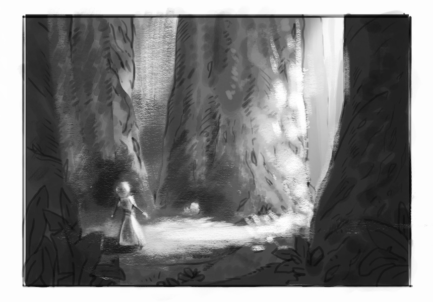
                                  @Jonas-Zavacky this is nice. Whether you go with any of @Kevin-Longueil suggestions or not I think decreasing the brightness in the light beam that is behind them (on the right) will help the focus on where they are headed.

                                  Lisa Burvant
                                  www.lisaburvant.com
                                  Instagram & Twitter & SVS: @burvantill

                                  Jonas Zavacky 1 Reply Last reply Reply Quote 1
                                  • Jonas Zavacky
                                    Jonas Zavacky @burvantill last edited by

                                    @burvantill Thank you! Yeah, you are right. That part is kinda stealing my attention

                                    1 Reply Last reply Reply Quote 1
                                    • First post
                                      Last post