Society of Visual Storytelling

    SVSLearn Forums

    • Register
    • Login
    • Search
    • Recent
    • Tags
    • Popular
    • Users
    • Groups
    • Search

    NIGHTFALL -Wip - Critique if you want.

    Projects
    critique wip nightfall spread
    11
    22
    1880
    Loading More Posts
    • Oldest to Newest
    • Newest to Oldest
    • Most Votes
    Reply
    • Reply as topic
    Log in to reply
    This topic has been deleted. Only users with topic management privileges can see it.
    • chrisaakins
      chrisaakins last edited by

      @CLCanadyArts This looks great! You shouldn't doubt yourself. You have mad skills!

      Chris Akins
      www.chrisakinsart.com
      www.instagram.com/chrisakinsart/

      1 Reply Last reply Reply Quote 1
      • Coley
        Coley last edited by

        looks so good!!!! Can't wait to see progress 🙂 !!!!

        https://www.instagram.com/nicoleledrewmay/

        1 Reply Last reply Reply Quote 1
        • carlianne
          carlianne last edited by

          Uhm, this is beautiful? I can't wait to see you color ❤

          Check out my art and tutorials :)

          Instagram: www.instagram.com/carliannecreates/

          Youtube:
          https://youtube.com/c/CarlianneCreates

          Shop: www.carliannecreates.com

          1 Reply Last reply Reply Quote 1
          • thousandwrecks
            thousandwrecks last edited by

            I really love this! I also can't wait to see the color, because I think this is only going to get more beautiful.

            thousandwrecks.com
            instagram.com/thousandwrecks

            1 Reply Last reply Reply Quote 1
            • romy
              romy last edited by

              Hehe, like it that the phoenix is called night -- nice oximoron-like setup, very fun! 👍 👏

              1 Reply Last reply Reply Quote 1
              • Nyrryl  Cadiz
                Nyrryl Cadiz SVS OG @APHOTICMOTH last edited by

                @CLCanadyArts i think this is already looking perfect

                Portfolio: nyrrylcadiz.com
                Instagram: https://www.instagram.com/nyrryl_cadiz/
                YouTube: https://www.youtube.com/channel/UCbJCF1Im8ZO7hpGWTKOJMuA

                1 Reply Last reply Reply Quote 1
                • APHOTICMOTH
                  APHOTICMOTH Moderator last edited by

                  Oh, gosh.. Thank you everyone, all of these comments have given me some hope. ❤ Going to go for a mostly lineless look this time. If it goes well, I will be re-illustrating each of my older submissions in the same style with the critiques I've gotten on each.

                  1 Reply Last reply Reply Quote 1
                  • T
                    teresaro last edited by teresaro

                    @CLCanadyArts I just wanted to reinforce it looks amazing and I'm really looking forward to seeing the final work! I'm a total newbie but for sure, don't doubt yourself or hold back! We're our own biggest obstacle

                    1 Reply Last reply Reply Quote 1
                    • APHOTICMOTH
                      APHOTICMOTH Moderator last edited by

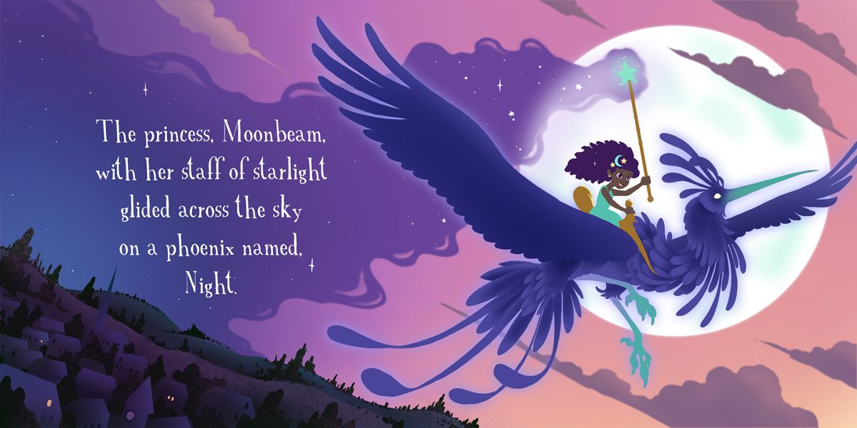
                      A lot left to do, but getting the basics worked out. She looks too old, going to refine the face. Thoughts on color choices?

                      night phoenix spread wip 2.jpg

                      chrisaakins 1 Reply Last reply Reply Quote 3
                      • chrisaakins
                        chrisaakins @APHOTICMOTH last edited by chrisaakins

                        @CLCanadyArts I think the colors are perfect! The smart use of complementary colors on her dress and saddle make her pop and yet are harmonious with the pinks and purples. Beautiful!

                        Edit: The phoenix's lower leg looks a little lost/blurry.

                        Chris Akins
                        www.chrisakinsart.com
                        www.instagram.com/chrisakinsart/

                        APHOTICMOTH 1 Reply Last reply Reply Quote 1
                        • APHOTICMOTH
                          APHOTICMOTH Moderator @chrisaakins last edited by

                          @chrisaakins Thanks. Yet to flesh out the legs, or much anything really. They are definitely lost right now. Will be adding some shadowing to them. 😃 Glad you like the gold next to turquoise, bounced around on the dress color choice for awhile. I'll be adding some gold glint to the saddle and staff, hopefully without overbaking it.

                          1 Reply Last reply Reply Quote 0
                          • carlianne
                            carlianne last edited by

                            I think it's overall working really well!

                            My only concern would be that the pheonix is getting a little lost with the value range? colorways.jpg

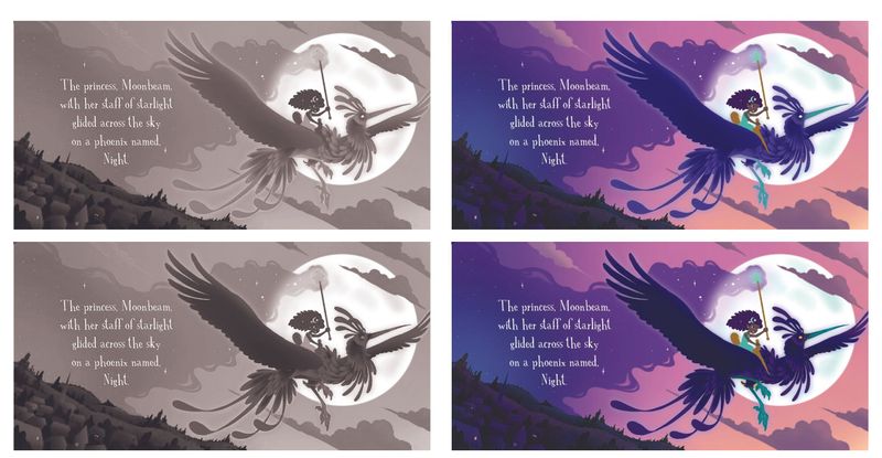
                            I just adjusted the bird, but you can play with it.

                            Check out my art and tutorials :)

                            Instagram: www.instagram.com/carliannecreates/

                            Youtube:
                            https://youtube.com/c/CarlianneCreates

                            Shop: www.carliannecreates.com

                            APHOTICMOTH 1 Reply Last reply Reply Quote 0
                            • APHOTICMOTH
                              APHOTICMOTH Moderator @carlianne last edited by APHOTICMOTH

                              @carlianne I just saved a wip. Thoughts? I like what you did though. Thank you.

                              night phoenix spread 3.jpg
                              Also just saw your reply, was 2 days ago. Where have I been? Might have taken this your direction had I seen it.

                              1 Reply Last reply Reply Quote 1
                              • APHOTICMOTH
                                APHOTICMOTH Moderator last edited by

                                The darker phoenix goes nicely with the hair too.

                                carlianne 1 Reply Last reply Reply Quote 0
                                • carlianne
                                  carlianne @APHOTICMOTH last edited by

                                  @CLCanadyArts I think it works now! If you want to change it you can try just doing a levels adjustment layer with a mask. But I think the values are reading ok 😊

                                  Check out my art and tutorials :)

                                  Instagram: www.instagram.com/carliannecreates/

                                  Youtube:
                                  https://youtube.com/c/CarlianneCreates

                                  Shop: www.carliannecreates.com

                                  1 Reply Last reply Reply Quote 0
                                  • Neha Rawat
                                    Neha Rawat last edited by

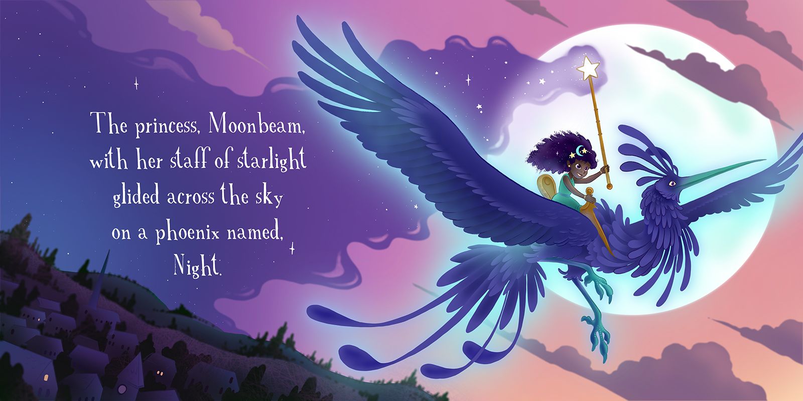
                                    @CLCanadyArts I love the colors!

                                    I just have a few thoughts going on in my head. Feel free to ignore them please since I'm not too sure about them myself.

                                    1. The background of the town - there is a distinct sharpness to the houses and a blurriness to all the trees (including the tress on the hills). Is that on purpose? Since all the other lines are sharp, this blurriness is throwing me a little off.

                                    2. Maybe try omitting the blue glow where the phoenix overlaps the moon? I would think the glow wouldn't be seen against the bright white moon.

                                    Your level of detailing is amazing! And I love the font selection and the way you've placed it in the starry night. Good luck! 😃

                                    https://www.nrbstudio.in/
                                    https://www.instagram.com/nrbstudio.in

                                    APHOTICMOTH 1 Reply Last reply Reply Quote 1
                                    • KathrynAdebayo
                                      KathrynAdebayo last edited by

                                      I love her hair!

                                      1 Reply Last reply Reply Quote 1
                                      • APHOTICMOTH
                                        APHOTICMOTH Moderator @Neha Rawat last edited by

                                        @Neha-Rawat Good thoughts. I kept the glow as it's colored magic, but yeah, it probably would not be visable, or at least barely.

                                        The blur was on purpose as the small trees/hills are far away, maybe I should lessen it a bit, and blur the far away houses a tad to make more sense.

                                        Thank you!

                                        1 Reply Last reply Reply Quote 0
                                        • APHOTICMOTH
                                          APHOTICMOTH Moderator last edited by

                                          This post is deleted!
                                          1 Reply Last reply Reply Quote 0
                                          • First post
                                            Last post