Constructive Feedback appreciated!
-
This post is deleted! -
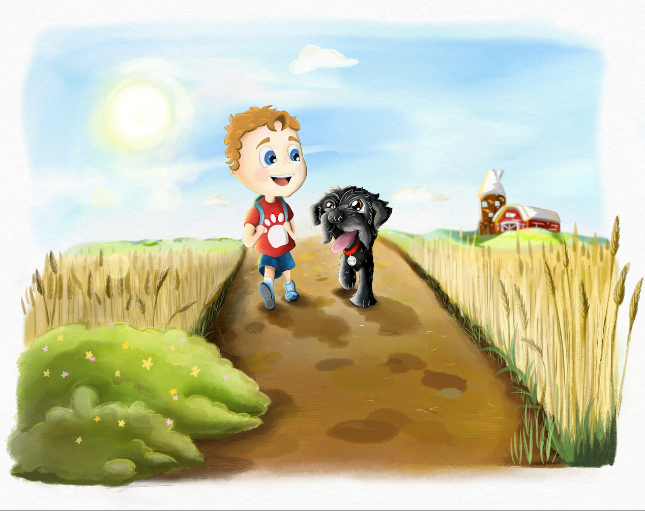
Nice, it really looks like a bright sunny day!
One thing I noticed with consistency is that the size of the dog changes compared to the boy. In the first picture, he’s as tall as his shoulder, in the next to he’s about at his elbow. (I know the dog is sitting in the third one, but when dogs put their back legs down like that their heads don’t get much lower.) It may help to do a kind of “character turnaround” page that you can use as your reference.
Also, I find the path a little busy looking. There’s a variety of colors and values, and it keeps drawing my eye’s focus. What if there was less contrast between colors, and between the darks and lights? I’m not sure how important this path is to the plot- like the yellow brick road is important in the Wizard of Oz. With the background plants, I think you did a good job with making them interesting but not distracting.
-
@LouD Hey, thanks for your comment. Yes the size of the dog I picked up on this recently so that's already on my to-do list
 .
.The pathway isn't important to the story so could definitely adjust. Original intention was just to create lots of colour but I can see how it could be distracting.
Thanks!
-
Heyhey @ChrisConnor - thanks for your patience
")
There's been a lot of feedback given since I last checked, so perhaps other artists have answered a few of the questions you were asking me? But in response:
-> For sure, experiment with what works best for your vision It sounds like you're doing that with Theo's clothes. Have you decided on the style you'd like? I checked out the styles of the artists you listed, it seems like a flowy, gradient style would best suit your goals (as opposed to the two/three toned, bold outlines).
I do this style by using a lasso tool to outline the subject (shirt, pants, whatever), and use the dry textured gauche, or a textured watercolor brush within the lassoed area. That way it has a nice clean outline but still looks vibrant and...storybookish. Same way you do the trees and bushes, but with a different texture. Perhaps that'll help you?-> So, for your tulip fields - keep in mind that the sharper you make their edges, the more defined they look, the less the viewers' eyes are directed to the focal points - they're too busy bouncing around all the little details. If it's your intention to add details, great, you're on it, just make sure you have a plan to direct the eyes back to your intended focal points - in leui of details (it seems your characters are cartoonish and not intended to be detailed) you can do this with a contrast in values, hues, and textures. I know that with the artists you listed, all of their style has an attention to detail with lively environments/backgrounds, so I know it's probably a goal of yours to maintain that level of detail. Just something to think about.
Does the tulip field look flat? Not all the time, not in all places. Keep in mind that the further away something is, the "cooler" it looks, lots of blue hues. The closer something is, the warmer it looks, lots of red hues. That's just the way light works over a distance. The further away something is, the less the contrast in tones and fewer details are perceived, and of course, the closer it is.... the more contrast and details can be perceived (sorry to repeat something you may already know).
If you want your environments to look like they go on forever (that seems to be the goal?), limit your palette, contrast, and details the further back you get, and use cooler colors (or fewer hues). For example, piece 1 - the hills by the barn could probably have the highlights a little lower to limit the contrast. The tulips could probably have fewer spots of dark green and incorporate some bluer greens the further away they are. Does that make sense? Same notes for Piece 3.
Experiment with those notes a bit and you'll find a way to give your pieces more depth.I hear ya on being self taught - for the most part, I am as well. It's incredible what time, patience, dedicated practice, a few youtube videos, and constructive feedback will get you. Kudos to you for going the extra mile to invest in your craft by joining a learning community like SVS. You'll go far with this kind of dedication! You can do it!
(PS - I saw there was a redraw of Piece 1 - I wanted to comment on it but now it's not here, am I missing it or was it removed? Lemme know, I'm happy to give feedback on the changes!)
All the best! Happy drawing!
Shani -
@TheArtBard the lasso tool is a game changer
 . I've been trying to figure out for ages to how to do what you just described and didn't even think about using that tool! So thanks for that pointer.
I did upload a new updated page 1, but I removed it as I noticed some more changes I wanted to make and didn't want to bombard the thread with loads of versions of the same picture. Thanks for those pointers on the contrasts. I noticed this the other day actually as I've kinda done this in the backdrop on the last image but not the others, so I will adjust those.
I'm so glad I found this forum which I didn't know was a thing until I read Will Terry's new book. It's so incredibly helpful to get advice and feedback from other artists. It's something I've needed for a long time.
-
@ChrisConnor great illustrations. They look fun! The biggest advice I could give to you right now is to follow the rule of thirds.
Portfolio: nyrrylcadiz.com
Instagram: https://www.instagram.com/nyrryl_cadiz/
YouTube: https://www.youtube.com/channel/UCbJCF1Im8ZO7hpGWTKOJMuA -
@Nyrryl-Cadiz thank you, I will take that into future practice!
-
Hi Chris,
Great job for taking the plunge and posting your artwork for critique. That's a big step forward.
It's natural to compare yourself with others. But you're right that it's not really helpful. I would study close-ups of Will Terry's work and try and fail to work out how he did it. Do you have a copy of his new book? I was just studying his picture of the zombie and his subtle use of texture is amazing. It would make me envious, but I've learnt to consciously force myself to take it as inspiration, rather than comparison.
I really like your artwork, composition design and line work. I think a lot of our peers have said good things to you already.
My only input is to work on improving your use of light and shadow, and depth of field. So a bit more contrast between your lights and darks. And remember that hills and buildings on the horizon shouldn't be sharply in focus. I think Will, Jake and Lee were talking about that in one of the recent 3 Point Perspectives.
Keep it up pro!
-
@Adam-Thornton-0 Hi Adam. So sorry for the delayed response. Thanks so much for your message. Yes, I've read it! Found it really insightful. His attention to the textures is amazing. I'm still finding what tools work best for that. Getting there slowly.
I'm actually already reworking the focus on the background and the lighting at the moment so on the same wave length
Thanks for the boost!
-
@TheArtBard @Nathalie-Kranich @LouD @Adam-Thornton-0
Hi everyone, it's been a while. I've pretty much redone most of image 1. I wanted to make it cleaner with the painting style as it was kinda messy. I've taken into account all your notes and applied them to it so I hope you see an improvement.
I could write out everything that's been changed but you should be able to see for yourselfI'm personally really happy with how this has turned out. I took way more time to pay more attention to detail and I think it's paid off. I just now need to match the rest of the illustrations to this
 (11 so far...and that's only half of the planned amount).
I have a question actually.
What dimensions do you generally go for when illustrating for a picture book? In pixels and/or inches...
I've been illustrating at a much higher pixel dimension as I like to really zoom in and go into detail but it obviously increases the file size quite significantly and too often makes the app crash on my tablet.
I've played around with making the canvas properties smaller of the existing illustration, but because it was originally done in a much higher resolution, it distorts the pencil lines a lot.
Or do you know of a way to compress the file size without losing picture quality?Would love to hear your thoughts!