Society of Visual Storytelling

    SVSLearn Forums

    • Register
    • Login
    • Search
    • Recent
    • Tags
    • Popular
    • Users
    • Groups
    • Search

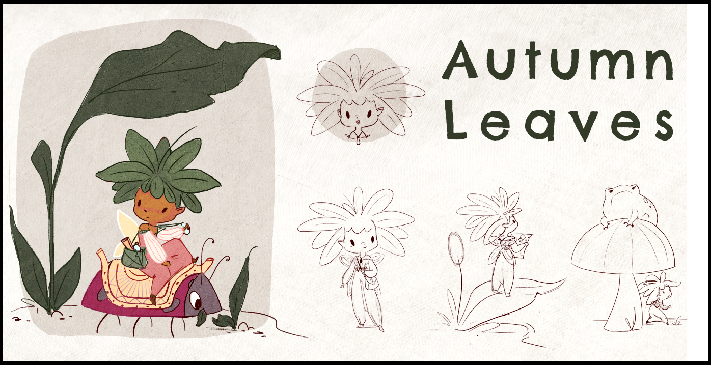
    March WIP - Fairytale Flower - final touches

    Contest
    27
    62
    5114
    Loading More Posts
    • Oldest to Newest
    • Newest to Oldest
    • Most Votes
    Reply
    • Reply as topic
    Log in to reply
    This topic has been deleted. Only users with topic management privileges can see it.
    • Tiffany Thomas
      Tiffany Thomas @carlianne last edited by

      @carlianne I love her and the color palette!! The texture and light are wonderful! Can't wait to see you final submission :).

      1 Reply Last reply Reply Quote 1
      • Larue
        Larue last edited by

        Love the painterly style and how the lighting is working. Great textures.

        1 Reply Last reply Reply Quote 1
        • carlianne
          carlianne last edited by

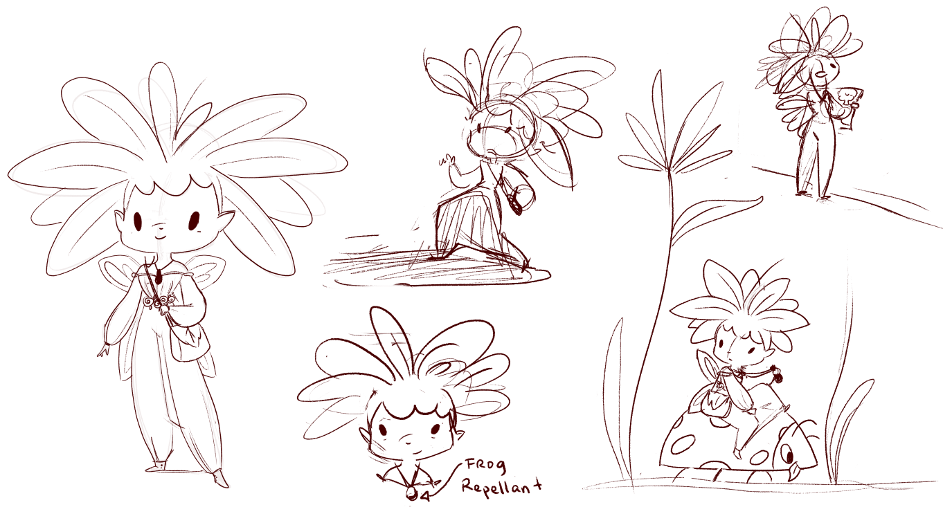
          Okay working on the poses

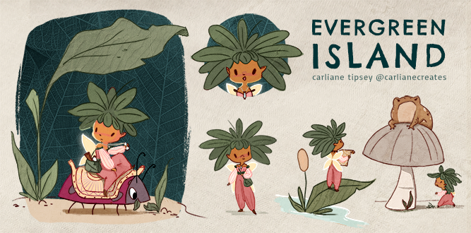
          To flush out my story idea, my idea is that she lives in a village that is under siege by frogs, and she's been sent to find repellants (lemons from the lemon tree) but she has to travel through frog territory to get there (the pond).

          78289683-9669-47d2-ae4b-43e96532eb0b-image.png

          Georgios Christopoulos 1 Reply Last reply Reply Quote 3
          • Georgios Christopoulos
            Georgios Christopoulos @carlianne last edited by

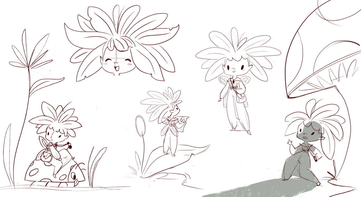
            @carlianne Beautiful illo.Also the layout sketch is nice. An idea if you want it 🙂 Maybe add a close up of her looking at a lemon tree picture ,so she can recognize it once she looks at it at real life (indicating that it is her first time stepping out of her village and she had not seen a lemon tree yet in her life)
            Just my 2 cents!!!
            Keep it up, the character is beautiful!

            Instagram : https://www.instagram.com/g.chris.artwork/
            Deviantart : https://www.deviantart.com/g-chris

            1 Reply Last reply Reply Quote 1
            • carlianne
              carlianne last edited by

              8ea91e3b-733f-4a7a-b556-5257ff61a6bf-image.png

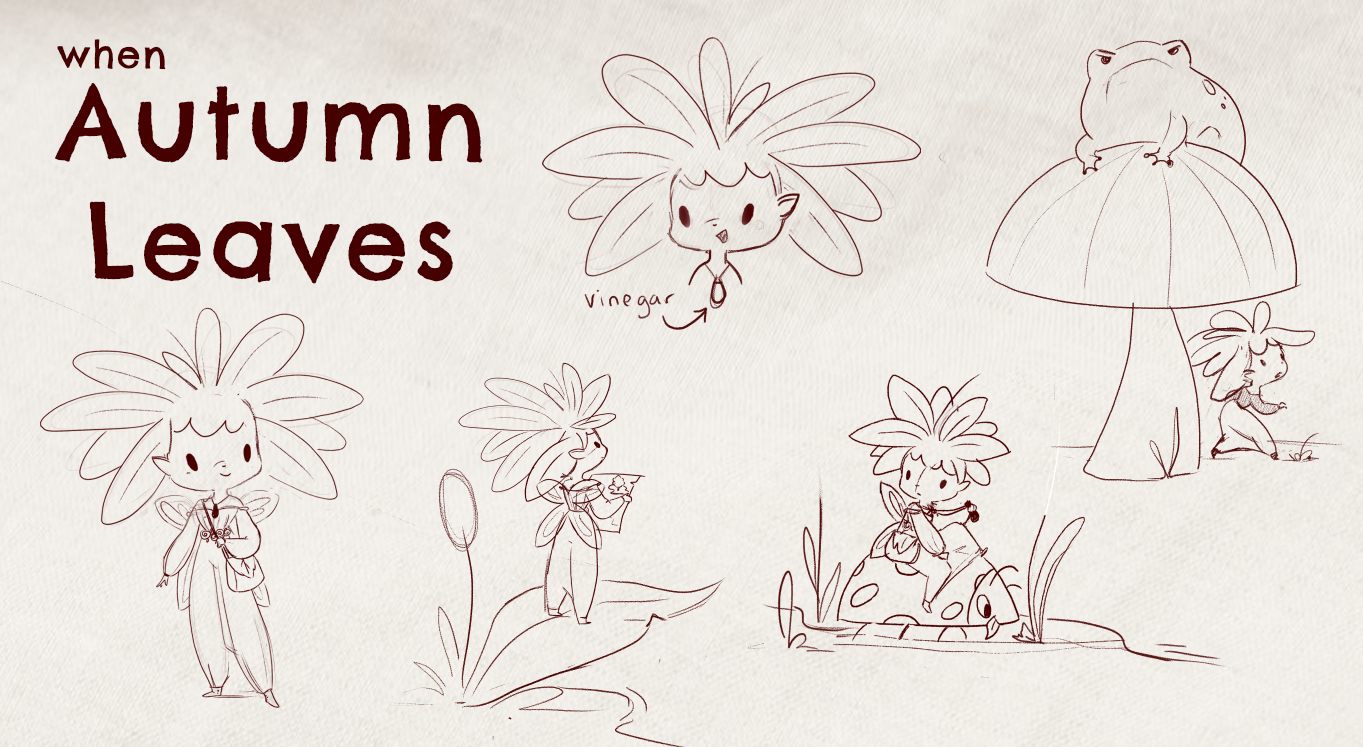
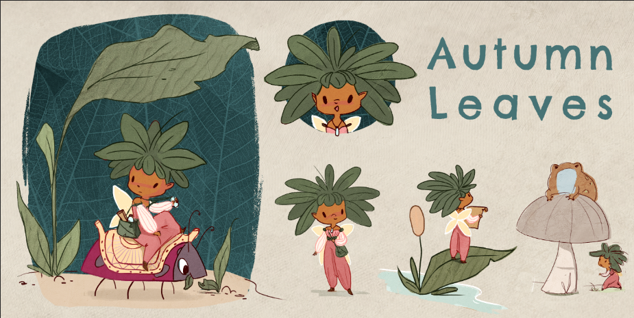
              Just refining and cleaning up, would love to know if that cast shadow in the bottom right is working

              1 Reply Last reply Reply Quote 2
              • K.Flagg
                K.Flagg last edited by

                Looks great! I think the shadow is a nice touch since it draws your eye back toward the center.

                K.Flagg

                carlianne 2 Replies Last reply Reply Quote 0
                • carlianne
                  carlianne @K.Flagg last edited by

                  This post is deleted!
                  1 Reply Last reply Reply Quote 0
                  • carlianne
                    carlianne @K.Flagg last edited by

                    @K-Flagg thank you, that is a great point!

                    1 Reply Last reply Reply Quote 0
                    • carlianne
                      carlianne last edited by

                      I wasn't feeling happy with the shadow, so I swapped out the pose and made some other changes, just trying to nail this down before I paint later

                      1334d1b2-1931-443a-bb56-9f1233cd381f-image.png

                      carlianne 1 Reply Last reply Reply Quote 0
                      • carlianne
                        carlianne @carlianne last edited by

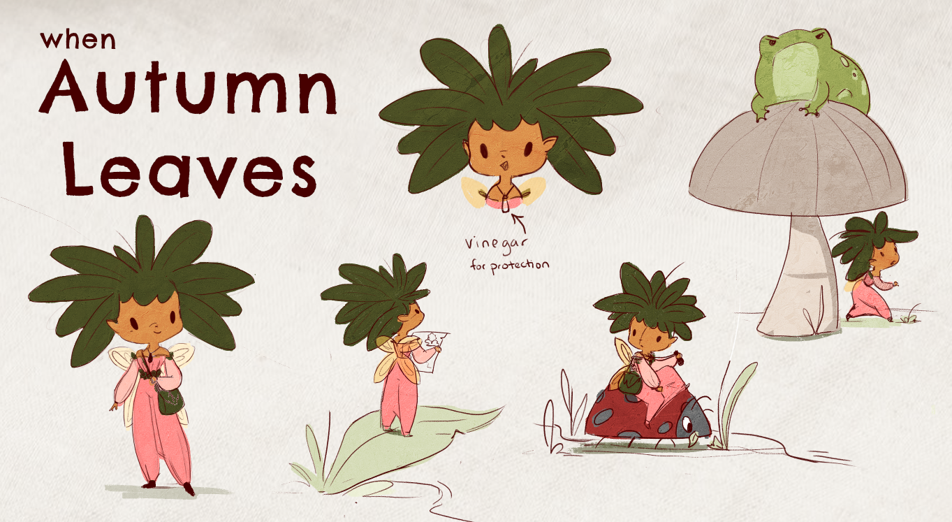
                        @carlianne starting to add color
                        94771be8-a169-4f05-bbc5-4020c7401fe1-image.png

                        Natalie Lundeen 1 Reply Last reply Reply Quote 4
                        • Natalie Lundeen
                          Natalie Lundeen @carlianne last edited by

                          @carlianne Ooh, this looks so good, Carli!

                          1 Reply Last reply Reply Quote 1
                          • carlianne
                            carlianne last edited by

                            I didn't like my layout, so I am trying to make one of the poses more of a focal point

                            03a94a04-f6cf-412e-9532-ea69b3d24ced-image.png

                            1 Reply Last reply Reply Quote 2
                            • K.Flagg
                              K.Flagg last edited by

                              I like the new layout better! Looks good!

                              K.Flagg

                              carlianne 1 Reply Last reply Reply Quote 1
                              • carlianne
                                carlianne @K.Flagg last edited by

                                @K-Flagg @Natalie-Lundeen thank you!! ❤

                                1 Reply Last reply Reply Quote 0
                                • J
                                  jdubz last edited by

                                  I like the newer layout structurally! It's has a nicer flow. I think the only potential problem is the "close up" on the face - it's the same size almost as the one below it in the pose. I think even if you decreased the name a little bit and made the face just a bit bigger that would help separate it.

                                  Josh White
                                  https://www.instagram.com/joshwhiteillustration/

                                  carlianne 1 Reply Last reply Reply Quote 0
                                  • carlianne
                                    carlianne @jdubz last edited by

                                    @jdubz Great point! I've adjusted it 🙂

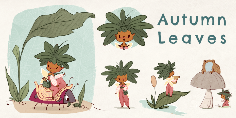
                                    Now Deciding on a background treatment. Do you all prefer dark or light bg?
                                    2587242b-af39-4de0-a879-cf966a34c53a-image.png

                                    3d8255c8-3980-4160-9f20-9bc32c3d5905-image.png

                                    jakecrowe Dima Eichhorn 2 Replies Last reply Reply Quote 3
                                    • jakecrowe
                                      jakecrowe @carlianne last edited by

                                      @carlianne I love the texture in the dark background.

                                      jakecrowe.com

                                      1 Reply Last reply Reply Quote 1
                                      • APHOTICMOTH
                                        APHOTICMOTH Moderator last edited by

                                        I love the dark bg, hard to say why though. Her wings stand out more, and it makes the other colors feel richer.

                                        All my links: https://APHOTICMOTH.carrd.co/

                                        1 Reply Last reply Reply Quote 1
                                        • carlianne
                                          carlianne last edited by carlianne

                                          23296ca5-4733-4443-ac21-6adcebdd9390-image.png

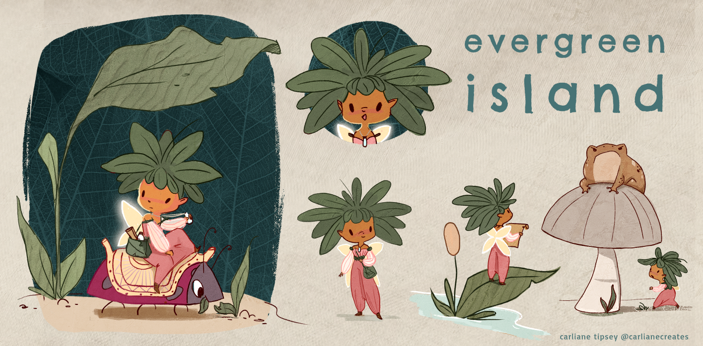
                                          getting close to calling it done! Any final feedback or ideas?? Wing glow yes/no?

                                          jaepereira 1 Reply Last reply Reply Quote 1
                                          • carlianne
                                            carlianne last edited by

                                            Fairy_cleanup_EXPORT_SMALL.png

                                            alright I'm calling it a night!

                                            1 Reply Last reply Reply Quote 2
                                            • First post
                                              Last post