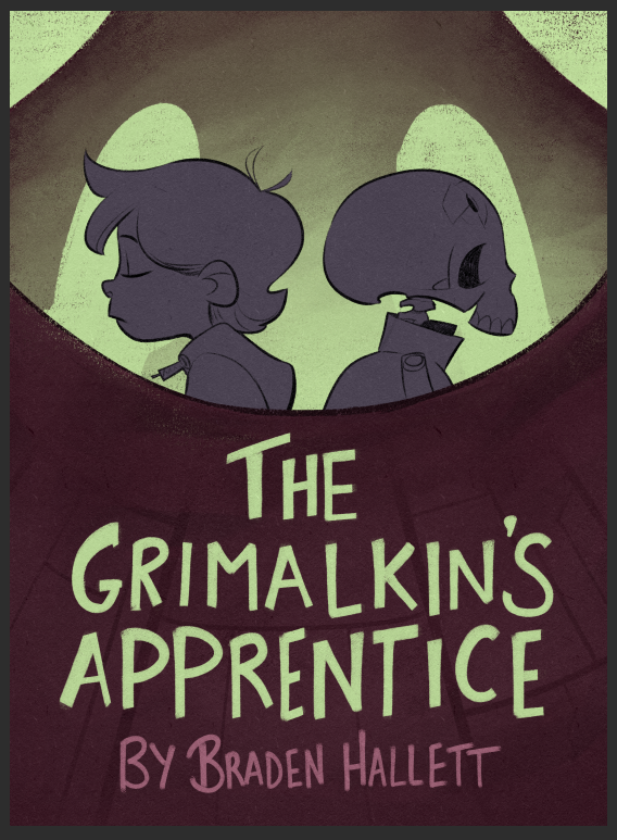
Cover rough critique! How do you feel about the colours?
-
Thanks for the feedback everyone! I got a bunch of awesome advice froma bunch of different places (including here) and I'm starting to settle on something darker (and much more saturated!)
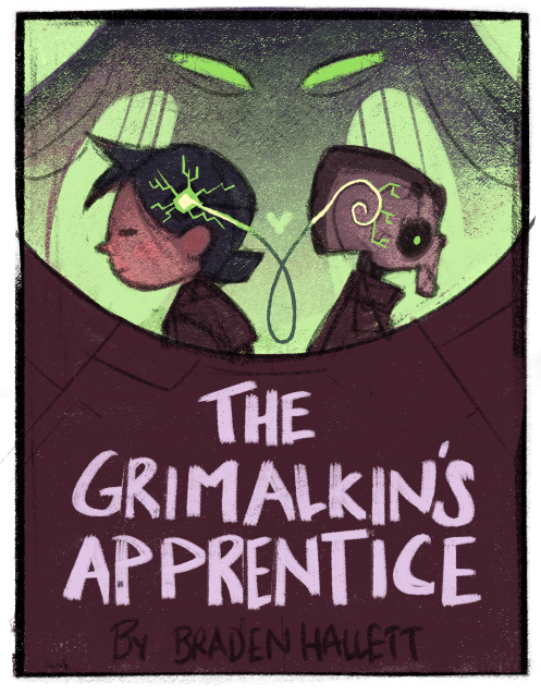
And a further WIP shot
-
@burvantill said in Cover rough critique! How do you feel about the colours?:
I love the little dude on the right.
Ah yes. Skullmeister. No lines and very limited screen time, but totally steals the show, lol.
-
@NessIllustration said in Cover rough critique! How do you feel about the colours?:
When we look at it from afar, the cover isn't as eye catching as it could be
I agree! Works-ish, but definitely not on the level of "LOOKATMELOOKATME!" which is what I want!
-
@chrisaakins said in Cover rough critique! How do you feel about the colours?:
If you wanted to you could push the intensity on the colors of his face and the alien's eyes but it's not necessary at all.
I think i tend toward muted colours which can be good for interiors, but (based on feedback) not necessarily the best for covers. So I'm definitely gonna push 'em a bit more!
-
@Braden-Hallett Yeah I think it might be because you have a lot of middle gray tones. The updated version you posted has the large block of high contrast, which really makes it pop!
vanessastoilova.com
instagram.com/vanessa.stoilova/Check out my Youtube channel for tips on how to start your career in illustration! www.youtube.com/c/ArtBusinesswithNess
-
@NessIllustration said in Cover rough critique! How do you feel about the colours?:
@Braden-Hallett Yeah I think it might be because you have a lot of middle gray tones. The updated version you posted has the large block of high contrast, which really makes it pop!
Awesome! Good to hear it's popping more

-
have you explored making the dark area more purple than red? The purple green combo tends to have a cool eerie sci-fi feel to it, might be fun!
")
Check out my art and tutorials :)
Instagram: www.instagram.com/carliannecreates/
Youtube:
https://youtube.com/c/CarlianneCreatesShop: www.carliannecreates.com
-
@carlianne said in Cover rough critique! How do you feel about the colours?:
have you explored making the dark area more purple than red? The purple green combo tends to have a cool eerie sci-fi feel to it, might be fun!
See, the interesting thing is that to me that DOES look purple
 Purple green is exactly what I was goin' for
 -
@Braden-Hallett moooooooaaaaar
Check out my art and tutorials :)
Instagram: www.instagram.com/carliannecreates/
Youtube:
https://youtube.com/c/CarlianneCreatesShop: www.carliannecreates.com
-
@carlianne MOOOOOOAAAAAAR PUUUUUURPLLLLLLLLE!
-
@Braden-Hallett Looks purple to me, a little on the red side. Like Mullberry/Wine. I like it.
-
@Braden-Hallett looks really good now. I like that you made the bottom colour less greyish and more juicy. Purple works nice
-
@Braden-Hallett Late to the party,but I think it works out fine.Maybe saturate th green a tad more.
Also love the letters! the handwritten format suits the cover so much!Instagram : https://www.instagram.com/g.chris.artwork/
Deviantart : https://www.deviantart.com/g-chris -
@Georgios-Christopoulos said in Cover rough critique! How do you feel about the colours?:
the handwritten format suits the cover so much!
Thanks! It turned out surprisingly well
-
I think it's close to done
Thanks for the feedback everyone!
-
@Braden-Hallett Nice. I like the saturation in the magenta. And the electric green details. Good color scheme.

Lisa Burvant
www.lisaburvant.com
Instagram & Twitter & SVS: @burvantill -
I liked the green text, but that's just me
 Looking really nice.
All my links: https://APHOTICMOTH.carrd.co/
-
@burvantill Dunno why but I love purple/grey/green
-
@CLCanadyArts said in Cover rough critique! How do you feel about the colours?:
I liked the green text, but that's just me
Looking really nice.It's still a possibility! It just reminds me too much of mint chocolate chip ice cream
-
@Braden-Hallett I was just writing...
“I really like the colours and dark foreground of this. From a graphic design perspective I also Iiked the title in green to help with the hierarchy of the text and help the title stand out when on a shelf (the accent colour green could tie the eyes/head circuit chip and title together if that makes sense).”
...but you have just done it before I pressed submit

I like it in the green, I think it’s can be read and noticed easier. Whether the title is green or purple - I’m totally intrigued by what the story could be about by the cover as a whole.
Website: lizardillo.co.uk
IG: instagram.com/lizardillo