Society of Visual Storytelling

    SVSLearn Forums

    • Register
    • Login
    • Search
    • Recent
    • Tags
    • Popular
    • Users
    • Groups
    • Search

    May WIP - Greenhouse Situation

    Contest
    critique feedback wip
    7
    12
    936
    Loading More Posts
    • Oldest to Newest
    • Newest to Oldest
    • Most Votes
    Reply
    • Reply as topic
    Log in to reply
    This topic has been deleted. Only users with topic management privileges can see it.
    • ellenseal_art
      ellenseal_art last edited by

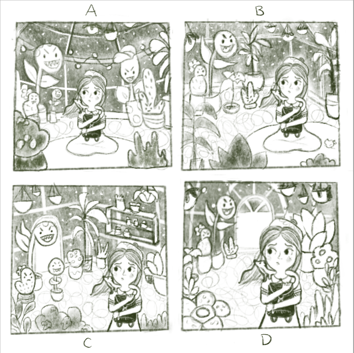
      Hey! Thanks for taking a look. I've been plugging away on my May entry but I'm having the hardest time with composition/background. A million thumbnails later, I've landed on these 4 options but I'm still struggling to choose.

      My concept is that the traveler (& her trusty weasel) have taken cover in a greenhouse because it's either night time or raining (though I'm unsure I have the skills to draw a rainy background). She starts to get a creepy feeling but hasn't actually seen the evil plants behind her yet.

      Do any of these 4 options stand out to you? Or should I continue the thumbnail stage?

      SS_ellenseal14_Fairytale_Situation_.png

      https://twitter.com/ellenseal_art
      https://www.instagram.com/ellenseal_art
      ellenseal.myportfolio.com

      Kim Rosenlof Jeremy Ross ajillustrates Kevin Longueil 4 Replies Last reply Reply Quote 3
      • Kim Rosenlof
        Kim Rosenlof @ellenseal_art last edited by

        @ellenseal14 I really like your idea! I like B the best.

        Instagram: https://www.instagram.com/kiminyrose/

        1 Reply Last reply Reply Quote 1
        • Jeremy Ross
          Jeremy Ross @ellenseal_art last edited by

          Hi @ellenseal14, what a fun piece! Personally, I like “D” the best because the main characters draw my attention the most. I feel like you’re using rule of thirds nicely.

          Can’t wait to see your final piece!

          https://www.instagram.com/jeremyrayross
          https://www.jeremyrayross.com/
          https://twitter.com/jeremyrayross
          https://jeremyrayross.substack.com/

          1 Reply Last reply Reply Quote 2
          • ajillustrates
            ajillustrates @ellenseal_art last edited by

            @ellenseal14 Personally, I like A the best because I'm not afraid of centered compositions, and because it's the only thumbnail that has evil plants on either side behind her, which makes stakes higher. You could even have her little sidekick looking off to the right, which would sell that they feel surrounded.

            https://ajillustrates.com
            https://www.instagram.com/aj.illustrates/

            1 Reply Last reply Reply Quote 2
            • Kevin Longueil
              Kevin Longueil SVS OG @ellenseal_art last edited by

              @ellenseal14 I've struggled with the fact that i like A best too - it is a centered composition but i think it looks perfect. This would make a very nice book cover if you extended the canvas up and down a bit to an 8 x 10 ratio. I am wondering if i am thinking that because it is centered?? - super nice drawings!!

              Portfolio: kevinlongueil.com
              https://www.instagram.com/kevinlongueil/

              ellenseal_art 1 Reply Last reply Reply Quote 2
              • ellenseal_art
                ellenseal_art @Kevin Longueil last edited by

                @Kim-Rosenlof @Jeremy-Ross @ajillustrates @Kevin-Longueil Thank you all so much for your feedback! Looks like 1 vote B, 1 vote D, and 2 votes A. At least I can eliminate C. 🙂

                I like A but was scared to go with something centered - great idea to flip the sidekick though! I'd also probably arch the plants a bit more towards her to frame her.

                On the other hand, I like how she's moving through the space in D. Both options are from different points in time - so this would be when she's just arrived whereas A would be after she sits to rest (maybe I'd add the bitten apple in there from B so perhaps they're pissed at her for biting a fruit...)

                Hmm...decisions decisions. Thanks again!

                https://twitter.com/ellenseal_art
                https://www.instagram.com/ellenseal_art
                ellenseal.myportfolio.com

                1 Reply Last reply Reply Quote 1
                • TaniaGomesArt
                  TaniaGomesArt last edited by TaniaGomesArt

                  I like A the best for what you are trying to tell. It's the one where I feel the danger of the plants the most. I'm personally not bothered with centered compositions, but if you think is a problem, you may extend the canvas vertically a bit and kind of make the plants bend a little, like they are trying to get to her. But I like it as it is to be honest.

                  ellenseal_art 1 Reply Last reply Reply Quote 0
                  • ellenseal_art
                    ellenseal_art @TaniaGomesArt last edited by

                    @TaniaGomesArt Thank you! A is one of the options I'm leaning towards so that really helps.

                    https://twitter.com/ellenseal_art
                    https://www.instagram.com/ellenseal_art
                    ellenseal.myportfolio.com

                    1 Reply Last reply Reply Quote 1
                    • KevinTreaccar
                      KevinTreaccar last edited by

                      A and D are my favorites. I like the surrounded feel of A, though her head disappears into the darker wall to me since her hair seems to be a similar tone. I think I like the contrast around her head in D and wonder if bringing its door to A would make A a clear winner.

                      kevintreaccar.com
                      instagram.com/kevintreaccar

                      1 Reply Last reply Reply Quote 0
                      • ellenseal_art
                        ellenseal_art last edited by

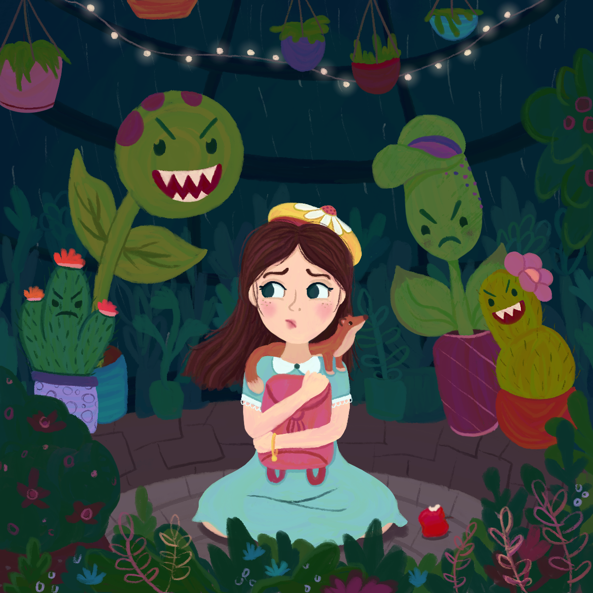
                        Thanks everyone who helped me out with this one! Here's where I'm at now. Any last minute things I should fix that I'm not noticing?

                        ellenseal_SVSFairytaleSitch.png

                        https://twitter.com/ellenseal_art
                        https://www.instagram.com/ellenseal_art
                        ellenseal.myportfolio.com

                        ajillustrates 1 Reply Last reply Reply Quote 4
                        • ajillustrates
                          ajillustrates @ellenseal_art last edited by

                          @ellenseal14 Looking lovely! A recommendation to think about: add some lightning out the wind to joing the rainstorm, which would justify putting some dramatic halo-backlighting on the monster plants, girl's hair, and pet's snout.

                          https://ajillustrates.com
                          https://www.instagram.com/aj.illustrates/

                          ellenseal_art 1 Reply Last reply Reply Quote 1
                          • ellenseal_art
                            ellenseal_art @ajillustrates last edited by

                            @ajillustrates Haha...I'll try it! Lighting is not my strong suit so I'm unsure I'll pull it off. Worth experimenting with though - thanks!

                            https://twitter.com/ellenseal_art
                            https://www.instagram.com/ellenseal_art
                            ellenseal.myportfolio.com

                            1 Reply Last reply Reply Quote 0
                            • First post
                              Last post