Society of Visual Storytelling

    SVSLearn Forums

    • Register
    • Login
    • Search
    • Recent
    • Tags
    • Popular
    • Users
    • Groups
    • Search

    Hey Looking for a Critique on this WIP

    Artwork
    painting wip critique
    4
    15
    2572
    Loading More Posts
    • Oldest to Newest
    • Newest to Oldest
    • Most Votes
    Reply
    • Reply as topic
    Log in to reply
    This topic has been deleted. Only users with topic management privileges can see it.
    • Jason Bowen
      Jason Bowen SVS OG last edited by

      0_1519235956976_pirate trip.jpg

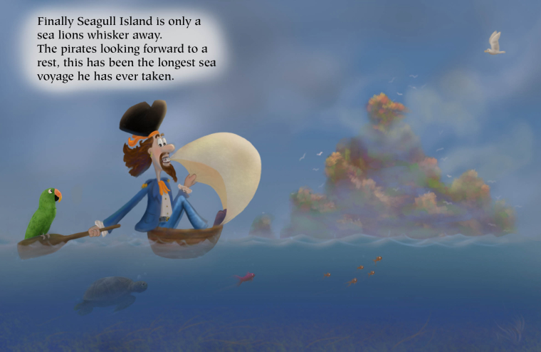
      I am trying to get use to having text with my pictures. This is something I have dreamt up and am trying to add more light and colour to my paintings because I seem to always end up going to the darkside haha. Any critiques welcome thanks.

      https://www.instagram.com/jasonbowenoils/

      1 Reply Last reply Reply Quote 0
      • Jon Anderson
        Jon Anderson SVS OG last edited by

        The main thing that jumps out to me would be having your pirate overlap the island a bit to really help push the distance. As you have it now you are giving us clues that the island is distant with the water overlapping the island, the blurriness, and lacking detail yet at the same time it feels like it is on the same 2D plane as the pirate. Making the pirate overlap the island will help sell those other cues that he's almost able to rest but he still has a small journey to get there. I hope that helps.

        instagram.com/jonandersonillu

        Jason Bowen 1 Reply Last reply Reply Quote 1
        • TessaW
          TessaW last edited by

          Hi Jason. Great start! I am a little unclear about your intentions with the environment and atmosphere. I have some suggestions, which will depend on what you are trying to achieve.

          So far, what I'm getting most from this scene, is that it's a smoky day from a fire. Perhaps his ship burned down? It looks like the sun is being masked by the smoke, but you can still see a bit of clear blue sky behind the island.

          Is this your intention?

          Website: www.tessawrathall.com

          Instagram: www.instagram.com/tessawrathall_art/

          Jason Bowen 1 Reply Last reply Reply Quote 1
          • Jason Bowen
            Jason Bowen SVS OG @TessaW last edited by

            @tessaw Hey not exactly. I was going for a misty look which masks the island from a distance. But I was thinking to myself that I could create more interesting clouds but until I read your thoughts I forgot about that idea. Thanks I will think about what to do...

            https://www.instagram.com/jasonbowenoils/

            TessaW 1 Reply Last reply Reply Quote 0
            • NizhoniWolf
              NizhoniWolf last edited by

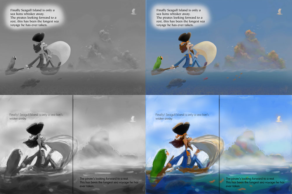
              Personally, I would have planned out the illustration to have more space available for the words. @Jon-Anderson mentioned moving the pirate over so he over laps the island a bit (to create more depth perception) but i also feel this would free up some natural space for those words 🙂

              Find me on Facebook and instagram under NizhoniWolf, for my sketches, musings and W.I.P's!

              Jason Bowen 1 Reply Last reply Reply Quote 2
              • Jason Bowen
                Jason Bowen SVS OG @Jon Anderson last edited by

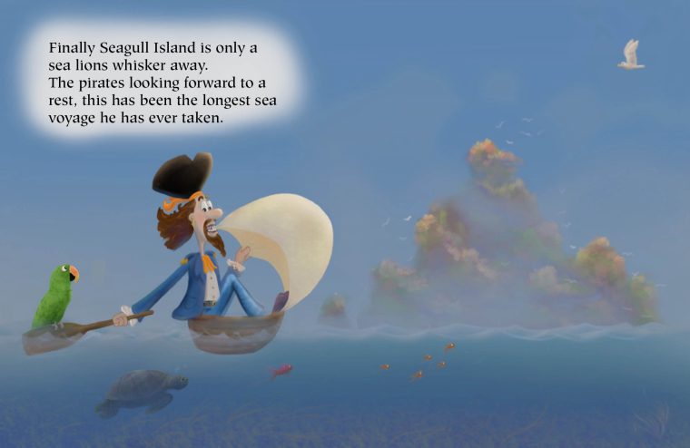
                @jon-anderson Thanks for your idea. I was planning it out as a double page spread and I am a little unsure whether you should ignore the fold of the page or not... I will have to play a bit with the positions.

                https://www.instagram.com/jasonbowenoils/

                Jon Anderson 1 Reply Last reply Reply Quote 1
                • TessaW
                  TessaW @Jason Bowen last edited by

                  @jason-bowen Ah, I see. In that case, I think you've gone a bit too gray and dark for the mist. What time of day is this? Do you mind if I attempt a paint over?

                  Website: www.tessawrathall.com

                  Instagram: www.instagram.com/tessawrathall_art/

                  Jason Bowen 2 Replies Last reply Reply Quote 1
                  • Jon Anderson
                    Jon Anderson SVS OG @Jason Bowen last edited by

                    @jason-bowen If your goal is a two page spread I would leave the pirate so that he isn't broken up and add something relevant on the right side to still overlap and help with depth. Making the island wider may help with that too and would not interfere with the page break so long as you have enough of it showing on the left side that it isn't awkward looking. You just definitely don't want to put your focal point right at the page break.

                    instagram.com/jonandersonillu

                    1 Reply Last reply Reply Quote 0
                    • Jason Bowen
                      Jason Bowen SVS OG @TessaW last edited by

                      @tessaw go for it 🙂

                      https://www.instagram.com/jasonbowenoils/

                      1 Reply Last reply Reply Quote 0
                      • Jason Bowen
                        Jason Bowen SVS OG @TessaW last edited by

                        @tessaw I didn't have a time of day really. Was just thinking light haha

                        https://www.instagram.com/jasonbowenoils/

                        1 Reply Last reply Reply Quote 0
                        • Jason Bowen
                          Jason Bowen SVS OG @NizhoniWolf last edited by

                          @nizhoniwolf thanks, the words are a problem I need to solve

                          https://www.instagram.com/jasonbowenoils/

                          1 Reply Last reply Reply Quote 0
                          • Jason Bowen
                            Jason Bowen SVS OG last edited by

                            0_1519250266069_pirate trip2.jpg

                            I had a brain wave and drained the water a bit to give me space at the top I'm still working on the mist I need some time away from this picture haha 🙂

                            https://www.instagram.com/jasonbowenoils/

                            1 Reply Last reply Reply Quote 0
                            • TessaW
                              TessaW last edited by

                              Ok, I did a rough paint-over. I personally felt your values could be grouped a bit different so that your pirate could stand out better. I also incorporated other's suggestions. The saturation levels are my personal preference, and I think a more muted palette would work as well!

                              Anyway, just my thoughts.

                              0_1519259780708_Jason.jpg

                              Website: www.tessawrathall.com

                              Instagram: www.instagram.com/tessawrathall_art/

                              Jason Bowen 1 Reply Last reply Reply Quote 3
                              • Jason Bowen
                                Jason Bowen SVS OG @TessaW last edited by

                                @tessaw Thanks a lot for the quick paint over! It has given me some great ideas I will post my progress 🙂

                                https://www.instagram.com/jasonbowenoils/

                                1 Reply Last reply Reply Quote 0
                                • Jason Bowen
                                  Jason Bowen SVS OG last edited by

                                  0_1519322939627_pirate trip 2.jpg
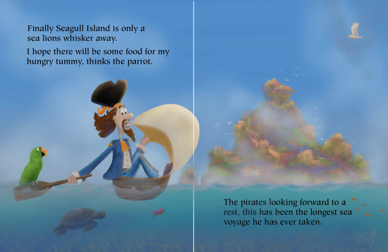
                                  I have done some more playing with this painting I am going to move on to the next page and see if I can create a book out of this. 🙂

                                  https://www.instagram.com/jasonbowenoils/

                                  1 Reply Last reply Reply Quote 0
                                  • First post
                                    Last post