Does this comic page work in black and white
-
Hiya!
I'm working on my portfolio for the western SCBWI conference in May. I want to have a short 9-10 page comic both in black and white in my portfolio. I'm used to making the page work in colour, but it's been a LONG time since I've worked in black and white (and then last thing I want is 9-10 pages in my portfolio that showcase my inability to work with BW
") )
)SO Do you think this page reads and works well in black and white as is? Can you decode characters from setting in the kinda busy third panel? I mostly want to make sure it's not just a liney jumble.
Thanks in advance

-
Looks pretty good overall. I do think that forth panel is a bit rough to read as is. From what I can see:
-
The wording might need a bit more bending. It looks like Nooooooole.
-
The outlines of the castle seem a bit strong. If you tone those down (same way as behind the lettering) I think it would work.
-
-
I agree with @JerrySketchyArt. Would you consider using halftone to help with the focus? Or something similar, crosshatching? Does it have to be strictly black and white?
-
This post is deleted! -
I agree about the name looking like "Nooole" in the big frame but should be easy to fix. Funny thing is that my name is actually Nicole and I feel like the Nicole in the comic when trying to do artwork and my family always interrupting for lunch and other things lol. I think I may have looked like the Nicole in your comic and screamed "what?!" rather loudly once or twice in my life ha ha ha!
-
@Braden-Hallett i love how this is turning out. Perhaps going greyscale?
-
I always love your art style and the style shown in the comic is no different, really nice work and expressions!
I think the main thing I'm seeing is perhaps not enough delineation between the foreground and background. In the first panel, for example, with the hand holding the gerbil it might be nice to have a bit bolder line work on the gerbil (or the line work, as is) and then a slightly thinner line work on the hand. Right now it is a bit difficult for me to read them as two separate objects.
I hope this helps!
-
Thanks everyone for the feedback
I'm gonna try and make it work in strictly black and white (I'm aiming super high for Jeff Smith as inspiration)
I know it'll work in colour at this point, but I'd love to have a strictly BW version.
I will fix the 'nooooooool'

You've given me some great stuff to think about! Thanks
-
@Braden-Hallett If ya wanna do black and white ONLY ya gotta add some more textures. Ive been looking at black and white art a lot lately because of my ink practice. As it is now it looks unfinished. If you’re not gonna use color, to prevent it from looking flat, you gotta either work with grays, monochrome, or dutone, or you gotta add more textures so theres some kinda contrast happening otherwise it looks very flat.
-
@Braden-Hallett I was just going to say the "nooooool" thing is what stands out to me most but you've said you'll fix this so other than that nothing stood out to me as needing to be fixed although I think maybe a bit more detail like others have said could work really well for a strictly black and white version, or maybe make it monochrome with some slight grey shadows to bring it to a finish! Great job though, I don't know too much about comics but in my opinion it reads well and the characters are cute

-
@Aleksey You're absolutely right
Way back when I was still trying my webcomic in black and white I couldn't figure out texture and spot black. I fixed it by moving to colour My tendency is to overdo it, so this'll be good practice!
-
@Braden-Hallett true. Im trying the texture thing myself im hoping it plays out ok for this months piece
-
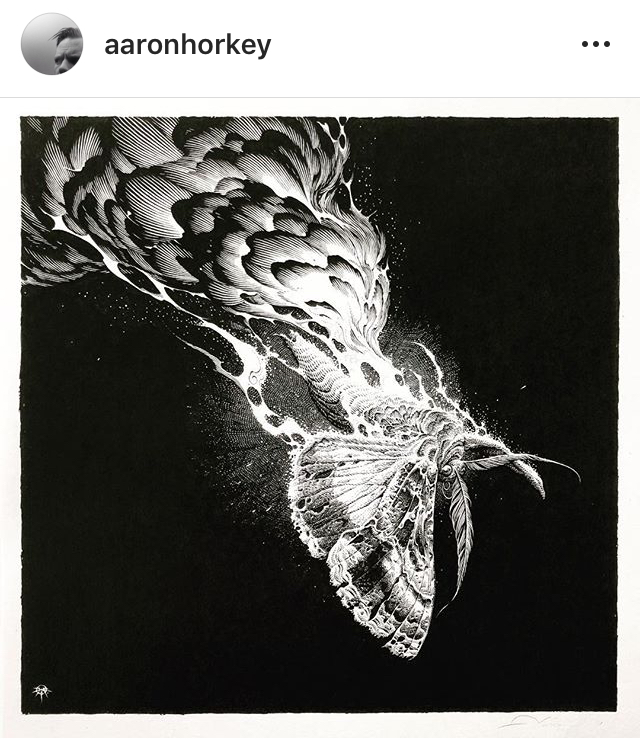
@Braden-Hallett I follow an artist on IG @aaronhorkey. He does a fine/commercial art of sorts but uses mainly ink. His halftones are AMAZING. It’s not the same style as yours by a long shot but it’s worth a look.
Here’s a screenshot
Lisa Burvant
www.lisaburvant.com
Instagram & Twitter & SVS: @burvantill -
@burvantill Oh wow! That is some amazing feathering! Thank you! Always good to have reference and inspiration
-
For me, the placement of the chapter number and title are kind of breaking up the sequence, it might just be that I'm not looking at it in the context of the other pages but it might flow better if you moved them to the beginning or end of this bit.
-
Hey! I think most of what I was going to say has already been said, that is, maybe add more texture or consider using half tones? I think this would be particularly helpful in panels like the very first one. The 'nool' thing also pops out but you've already adressed that.
Well done though. It looks really great!! -
@Braden-Hallett I like it!
In addition to what others have said and you have acknowledged-is Nicole the customer?
I’m reading her as staff. Or why would the character ask a customer when is lunch?It took me some work to figure out how Nicole was the same as the character in the 4th Panel. I figured it out by putting together the helmet. Perhaps you’re I could make that connection a little easier by making some aspect of her clothing visually the same (with texture! Rather than color).
-
@Susan-Marks I think the confusion about 'who is customer' comes from lack of context. The next 10 pages sort things out
-
Thanks very much for the feedback, everyone! Regardless of whether I try and provide a BW version along with the colour, trying to really sort things out in BW is a great exercise (and really takes planning, apparently :smiling_face_with_open_mouth_closed_eyes: )
Here's the black and white with more spot black and texture (gonna do some Jeff Smith master studies over the next few days) and a colour version.
Do you think providing a BW version along with the colour is a bad idea?


-
@Braden-Hallett I have been working through this problem as well. It really came up to me as we were working class to figure out values. I would like most of my finish work to be done in monochrome. But I still need to work in value if I want a piece to read well.
That means, you need to add texture and/or shading via ink...
What I was doing in class was using the values studies in thumbnails and the rough process and then figured out equivalent in B&W. Which may be textures or half-tones or crosshatching as needed. You get a little of this in your 3rd panel as you have the wood textured, but you could do so much more to get the definition and get everything to read.
For example: the last panel I just read the hair and the angry bubble. I can't really see what is going on with the desk. If the person is important behind the desk maybe make her dark?
I think you could use the suspenders as a mid-tone with a texture to provide a quick read on your main character as well.
Just some thoughts, I love your work. It is always so much fun.
-The Prairie Fox
https://www.instagram.com/theprairiefox
https://www.theprairiefox.com