Children's Book Illustration - Feedback
-
Hello, everybody!
 My name is Roxana and have taken some classes here on SVS, which I found very useful in giving me a better understanding on color, light situations and character designs.
I took my time with this piece, particularly because I wanted to do more character explorations (I'm trying to upgrade my illustration style to better fit children's books industry) and because I wanted to understand and practice digital drawing, and expressing color values according to the light situation.
I am very much interested in getting to know some honest opinions on this illustration, because I want to understand what I could do better next time.
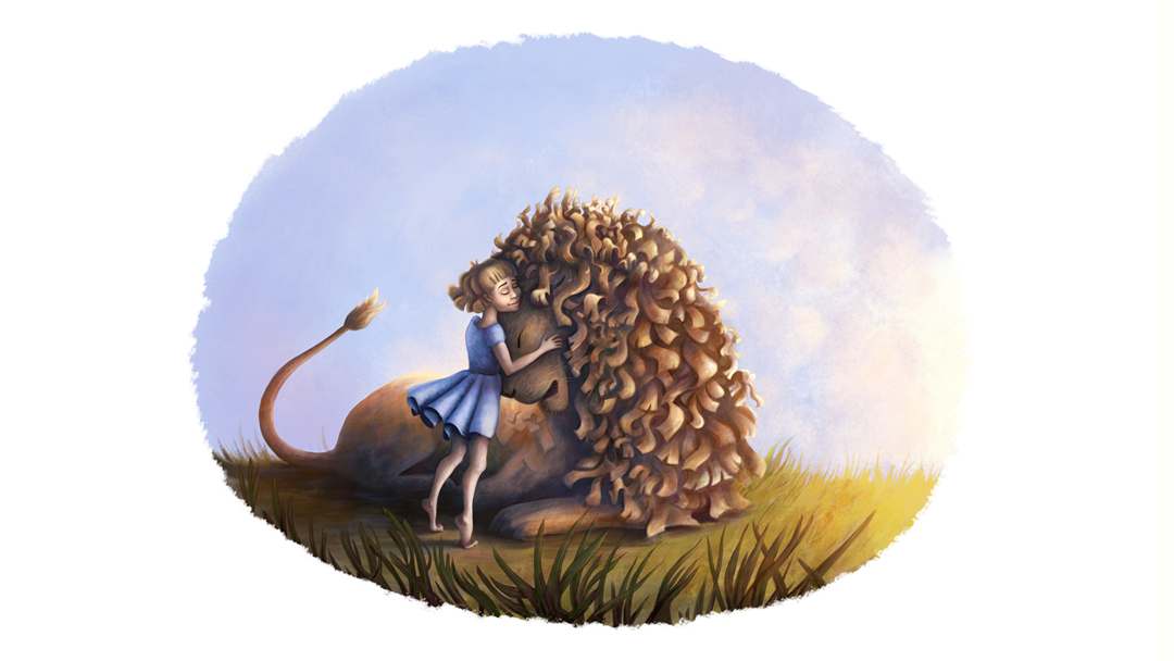
This illustration is Lucy and Aslan, from The Cronicles of Narnia, showing Lucy happilly hugging Aslan after finding out he is alive. I've started this project with character design, thumbnails for finding the pose I liked, color values and then coloring process.
Thanks for your feedback. Appreciated.

-
Hi @Roxana-Antochi !
I'm definitely not an expert but I really like the pose and the lion's curls!")
I wonder if it would be possible to see more of the lion's face and his emotions?
Also, have you tried to get the light source to highlight the 2 faces and show more their interaction? -
@Roxana-Antochi This is a beautiful piece, I think where you are running into trouble is in your use of colour in the shadows. I think you are using too much black in your shadows and that seems to darken the whole piece. Try using darker values of the local object colour rather than black for shadows. The only places you should be using black is in the occlusion shadows where no ambient light can get in (even then you don't have to use black). I did a quick draw over to show you what I mean. I'm currently on a laptop with no mouse, so all I could do was lighten the areas that were too dark, but it communicates the general idea.

-
@marine Thanks for the feedback
I think I've focused too much on getting the light right, that I lost focus on the way their faces show emotion and interaction. That's a very good input because it should basically the focus here. -
@ErinCortese Thank you. It kind of blew my mind when I compared my initial illustration to your solution. Their faces really get into focus like that. When I started adding shadows it felt to me that I wasn't getting enough defined lines and shapes and I guess that is why I kept adding darker shadows. I ended up using close to black values. Thanks a lot for the feedback, very useful.
-
I've also got a bit of a doubt when it comes to Lucy's face. When I zoom it, it looks fine, but when I zoom out and see the whole picture, her face seems to come out as a bit weird, especially around the eyes shadows. What do you think the problem is? Should I redraw her eyes and cheeks so that less shadow appears on them?
-
@Roxana-Antochi I really like the emotion of this piece and particularly like Aslan's expression. My one critique when I saw it is what you mentioned in your last post -- Lucy's face. I think the shadows and mouth (cheek?) line make her look much older than she was. You could try softening up her face and features so that she looks younger.
Laurie DeMott
instagram.com/demotlj -
@demotlj Thank you for the feedback! I've changed Lucy's face, not only in terms of shadows and cheeks, but also the eyes, which I've decided would look better if they were closed. I think it's a lot better like this now.
Thank you all for the feedback! It helped me understand some notions about shadows, focus of the illustration and illustrating the faces better