May stormN wip(s)
-
@Asyas_illos Yes I am hoping that you will increase the size of the characters in the balloon, as I feel these are a bit lost.
-
I love costume design!
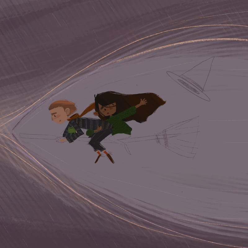
-
I’m wonder if my illustration is too dark? What do you guys think? I could add a lightening bolt and get some light in there that way or maybe a spell?
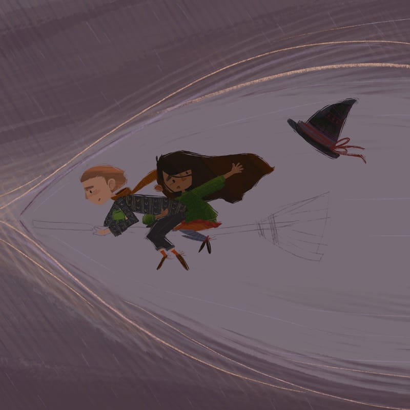
-
@Asyas_illos The evenness of value throughout does kind of muddle the image, particularly around the front figure’s face. I often find it helpful to switch to greyscale so it’s easier to see what needs value adjustments. A light source of some sort to highlight the focal points would probably help a lot!
-
Ok so here’s where I am at currently. I’m going to play around with lighting and see how it goes…
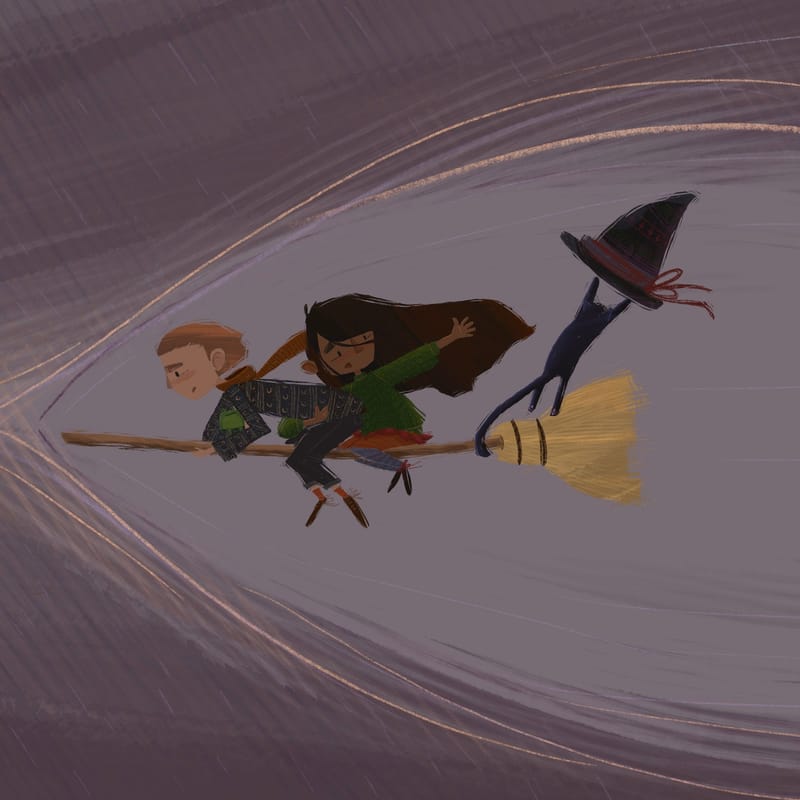
-
Think k I’m gonna call it with this light !
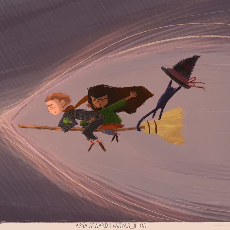
-
@Asyas_illos that definitely did the trick! Love it!
-
@patricialamas thank you!
-
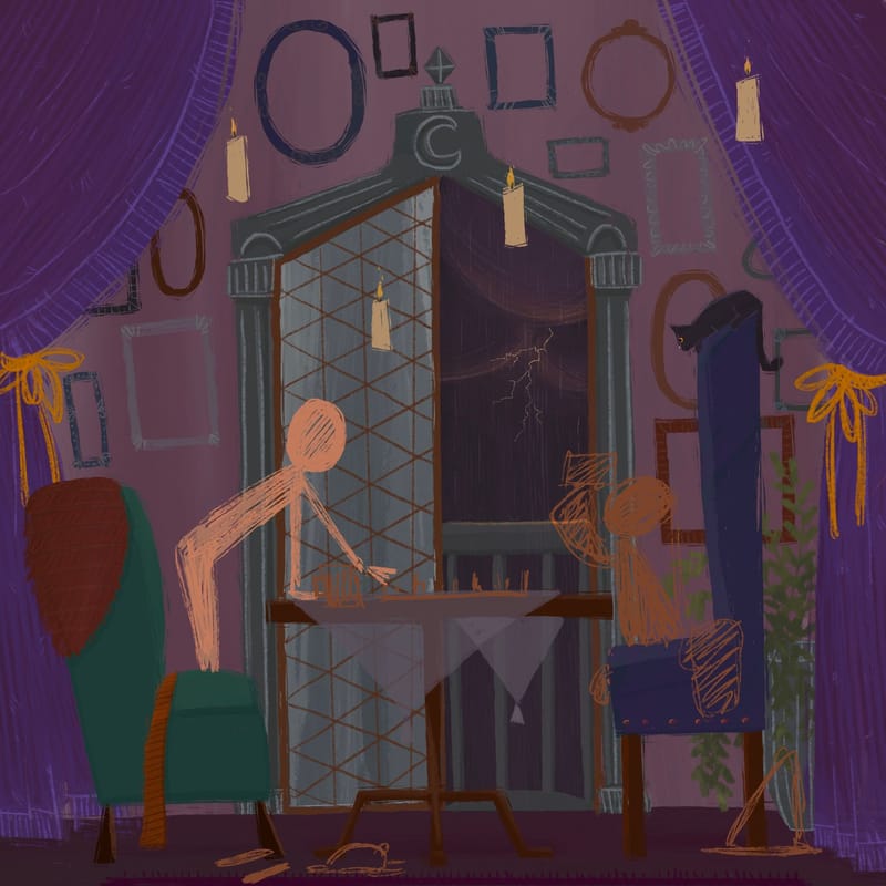
Working on a sister illustration I love these characters so much I had to bring them inside! And yes I’ve been watching a bit of Harry Potter…just need the characters!
-
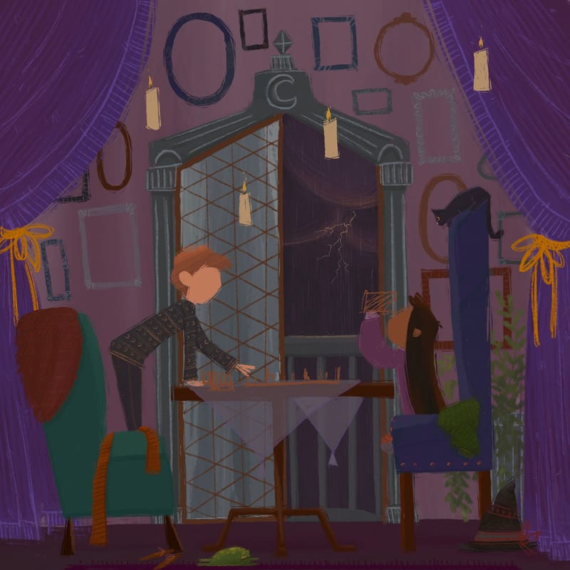
Contemplating on using this as an entry too. The storm is not very prevalent. What do you guys think?
-
@Asyas_illos this is so fun and I love the shapes. Maybe the (floating?) candles could be flickering/threatening to blow out and the door could be swinging open or curtains blowing due to the storm.
-
@jenn thank you for the feedback ! I should have thought of something like that before but I also wanted to convey a feeling of safety and warmth. I think I’m done at this point though…
-
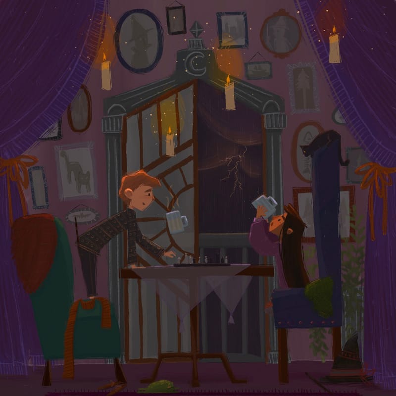
Maybe not “stormy” enough for the judges but may as well enter it anyways!
-
@Asyas_illos Love the lighting from the floating candles! The orange highlights seem just right.
-
@JessicaLinnEvans thank you!
-
Awesome and very fun illustration to explore, the frog on the floor, the floating candles, the black cat and is that Ron playing chess?
You might want to experiment with something in the foreground in the corners a little something overlapping the middle ground so it feels like we are moving into the scene.
Very excited to see what you come up with. It has a lovely air of mystery to it. Nicely done!
-
@Robert-Henderson thank you! I appreciate your feedback! If you’re familiar with my stuff you’ll notice I usually avoid tons of details this was my attempt of pushing myself out of my comfort zone. Unfortunately I already submitted it and I don’t want to make any extra work for Austin, but something silhouetted in the foreground would’ve been killer! And no it’s not Ron in particular but maybe they’d have been buddies?!
-
@Asyas_illos I think this is CUTE! Love how you kept the palette contained. My eye moves between several sweet little focal points, but stays moving within the composition.
You really nailed a whole atmosphere here.I know it's already submitted, but maybe for a future edit, consider neutralizing the strength the red blanket and bow behind the standing boy. That's the only thing that pulls focus, to me.
-
@Valerie-Light awesome thanks for the feedback! I was worried I tried to get in too much detail and clutter the composition!
-
@Asyas_illos beautiful work on this scene as always! The thing I struggled with at first was not understanding that the window door was open on the right side - I thought the difference was sort of symbolic of him and her being in two separate "worlds" like that she is part of this stormy halloweeny world and he is part of a more calm and peaceful side...
But I absolutely love this color palette you've used - it really sets the mood well!